1.8 The Output
The result of all this is a model with two giant probability functions. In this section I’ll talk through what those functions look like with a worked example, and then some graphs about how well the models perform at their intended task.
The worked example involves David Makinson’s article “The Paradox of the Preface” (Makinson 1965). The input to the model looks like this.
| Word | Word Count |
|---|---|
| rational | 14 |
| beliefs | 11 |
| paradox | 9 |
| book | 8 |
| author | 7 |
| belief | 6 |
| statements | 6 |
| believes | 5 |
| errors | 5 |
| incompatible | 5 |
| preface | 5 |
| present | 5 |
| set | 5 |
| true | 5 |
| believe | 4 |
| example | 4 |
| however | 4 |
| logically | 4 |
| maciver | 4 |
That is, the word rational appears fourteen times, beliefs appears eleven times, and so on. This is a list of all of the words in the article, excluding the various stop words described above and the words that appear one to three times.
The model gives a probability to the article being in each of ninety topics. For this article, as for most articles, it just gives a residual probability to the vast majority of topics. For eighty-three topics, the probability it gives to the article being in that topic is about 0.0003. The seven topics it gives a serious probability to are:
| Topic | Probability |
|---|---|
| 76 | 0.2681 |
| 4 | 0.2668 |
| 15 | 0.1311 |
| 81 | 0.1266 |
| 59 | 0.1109 |
| 37 | 0.0385 |
| 39 | 0.0318 |
I’m going to spend a lot of time in the next chapter on what these topics are. For now, I’ll just refer to them by number.
The model also gives a probability to each word turning up in a paradigm article for each of the topics. For those nineteen words that the model saw as input, we can look at how frequently the model thinks a word should turn up in each of these seven topics.
| Word | Topic 4 | Topic 15 | Topic 37 | Topic 39 | Topic 59 | Topic 76 | Topic 81 |
|---|---|---|---|---|---|---|---|
| present | 0.0029 | 0.0018 | 0.0019 | 0.076 | 0.00047 | 0.00033 | 0.00062 |
| rational | 8.3e-12 | 9.6e-20 | 3e-11 | 2.7e-34 | 9.1e-32 | 0.0029 | 0.044 |
| true | 0.0011 | 0.016 | 1.3e-05 | 0.0056 | 0.14 | 0.015 | 0.00081 |
| however | 0.0035 | 0.0044 | 0.0031 | 0.0028 | 0.0027 | 0.0032 | 0.0026 |
| statements | 1.7e-43 | 0.088 | 3.1e-26 | 1.3e-33 | 2.2e-12 | 1.5e-44 | 4.5e-59 |
| example | 0.00039 | 0.0028 | 0.0058 | 0.0011 | 0.0024 | 0.0033 | 0.0024 |
| believes | 3.3e-33 | 2.5e-26 | 2.2e-44 | 9.4e-25 | 1.2e-18 | 0.011 | 0.0018 |
| set | 0.00077 | 0.001 | 0.058 | 2.4e-08 | 1.7e-06 | 0.00094 | 0.0014 |
| believe | 0.00075 | 2.8e-05 | 3.3e-17 | 0.00082 | 8.1e-09 | 0.045 | 0.0032 |
| maciver | 6.4e-05 | 2.3e-10 | 1.1e-156 | 9.5e-72 | 3.8e-66 | 1.4e-34 | 1.1e-150 |
| book | 0.02 | 7.8e-07 | 1.1e-19 | 5.8e-22 | 1.3e-18 | 4.3e-10 | 0.00022 |
| incompatible | 1.6e-31 | 0.00084 | 6.4e-05 | 0.00051 | 5e-13 | 7.6e-05 | 0.00018 |
| beliefs | 1.2e-39 | 1.1e-44 | 1.2e-48 | 3.4e-35 | 2.4e-26 | 0.077 | 0.0035 |
| author | 0.0092 | 1.2e-23 | 2.8e-21 | 4.5e-31 | 2.2e-11 | 3.6e-09 | 2.4e-14 |
| belief | 1.1e-25 | 3.3e-27 | 1.4e-42 | 4e-30 | 3.4e-23 | 0.13 | 1.1e-10 |
| errors | 0.00022 | 9.7e-23 | 1.9e-30 | 9.2e-38 | 5.2e-35 | 5.7e-06 | 3.2e-27 |
| logically | 1.8e-38 | 0.018 | 0.0012 | 0.00026 | 4e-09 | 9.6e-10 | 8.2e-15 |
| preface | 0.00069 | 2e-33 | 8.6e-63 | 3e-105 | 4.8e-07 | 1.5e-06 | 2.2e-11 |
| paradox | 1.1e-31 | 1.2e-09 | 0.0014 | 4.8e-13 | 0.02 | 9.5e-12 | 2.4e-26 |
But the model doesn’t think that “The Paradox of the Preface” is a paradigm case of any one of these topics; it thinks it is a mix of seven. Therefore, what it thinks the word frequencies in that article should be can be worked out by taking weighted means of these columns, with the weights given by the topic probabilities. And that gives the following results:
| Word | Wordcount | Measured Frequency | Modeled Frequency |
|---|---|---|---|
| rational | 14 | 0.1207 | 0.0065 |
| beliefs | 11 | 0.0948 | 0.0217 |
| paradox | 9 | 0.0776 | 0.0023 |
| book | 8 | 0.0690 | 0.0055 |
| author | 7 | 0.0603 | 0.0025 |
| belief | 6 | 0.0517 | 0.0358 |
| statements | 6 | 0.0517 | 0.0118 |
| believes | 5 | 0.0431 | 0.0033 |
| errors | 5 | 0.0431 | 0.0001 |
| incompatible | 5 | 0.0431 | 0.0002 |
| preface | 5 | 0.0431 | 0.0002 |
| present | 5 | 0.0431 | 0.0038 |
| set | 5 | 0.0431 | 0.0031 |
| true | 5 | 0.0431 | 0.0228 |
| believe | 4 | 0.0345 | 0.0130 |
| example | 4 | 0.0345 | 0.0022 |
| however | 4 | 0.0345 | 0.0033 |
| logically | 4 | 0.0345 | 0.0025 |
| maciver | 4 | 0.0345 | 0.0000 |
The modeled frequency of rational is given by multiplying, across seven topics, the probability of the article being in that topic, by the expected frequency of the word given it is in that topic. And the same goes for the other words. What I’m giving here as the measured frequency of a word is not its frequency in the original article; it is its frequency among the words that survive the various filters I described above. In general that will be two to three times as large as its original frequency.
The aim is that the two columns here would line up. And, of course they don’t. In fact, the model doesn’t end up doing very well with this article; it is still a long way from equilibrium.
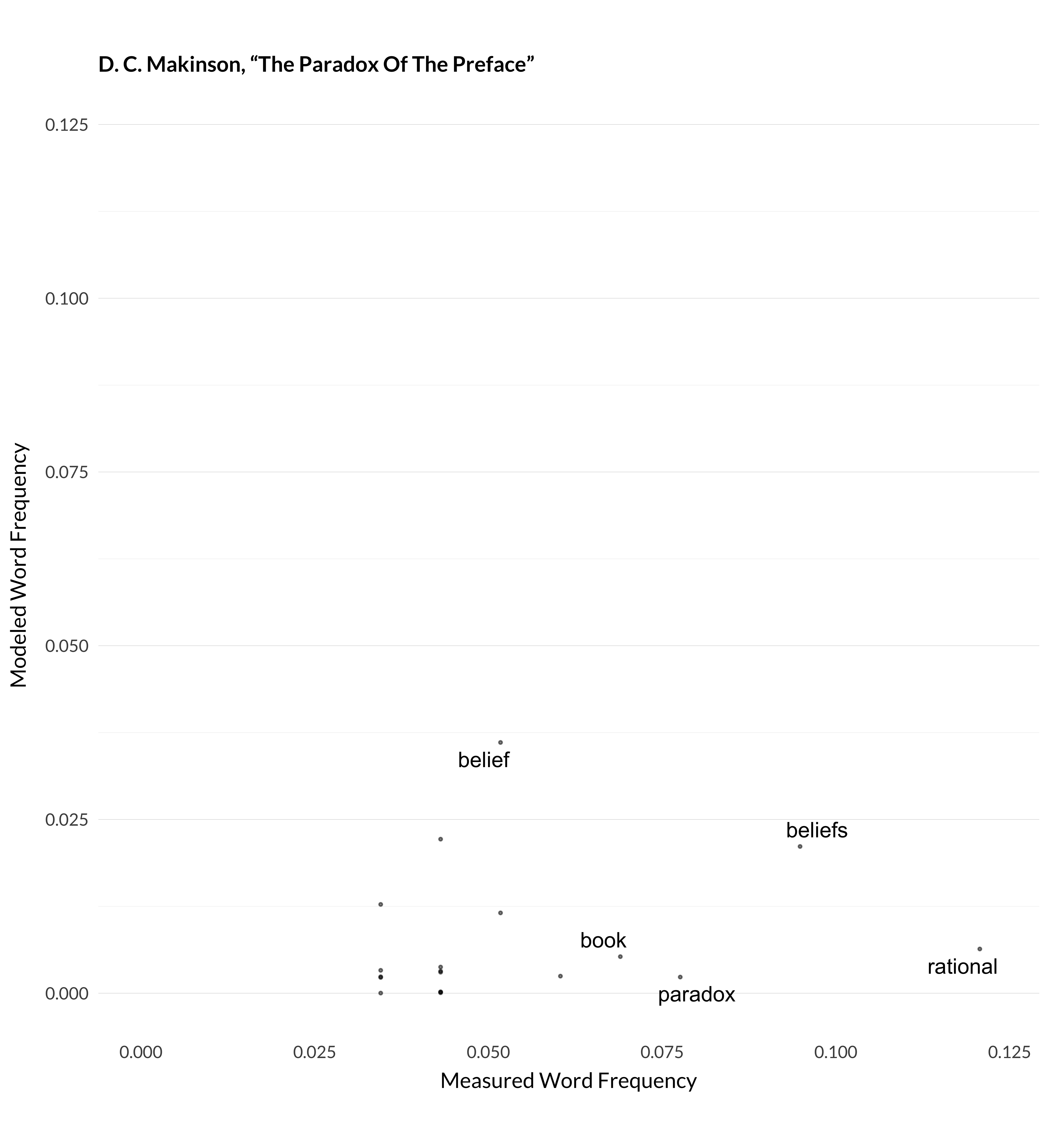
Figure 1.1: Modeled and measured frequency for Makinson (1965).
On that graph, every dot is a word type. The x axis represents the frequency of that word type in the article (after excluding the stop words and so on), and the y axis represents how frequently the model thinks the word ‘should’ appear, given its classification of the article into ninety topics, and the frequency of words in those topics. Ideally, all the dots would be on the forty-five degree line coming northeast out of the origin. Obviously, that doesn’t happen. It can’t really, because, to a very rough approximation, I’ve only given the model ninety degrees of freedom, and I’ve asked it to approximate over 32,000 data points.
Actually, this is one of the least impressive jobs the model does. I measured the correlations between measured and modeled word frequency, i.e., what this graph represents, for six hundred highly cited articles. Among those six hundred, this was the twenty-third lowest correlation between measured and modeled frequency. But in many cases, that correlation was very strong. For example, here are the graphs for three more articles where the model manages to understand what’s happening.
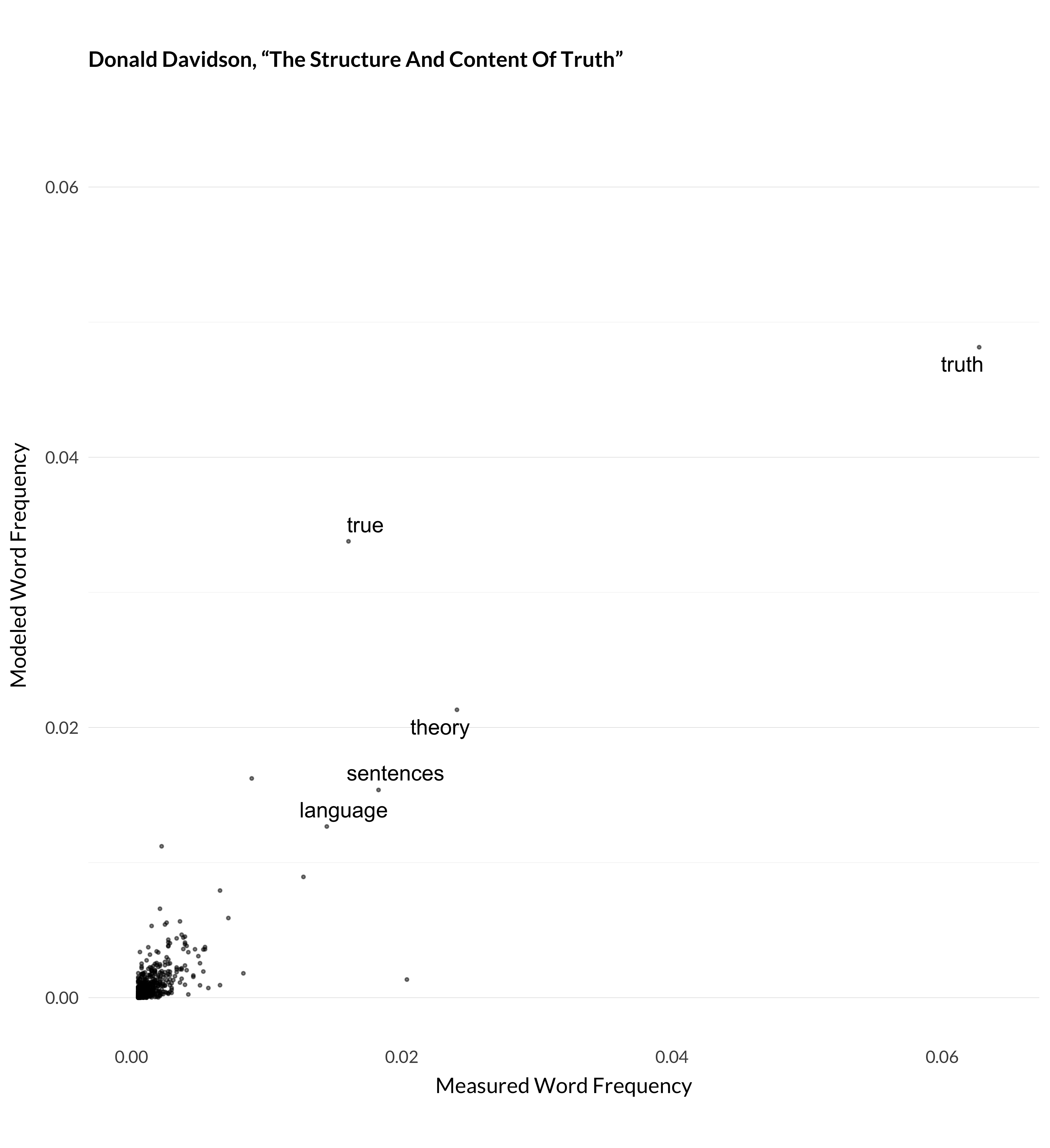
Figure 1.2: Modeled and measured frequency for Davidson (1990).
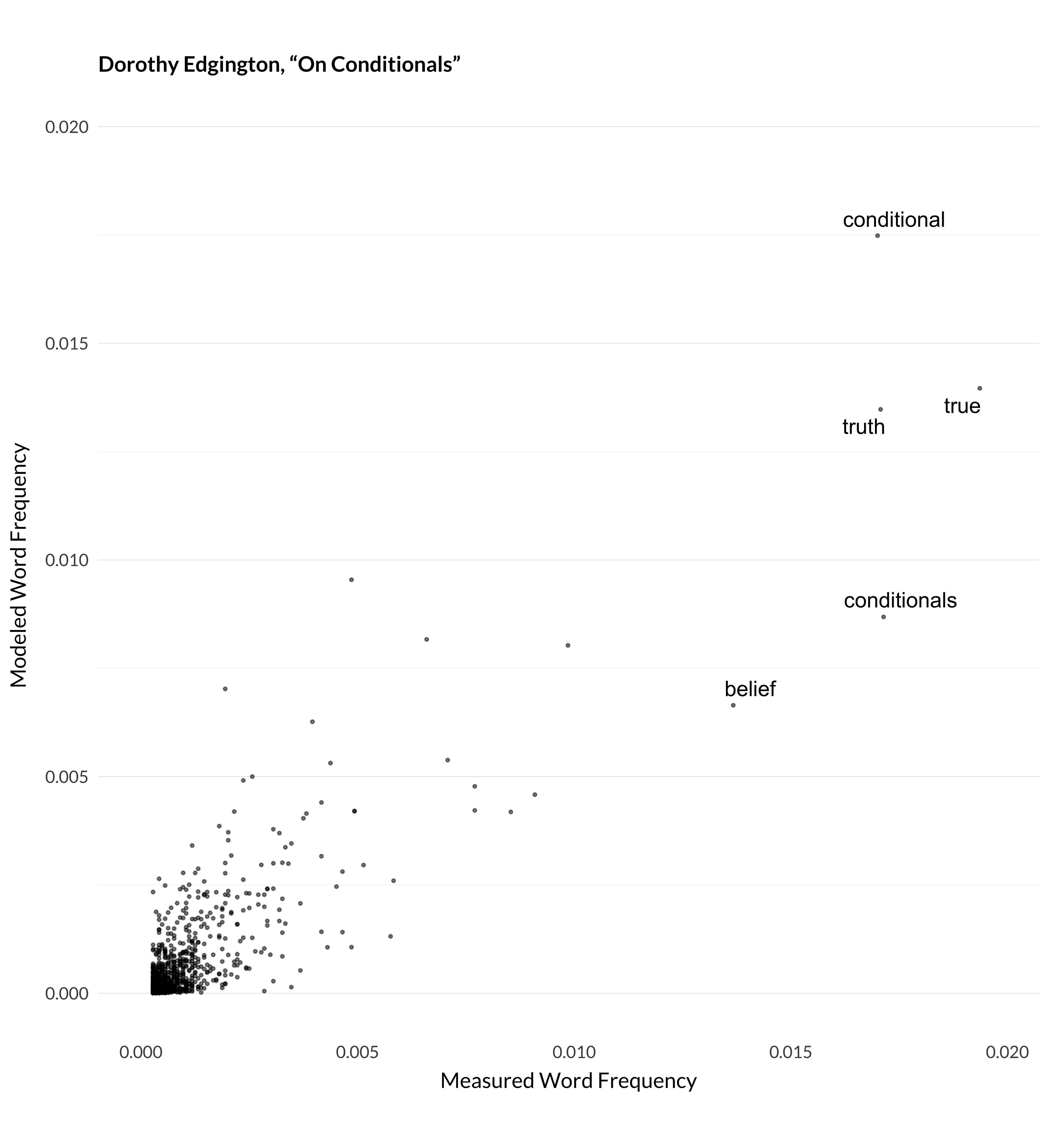
Figure 1.3: Modeled and measured frequency for Edgington (1995).
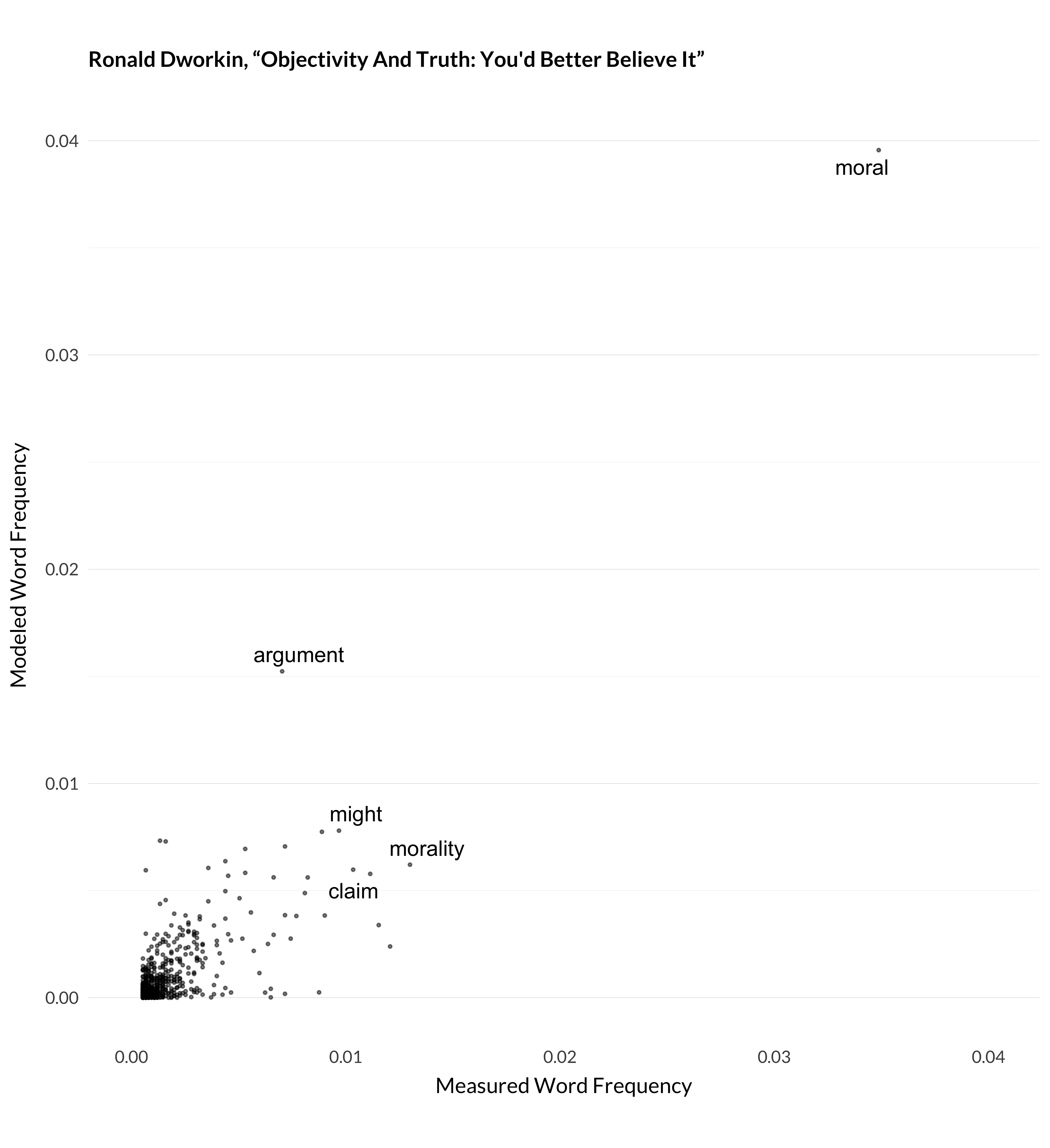
Figure 1.4: Modeled and measured frequency for Dworkin (1996).
There are some articles that it doesn’t manage as well—typically articles with unusual words. (It also does poorly with short articles, like “The Paradox of the Preface”.)
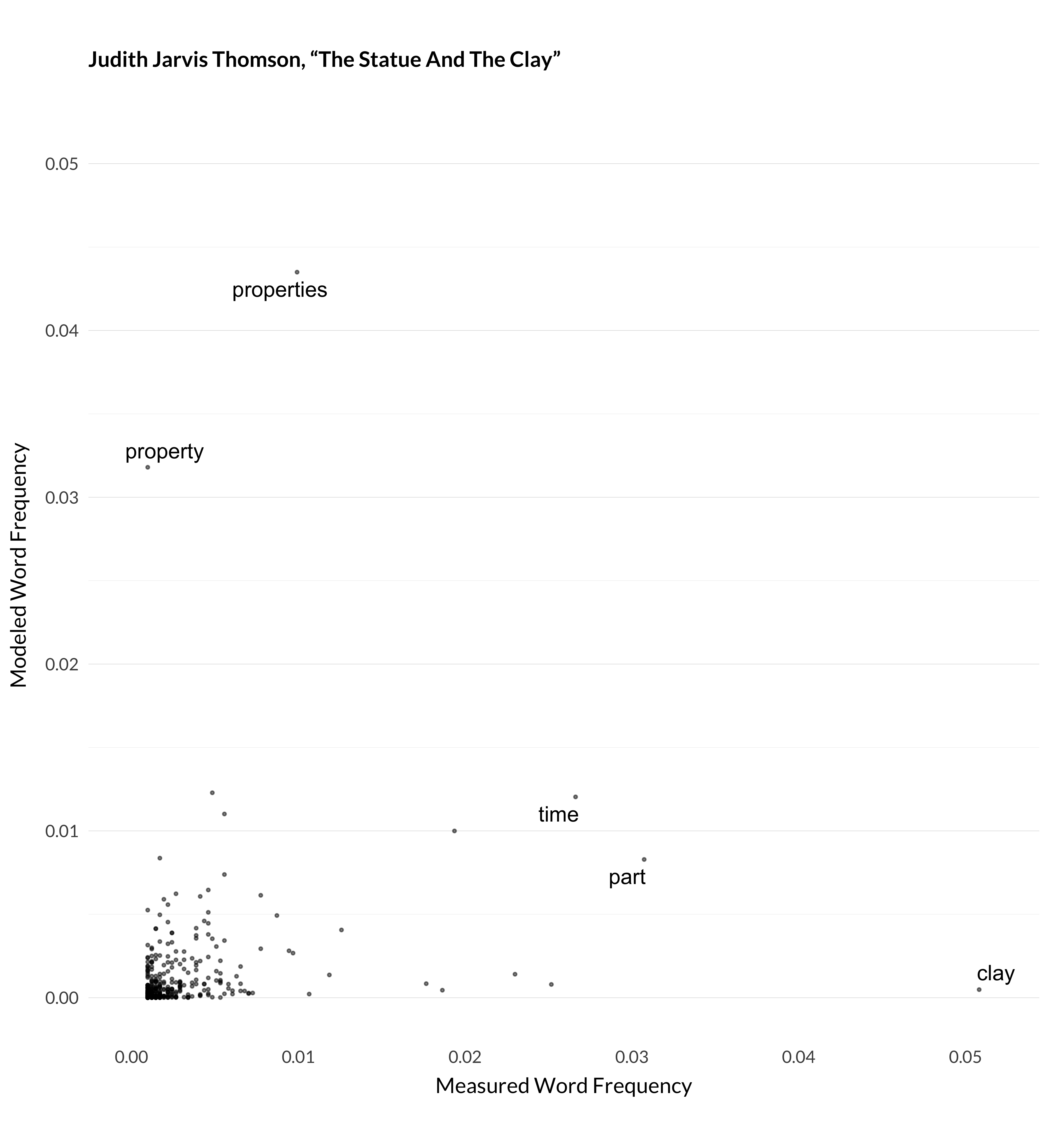
Figure 1.5: Modeled and measured frequency for Thomson (1998).
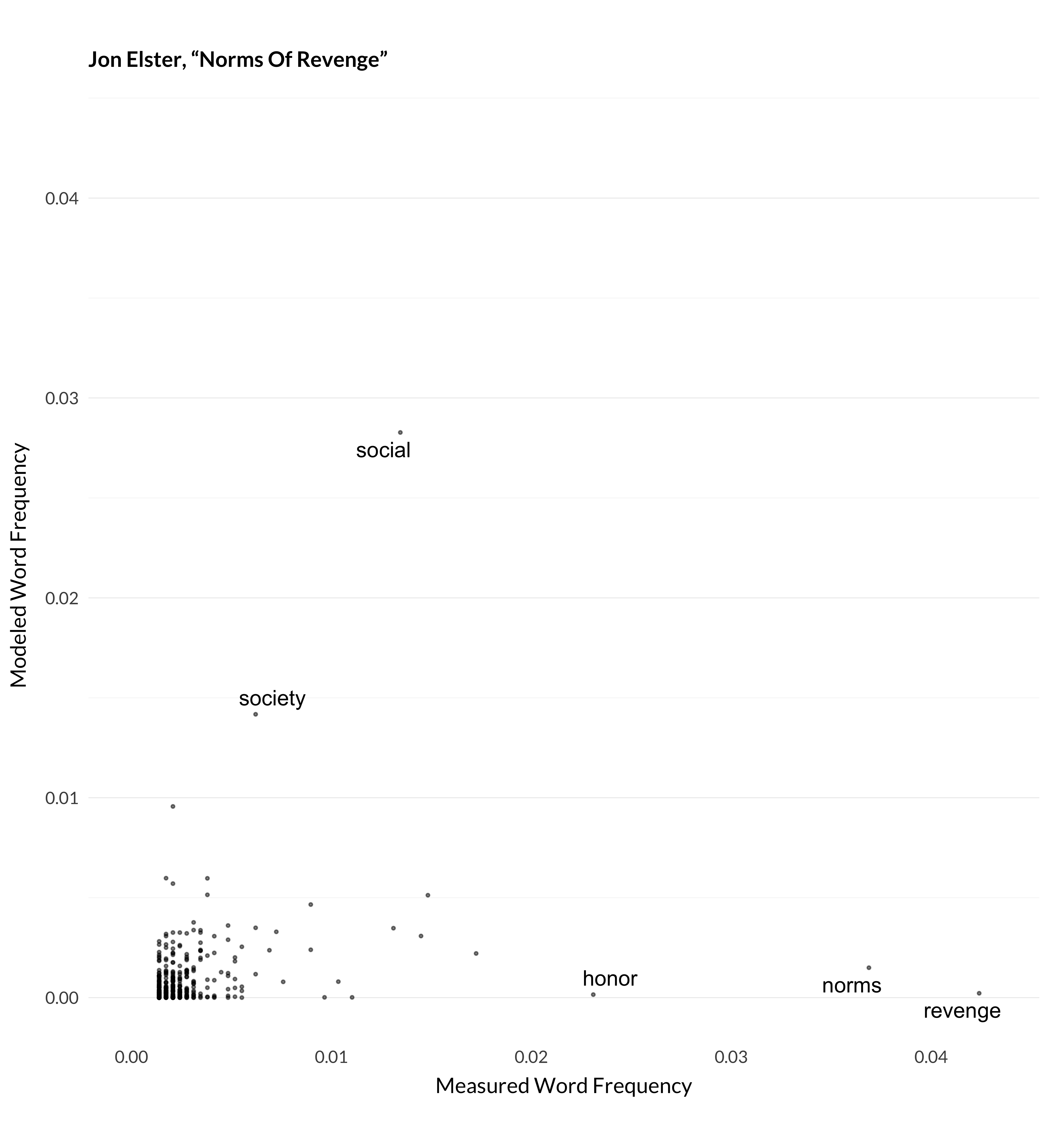
Figure 1.6: Modeled and measured frequency for Elster (1990).
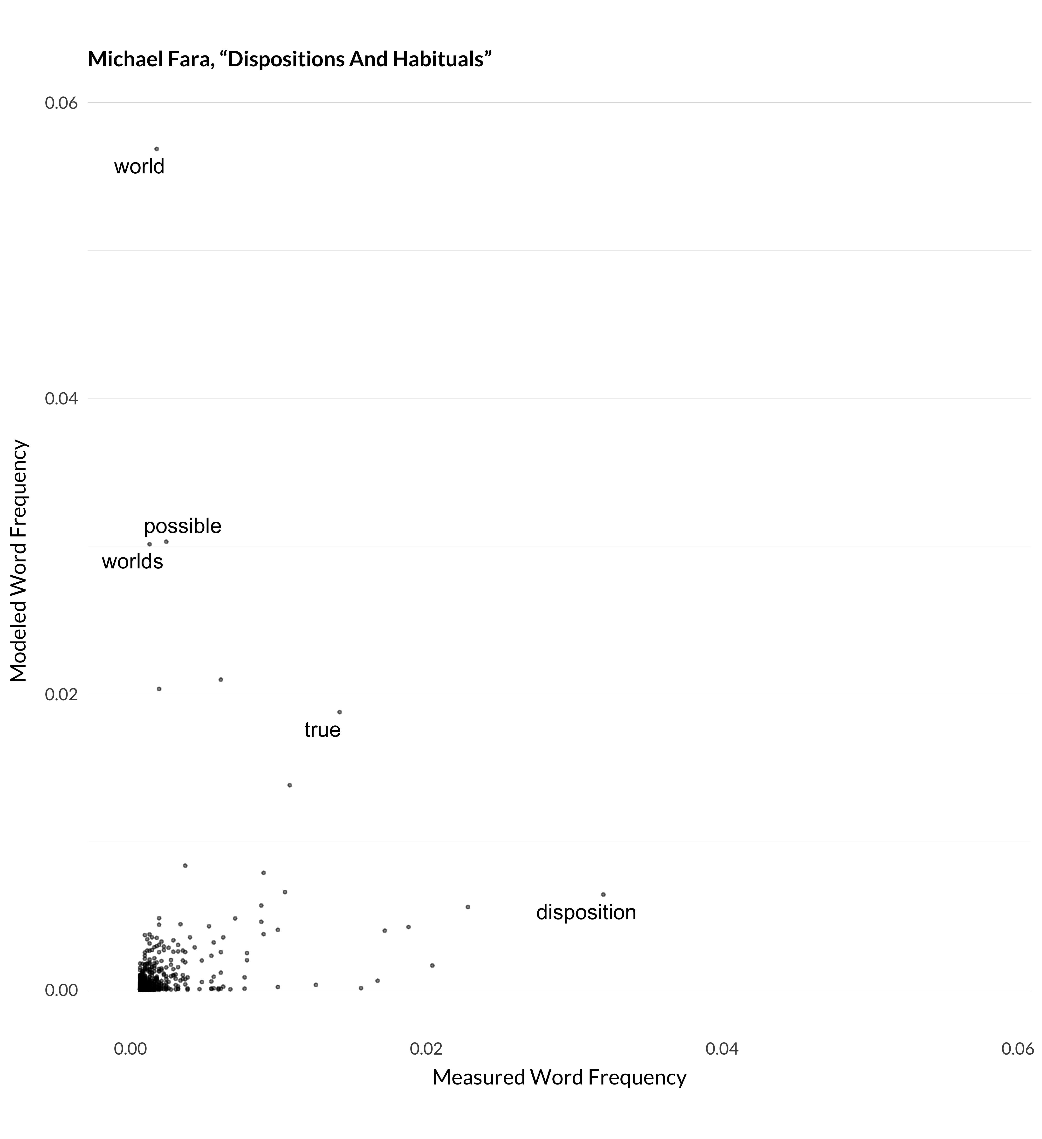
Figure 1.7: Modeled and measured frequency for Fara (2005).
A few different things are going on here. In Elster’s article, the model doesn’t expect any philosophy article to use the word revenge as much as the author does. In Fara’s article, the model lumps articles about modality (especially possible worlds) in with articles on dispositions. (This ends up being topic 80.) And so it expected that Fara will talk about worlds, given he is also talking about dispositions, but he doesn’t. Thomson’s article has both of these features. The model is surprised that anyone is talking about clay so much. And it expects that a metaphysics article like Thomson’s will talk about properties more than Thomson does.
It isn’t perfect, but as seen above, it does pretty well with some cases. The papers I’ve shown so far are pretty much outliers though; here are some more typical examples:
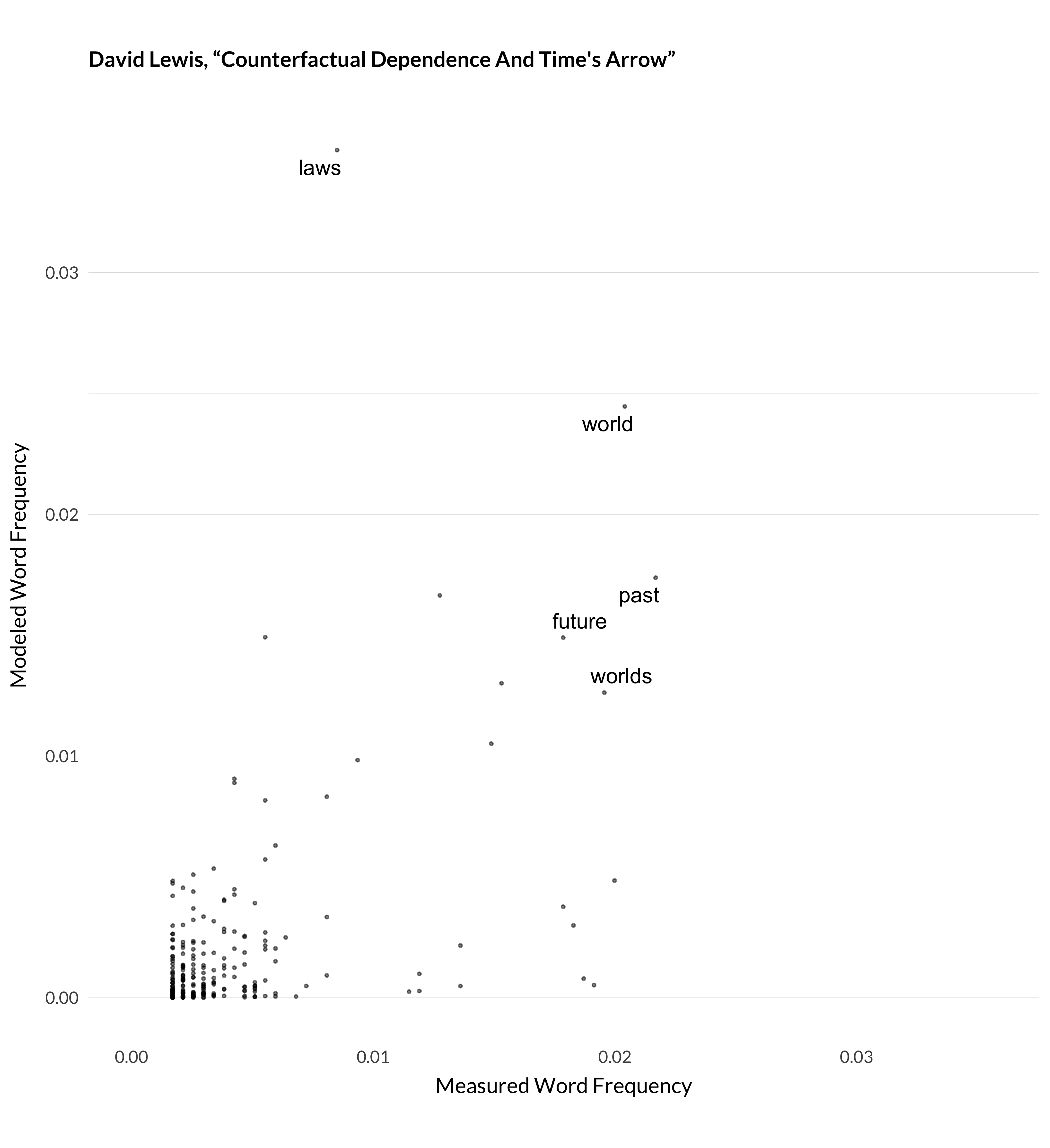
Figure 1.8: Modeled and measured frequency for Lewis (1979).
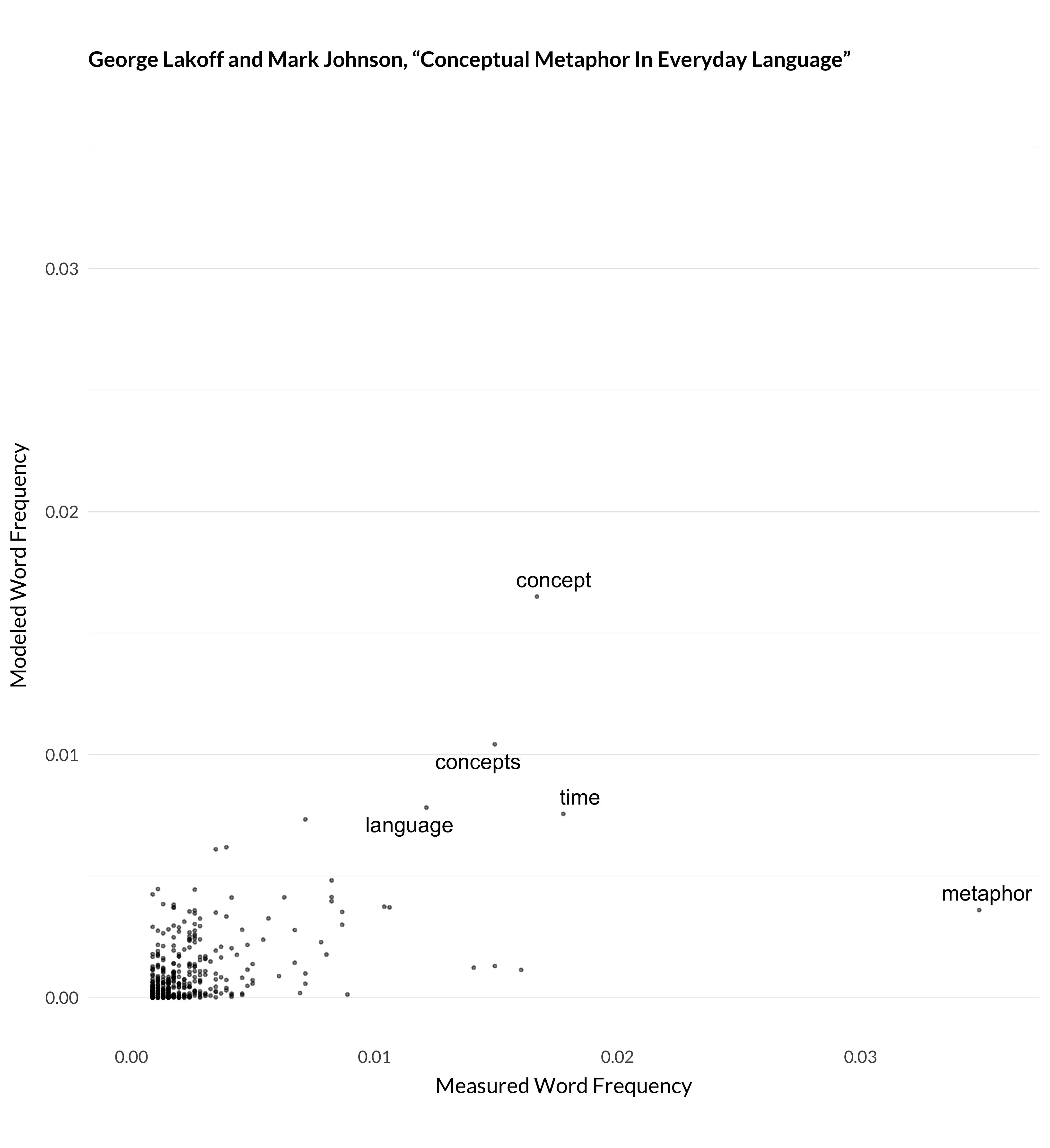
Figure 1.9: Modeled and measured frequency for Lakoff and Johnson (1980).
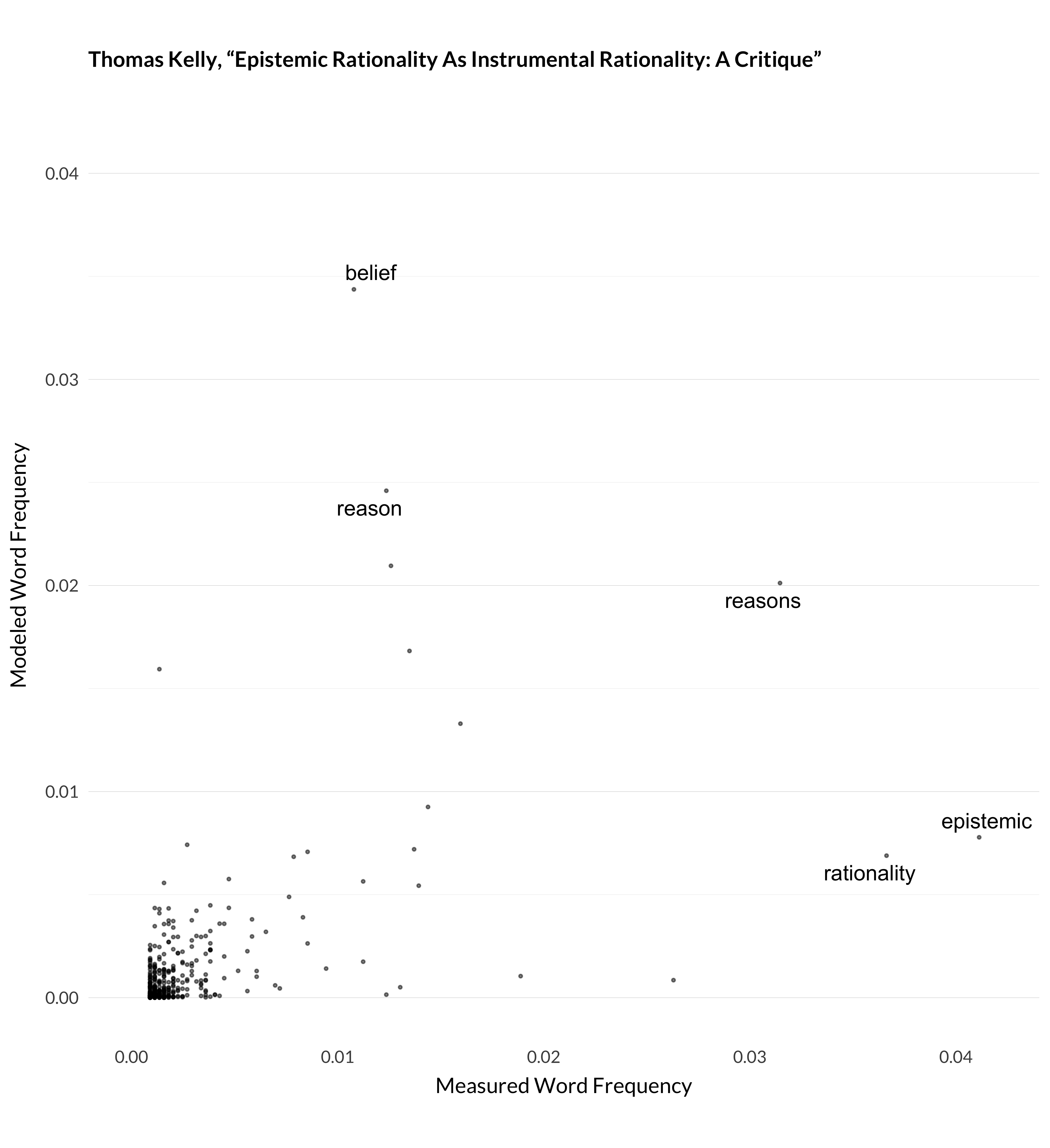
Figure 1.10: Modeled and measured frequency for Kelly (2003).
It’s not perfect, but the general picture is that the model does a pretty good job of modeling 32000 articles given the tools it has. And, more importantly from the perspective of this book, the way it models them ends up grouping like articles together. And that’s what I’ll use for describing trends in the journals over their first 138 years.