8.8 The Bump
A strange thing about these models is that there is a “bump” around the early 1980s. I’ll explain what I mean by a bump in a minute, but I want to stress that this is not an artifact of the particular LDA model I’m using. It might be an artifact of the LDA process, but it turns up in practically every model I built, no matter how the different parameters get set. Just about the only constants across all model runs were that there was a huge topic on idealism, and there was a bump.
To get to the bump, start with a slightly different graph. One useful measure of the informativeness of a probability distribution is how different it is from the flat distribution. So if you’ve got a probability distribution over N atoms, the more distribution is more informative the further away it is from the distribution that assigns probability 1/N to each of the N atoms. There are a bunch of ways to measure distance here, but for simplicity I’ll use a simple Pythagorean measure. This takes the sum (over the N atoms) of the square of the difference between the probability assigned to that atom, and 1/N. (If I was being more careful I’d divide by N to get an average distance, but since we’re not going to be varying the number of atoms, this won’t be necessary.)
Now one thing we can do with the model I’ve built is for each year, work out for each topic the average probability that an article in that year will be in that topic. Since this is the average of a bunch of probability functions, it is a probability function. And we can then ask how informative this function is by measuring its distance from this flat probability distribution. Or, more or less equivalently, we can ask how “normal” it is by taking the inverse of this informativeness measure. And if we plot that over time, we get the following graph.
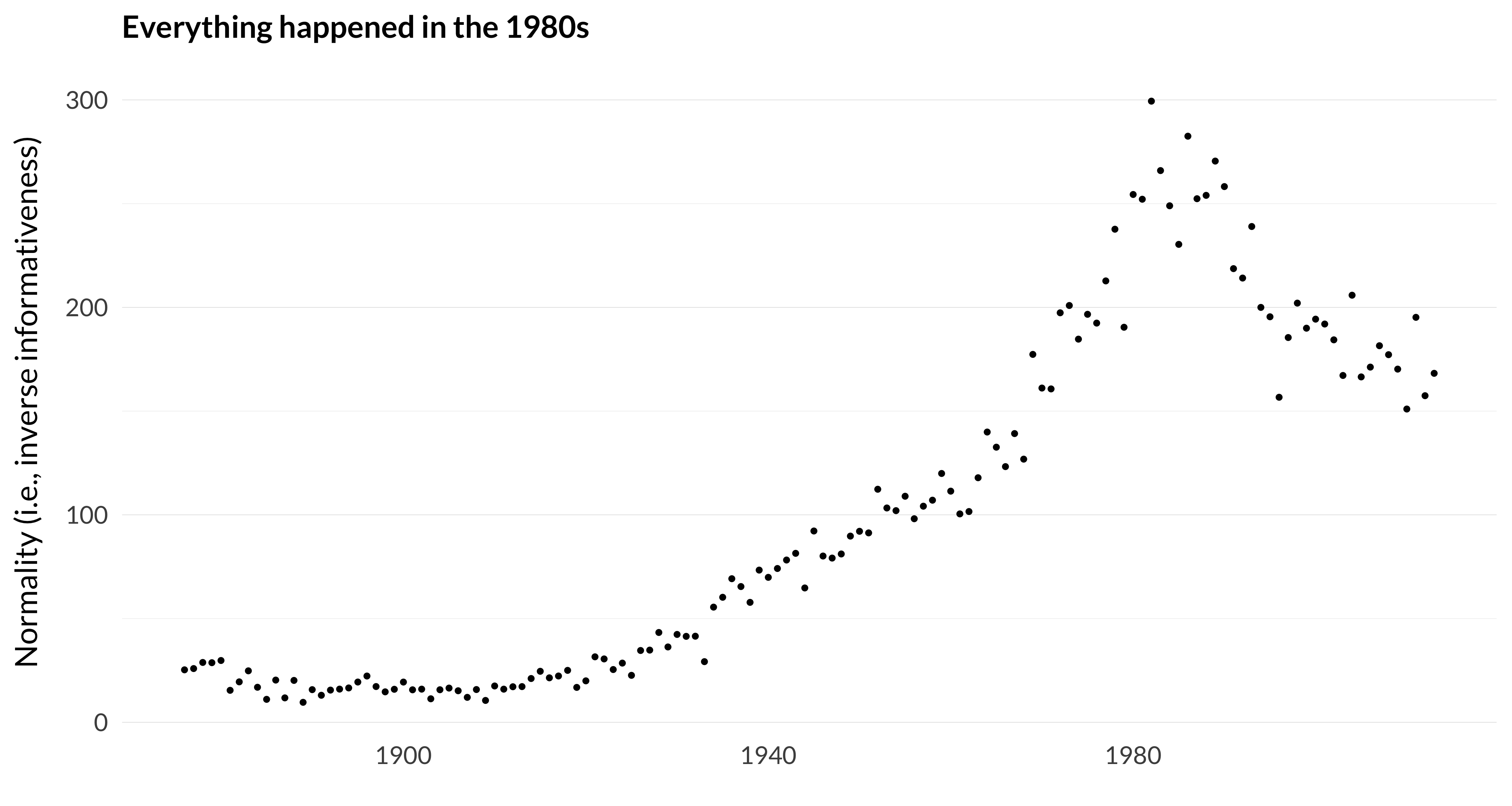
Figure 8.8: How similar the average probability distribution is to the flat distribution.
I don’t know quite what I expected this to look like, but it wasn’t that. The distribution gets flatter and flatter, at an accelerating rate, until about 1982, when it turns around and gets more informative in a hurry.
There are other ways of looking at the model that tell us similar things. Rather than looking at each topic one at a time, we can ask the following question for each year: what’s the lowest number of (expected) articles in any topic that year? That can be thrown off by random topics, so we’ll also look at the third lowest and fifth lowest average topic probability in each year.

Figure 8.9: Lowest, third lowest, and fifth lowest average topic probability by year.
We see something very similar to the previous graph. Around the early 1980s, every topic is getting at least some attention from the model. But that changes the further we get away from 1980.
The results around 1980 are really striking I think. For several years, no topic is below 0.2 percent, and only 4fourtopics are below 0.5 percent. Since by definition the average topic is at 1.1 percent, this means that there are very few topics that are very far from the mean.
I don’t have a good theory as to why this should be true. And there are two quite different explanations that seem plausible to me.
- The twelve journals in the early 1980s really were more pluralist than they have been before or since. There was, at last, space for philosophy of biology, and formal epistemology. But there was still (largely thanks to Philosophy and Phenomenological Research and Philosophical Quarterly) space for articles continuous with idealism, pragmatism and phenomenology.
- It’s just an artifact of the model-building process. If there is ever any kind of drift in topics, and there is always going to be some kind of drift in topics, there will be a point near the middle of the data set where all the topics are represented.
I don’t know how to tell between these topics without running a lot more studies. For example, I could redo everything I’ve done, but stop in 1985, and see what these graphs look like. It might be that they look the same (with the last twenty-eight years missing), or it might be that the peaks move back fifteen or twenty years. It would take a huge amount of processing time to tell these apart, and I don’t think it’s a particularly worthwhile exercise.
And one reason for that (one I’ll return to in the next chapter when faced with a similar puzzle) is that the best way to solve this involves doing something that would be good to do independently: extend the model forwards in time. Hopefully in the future we’ll see models like this that don’t stop at 2013. The “artifact” explanation predicts that in those models, the bump will drift forwards a bit. The explanation in terms of actual pluralism predicts that it won’t. When those models are built, we’ll know more about what’s driving the phenomena I’ve just graphed.