4.1 Graphs
First, let’s look at how many articles are in each category in each year. I’ll say an article is “in” a category if the probability the model gives to the article being from that category is greater than the probability it gives to the article being from any other category. And the probability an article is from a category is just the sum of the probability that it is from one of the topics (or subtopics) that make up the category. (What’s a subtopic? I’ll get to that in the next chapter.)
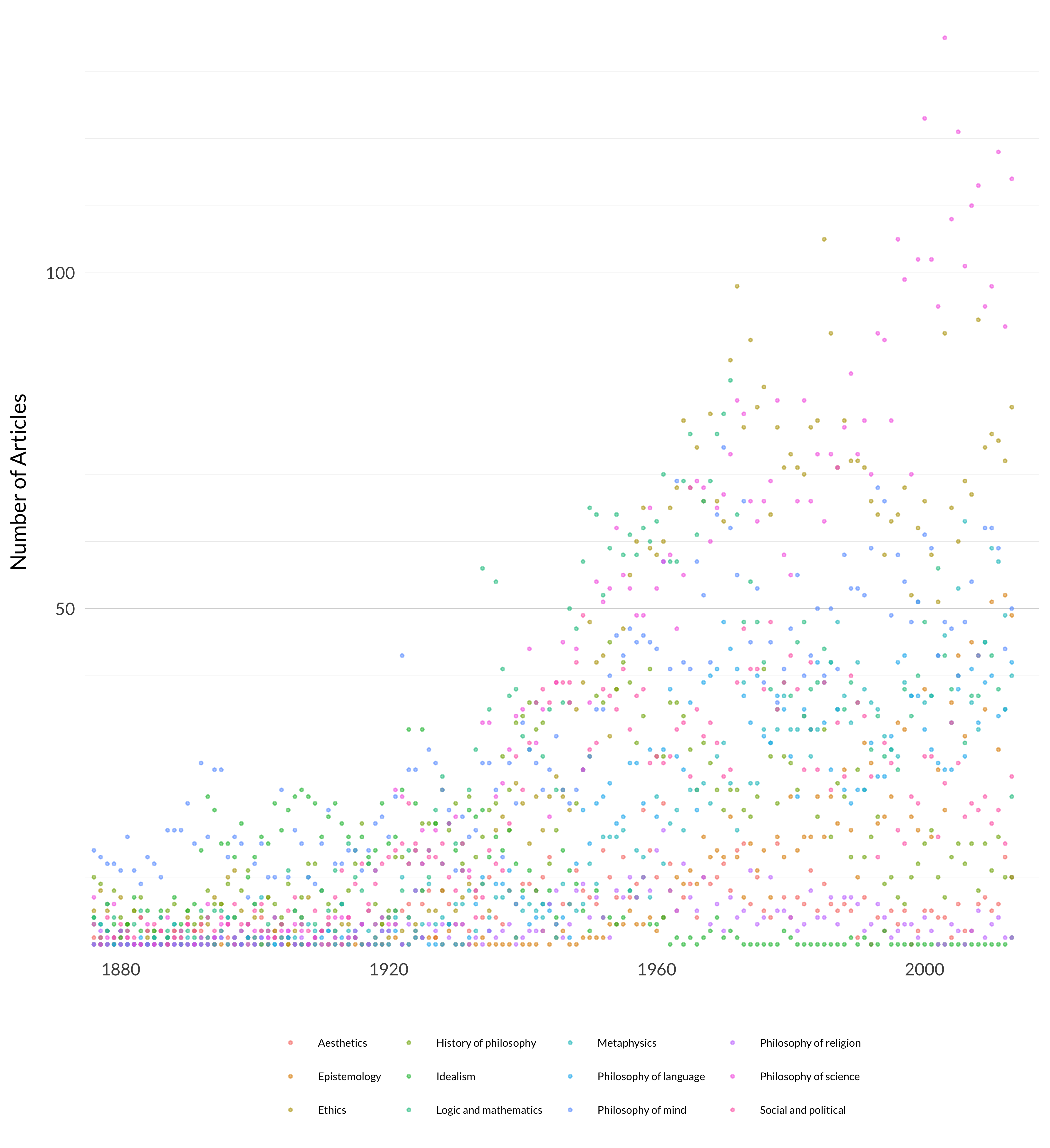
Figure 4.1: Number of articles in each of the twelve categories over time.
That’s a lot of dots, and I’m not sure it’s easy to see a trendline in there. Let’s add some automatic trendlines to see if it’s any clearer.
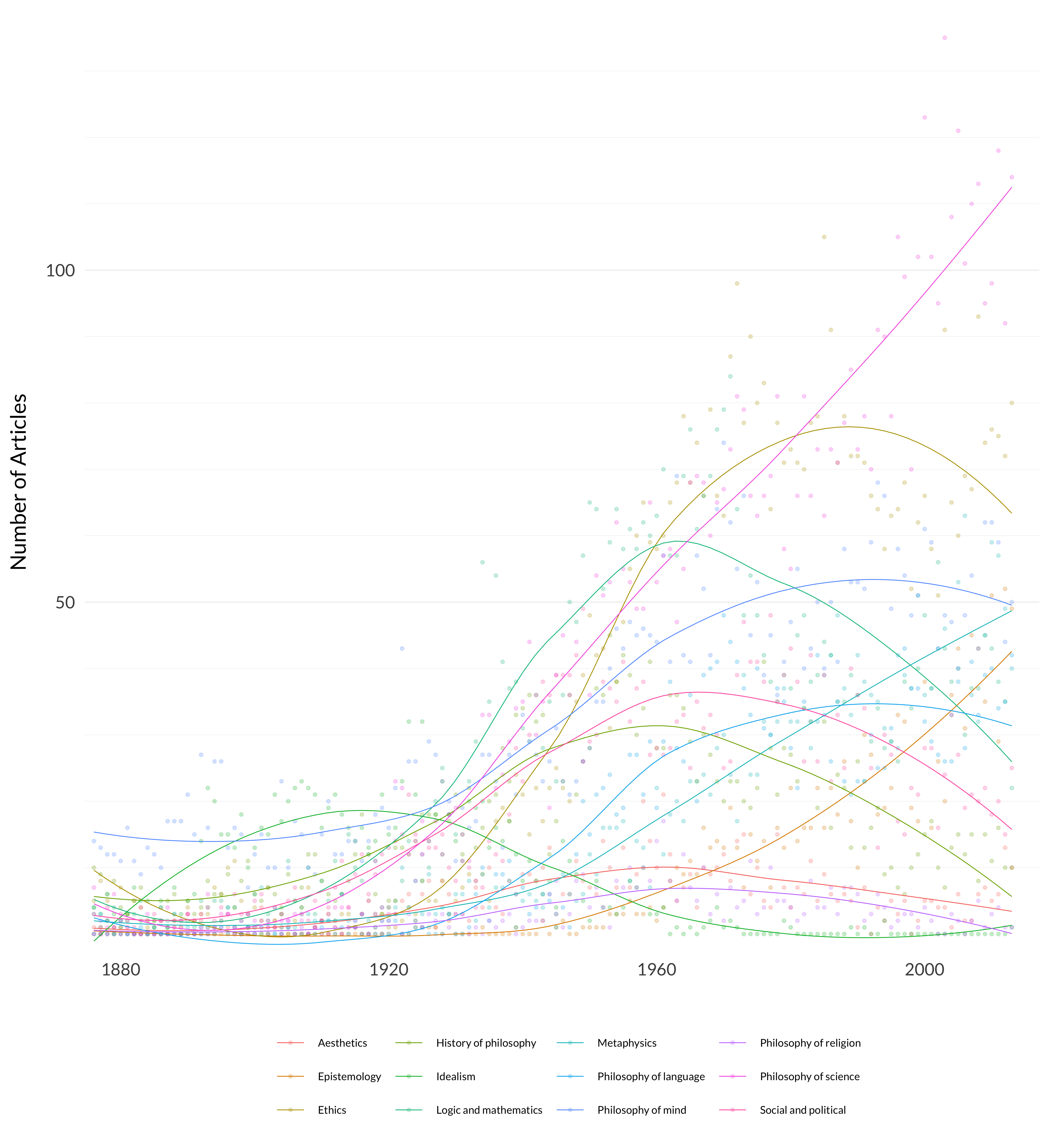
Figure 4.2: Number of articles in each of the twelve categories over time (with trendlines).
That’s a bit clearer, but only a bit. Most categories are growing, which isn’t surprising because there are more and more articles each year. Philosophy of science starts rising early and keeps on rising. Ethics shoots up in the postwar years, and gets to a high point around 1980. Mind grows, but loses rank. metaphysics and epistemology both grow, though metaphysics’s growth comes earlier. Logic and mathematics is strongest in mid-century. History gets smaller over time. (This certainly tells us more about the journals than the field.) And idealism grows until at least World War I, then falls dramatically.
In principle it’s better to do this with probabilities rather than just these counts though, to reflect the fact that the model itself is probabilistic. So next I’ll show the expected number of articles in each category in each year. That is, for each category and year, I’ll take the sum across all articles from that year of the probability that the article is in that category. And the probability that an article is in a category is just the sum of the probabilities of it being in the topics and subtopics that make up the category.
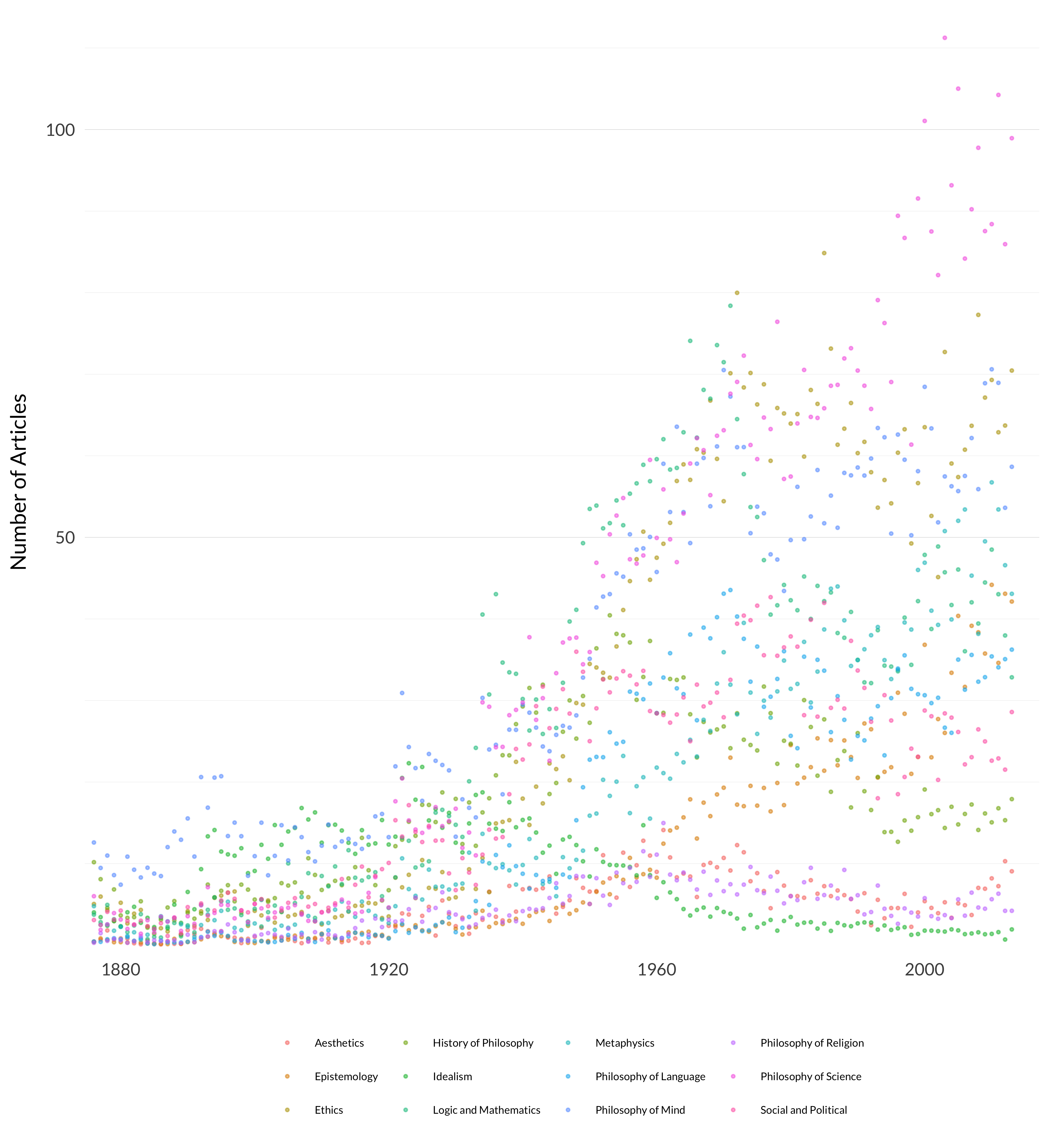
Figure 4.3: Weighted number of articles in each of the twelve categories over time
That’s also a bunch of dots, though interestingly the trends are more visible without trend lines. Let’s see what happens when we add the trend lines back in.
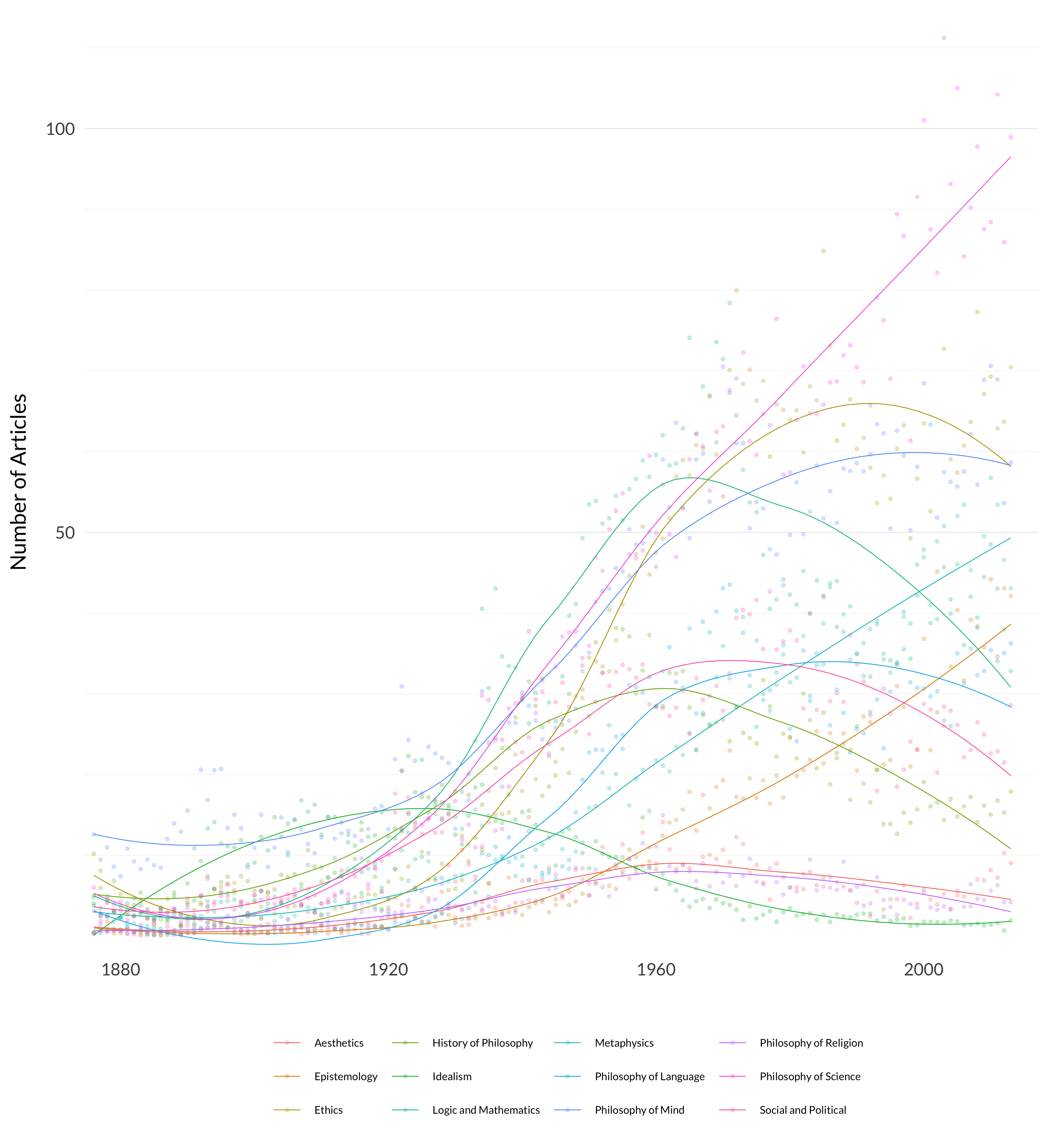
Figure 4.4: Weighted number of articles in each of the twelve categories over time (with trendlines).
That’s pretty similar to the other trendline graph. The big difference is that the lines are more compressed. (This is most visible in the scales.) But the rank at any given time is fairly similar.
The big challenge here is seeing which rises are due to a category getting more prominent, and which are due to the field getting bigger. So let’s take that graph and divide all the values by the number of articles in a given year. What we end up with, for each year-category pair, is the average probability an article from a year falls into that category. The numbers are thrown off a fair bit by the presence of a lot of psychology articles in Mind before 1900, so I’ll start in 1900.
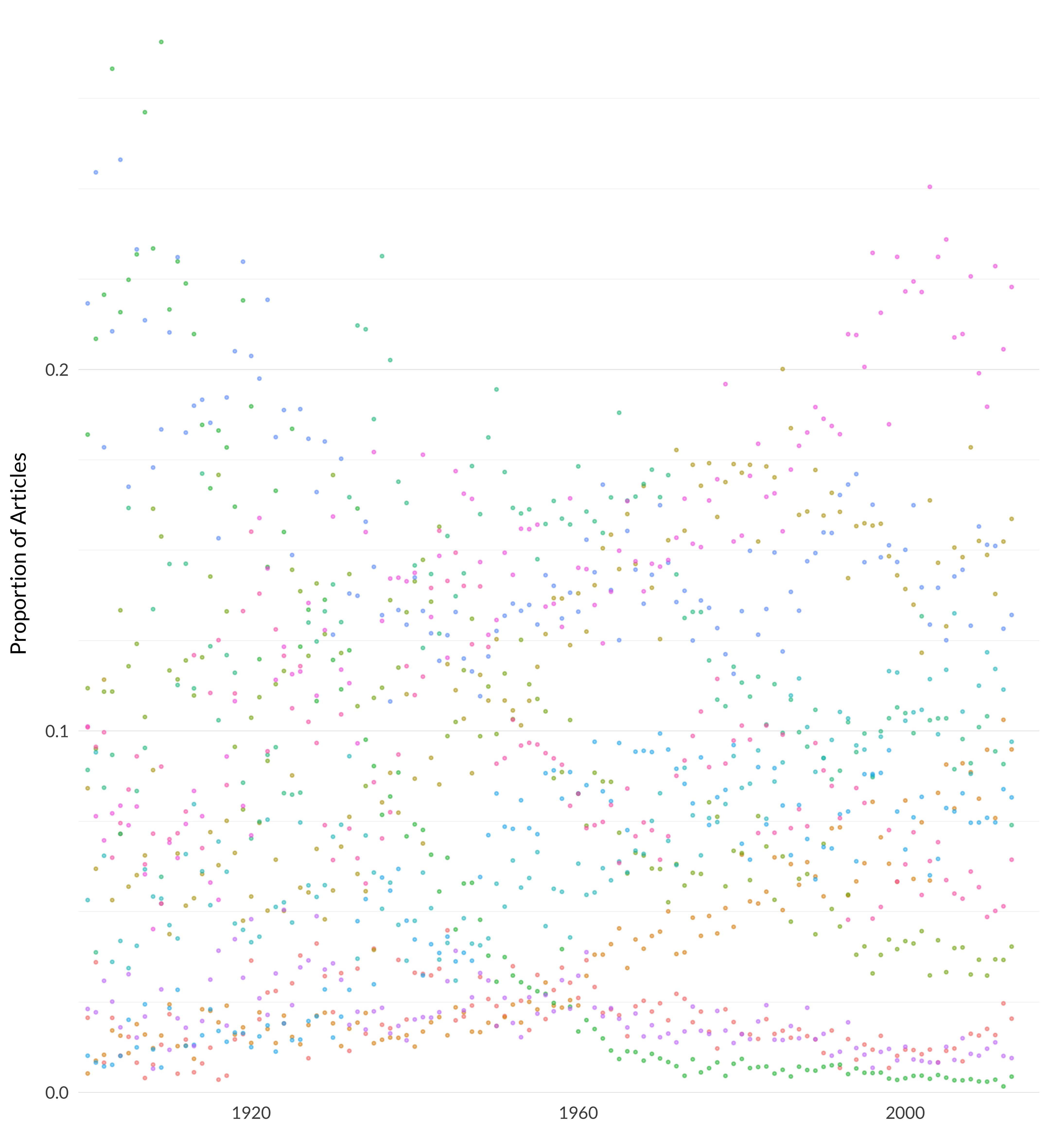
Figure 4.5: Proportion of articles in each category each year.
It’s striking how many trendlines are already visible, but it’s clearer with actual trendlines added.

Figure 4.6: Proportion of articles in each category each year (with trendlines).
And it’s really striking how many of the graphs are relatively simple to describe.
- Aesthetics is always low, though it’s high point is midcentury.
- Epistemology is almost invisible until 1950, then rises linearly afterward.
- Ethics has a low equilibrium before 1930, a high equilibrium after 1970, and rises rapidly between those points.
- History of philosophy falls from 1930 to 2000, though maybe it has stopped falling.
- Idealism falls rapidly until it hits 0 around 1980. (Though note that this is a consequence of my excluding the nineteenth-century data points - it arguably rises in the early twentieth-century.)
- Logic and mathematics reaches a high point around 1955, with a striking rise before then and fall afterwards.
- Metaphysics has a steady base through the early 1960s, and then a steady rise after that. (This is not remotely in keeping with my prior view about metaphysics in the journals, and we’ll come back to how plausible this is.)
- Apart from a small blip around 1930, philosophy of language has a low equilibrium before 1950, and a higher equilibrium afterwards.
- Philosophy of mind falls as the psychology articles gradually fade (and the relative size of Mind fades) but is very constant from 1940 or so onwards.
- Philosophy of religion is very small, but probably gradually falling.
- Philosophy of science rises rapidly through 1940, then hits an equilibrium, then rises rapidly again after 1970.
- Social and political has a peak around 1920, then a dip and another peack 1940, then gradually fades. (Again, this is not remotely like what I expected, though the explanation isn’t that hard.)
In the next chapter I’ll go over how the categories were constructed, which in turn will explain some of these trends. But some of them are just interesting facts about the nature of philosophy in these twelve journals.
It might be easier to see these twelve categories separated out.
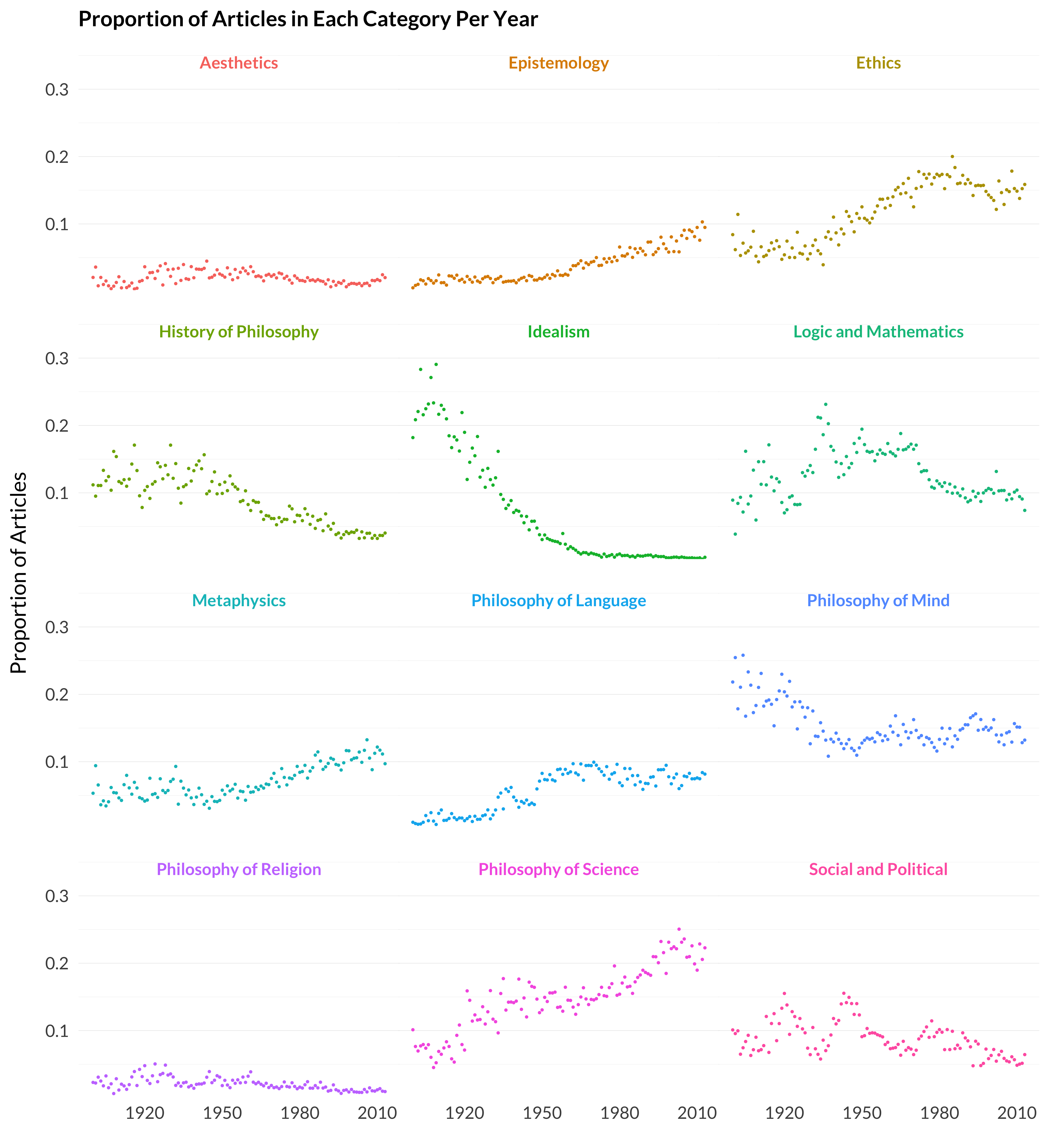
Figure 4.7: Proportion of articles in each category (with facets).
It’s really striking how continuous these graphs are. This is not something that’s programmed in—we’re just seeing one data point after another rather than trendlines. The numbers here are sums across journals, and across topics/subtopics. And within each of those components, there is nothing like this continuity. But the large year-to-year variation mostly washes away at the category level.