|
If scanning is a craft, then color reversal directly from the
color negative is an art. Black and white negatives easily reverse
directly to their correct positive, perhaps with a little adjustment
of contrast. Color negatives, on the other hand, are not simple
color reversals of their positives. The experiment above was
carried out by first video taping the negatives on a light table,
using the light table as the white balance. The exposure was
then adjusted to give an accurate renedering of what the eye
was seeing. This video was then edited in Premiere 6.5 with an
objective of attempting some approximation of the scene as it
appeared. A simple reversal will not be enough with color negative
material since the film base itself will yield a positive with
a strong bluish cast which overshadows all other color contained
in the negative. One begins to understand why color work in video
and film production is difficult and expensive. The Rank Cintel
machine used to telecine color negative film costs many thousands
of dollars and requires expert adjustments to truly capture what
was originally seen either in the eye or the mind of the creator.
This little
project was an experient in using Adobe Premiere 6.5 to enter
into the visual world of the color negative and attempt to extract
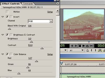
some meager yield of the magic that it in truth contains. The
first step was to use the Invert Effect and then improve the
contrast of the very blue positive with the Contrast-Brightness
Effect, followed by using Color Balance to remove the orange
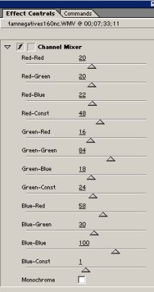
mask. The remainder of the color correction was done with somewhat
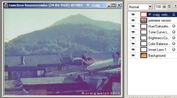
intimidating Channel Mixer Effect. Image 'A' shows the look of
the controls and the final settings for image 'C' (image 'B'
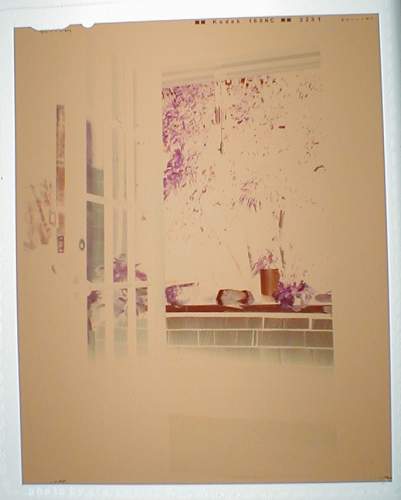
is the original video of the negative as it looked on the light
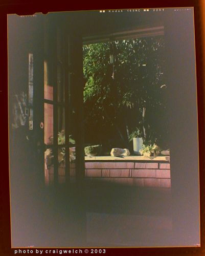
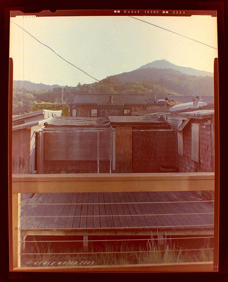
table). Below is close to a perfect rendering of the scene by
combining the premiere version with a slightly bluer version
done in Corel Photopaint 9 (shown to the right are the various
adjustment layers needed to make this reversal). The quality
of the copy of the negative is very important to retain the color
information that is present. A good quality digital camera can
be as accurate as a scanner in making the digital version of
the negative for the reversal. A very
high quality positive was obtained by
photographing the negative on a light table and comparing the
digital copy with the original for accuracy. The bottom line
to this notion is that color is very, very subtle and perhaps
a single pass is not enough. In a video editing program like
Adobe Premiere, the combination of two versions as I have done
with Corel Photopaint could be done as two video tracks and the
upper track would have a reduced opacity to blend the two tracks.
That would be an identical solution. The two tracks would of
course need to be exactly synchronized.
If nothing else, this experiment is worth the effort because
it gives a good excercise in getting control of the Channel Mixer
Effect and a sense of how very subtle color changes and additions
are possible with this seemingly awkward and difficult tool.
As a footnote, in theory digital should be the best means
of working in color. Why? Digital is all numbers, pure math;
and, light in its wavelength behavior is also pure math. Now
it becomes more apparent how 48 bit color processing, with its
16 digits each for the Red, Green, and Blue color channel definitions,
will greatly improve the manipulation of color and tone information
contained in negative and reversal films. The higher contrast
and resulting sharper detail of reversal films as well as the
presence of a positive image reference has made transparencies
the standard for making screened halftone plates for printing
four color process with ink on paper. On the other hand, the
integration of still image resources with negative stock motion
picture film might favor print films such as the Kodak Portra
family rather than transparency film. Given the size of 4x5
sheet film resolution is not an issue. However, the image
characteristics of negative film might be a better match with
negative motion picture film.
July 30,
2003
Using my
Olympus digital camera to photograph the negative
on a light box gives a good white balance, clear detail, and
accurate color of the original negative. I used Corel Photopaint
9
and first reversing, then using Levels to tighten the contrast
in
in each color channel before adjusting contrast in the RGB composite
channel. Then using Color Balance to offset the color cast of
the film base
a good positive was obtained that compares to a scan of the contact sheet. |
