Part I: Benchmarking the Map
Adjunct Professor of Mathematical
Geography and Population-Environment
Dynamics
School of Natural Resources and Environment, The University of
Michigan, Ann Arbor
Please set screen to highest
resolution and use a high speed internet connection.
Please download the most recent free version of Google Earth®. Make sure the "Terrain"
box in Google Earth® is checked.
|
Links
to files to download for use in Google Earth®
|
Bringing an Historical Map Across the Digital Divide
One complex system from the early 20th century in the history of geography is the development, by Walter Christaller, of a theory of settlement locations: central place theory. The communication of his ideas is in the printed format of the times. There are black and white maps of complex systems of pattern; they tell one story. What might they look like, however, when recast using contemporary capability? How might this capability expand the research frontier? The sequence of images and text below will examine a single map of Christaller, from a 1941 document, and bring it into the virtual reality of Google Earth®. When the reader downloads the files above, the power of the Internet is harnessed to permit him/her to replicate the results of the article while reading it and to experiment with related ideas at the same time. Such capability is an important aspect of scientific communication.
Settlements in Eastern Europe: Walter Christaller
Figure 1 shows Christaller's 1941 map of a proposed settlement pattern in Eastern Europe (in the western and central parts of what is today, Poland). Cities, towns, or villages are marked with circles of varying size where the size of the circle represents the number of inhabitants proposed to make up the population. The largest circles represent cities of 450,000 inhabitants, the next largest 100,000, the third largest 30,000 and so on according to the legend. The regional boundaries of varying line weight are drawn also to include a fixed number of inhabitants: the largest region is to include 2.7 million inhabitants, the next largest 210,000 inhabitants, and so on according to the legend. The map from 1941 is a remarkable cartographic effort: layer upon layer is meticulously drawn and labelled by hand. One might speculate in various ways about adjacency patterns, spacing patterns, or others on the existing map. Understanding such patterns from maps is often aided by having the full picture on the map: terrain, physical features, three dimensional effects, and so forth. The map that Christaller drew is already complicated; introducing physical or other features would clutter this two dimensional map and destroy its legibility.
Figure 1. Christaller's map of proposed settlement patterns in Eastern Europe, 1941. Both city/town and regional values are determined by prescribed number of inhabitants to occupy the city or region. [See reference at end]. |
Figure 2 shows the map
from Figure 1 brought directly into Google
Earth® where one sees
immediately the possibility of visualizing the map in relation to the
terrain. When the opaque
map is placed on the surface, it is
difficult to align the map with the globe. Activating the
"populated places" checkbox in Google Earth® brings up a set of
points
to use as established positions to see if the alignment of the paper
map
with the software is reasonable. For additional context in the
virtual environment of Google Earth® current subnational
boundary files are introduced [see reference to Valery35 and Barmigan
for link]. The paper map is made semi-transparent to see
simultaneously both the original map and
the globe under it. The paper map is manipulated in various
ways, suggested in the animation sequence, to improve the
alignment. Despite considerable maneuvering, the paper map does
not line up very well with the Google Earth® image. Bydgoszcz on the globe
should line up with Bromberg on the map; Torun on the globe
should line up with Thorn on the map; Lodz on the globe should line up
with Litzmannstadt on the map; Poznan on the globe should line up with
Posen on the map; Wroclaw on the globe should line up with Breslau on
the map; and so forth. The needed alignment is not present
and cannot be made to work simply by importing the map and adjusting
its position in relation to known positions. The reader wishing
to try may do so using basemaps contained in the second downloaded file
from the top of this article.
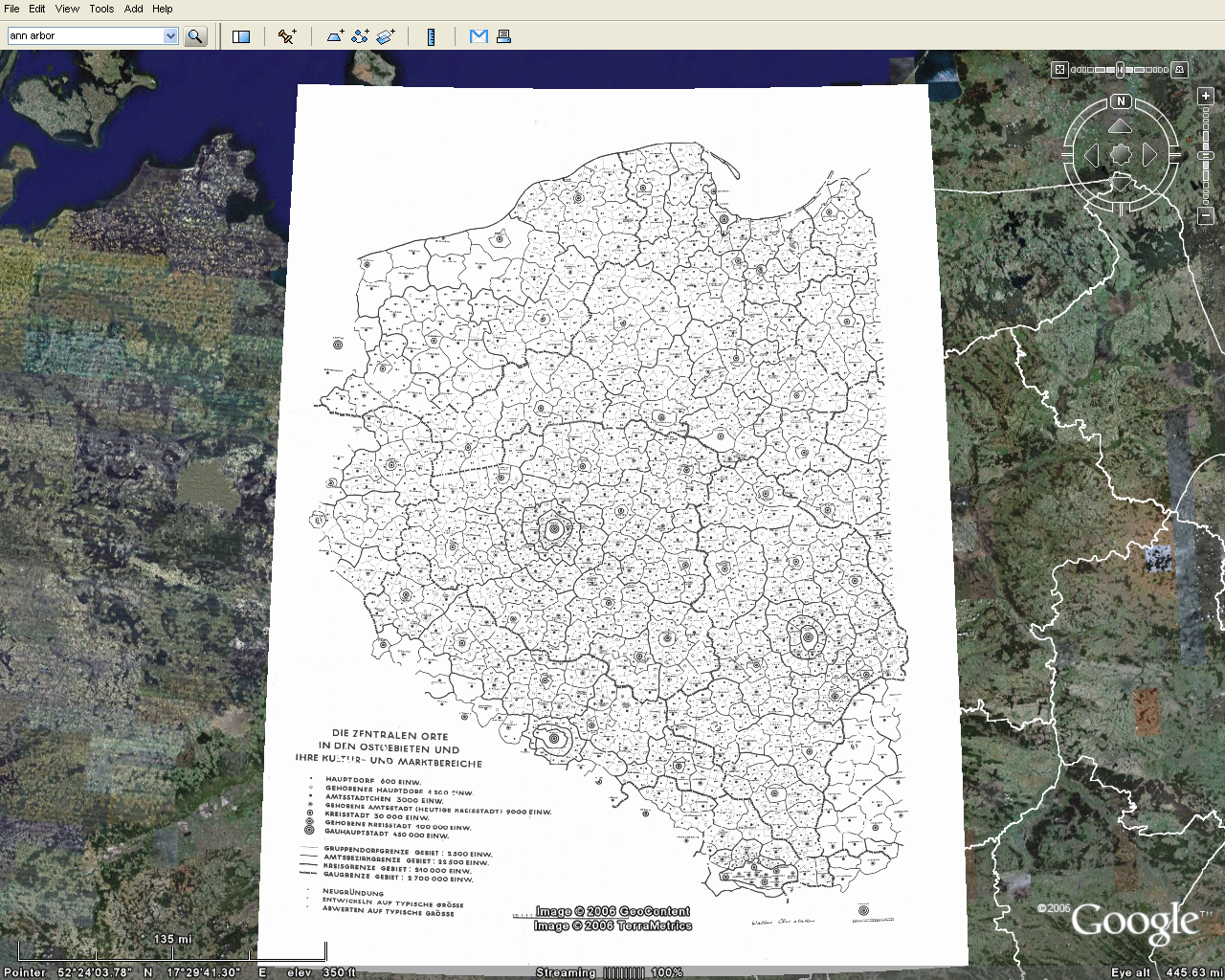 Figure 2 |
Aligning the Paper Map on
the Virtual Earth
The set of cities already present in Google Earth® was used in Figure 2 as a set of known positions against which to test imported map position. There are two sets of locations:
Benchmarks
The set of cities already present in Google Earth® was used in Figure 2 as a set of known positions against which to test imported map position. There are two sets of locations:
- one in the virtual world--cities and towns in Google Earth®
- one in a map from the physical world--cities and towns depicted on Christaller's map.
- The largest Christaller point locations are represented by the blue rods
- The next largest Christaller point locations are represented by the red rods.
- The
third largest Christaller point locations are represented by the gold
rods.
The
rods emphasize benchmark position. They are translucent so one
can see the terrain through them. Structures such as this are
easy to create in either Google SketchUp®
(free software) that can then be imported to Google Earth®
(free software) [see Appendix to
Part I of article by Arlinghaus and Batty in this journal]. Or,
they can be created directly in Google Earth Pro®
(not free)
 Figure 3. Benchmarks. The blue rods represent locations for cities in the top Christaller category; the red one in the second; and, the gold ones in the third. |
Use
of the benchmarks for map alignment
The maps in Figure 3 show the position of a subset of Christaller points as benchmarks for extracting the rest of the information from the map. The remaining images in this section suggest ways to use these benchmarks to improve the fit of the map with the surface of the virtual Earth. Figure 4 illustrates the location of the flat map with respect to the benchmarks: clearly, the benchmarks in the virtual world cannot be made to line up with the existing map. One way to improve the fit may be to disassemble the Christaller map into smaller regions, fit thesmaller regions to the benchmarks, and then reassemble the information.
Smaller regions assigned to benchmarks produce a better fit of benchmarks to the map. Such an assignment strategy also spreads the error across the map, away from the benchmarks. Thus, while there are no particular standards for accuracy associated with this sort of mapping in the virtual world, the same ideas apply as when mapping the physical world. Figure out where the error is and tell the reader about it. If possible, develop a quantitative measure to ensure replicable communication (often, when using control points to digitize a map in Geographic Information Systems software, one finds a Root Mean Square error of 0.004 as a default setting).
 Figure 4 |
Map
Disassembly: Use of the Christaller 2.7 million regions
The Christaller hierarchy associated with place size was used to create a set of mapping benchmarks. It is natural, then, to use the regions in the Christaller hierarchy as the regions in which to disassemble the map. The largest regions in the Christaller map are those designed for 2.7 million inhabitants. Will these regions be small enough? Figure 5 shows the results of using the three largest 2.7 million regions: only the full regions within the map (with Danzig, Litzmannstadt, and Posen as largest cities). The fit of benchmarks in the virtual world to this set of smaller maps is better than it is using the entire map. Nonetheless, there is still much room for improvement. The blue rods necessarily fit, as the foci of the 2.7 million regions, but many of the red rods and gold rods clearly miss the mark. The reader wishing to experiment with alignment may do so, as well. These files are contained in the files at the top of this article.
 Figure 5. Alignment of Christaller map with underlying Earth image. The blue rods necessarily fit, as the foci of the 2.7 million regions, but many of the red and gold rods clearly miss the mark. |
Map
Disassembly: Use of the Christaller 210,000 regions
Assigning transparency in Google Earth® is helpful in seeing, simultaneously, both the map and what is under the map. Another approach that is also useful, especially when looking at detail, is first to remove the polygon interiors from the map. This procedure is simple to execute: save the map pieces in .gif format and assign transparency to white colors. Figure 6 shows an animated sequence of Christaller 2.7 million full regions (Danzig, Litzmannstadt, and Posen) disassembled into the smaller Christaller 210,000 regions and saved as transparent .gifs. (One advance-reader noted the peculiarity that Danzig, as a highest order central place, is not in the center of its apparently "complete" region.)
Figure 6.a. Danzig--2.7 million region disassembled into smaller 210,000 regions. |
Figure 6.b. Litzmannstadt--2.7 million region disassembled into smaller 210,000 regions. |
Figure
6.c. Posen--2.7
million region disassembled into smaller 210,000 regions.
|
The
focal point of each of the 210,000 regions is assigned to the
corrresponding benchmark. One of these regions has a blue rod as
focal point, others have red rods as focal points, and yet others have
gold rods as focal points. There is no instance, in the case of
the full regions, of assigning
more than one rod to a 210,000 region; in addition, the entire set is
used. Thus, all blue rods, all red rods, and all gold rods (with
none omitted) necessarily fit these three reassembled
2.7 million regions. They are shown in Figure 7: the fit is true
on the rods with distortion and error increasing away from them.
 Figure 7.a. Christaller's 2.7 million Danzig region formed from 210,000 regions assigned to benchmarks. |
 Figure 7.b. Christaller's 2.7 million region Litzmannstadt formed from 210,000 regions assigned to benchmarks. |
 Figure 7.c. Christaller's 2.7 milion region Posen formed from 210,000 regions assigned to benchmarks. |
The
Reassembled Full Map
In addition to the three full regions of Danzig, Posen, and Litzmannstadt, there are two incomplete perimeter regions, one to the east and one to the west, as well as regions centered on Breslau, the Katowice region, Krakow, and Stettin. They too were processed, as above, to force the blue, red, and most gold rods to fit the Christaller map. Only in the Katowice region, near the bottom of the map, was there any lack of fit: in that region a red rod is the focal point and in addition there are a number of gold rods also within the same boundary as the red rod. Because that region is small in extent, the error in gold rod placement is also small but increases with distance from the red rod. Finally, all of these regions were reassembled on the Google Earth globe. The result is shown in Figure 8. All blue and red fit exactly. Most gold rods also fit exactly (except those in the Katowice region). Error is distributed across the map, away from benchmarks. It is also evident at the edges of the map. The fit of the map using smaller regions is superior to any other considered. Again, the reader has all files available to replicate results: to see the terrain in relation to the Christaller map, to drive around through it, to study point location patterns from various perspectives, to visualize the landscape, to turn layers off and on, and to make history and associated policy issues come alive.
 Figure 8. The reassembled map. The Christaller map now fits the blue, red, and most gold rods of the virtual world. Error increases away from these rods and at the map perimeter. |
- A logical next step is to use the map of Figure 8, with the benchmarks, to interpolate intervening Christaller locations (those lower in the hierarchy). That task is completed in Part II of this article.
- These 3D maps might offer insight into
studies of, or from, the past. Cosgrove notes that "Few
geographers outside Germany who took up spatial science were aware at
that time that this tradition of settlement landscape study was deeply
compromised, not only by its connections with German geopolitics but
through Christaller's work for Himmler. The geographer's theories
were used in planning the resettlement of the eastern Slavic lands
captured after 1939, directly connecting geographical landscape studies
and the Nazi project of spatial domination and population
engineering. The former Polish and Soviet territories were
divided by German geographers into authentically German zones, where
farmers from the Rhineland and other 'crowded' rural regions could be
relocated, and spaces under German conrol but occupied by lesser
(Slavic) races, were to be managed in the interests of the Reich. According to the plan,
the former zones were to be reshaped and redesigned through the
management of field patterns, farmstead architecture, and woodland
planting to resemble an ideal of 'German' landscape, while the latter
regions, cleansed of 'undesirables,' could be treated precisely as an
isotropic plain, a non-place whose landscape design was merely a matter
of managerial efficiency and productivity" [Cosgrove,
2004]. How might one use these maps with enhanced
capability to
consider statements such as these? That task is left to others.
- Work with the underlying geometry--outline
of various projects underway:
- Incompatibility
of geodesic uniqueness from globe (non-unique) to plane (unique).
- The problem of moving from sphere to plane and back to sphere again is an interesting one that is reminiscent of creating a globe from flat sections bent to suggest a sphere (globe gores). What sort of symmetry is there, or is there not, in taking a map (already formed from the imperfect transferral of a sphere to a plane) and trying to stretch it in various ways to fit a globe?
- The
importance of the four color theorem (given
that regional adjacency is across non-trivial line segments) and
the proof (based on stereographic projection) that four colors are all
that is ever needed for map coloring on a globe
- Implications of the one-point
compactification theorem (demonstrating that stereographic projection
misses by one point of creating a one-to-one mapping of the sphere to
the plane) and a consideration of mapping in the non-Euclidean
world. For that work, a Non-Euclidean Atlas is underway.
RELATED
REFERENCES [All links last accessed on Nov. 27, 2006.]
- Arlinghaus, Sandra Lach.
- 1986.
Terrae
Antipodum: Antipodal Landmass Map. Appendix C, pp.
77-78, in Mathematical
Geography and
Global
Art: the Mathematics of David Barr's `Four Corners Project'. IMaGe Monograph Series, Number 1, Ann Arbor: Institute of
Mathematical Geography.
- 1986: The
Well-tempered Map Projection, pp. 1-27, in Essays on Mathematical Geography,
IMaGe Monograph Series Number 3, Ann Arbor: Institute of Mathematical Geography.
- 1987: Terrae
Antipodum, pp. 33-41, in Essays
on Mathematical Geography--II, IMaGe Monograph Series Number 5,
Ann Arbor: Institute
of
Mathematical Geography.
- Publications in Solstice: An Electronic Journal of Geography and Mathematics (with older articles reprinted in the IMaGe Monograph Series). Ann Arbor: Institute of Mathematical Geography.
- 1990: Beyond the fractal, reprinted in IMaGe Monograph 13, pp. 17-35, part 1.
- 1990: Theorem
museum: Desargues's two-triangle theorem, reprinted in IMaGe
Monograph 13, pp. 38-40, part 1.
- 1990: Scale
and dimension: their logical harmony, reprinted in IMaGe
Monograph 13, pp. 20-23, part 2.
- 1990: Parallels
between parallels, reprinted in IMaGe Monograph 13, pp.
24-36, part 2.
- 1990: Fractal geometry of infinite pixel sequences: super-definition resolution? Reprinted in IMaGe Monograph 13, pp. 48-53, part 2.
- 1993: Microcell hexnets? Reprinted in IMaGe Monograph 17, pp. 39-43, part 1.
- 1994: Construction zone: the Braikenridge-MacLaurin construction, reprinted in IMaGe Monograph 19, pp. 44-45, part 2.
- 1996: Web
fractals, reprinted in IMaGe Monograph 21, part 2.
- 1991: Table for Central Place Fractals, pp. 6-15 in Essays on Mathematical Geography--III, IMaGe Monograph Series Number 14, Ann Arbor: Institute of Mathematical Geography.
- 1991: Tiling according to the "administrative" principle, pp. 16-25 in Essays on Mathematical Geography--III, IMaGe Monograph Series Number 14, Ann Arbor: Institute of Mathematical Geography.
- Arlinghaus, S. L. and Arlinghaus, W. C. 2005: Spatial Synthesis: Centrality and Hierarchy, Chapter 1. Ann Arbor: Institute of Mathematical Geography.
- Arlinghaus, Sandra and Batty, Michael. 2006. .Zipf's Hyperboloid? Research Announcement, Solstice: An Electronic Journal of Geography and Mathematics, Volume XVII, No. 1,
- Christaller, Dr. Walter. 1941. Die Zentralen Orte in den Ostgebieten und ihre Kultur- und Marktbereiche. Struktur und Gestaltung der Zentralen Orte des Deutschen Ostens, Teil 1. Leipzig: K. F. Koehler Verlag
- Cosgrove, Denis.
2004. Landscape and
Landschaft. Lecture
delivered at the "Spatial Turn in History" Symposium. German
Historical Institute, February 19, 2004.
- Moellering, Harold. 2005: World Spatial Metadata Standards: Scientific and Technical Characteristics, and Full Descriptions with Crosstable (International Cartographic Association)
- Tobler, Waldo.
- 1961: World map on a Moebius Strip. Surveying and Mapping, 21, p. 486.
- 2001: Spherical measures without spherical trigonometry. Solstice: An Electronic Journal of Geography and Mathematics, Vol. XII, No. 2, Ann Arbor: Institute of Mathematical Geography.
- Valery35 and Barmigen 23.02.2006
4:20:46 Boundary Files .kmz Checked and
updated by PriceCollins
http://bbs.keyhole.com/ubb/showflat.php/Cat/0/Number/324595
Solstice:
An Electronic Journal of Geography and Mathematics, Volume XVII,
Number 2
Institute of Mathematical Geography (IMaGe).
All rights reserved worldwide, by IMaGe and by the authors.
Please contact an appropriate party concerning citation of this article: sarhaus@umich.edu
http://www.imagenet.org
Institute of Mathematical Geography (IMaGe).
All rights reserved worldwide, by IMaGe and by the authors.
Please contact an appropriate party concerning citation of this article: sarhaus@umich.edu
http://www.imagenet.org