Description
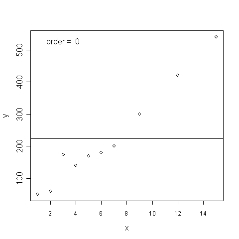
This animation shows the utility of polynomials at representing a curve to the desired level of precision. The points represent observed data. Each successive curve adds a higher level polynomial. The key observation is that as the order increases the curve can eventually account for all the points perfectly. Yes, the curve goes through all the points and would yield an R^2 = 1. It is always possible to get perfect fits to one's data. But the price one pays is that the curve is a perfect fit to this specific data set. It isn't clear the parameters of the perfectly fitting curve would generalize to other data sets. To a first approximation the a straight line with positive slope (order 1) represents the data reasonably well, and the slope estimate will probably replicate well in other samples drawn from the same population. There is of course a possible outlier at x=3 that would require additional study.
Richard Gonzalez, University of Michigan
gonzo at umich dot edu
Click here to give feedback on this site or report problems.