 Next, open the Layer Style menu. You can do this in one of three ways:
![]() Open a new image and type the text that you intend to use for your logo. The logo I decided upon is shown in the picture (left). A large, block-style font is often a good choice; this one is called Goudy Stout. Notice that when you finish typing your logo, the text automatically forms in its own layer on top of the background.
Open a new image and type the text that you intend to use for your logo. The logo I decided upon is shown in the picture (left). A large, block-style font is often a good choice; this one is called Goudy Stout. Notice that when you finish typing your logo, the text automatically forms in its own layer on top of the background.
Next, open the Layer Style menu. You can do this in one of three ways:
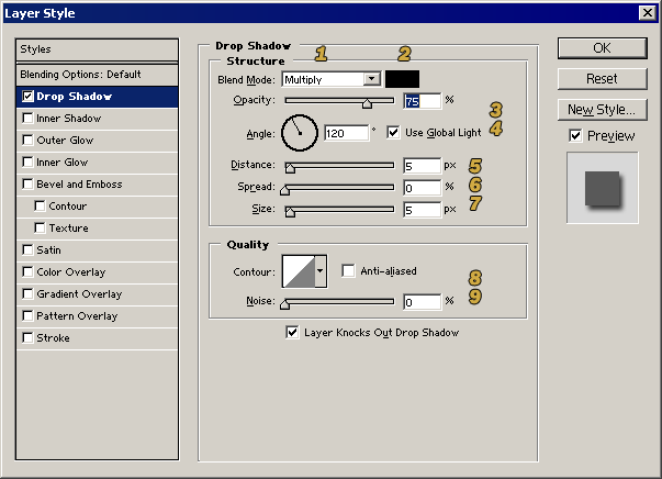
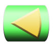
 Color: Black |
 Angle: 120° |
 Distance: 1 |
Spread: 0 |
 Size: 0 |
 Contour: Ring-Double |
 Noise: 0 |
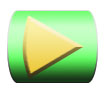
 Color: Brown |
 Angle: 45° |
 Distance: 10 |
 Spread: 30 |
 Size: 10 |
 Contour: Cone-Inverted |
 Noise: 30 |
The next item in the Layer Style menu is Inner Shadow. Whereas the Drop Shadow projects the shadow outward from the object, Inner Shadow projects the shadow inward on top of the object itself. The main difference in the menu is that "Spread" is replaced by "Choke," which governs how far into the object the shadow reaches.
 This picture (left) illustrates an Inner Shadow with an angle of -45° and a "Sawtooth" contour. It's a good idea to play around with the settings for yourself to see what they do. You might be surprised by the effects you can get.
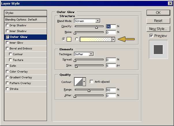 The next important menu item is Outer Glow. It is similar to Drop Shadow, except that it surrounds the object with a halo of a light color that fades to transparency. This makes your object appear to glow, particularly against a dark background. If you are trying to write dark text over a dark background, this is one way to make your words more legible.
 You can use the dialogue box (right) to change the color of the glow where indicated by the arrow. If you click the pull-down menu, you can change the halo from a single-color gradient to any of the gradient patterns that are stored on your computer. The picture (left) shows an Outer Glow set for an orange and yellow gradient. The "Jitter" option at the bottom of the menu will make the gradient colors speckle together.
Unlike drop shadow, which is set for a blend mode of "Multiply" by default, the Outer Glow is set for "Screen." The result of this is that the glow will be invisible against a white background. If you have a white (or other light color) background, you will have to change the blend mode to make the glow visible.
 Inner Glow is similar to Outer Glow except that it projects the color inward on top of the object, as shown in the picture (left).
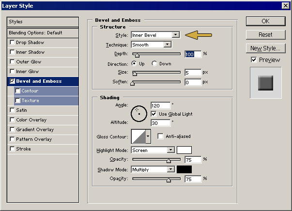 Next is the Bevel and Emboss dialogue box (right). This is one of the most fun items in the Layer Style menu. With this, you can make the objects in the layer pop out or sink down into the background as if three-dimensional.
The type of bevel or emboss function applied to your layer is determined by the pull-down menu at the very top, where indicated by the arrow. Directly below this is another pull-down menu that manages how the bevel is applied. The pictures below illustrate various combinations of these options.
 Outer Bevel Smooth |
 Outer Bevel Chisel Hard |
 Inner Bevel Smooth |
 Inner Bevel Chisel Hard |
 Emboss Smooth |
 Emboss Chisel Hard |
 Pillow Emboss Smooth |
 Pillow Emboss Chisel Hard |
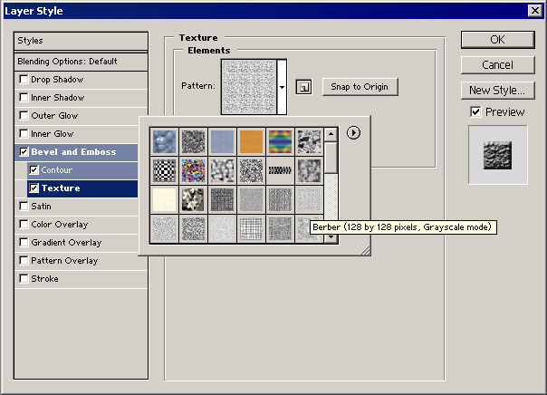
Bevel and Emboss has two sub-menu items: Contour and Texture. Contour applies a contour to the bevel.
 The Texture item applies a texture to the object. The textures are available from the "Pattern" pull-down menu. You can use the library of patterns that comes with the software, or you can design your own and add them to the list. The picture (right) was done with the settings shown (below).
The Satin item applies a dark wavy shadow over the object. The appearance of the shadow can be altered considerably by choosing a different contour. You can also change the color of the shadow if you don't like black, or you can uncheck "Invert" to make the shadow glow bright. The pictures below show some of the effects.
 |
 |
 |
 |
| Contour: Ring - Double |
Contour: Gaussian |
||
Color Overlay does exactly what it says--it covers the object with a color of your choice. This is particularly useful if you intend to save the style for use later (explained below) and want to save the color along with it. You can change the opacity of the color to whatever level you desire, and you can alter how the overlay color blends with the colors of the object.
 Gradient Overlay is similar, but instead of a solid color, it covers the object with a gradient of your choice. In the picture (left), I used the gradient to make the object into a Michigan fan. You can tilt the gradient in any direction you like, and you can change the proportional widths of the colors. You can even adjust the opacity and blending mode of the gradient so that it blends with the object's original color.
 Pattern Overlay, on the other hand, covers the object with a pattern from the "Pattern" menu. As with the Texture option, you can use the available designs or you can create your own. The picture (right) uses a pattern called "Gauze."
 Color Black |
 Gradient White to Black |
 Pattern Sakura |
The last menu item, Stroke, is immensely valuable. It surrounds your object with a border. You can specify the color and width of the border. If you like, you can also fill the border with a gradient or a pattern instead of a solid color. Stroke, used properly, can really make the objects in the layer stand out from the background. The pictures (left) demonstrate the three types of Stroke. (The sakura pattern is simply a grayscale image of cherry blossoms from a photograph that I saved as a pattern.)
![]() Now it's time to combine the effects to make the logo. I used the following list of styles to create the logo in the picture (right).
Now it's time to combine the effects to make the logo. I used the following list of styles to create the logo in the picture (right).
 But wait! It doesn't end there. Even though the Layer Style menu is a lot faster than hand-painting the effects, it can be time-consuming to experiment with all the possibilities to find the perfect combination. Plus, once you have the settings exactly the way you want them, what do you do if you ever want to use the same settings again?
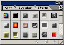
Fortunately, Photoshop makes using these styles even easier with the Styles palette (left). It comes with a number of preset styles so that all you have to do is click on the menu and that style will be applied to the active layer. If you design your own style that's perfect for your needs, you can save it by dragging and dropping the layer onto the Styles palette. That way you can use the same style again with one click at any time. If you decide you don't need that style anymore, you can always delete it from the palette later.
 If you don't need to save the style to the Styles palette but would still like to use the same style on more than one layer in the same image, you can do that as well without going through all the trouble of re-selecting all the style options. Right-click on the layer in the Layers palette and select "Copy Layer Style" from the pop-up menu. (You could alternatively click Layer → Layer Style → Copy Layer Style.) Once the style is copied, you can apply it by pasting it on another layer.
Once Layer Style has been applied to a layer, the individual style settings show up in the Layers palette as illustrated in the picture (right). Each setting has an eye icon next to it that you can use to toggle the visibility of that particular setting without changing the rest. For example, you can toggle the Stroke on and off without changing the Drop Shadow, to see which way you like it best. The eye icon for the line named "Effects" toggles visibility for all the style settings at once. You can also delete an individual setting by selecting it in the Layers palette and dragging it to the trashcan icon. Clicking the triangle next to the Layer Style icon on an individual layer hides the style settings for that layer.