Method Three:
Point Source and Buffering Analysis
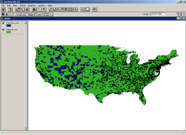
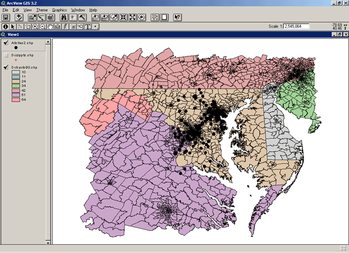
Unlike the other methods presented earlier, I contend that using points, or the environmental hazards under investigation as the unit of analysis is the best manner to determine disproportionate impact in environmental justice research. While it is the best form to date, it is the most difficult to produce. To obtain points, researchers must have exact coordinates or street addresses to create a point shapefile for use in geographic information system. This is manageable under small, discrete geographical boundaries, but it quite difficult in creating a point shapefile for the entire United States. For this method, I greatly reduced my area for analysis for census tracts within 45 mile radius of the District of Columbia.
This resulted in a total of 273 total sites. I started with a list of addresses for CERCLIS sites within the area of interest (which included Maryland, Virginia and DC). Using a street map boundary file at the CSCAR (Center for Statistical Consulting and Research) we were able to match geocoded points for 85% of the addresses for the area. For the remaining sites, I went to Mapblast.com to plot the sites on their interactive map and get latitude and longitude coordinates. I was able to take the list of approximately 50 sites and successfully matched through latitude/longitude on all but 5 sites. The result of this very time-consuming geocode exercise is above.
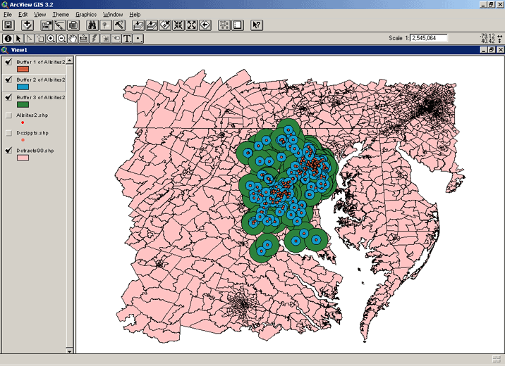
Next, the DC metro areas were rasterized for each of the racial/ethnic groups under investigation. Over the grid shapefiles, I created 1, 4, and 10 mile buffers. It was important to maintain the attribute information from the grid within the buffers. The rasterized maps assisted in the interpolation, or theoretical estimation of the population per square mile of each pixel. Thus, it provided a more accurate representation of racial and ethnic identity per square mile around the site. The buffers are presented below. The red point represents the 1-mile radius around the site. The blue circle marks the 4-mile radius, and the 10-mile is illustrated by the green circles.
CERCLIS and White Americans
click here for Animated map of White population distribution at 1, 4, and 10 miles from CERCLIS site
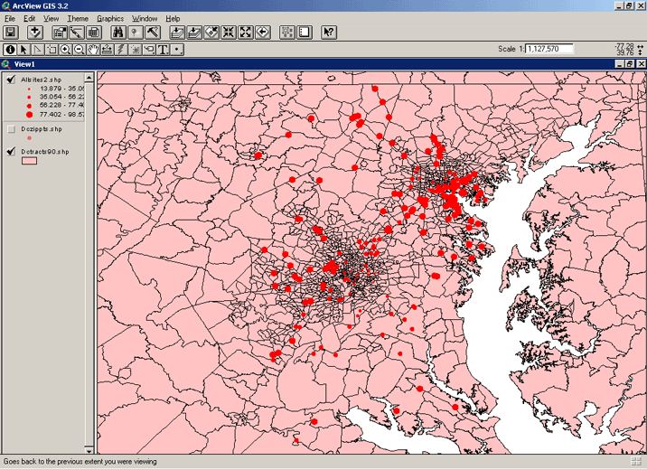
The graduated symbol map below illustrates the population of White Americans around the 1 mile radius of the site at equal intervals. The smaller circle represent smaller population. The larger points may reflect denser areas, rather than greater impact by race.

This graduated symbol map depicts the white population at 4 mile radius from the site. The only noticeable difference that I detect is that suburban areas have higher percentage of white population around the site. The percentage of white from 1-4 miles appears to remain relatively constant.
This map illustrates white population at a 10 mile radius. In contrast to the map depicted distribution within a 4-mile impact area, the CERCLIS sites in the southwestern parts of the region (closer to Virginia) have a lower population of Whites in the 10-mile impact area. In fact, the 10-mile map illustrates that there are relatively fewer whites further from CERCLIS sites. These comparisons are intra-racial, and do not reflect racial differences in proximity to hazardous site. For racial comparison, see the evaluation section at the end of this page.

CERCLIS and African-Americans
click here for Animated map of Black population distribution at 1, 4, and 10 miles from CERCLIS site
This graduated symbol map depicts the distribution of African-American within one mile of CERCLIS sites within the greater Washington, DC area:
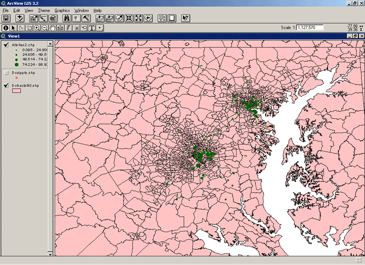
At four miles distance within the CERCLIS site, the degree of change in the distribution of African-Americans is relatively constant. One point to note is that there are very few Blacks in the southernmost CERCLIS sites.

And at 10 miles, I note that there is an increase in the Black population the further away from the sites that are located directly between the central cities of DC and Baltimore. This increase in Black population the further the radius from the site counters claims of environmental racism. However, this investigation ends at the 10-mile radius mark. Other studies have extended radii up to 25 miles away from hazardous site.

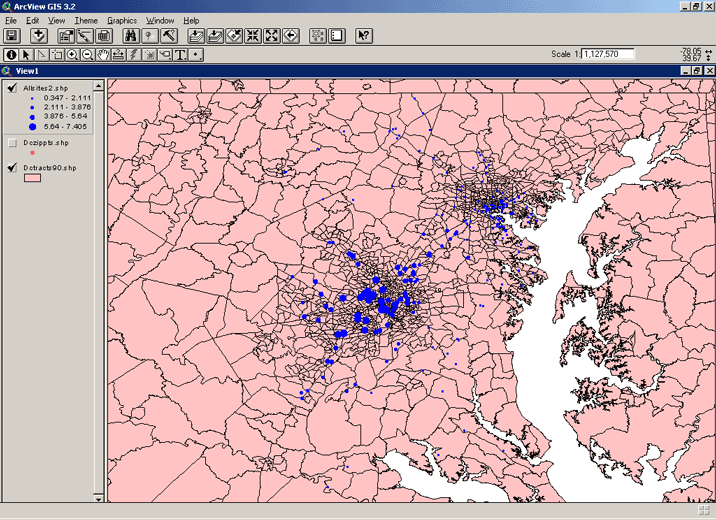
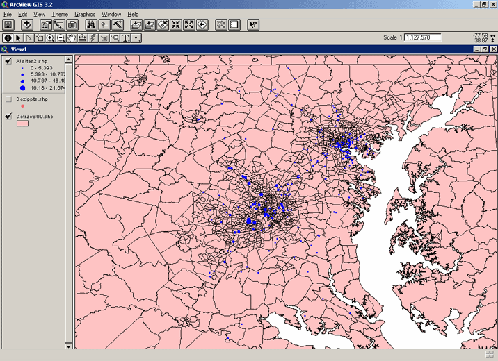
CERCLIS and Latinos/as
Hispanic are smallest ethnic group in comparison to White and Blacks in the DC. Reflected in this fact, Hispanic Americans are not widely dispersed in the area. The map below depicts the Hispanic population at a one mile radius around the CERCLIS site :

Moving from a 1-mile to a 4-mile buffer, the Hispanic population increases along the DC central city CERCLIS sites quite noticeably:

From 4-mile to 10-mile buffer, the Hispanic population increases around CERCLIS sites:
Evaluating Method Three
The maps drawn from this method depicts racial and ethnic segregation as much as it presents a glimpse of disproportionate impact. Whites are dispersed throughout the region, while both Blacks, and to a greater extent, Hispanic Americans, are located in the central city and their surrounding areas. The table below shows the ranges in the population distribution per buffer:
|
Race/Ethnicity
|
One Mile Range
|
Four Miles Range
|
Ten Miles Range
|
|
White
|
0-98%
|
14-99%
|
39-99%
|
|
Black
|
0-98%
|
0-84%
|
0-56%
|
|
Hispanic
|
0-22%
|
0-11%
|
0-7%
|
The fact that many of the hazards are concentrated in and around the central city is indicates that there might be disproportionate impacts. In a comparison of all races, per buffer, I can conclude the following:
The highest concentrations of both minority groups are in the central cities of Washington, DC and Baltimore. The next research questions would be in regards to the density of hazards. For instance, are there more environmental hazards in the central city? If so, what is the basis for determining disparate impact? And, how significant are the racial differences in regards to proximity to sites within central cities?