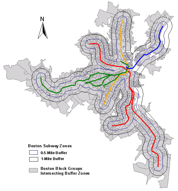
Analysis: Subway Zones
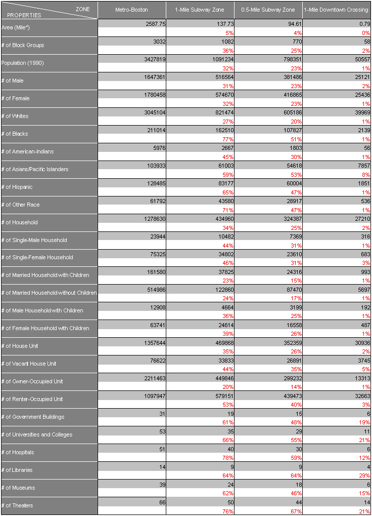
(Click the table to see details.)
Table 1. Items Categorized by Created Datasets
The first chart is a comparison of the population density for zones, and the second chart is the distribution of race there. More analyses for this category could be drawn to future studies. Based on the figures of the people of color intersected in the census blocks, I developed a graph charting a comparison of the population living within one mile of buffered subway zones, a half mile of buffered subway zones, and a mile of downtown crossing.
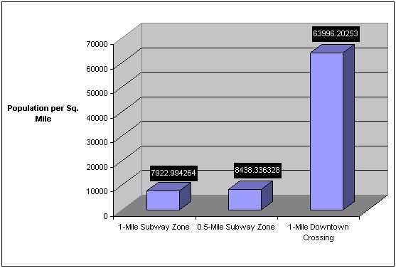
(Click the figure to see details.)
Figure 1. Population Density for Each Buffered Zone
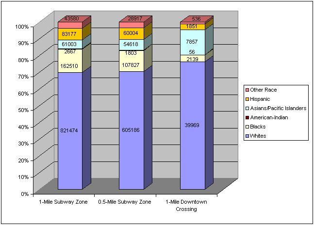
(Click the figure to see details.)
Figure 2. Distribution of Race for Each Buffered Zone
After that, the following spatial analyses were performed with choropleth mapping using normalizations; whats there in subway zones?
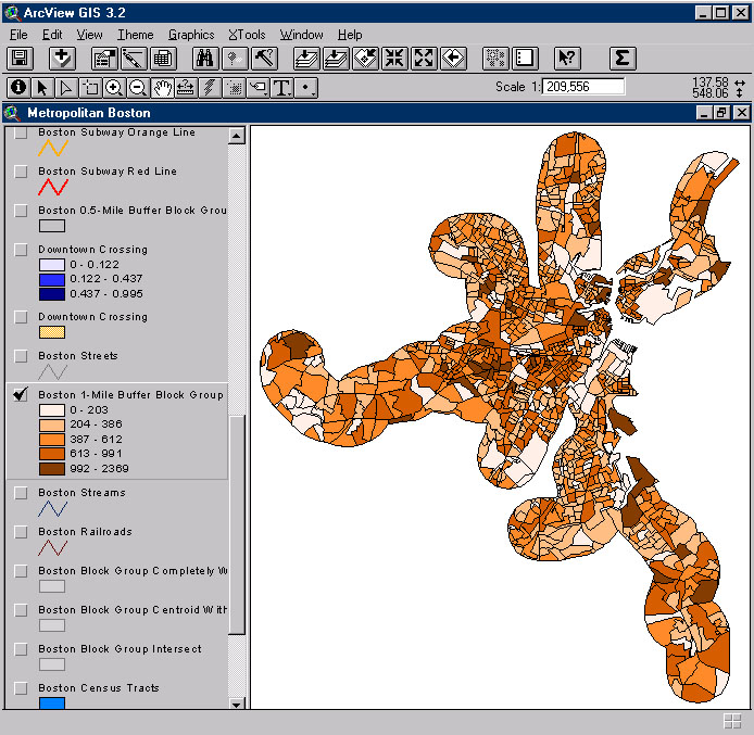
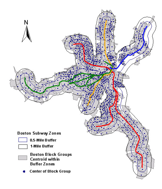
- Number of household for each block group in buffered subway zones was determined (See Map 8).
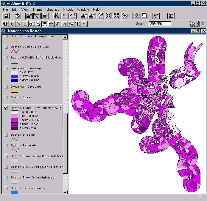
- Number of house units for each block group in buffered subway zones was found (See Map 9).
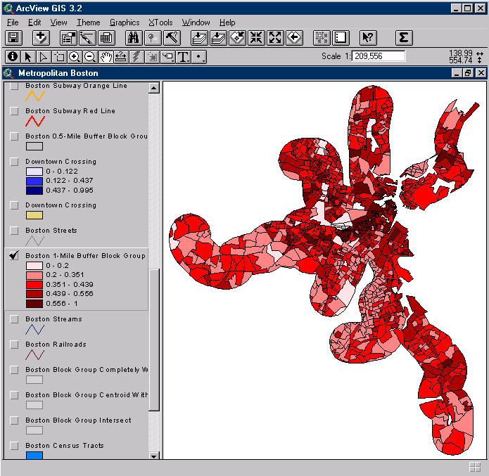
- One of interesting characteristic was the household - house unit ratio (See Map 10).
- Household normalized by population (1990) was represented on the Map 11.
- Renter occupancy in relation to house units was also shown on Map 12.
(Click the map to see details.)
Map 8. Number of Households in Buffered Zones
(Click the map to see details.)
Map 9. Number of House Units in Buffered Zones
(Click the map to see details.)
Map 10. Households vs. House Units
For the fourth and fifth analyses, the downtown crossing area seems to have relatively higher proportion for comparative zones.
(Click the map to see details.)
Map 11. Households Normalized by Population
(Click the map to see details.)
Map 12. Renter Occupancy Normalized by House Units
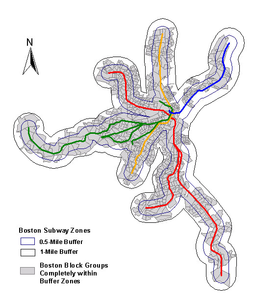
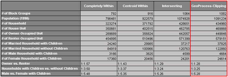
The next step involved finding differences between three operations for spatial analyses: Completely Within, Centroid Within, and Intersecting block groups in subway buffer zones. Map 13 to 15 demonstrate the differences visually, and the following table was characterized by three different operations.
(Click the map to see details.)
Map 13. Block Groups Intersecting 1-Mile Buffer Zone
(Click the map to see details.)
Map 14. Block Groups Centroid Within 1-Mile Buffer Zone
(Click the map to see details.)
Map 15. Block Groups Completely Within 1-Mile Buffer Zone
After creating three different shape files and datasets, I tried to examine the most accurate study area for the analyses. I supposed that the shape created by clipping of geoprocessing methods is the most suitable for the project, and Centroid Within would be the closest to the clipped shape, because block groups Intersecting buffer zone was too big as shown in the Map 16 and was including the clipped area. But, facts in database were appeared somewhat differently as shown on Table 2; clipped shape seems larger than intersected area in this table created by Excel.

(Click the map to see details.)
Map 16. Problem in Block Groups
(Click the map to see details.)
Table 2. Items Categorized by Different Datasets for 1-Mile Buffer Zone
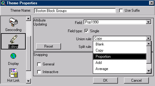
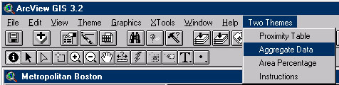
With assistance of professor Arlinghaus and Marc Schlossberg, this question began to be resolved. I found that there are some different theme editing options, and each of them makes a different dataset with each different mathematical algorithms during geoprocessing. I chose "Proportion" among them, instead of the previous option "Copy", and tried clipping again. It simply made a precise, proportional dataset. Another way dealt with the problem is using an ArcView extension called "TwoTheme.avx". I downloaded the extension from Marc Schlossberg's Web page, and it says that TwoTheme.avx is an ArcView extension by Kevin O'Malley that allows you to overlay two polygon themes and extract attribute data proportionally based on area, e.g. overlay a buffer on census tracts and proportionally extract data underneath buffer.
(Click the figure to see details.)
Figure 3. Theme Editing Options
(Click the figure to see details.)
Figure 4. The TwoThemes Extension for ArcView
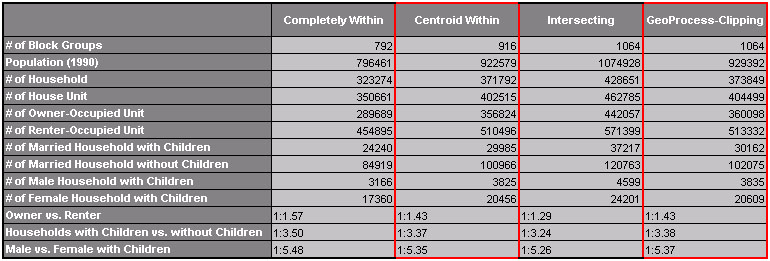
The "Aggregate Data" menu in the TwoThemes extension enabled the destination shape (1-Mile Subway Buffer Zone) to collect/count data from a source shape (Boston Block Groups), and produced a precise result set about the zone. Table 3 shows fixed datasets acquired after the process.
(Click the table to see details.)
Table 3. Fixed Datasets for 1-Mile Buffer Zone
In sum, the buffer zones being used in this project, have been created by "Clipping" of geoprocessing, and datasets for the areas highly match those obtained from the "Centroid Within" operation. For consistency during the studies, I will employ the "Centroid Within" operation regarding analyses between themes in this project.
SUBWAY ZONES IN BOSTON, MASSACHUSETTS / SUBWAY ZONES