Back to Science & Society Lesson Home Page
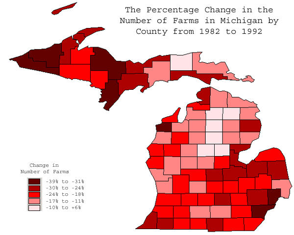
This map illustrates the percent change in the number of farms in each county
for the 10 year period of 1982-1992. As you can see the shade of red
becomes darker it reflects a greater the percentage decrease in the number of farms,
thus the total number of farms in each county tend to be decreasing.