Back to Science & Society Lesson Home Page
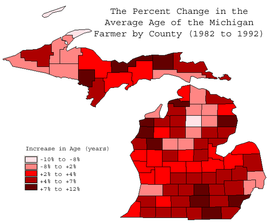
This map illustrates the percentage change in the average age of the
farmers in each county of Michigan in the years 1982 to 1992. While some
counties have seen a decrease in the average age (shown by lighter red colors),
the darker red colors indicate that the average age of the farmers have
increased.