Mapping and the partition of data.
Different schemes of partitioning data can lead to vastly different maps. The material below, in italics, is directly from the on-line help in ArcView. It is illustrated using maps created in ArcView 3.0a. The maps are all maps of the world. There are 4 classes in each map (or 4 above the mean). The variable (attribute) being mapped is "area"--that is land area.
Classification methods
You can explore your data by applying the different classification techniques found in the Graduated Color and Graduated Symbol Legend Editors or by typing in your own classes. The purpose of classification is twofold: to make the process of reading and understanding a map easier and to show something about the area you’re mapping that is not self-evident. Try each of the classification types and see if any interesting spatial patterns appear.
ArcView provides six (five listed below?) classification methods to display data:
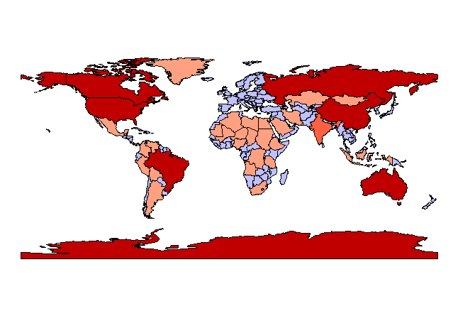
Natural Breaks
This is the default classification method in ArcView. This method identifies breakpoints between classes using a statistical formula (Jenk’s optimization). This method is rather complex, but basically the Jenk’s method minimizes the sum of the variance within each of the classes. Natural Breaks finds groupings and patterns inherent in your data.
Map appears below
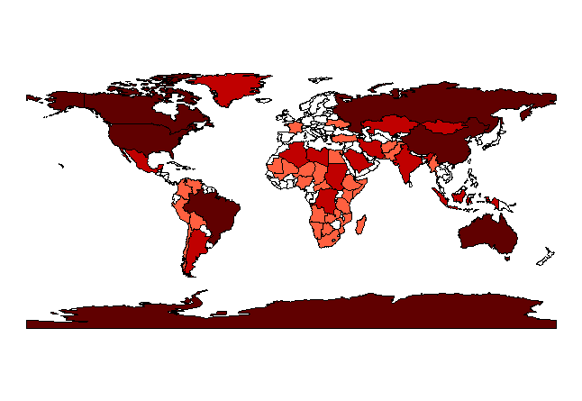
Quantile
In the quantile classification method, each class contains the same number of features. Quantile classes are perhaps the easiest to understand, but they can be misleading. Population counts (as opposed to density or percentage), for example, are usually not suitable for quantile classification because only a few places are highly populated. You can overcome this distortion by increasing the number of classes. Imagine the difference, for example, if five classes are used in the chart instead of three. Quantiles are best suited for data that is linearly distributed; in other words, data that does not have disproportionate numbers of features with similar values.
Map appears below
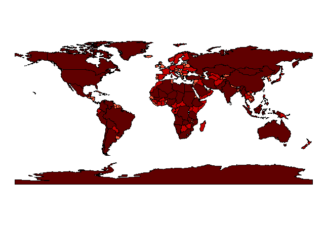
Equal Area
This method classifies polygon features by finding breakpoints so that the total area of the polygons in each class is the approximately the same. (ArcView determines the total area of the features that have valid data values.) Classes determined with the equal area method are typically very similar to Quantile classes when the sizes of all the features are roughly the same. Equal Area will differ from Quantile if the features are of vastly different areas.
Map appears below
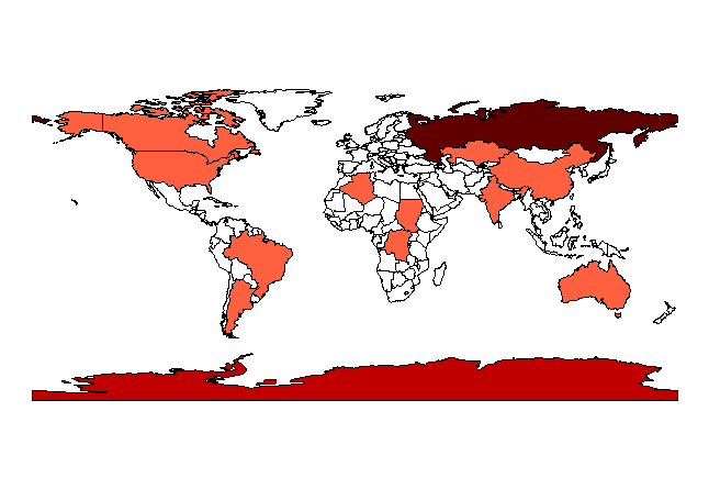
Equal Interval
The equal interval method divides the range of attribute values into equal sized sub-ranges. Then the features are classified based on those sub-ranges.
Map appears below
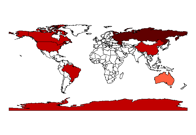
Standard Deviations
When you classify data using the standard deviations method, ArcView finds the mean value and then places class breaks above and below the mean at intervals of either 1/4, 1/2, or 1 standard deviations until all the data values are contained within the classes. ArcView will aggregate any values that are beyond three standard deviations from the mean into two classes, greater than three standard deviations above the mean ("> 3 Std Dev.") and less than three standard deviations below the mean ("< -3 Std. Dev.").
Map appears below