-
Reductionist approach to computer-assisted cartography using GIS software:
software in which base map and data set are interactive. A change
in the underlying data base causes a corresponding change in the map and
vice-versa.
-
learn to use maps and data that come with the GIS
-
learn to bring data in to the GIS from other sources (thereby reducing
the analysis back to the first stage).
-
learn to bring images in to the GIS from other sources (thereby reducing
the analysis back to the first stage).
-
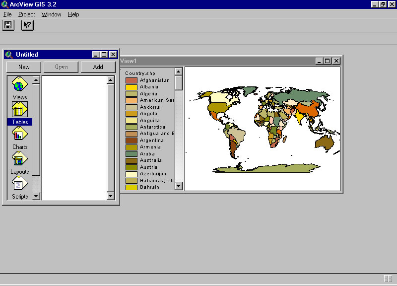
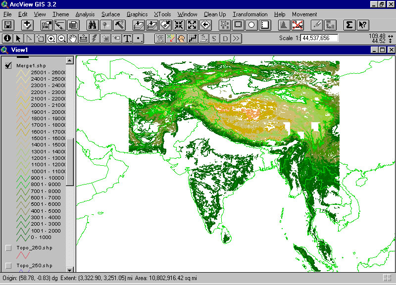
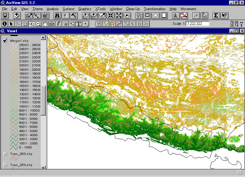
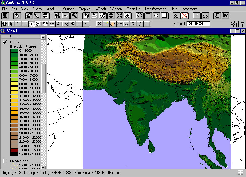
Using maps and data that come with the GIS (ArcView
GIS, in this case).
-
Review of thematic mapping
-
Spatial analysis.
-
Buffers. Analysis of information using buffers. Buffers are
but one analytic tool; ArcView has a whole host onboard.
-
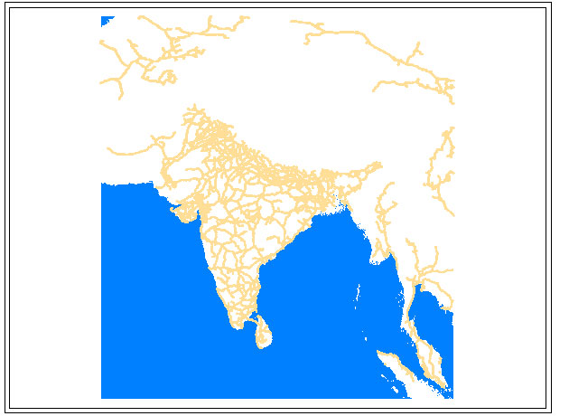
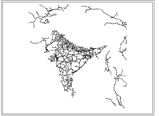
South Asia, 10 mile railroad buffers
-
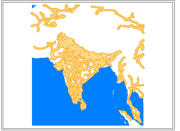
South Asia, 10 and 25 mile railroad buffers
-
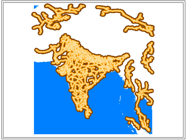
South Asia, 10, 25, and 50 mile railroad buffers
Good ideas endure, despite technology change (reference Mark Jefferson's
work on "The Civilizing Rails"; link (from
www.imagenet.org) to a reference about Jefferson's work). The buffers
can then be used in conjunction with other information.
-
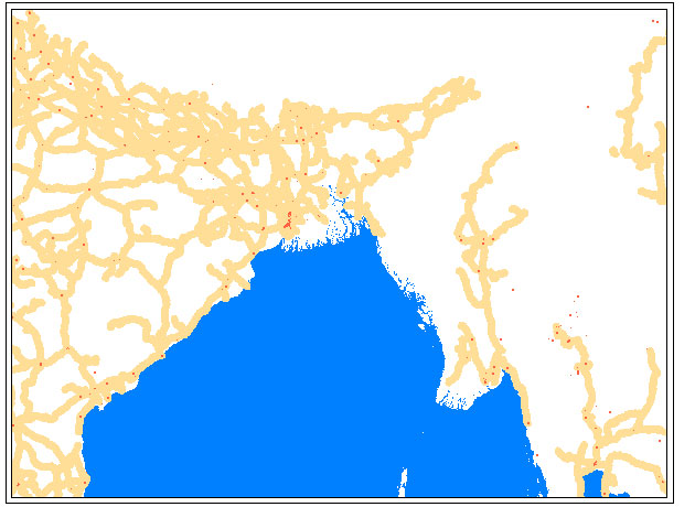
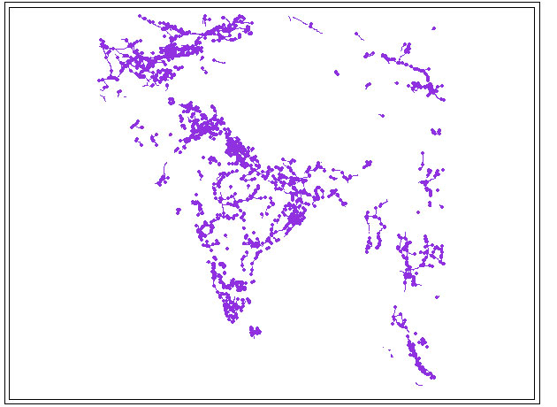
How many
major populated places lie within the 10 mile
buffer? Close-up view.
-
Imagine using census data, by household to calculate, for example, how
many households of one type or another lie within 50 km. of a hazardous
waste site. Often the analytic capabilities are limited (mostly)
by data availability.
-
To calculate buffers in ArcView:
-
Open up a dot layer, for example.
-
In View|Properties, if the units are listed as "unknown" set the units
to miles (or whatever you want) in both places. Otherwise, just take
the default that comes up (decimal degrees and miles, for example).
-
Go to Theme|create buffers and follow through the wizard that comes up
experimenting with various choices that can be made. (Try as an example,
Canadian cities with a buffer of 100 miles.)
-
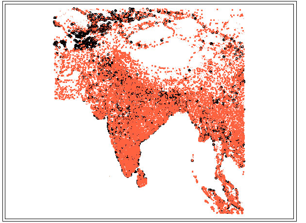
Dot density maps and maps showing clusters of regions.
-
Spider diagrams--outlining regions where no outlines
exist.
HANDS-ON TIME--MAKE YOUR OWN MAP!
-
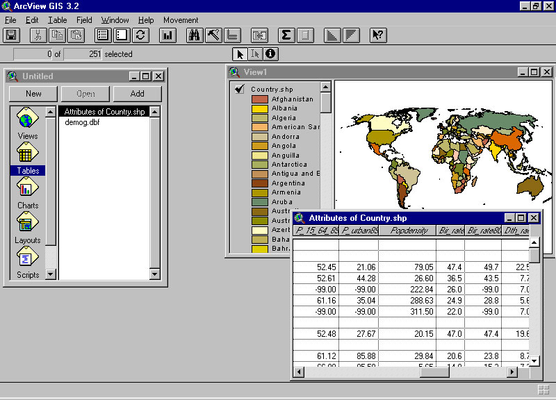
Bringing data in to the GIS fro other sources--demonstration.
Bringing in new data (in an Excel spreadsheet) to use with on-board base
maps--ESRI demographic data by nation.
-
Open up the map of the world.
-
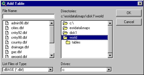
Go to start up window and select the tables option.
-
Navigate to where desired spreadsheet is stored.
Click on "add" if it is active (otherwise, "new" and then later on "add").
-
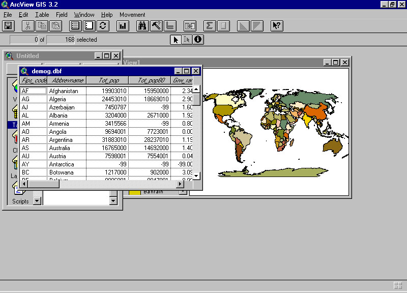
New table (demog.dbf in this example) will then
appear along with the map. Click on the map to make the map
window active (title bar turns blue).
-
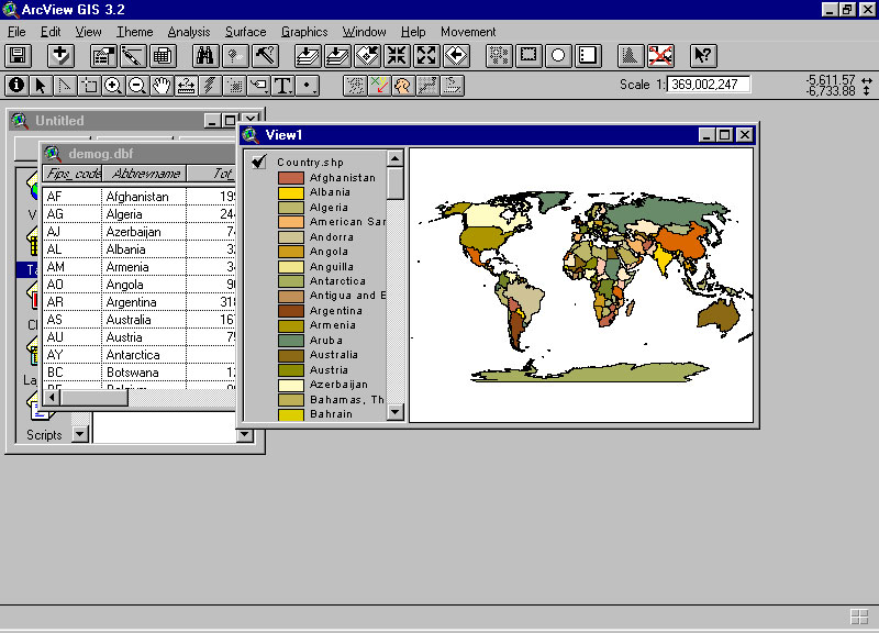
Open the attribute table for the country
theme in the map. This is the table that came with the map and has
all the key information about the map (such as perimeter, area, and such
so that the map can be drawn). Data in the new spreadsheet will be
linked to the existing attribute table. In order for it to link,
there MUST be a column in the new spreadsheet that is has the same topic
as a column in the attribute table. That is, the content of the two
columns should be on the same topic (the column headings need not be identical).
The two columns need not be identical but should have a common theme.
-
Identify the common column; in this case it is Abbrevname in demog.dbf
and Cntry_name in the attribute file. Both show country names--matches
will be made where there is duplication between columns.
-
On the new spreadsheet, demog.dbf, click on the
column heading; it becomes highlighted.
-
THEN, on the attribute table, click the corresponding
column heading so that it becomes highlighted. The order in which
these two steps are executed is critical. FIRST the new table, THEN
the attribute table.
-
Now, notice the join button at the top (run
the mouse over the buttons and callouts will tell you which one is the
join button--if it is not active, try the sequence of steps again).
Click on it and the new table will disappear and become joined
to the attribute table.
-
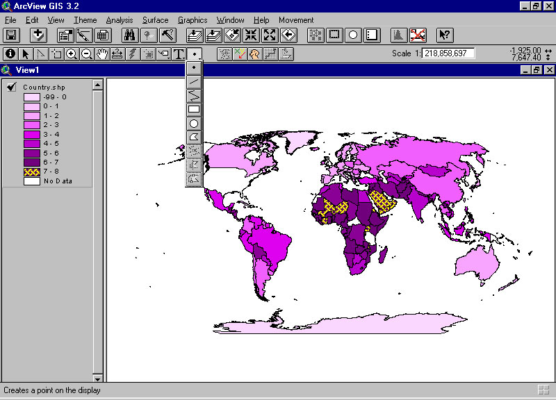
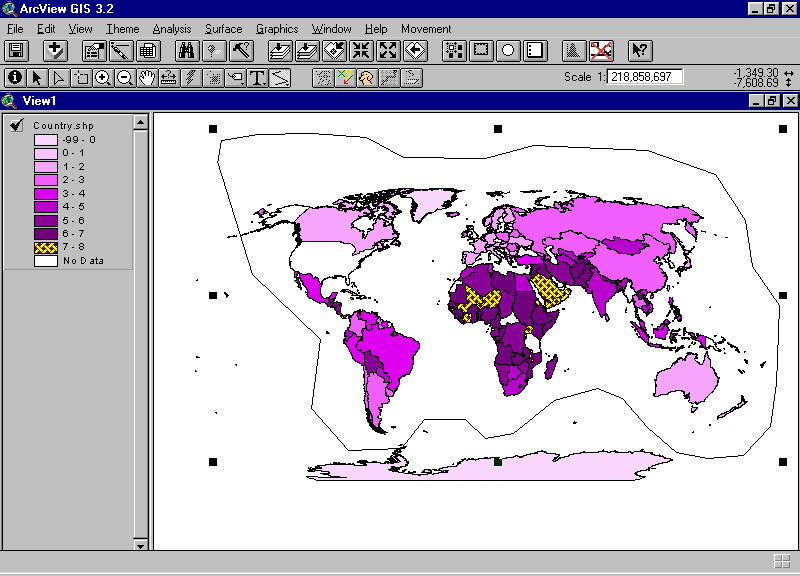
THUS, the situation of bringing in new data has now been reduced to the
first situation of both onboard data and maps. The map can now be
colored using the new demographic data that has been successfully joined
to the attribute table. Here is a sample of a map colored according
to total fertility rate.
-
Bringing images in to the GIS from other sources.
-
Aerial photos and remotely sensed images. To have images aligned
with a map can be a persuasive visual display. In order for the alignment
to occur, some form of extra processing needs to take place. Check
with the source of the aerial files to make sure that "world files" exist
so that your aerial image will align properly with desired ArcView maps.
-
To pull up an aerial in ArcView, click the + sign to add a new layer, but
now go to the lower pulldown menu and select the second option which will
let you add an image.
-
Sample image and map to pull up--link to folder.
-
Use them in conjunction with remotely-sensed data (for example, counting
the number of trees along a street (work of Katya
Podsiadlo in NRE530, Fall, 1999, University of Michigan, School of Natural
Resources and Environment, employing City of Ann Arbor maps and aerial
photos--so that a city might have a count used in assessing developers
funds to put in a street-tree escrow).
-
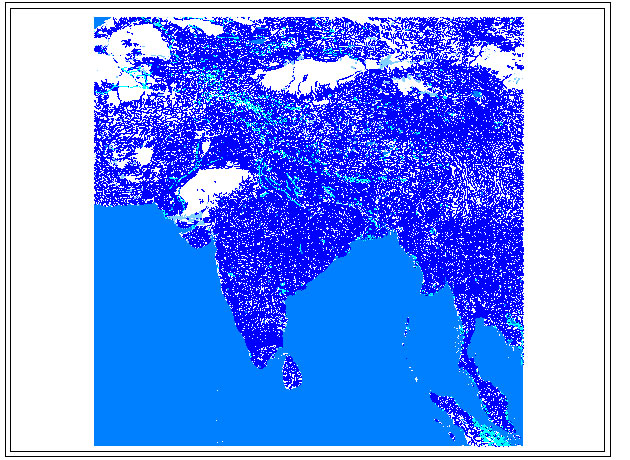
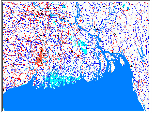
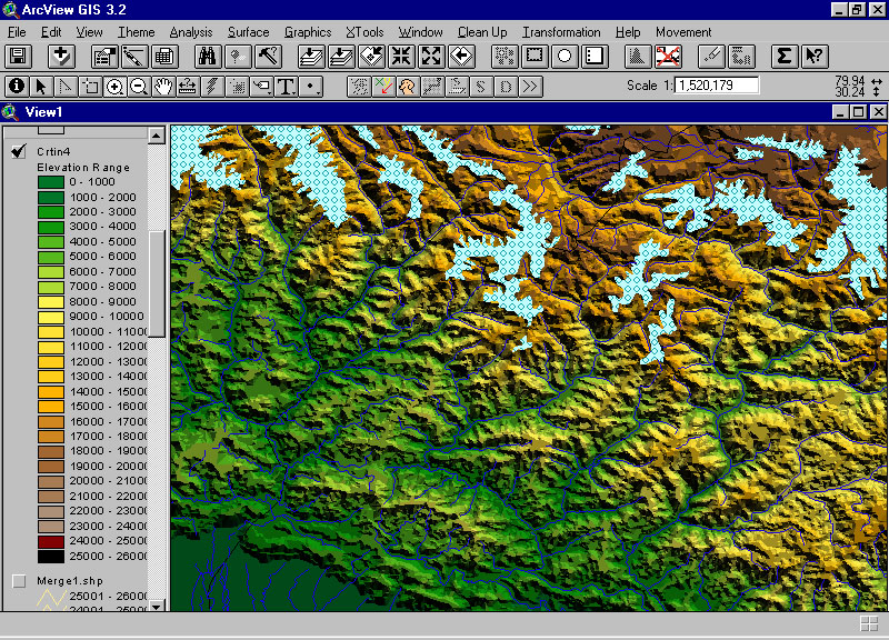
Bringing in new maps that are already in electronic format--the Digital
Chart of the World (DCW) as an example. These maps show an unusual
amount of detail. The information is gathered from various aerial
surveys. A few DCW maps made in Atlas GIS are linked below.
-
DCW maps can be brought from Atlas to ArcView (as can other maps using
a conversion package available on the ESRI website, www.esri.com).
The reason to convert the maps is to use the extra computing capability
of ArcView. Some contour maps (contour interval of 1000 feet) are
converted to Triangulated Irregular Networks using ArcView. Samples
are shown below.
-
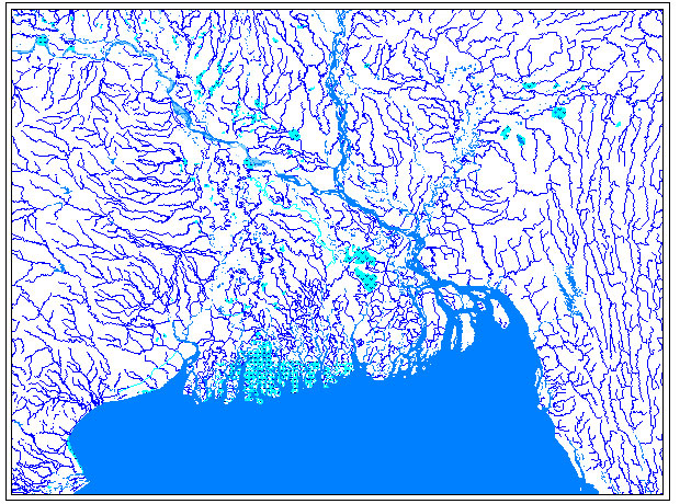
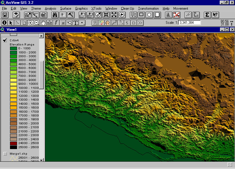
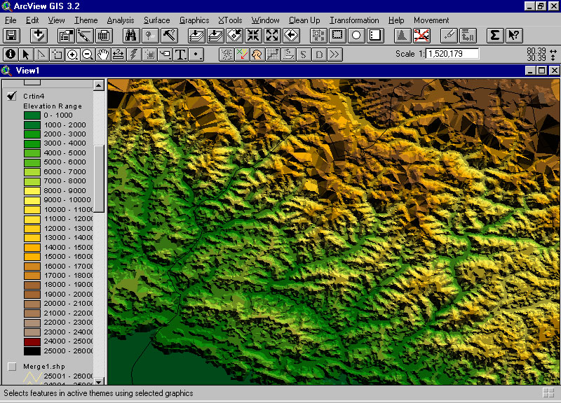
South Asia, contours, 1000 foot contour interval
(DCW).
-
South Asia, triangulated irregular network (TIN); each point is joined
to nearby points to create triangular facets that suggest relief.
-
Enclosed on the CD are some images made from DCW
files, of possible use for the broader interests of this workshop.
-
Bringing in new maps that are not already in electronic format
-
Heads-up, or on-screen, digitizing (drawing of maps)
-
Freehand drawing
Click on the drawing tool button on its lower
right-hand corner; this action will expose a drop-down list of tools.
Choose the zigzag line (click on it). Now move the cursor over into
the map and click and draw. This new polygon
can be made into a layer of its own and can have data associated with it.
With such procedure done, then we are once again reduced to the state of
simply manipulating onboard maps and data.
-
Illustration of using drawing combined with spatial analysis: the
creation of buffers in ArcView.
-
Tracing using a transparency (the "harsh environment" approach to digitizing)
Imagine that you have a photocopy on a transparency of what you would
like to draw on the map. Tape the transparency to the screen and
use the cursor and the drawing tools above to trace the transparency from
the underneath side.
-
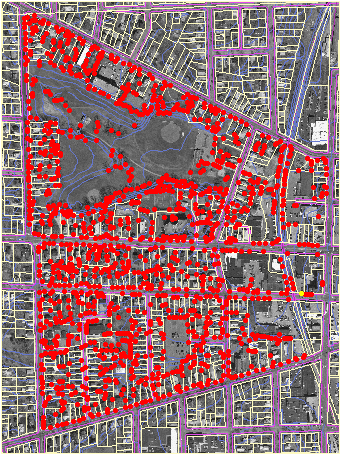
Tracing using a scanned (raster) image (made up of pixels--little squares)
underlay or an aerial photo. Here the problem is usually to get the
image to "register" properly with the map. Knowing the projection
of both is very useful in this regard so that the image and the map line
up correctly. Zoom in to trace a quite detailed image. Illustration
using University of Michigan central campus.
-
There are extensions or plug-ins to software that allow one to use a raster
image as a backdrop behind a vector (made of mathematical points) map and
to draw on the map.
-
One such extension is enclosed on this CD.
In ArcView place this file in Esri|Av_gis30|ArcView|Ext32 to get the registration
software to work.
-
Another useful one is called Edtools--search for the latest version on
the web. It is useful when one needs to move maps around in the plane.
-
Digitizing using a digitizer--a substantial piece of equipment that gets
plugged into the computer to mimic a computerized drafting table.
Trace on the table underlain with fine wires and the information gets sent
to the computer to which the digitizer is attached. Digitizers are
particularly useful for maps that are too large to scan (physically cutting
a map removes part of it). In any digitizing there are tradeoffs
between file size and curvature fidelity.
-
Global Positioning System (GPS) and satellite technology offer exciting,
but perhaps expensive, sources for input.
|