The University of Chicago
Cartography Workshop
June 26, 2000, 9a.m. to noon.
Sandra Lach Arlinghaus, Ph.D.
The University of Michigan, Ann
Arbor.
School of Natural Resources and
Environment; College of Architecture and Urban Planning.
sarhaus@umich.edu; http://www.snre.umich.edu/~sarhaus;
http://www.imagenet.org
Community Systems Foundation, Ann
Arbor.
Director, Spatial Analysis Division
-
Maps on the computer--an application of mathematics in geography:
-
Static maps: maps on the World Wide Web and elsewhere. Click
here
for sample.
-
Dynamic maps (maps that change when there is a change in the underlying
database). Geographical Information Systems (GIS). Two desktop
GISs: compare and contrast them. Generally, Atlas is based
more on classical cartography than is ArcView; however, ArcView makes much
greater use of the capability of the computer than does Atlas.
-
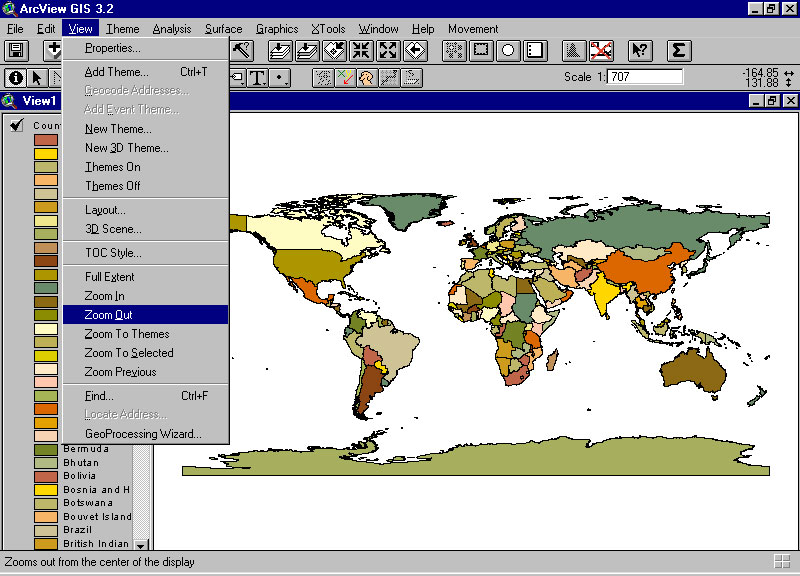
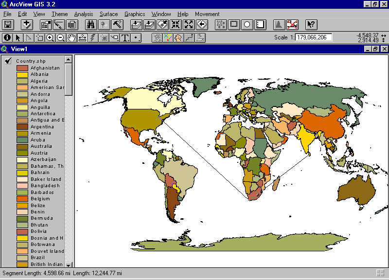
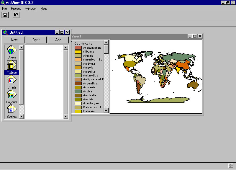
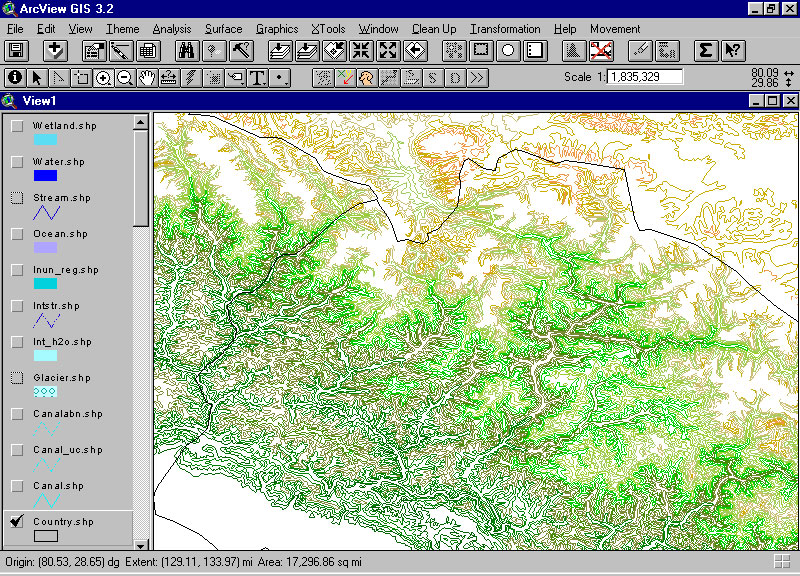
ArcView GIS (Environmental Systems Research Institute, ESRI)--open
a map of the world. Note the latitude and longitude read-out.
Default projection generally just a flat map.
-
Zoom-in tool: magnifying glass with a plus sign in it.
-
Zoom-out tool, magnifying glass with a minus sign in it, or use a menu.
-
Distance tool: distance from
Chicago to Cape of Good Hope to Sri Lanka; shows individual distance for
last leg of trip as well as accumulated distance, after the default flat
map is projected to some standard projection--here the Robinson.
-
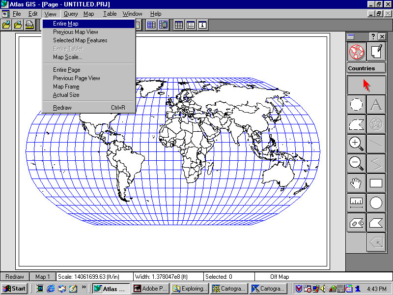
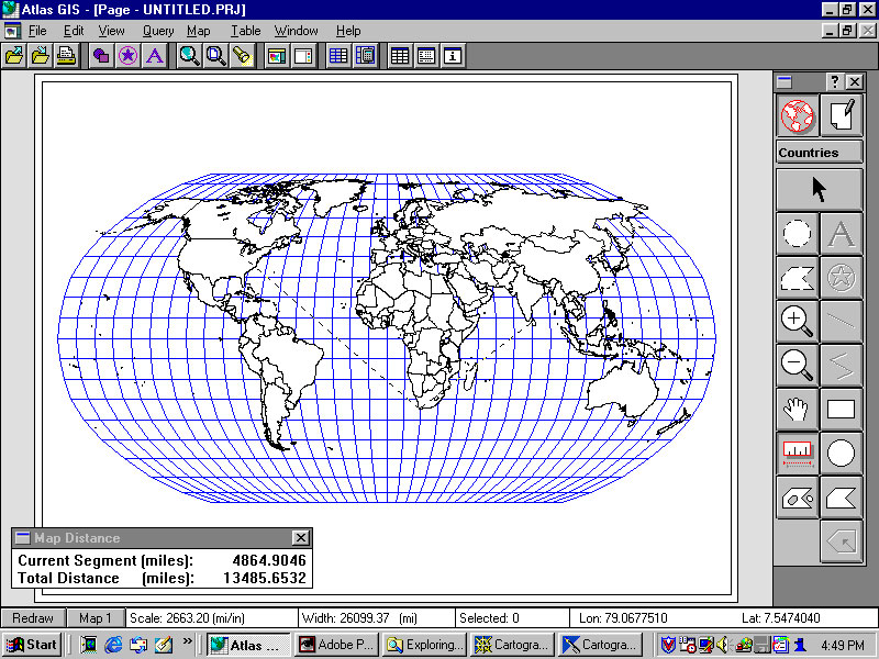
Atlas GIS (ESRI)--open a map of the world.
Note the latitude and longitude read-out. Default projection is a
Robinson projection.
-
Zoom-in tool: magnifying glass with a plus sign in it.
-
Zoom-out tool, magnifying glass with a minus sign in it, or use a menu.
-
Distance tool: distance from Chicago
to Cape of Good Hope to Sri Lanka; shows individual distance for last leg
of trip as well as accumulated distance. (Distance used is great
circle distance.)
-
Concepts:
-
Making GIS maps using onboard information and base maps--demonstration
of thematic mapping. Different methods of partitioning the data can
lead to very different maps. When considering a thematic map made
by someone else, it is therefore important to consider how the underlying
database might have been partitioned.
-
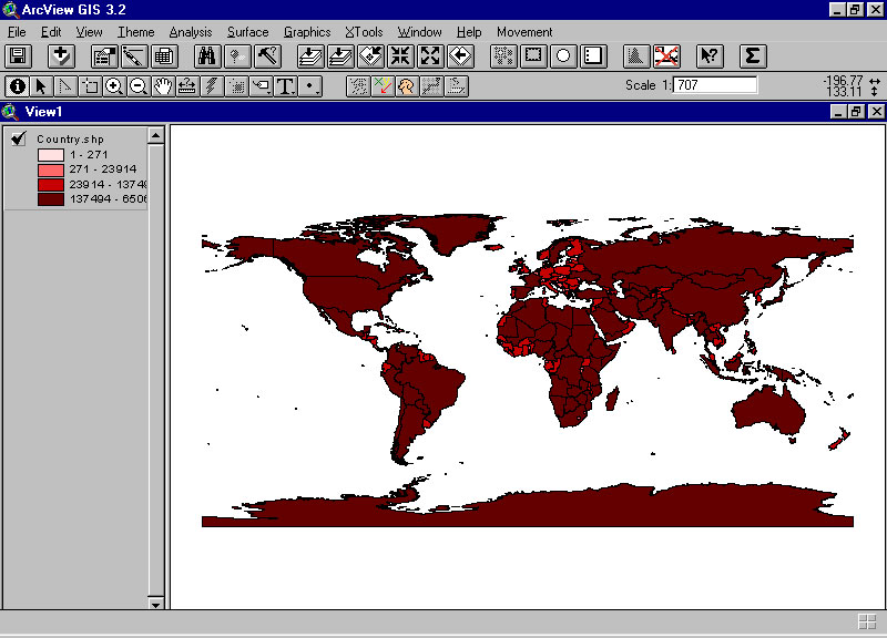
Quantiles--there are roughly the same number of observations in each
interval but the size of the interval might vary.
-
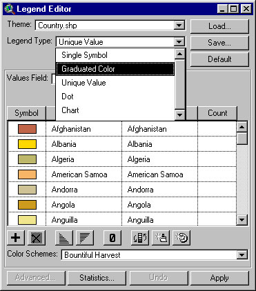
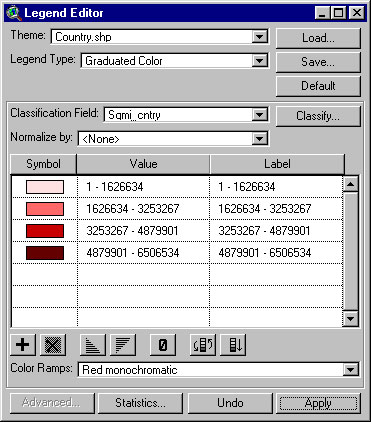
With a map of the world in view, double click on the "legend" on the
left (in ArcView). A "legend editor"
pops up. Choose "graduated color" from the pull-down menu.
The default value colors each country a unique color (called "unique value").
Choosing "graduated color" will enable you to group countries with similar
characteristics as one color. The map will have a theme, such as
the world's lands grouped by area. Data about area will be grouped
into ranges, or categories, by color (e.g. all countries of less that 1.6
million square miles are colored pink).
-
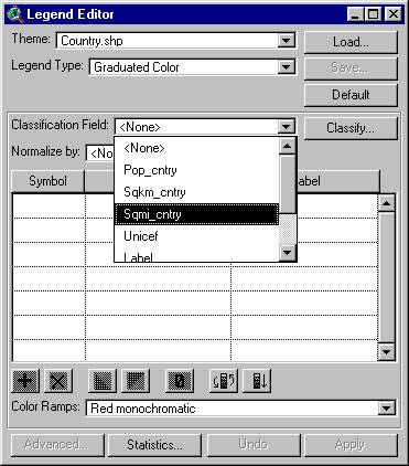
You will need to choose a classification field; that is, you will need
to choose some set of data. For example, choose "sqmi_cntry"
or number of square miles in each country shown on the map.
-
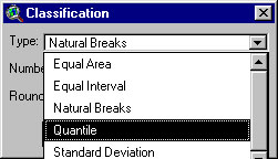
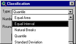
Choose the classification method for the data. That is, how is
the information about area to be split into different categories?
One way is to choose by "quantile."
-
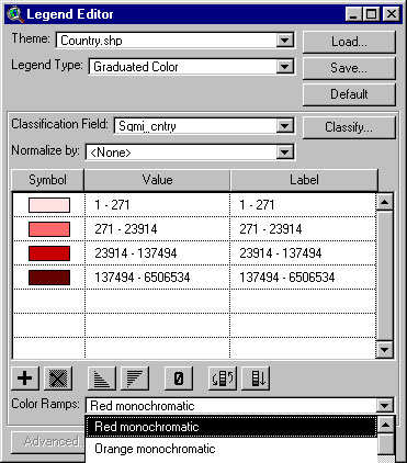
Notice now that back in the legend editor you can choose various color
schemes; the default scheme is red monochromatic
(different shades of red come up for different data ranges--pink for lower
values, deep red for higher values).
-
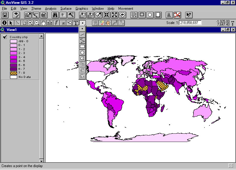
Now, look at the map made using this process.
There are many countries in the deep red category that are visible on the
map and none that are easily visible in the pink range. This observation
should not be surprising, but it should be noted.
-
Equal interval--the size of the interval is uniform but the number of
observations within each interval might vary.
-
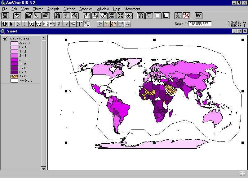
Repeat the steps above, but instead of choosing "quantile" as the method
by which to partition data, choose instead "equal
interval."
-
Look at the result back in the legend editor;
keep the color scheme the same (red monochromatic).
-
Now, look at the map made using this process.
Compare and contrast the result with the map above. Notice
the importance of selecting a method for partitioning of data and its implication
for resulting maps. (Related reference: Monmonier,
How to Lie with Maps.)
-
Other methods of data partitioning and consequences for associated maps
are available, as well, in most GIS packages. Each has its own merits
and drawbacks; each produces maps different from other data partitioning
methods.
-
Concepts:
-
Partition--choose method according to data arrangement.
-
Coloring--no more than four colors are ever required to color a map
in the plane. Animated map of the U.S.A.
using four colors (they were needed to distinguish adjacent states; adjacency
along edges--not at corners).
|
Break
-
Making GIS maps bringing in custom information or base maps--demonstration.
-
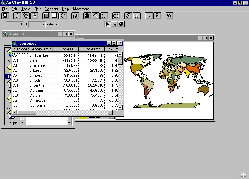
Bringing in new data (in a spreadsheet) to use with on-board base maps--ESRI
demographic data by nation.
-
Open up the map of the world.
-
Go to start up window and select the tables
option.
-
Navigate to where desired spreadsheet is
stored. Click on "add" if it is active (otherwise, "new" and then
later on "add").
-
New table (demog.dbf in this example) will
then appear along with the map. Click on the map to make the map
window active (title bar turns blue).
-
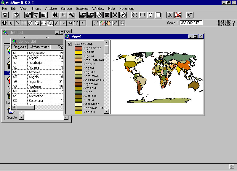
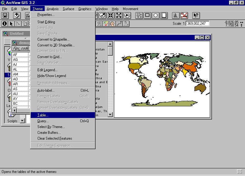
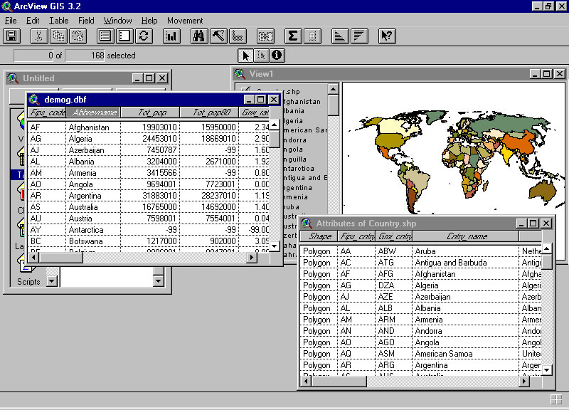
Open the attribute table for the country
theme in the map. This is the table that came with the map and has
all the key information about the map (such as perimeter, area, and such
so that the map can be drawn). Data in the new spreadsheet will be
linked to the existing attribute table. In order for it to link,
there MUST be a column in the new spreadsheet that is has the same topic
as a column in the attribute table. That is, the content of the two
columns should be on the same topic (the column headings need not be identical).
The two columns need not be identical but should have a common theme.
-
Identify the common column; in this case it is Abbrevname in demog.dbf
and Cntry_name in the attribute file. Both show country names--matches
will be made where there is duplication between columns.
-
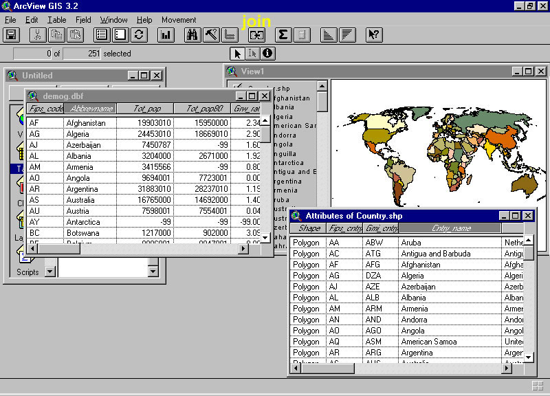
On the new spreadsheet, demog.dbf, click on
the column heading; it becomes highlighted.
-
THEN, on the attribute table, click the corresponding
column heading so that it becomes highlighted. The order in which
these two steps are executed is critical. FIRST the new table, THEN
the attribute table.
-
Now, notice the join button at the top
(run the mouse over the buttons and callouts will tell you which one is
the join button--if it is not active, try the sequence of steps again).
Click on it and the new table will disappear and become joined
to the attribute table.
-
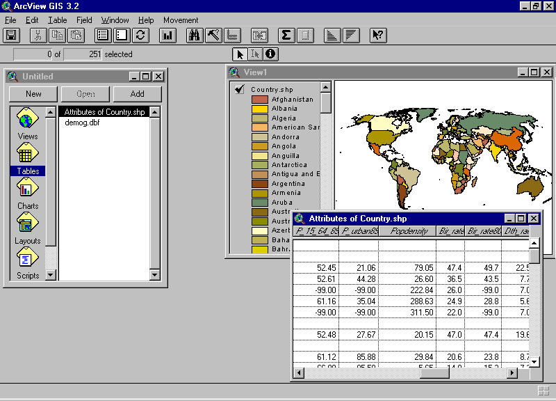
THUS, the situation of bringing in new data has now been reduced to
the first situation of both onboard data and maps. The map can now
be colored using the new demographic data that has been successfully joined
to the attribute table. Here is a sample of a map colored according
to total fertility rate.
-
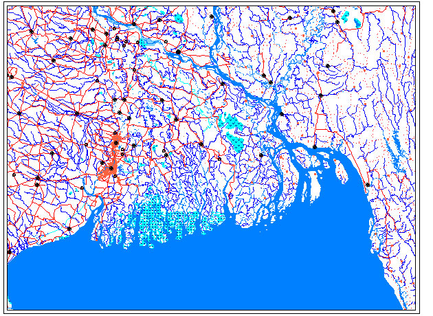
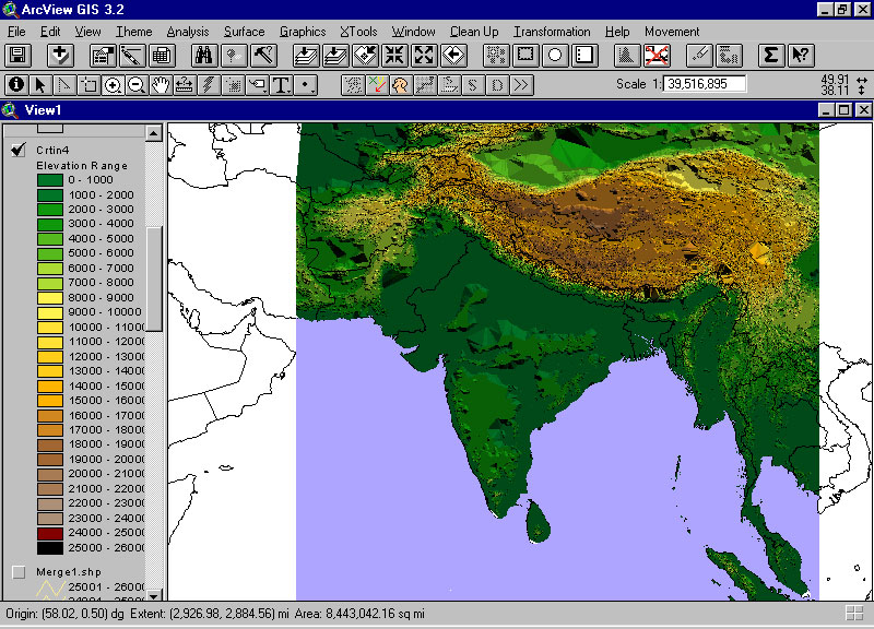
Bringing in new maps that are already in electronic format--the Digital
Chart of the World (DCW) as an example. These maps show an unusual
amount of detail. The information is gathered from various aerial
surveys. There is information on the web and the capability to generate
DCW maps on the web (look in any search engine or web guide). A few
DCW maps made in Atlas GIS are linked below.
-
DCW maps can be brought from Atlas to ArcView (as can other maps using
a conversion package available on the ESRI website, www.esri.com).
The reason to convert the maps is to use the extra computing capability
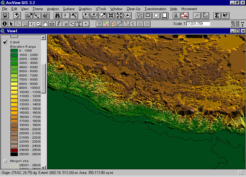
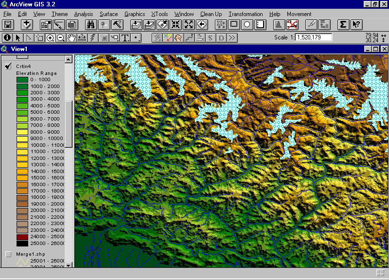
of ArcView. Some contour maps (contour interval of 1000 feet) are
converted to Triangulated Irregular Networks using ArcView. Samples
are shown below.
-
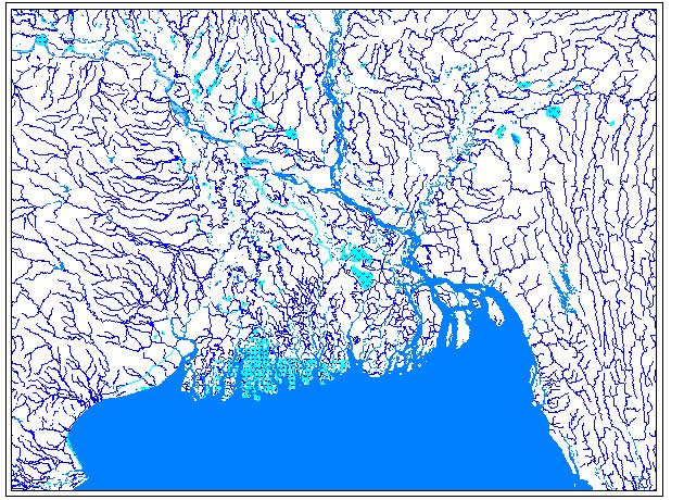
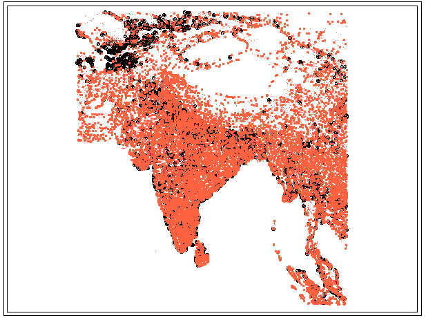
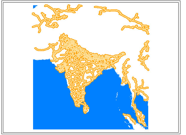
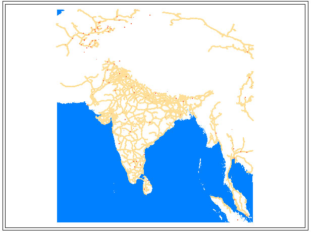
South Asia, contours, 1000 foot contour interval
(DCW).
-
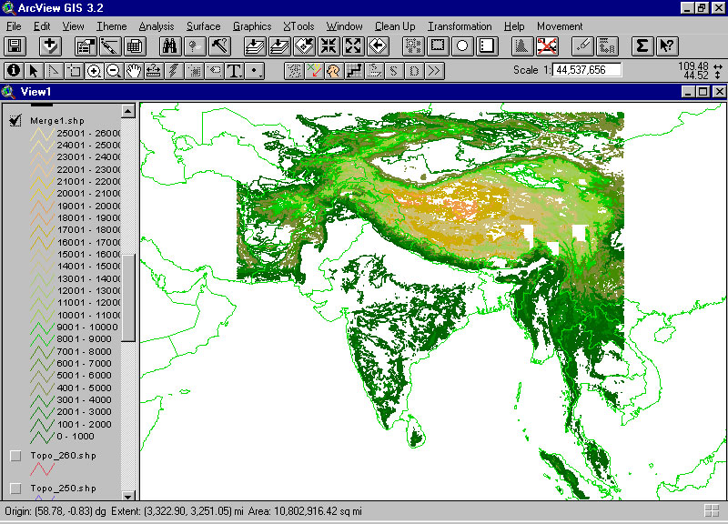
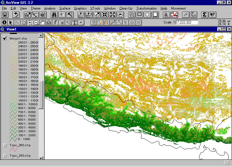
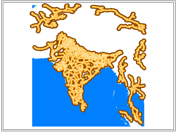
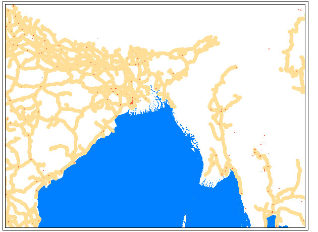
South Asia, triangulated irregular network (TIN); each point is joined
to nearby points to create triangular facets that suggest relief.
-
Bringing in new maps that are not already in electronic format
-
Heads-up, or on-screen, digitizing (drawing of maps)
-
Freehand drawing
Click on the drawing tool button on its lower
right-hand corner; this action will expose a drop-down list of tools.
Choose the zigzag line (click on it). Now move the cursor over into
the map and click and draw. This new polygon
can be made into a layer of its own and can have data associated with it.
With such procedure done, then we are once again reduced to the state of
simply manipulating onboard maps and data.
-
Tracing using a transparency (the "harsh environment" approach to digitizing)
Imagine that you have a photocopy on a transparency of what you
would like to draw on the map. Tape the transparency to the screen
and use the cursor and the drawing tools above to trace the transparency
from the underneath side.
-
Tracing using a scanned (raster) image (made up of pixels--little squares)
underlay or an aerial photo. Here the problem is usually to get the
image to "register" properly with the map. Knowing the projection
of both is very useful in this regard so that the image and the map line
up correctly.
There are extensions or plug-ins to software that allow one to use
a raster image as a backdrop behind a vector (made of mathematical points)
map and to draw on the map.
-
Digitizing using a digitizer--a substantial piece of equipment that
gets plugged into the computer to mimic a computerized drafting table.
Trace on the table underlain with fine wires and the information gets sent
to the computer to which the digitizer is attached. Digitizers are
particularly useful for maps that are too large to scan (physically cutting
a map removes part of it). In any digitizing there are tradeoffs
between file size and curvature fidelity.
-
Global Positioning System (GPS) and satellite technology offer exciting,
but perhaps expensive, sources for input.
|
USING GIS MAPS
-
Within a GIS.
-
One way to use them is to analyze them further WITHIN the GIS.
Analysis of information using buffers. Buffers are but one analytic
tool; ArcView has a whole host onboard.
Good ideas endure, despite technology change (reference Mark Jefferson's
work on "The Civilizing Rails"; link (from
www.imagenet.org) to a reference about Jefferson's work). The buffers
can then be used in conjunction with other information. How many
major
populated places lie within the 10 mile buffer?
Close-up
view. Imagine using census data, by household to calculate, for
example, how many households of one type or another lie within 50 km. of
a hazardous waste site. Often the analytic capabilities are limited
(mostly) by data availability.
-
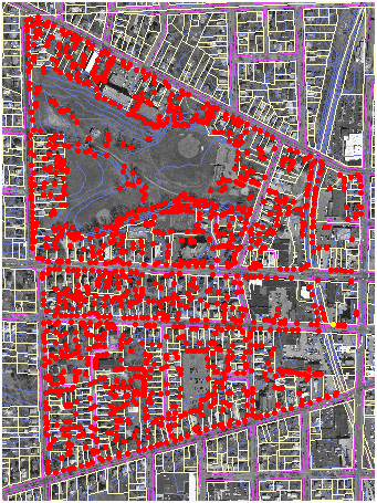
Use them in conjunction with remotely-sensed data (for example, counting
the number of trees along a street (work of Katya
Podsiadlo in NRE530, Fall, 1999, University of Michigan, School of Natural
Resources and Environment, employing City of Ann Arbor maps and aerial
photos--so that a city might have a count used in assessing developers
funds to put in a street-tree escrow).
-
Outside a GIS.
-
To get copies of GIS maps for use elsewhere:
-
Use the Windows-universal command, Alt+PrntScrn, to take what is on
the screen, put it on the Windows clipboard, and paste it into other applications.
-
Use the "save as" or "export" or "copying" capability of the GIS itself
to make static maps that can be opened as images in other applications
(sometimes, though, these capabilities that are internal to the GIS itself
are not all that one might wish for; one example is in exporting images
from ArcView that have patterns with transparent backgrounds--in this case
it is better to use the command above).
-
Using GIS images elsewhere.
-
Adobe PhotoShop or other editor to create .gif or .jpg image from GIS
maps. Go to File|New to open a blank canvas. Then use Ctrl+v
to paste in the content of the Windows clipboard.
-
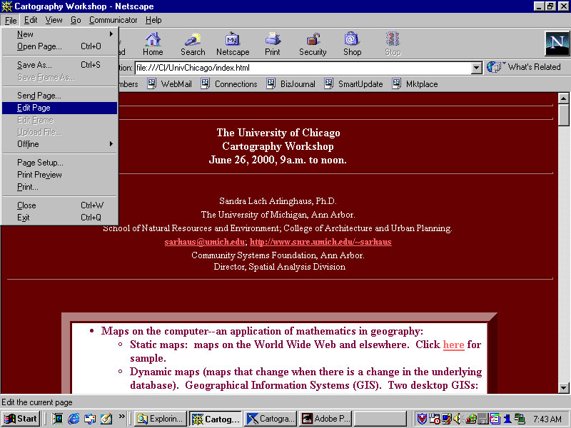
Web pages--create a simple one using Netscape. Open any site using
a recent version of Netscape. Then, go to File|Edit
Page. Then, edit the page, much as you would in a word processor,
save it, and talk to your local tech people to find out how to put it up
on the web.
-
Clickable maps. Take a map at a broad scale and link to it close-ups
of regional maps, photos, or images of spreadsheets. Link more to
each of these. A clickable map is a sort of spatial table of content
to a broad range of graphic displays. Here is a sample
made by Jennifer Rennicks in NRE530, Fall, 1999 (click on the Cockscomb
Basin Wildlife Sanctuary in the map).
-
Animated maps
-
Link to an article about animated maps, from
the site: http://www.imagenet.org. Animated maps can be quite useful
in tracking diffusion or spatial change over time.
-
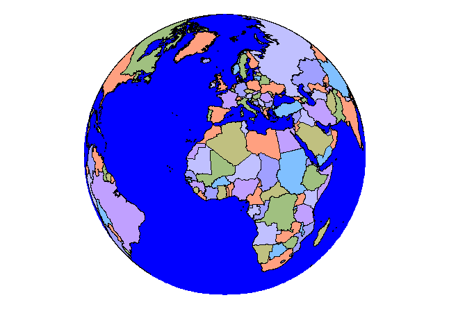
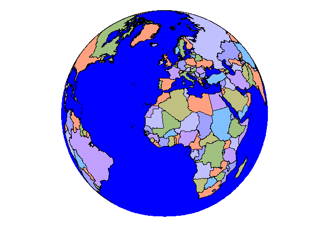
In ArcView, project the map of the world to the orthographic (world
from space) view. This map can be customized to be centered on various
longitude values. Save these views as .gif images in PhotoShop.
Assemble them in a .gif animator such as Gamani Movie Gear.
-
Useful in creating your own images to go with explanations, in Word
for example, of how to use software (as above with the images of ArcView
and Atlas GIS).
|
Resource CD. This
CD includes a wide variety of maps. Some, such as the files in the
GIS Maps folder, contain subnational boundaries by country and are suitable
for use as base maps. Others are simply images that may be useful
as a base for a clickable map or for insertion into a Word document.
Yet others are files that can be loaded into ArcView. This CD is
distributed by the author free of charge and neither it, nor any of its
files, are to be sold.
A few hard copy references are listed below.
Some are classical, some are contemporary. Most authors have written
a number of books on cartography. These few are offered as entry
points to the literature at various time periods.
Jefferson, Mark. The civilizing rails. Economic
Geography, 1928, 4, 217-231.
Raisz, Erwin. General Cartography.
New York: McGraw-Hill, 1938 (and later by various publishers).
Robinson, Arthur H. Elements of Cartography.
New York: John Wiley and Sons, 1953 (and later; some recent versions
with multiple authors).
Greenhood, David. Mapping.
Chicago: University of Chicago Press, 1964.
Robinson, Arthur H. Early Thematic
Mapping in the History of Cartography. Chicago: University
of Chicago Press, 1982.
Harley, J. B. and Woodward, David. The
History of Cartography (multiple volumes). Chicago: University
of Chicago Press, 1987.
Snyder, John P. Flattening the Earth:
Two Thousand Years of Map Projections. Chicago: University
of Chicago Press, 1993.
Sobel, Dava and Andrews, William J. H. The
Longitude. New York: Walker and Company, 1995.
Monmonier, Mark S. and de Blij, Harm, How
to Lie with Maps, 2nd Edition. Chicago: University of Chicago
Press, 1996.
Puu, Tonu, Mathematical Location and
Land Use Theory. Berlin and New York: Springer Verlag,
1997.