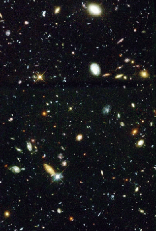
 Check out the home page of the Las Campanas Redshift Survey:
Las Campanas Survey . Can you spell out in a few well-chosen words the
nature of this project? What is the goal, and what are the techniques? In
particular, why survey the Universe in "slices"? Why not survey an entire
sphere of galaxies centered on the Earth?
Check out the home page of the Las Campanas Redshift Survey:
Las Campanas Survey . Can you spell out in a few well-chosen words the
nature of this project? What is the goal, and what are the techniques? In
particular, why survey the Universe in "slices"? Why not survey an entire
sphere of galaxies centered on the Earth? If rich clusters of galaxies contain 1000 galaxies each, and such clusters are 50 million light years apart, how many galaxies lie within a billion light years? If each galaxy needed a 5 minute exposure to get a spectrum, how long would a survey of this volume take? Can you put that in (pre)historical perspective?
How does this compare with the older CFA (Center for Astrophysics, Harvard) survey -- see CFA Survey , and how does it compare with the SDSS (Sloan Digital Sky Survey) -- see Sloan Survey ?
The Las Campanas Redshift survey is located on a disk accessible to your MAC.
Start MATLAB, and add the path to the data by typing at the command line:
addpath('YOUR-PATH')
Once you start, as each slice is plotted, the program will pause to let
you see what has been added -- press the ENTER key to get the next data. As
each slice is added, think about how it appears to relate to the previous
one! Ready? OK. Activate a script that will help you explore the data by
typing
vizlcrs
Once all six slices have been displayed, you might want to increase the
window size by dragging the lower right corner. On the face of it, there
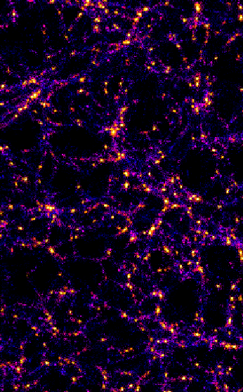
are two pizza-wedge shaped regions of the Universe explored by these data.
So why bother with six slices? Use the mouse to rotate the image.
Try rotating the image so that you first see the slices made North of our Galaxy's disk (red, green and blue) almost edge on, and then do the same for the slices South of our Galaxy's disk (magenta, cyan and black). Why is it valuable for a survey to have some slices close together, but others far separated?
Now rotate the image so that you see one or other set of slices almost face on. It does not matter which slice you look at -- there are way fewer galaxies far from the apex (that's where we are!) than near by. Does it really seem likely that the density of galaxies is less far from our own?
You will notice that you have been prompted to specify a particular slice to explore in more detail; pick any one by specifying the color -- red, green, blue, cyan, magenta or black. The image has been oriented so that you see the slice face on. Visually select a region of interest; click on the "Zoom In" button on the plot control bar, and select your chosen region by using the mouse to draw a rubber-band frame around it. How would you describe the structure that you see? Compare this to a sponge and to a raisin muffin -- what is the difference between a journey from any fiber of sponge to any other fiber of sponge on the one hand, and from raisin to raisin on the other? Click on the "Zoom Out" button, and then click any where within the plot, repeatedly until you have the original image. Try exploring another region; in general terms, is the structure the same?
Using the technique just described, zoom in on a region -- not too small -- pick a significant portion of the region dense with galaxies near to the apex. Find an empty region, place the mouse there and continue to click, to zoom in on that region, stopping when you feel you have isolated a single "bubble". This a a void -- the equivalent of the air in a sponge, encompassed by the sheets and filaments of the sponge itself. The axes are velocity of recession in km/s. Can you use a value of the Hubble constant -- say 70 km/s/Mpc to estimate a size for the void? Try this at several other locations; what is the average size of the voids you have explored? How does this compare with the size of our Local Group of galaxies, the distance to the Virgo cluster, and the size of the Local Supercluster?
Zoom back out so that you can again see the whole slice. Try to identify the largest single structure that you can. Rubber-band frame it and zoom in: how confident are you that this really is a single structure, and not just a chance alignment of galaxies? Using the same approach as you adopted for the voids, estimate the size of this structure, and some others, to get an idea of the typical size of sheets and filaments in our Universe.
Zoom in on structure near to the apex. Can you identify any small chains of galaxies that appear to point towards the apex? These are the so-called "fingers of god". Can you explain these? Hint: remember that we are plotting speed of recession; what is the difference in speed between those galaxies closest to the apex and those furthest from the apex in one of these chains? How does that compare with the speed with which galaxies move around in a cluster?
Pick a few other slices, and see to what extent you can see the same features on these. You can finish this exercise by pressing the ENTER key, rather than typing a slice color.
 You will use output from the N-body Cosmology code called GADGET written by Volker
Springel at the Max-Planck Institute, Garching, Germany, to simulate the
creation of structure in the Universe.
You will use output from the N-body Cosmology code called GADGET written by Volker
Springel at the Max-Planck Institute, Garching, Germany, to simulate the
creation of structure in the Universe.
The program starts with a box millions of light years on a side, with a random spread of matter in it -- represented by a random sprinkling of points. As each pulls on the other, structure starts to form, and eventually the initially random points form sheets and filaments.
There are two sets of simulations, one in which structure forms in a static Universe -- not expanding -- and another, in which the Universe expands as the simulation progresses. (In the latter case, the volume shown increases with time to encompass the expanded region.) In each case, there are 5 snaphots, 000, 001, 002, 003 and 004. In the static case, each snaphot follows the previous one by the same time increment; as the Universe is not expanding in this case, the actual time interval does not matter. In the expanding case, the time intervals after 000 are 0.1009, 0.117, 0.166, and 0.285, and the redshift z is related to this time by t=1/(1+z).
Tell MATLAB the location of the material, and activate the plotting
program by typing
addpath('YOUR-PATH')
vizgadget
You will be prompted to indicate which data set you wish to explore,
and which time slice of that data set to look at. First explore "static",
then "comoving", in response to the first prompt and then the sequence of
timeslices (000-004) in response to the second prompt.
The key points about the exploration are