site analysis & critique

www.xvideos.com is a free video sharing website that allows users to watch and upload pornographic videos. The site intends to provide internet users with access to pornographic content and pornography producers a place to distribute their videos. The goal of the site is to provide a pornographic experience and make money off of ads and memberships. Users do not need to pay for a membership to access content on xvideos, though they will be subject to ads, I think exclusively for other porn sites.
The intent translates pretty directly to the real uses of the work, though there are some flaws:
_the site contains a large variety of content, and it is not easily filtered by users, thus the experience is difficult to tailor for each individual.
_upon entering the site, the user faces a bombardment of visual information, and it is not clear how to navigate through it.
_for the above reasons, experience with the site could be potentially uncomfortable or triggering, thus the site is not safe or accessible for all people who would like to watch porn for free
What could be better:
_in order for the site to provide a comfortable, safe, and enjoyable experience for all users
_a more layered and filtered experience
_organizing and limiting the visual information on each page will help synthesize navigation
_validation of site with better design
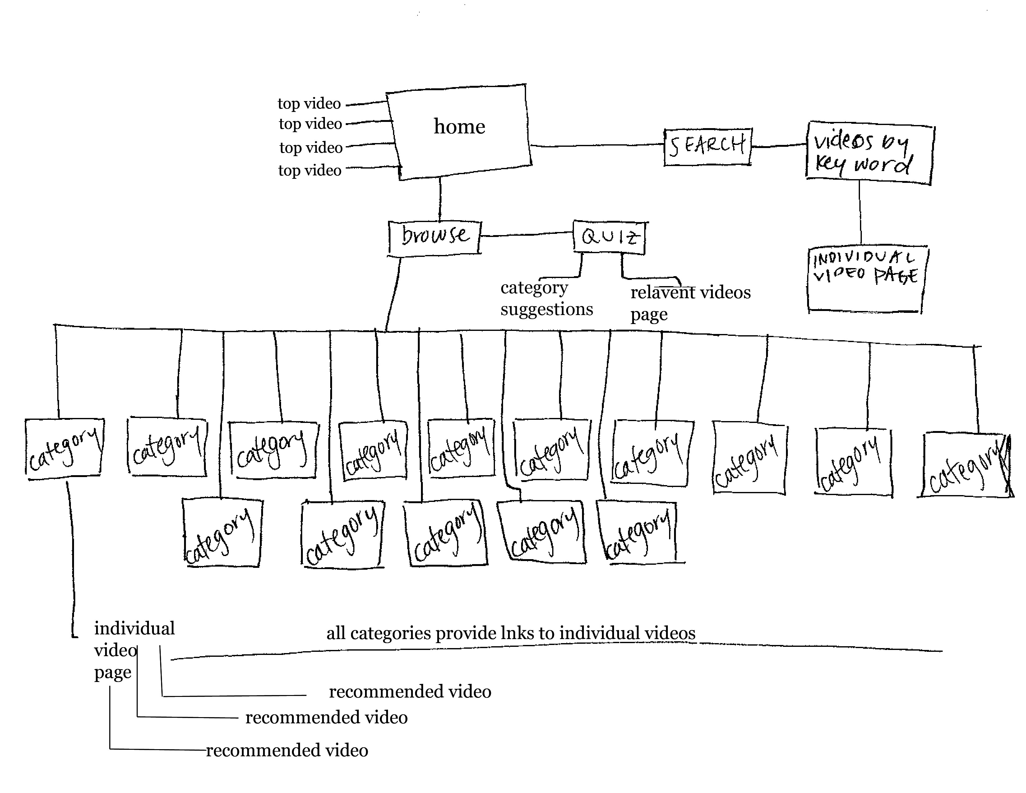
proposed site map
proposed design
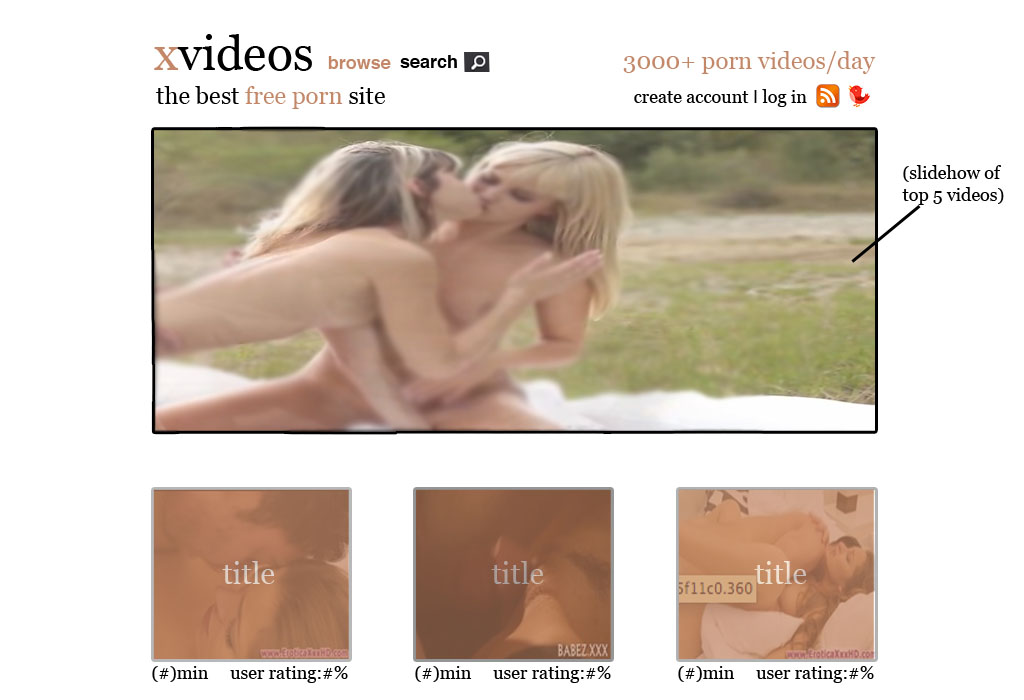
home page
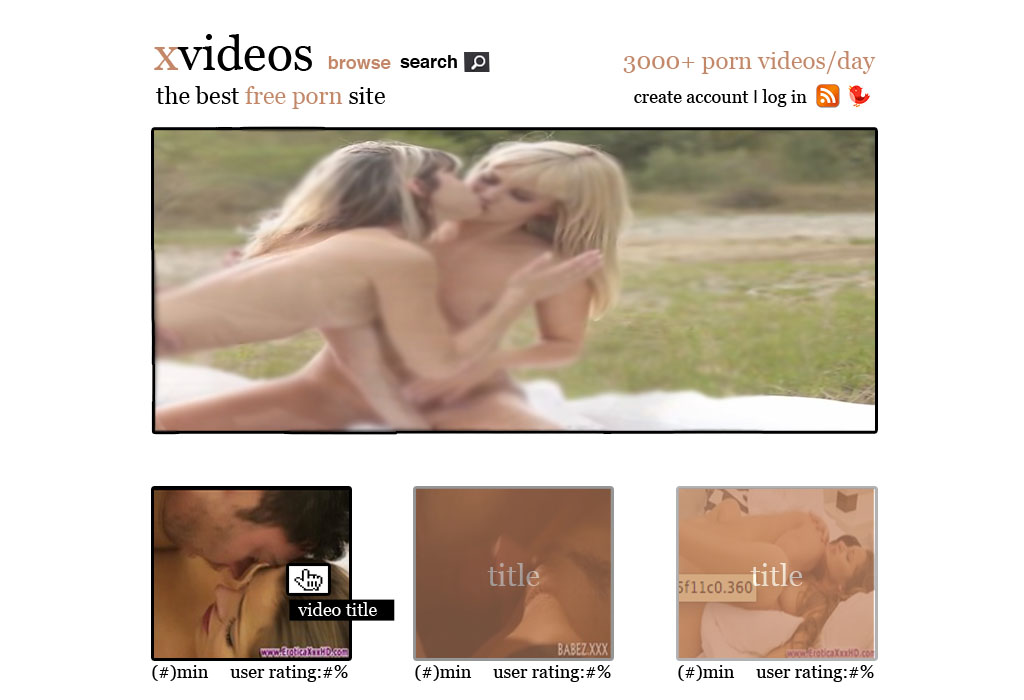
hovering over images will remove opaque filter and show full title under cursor
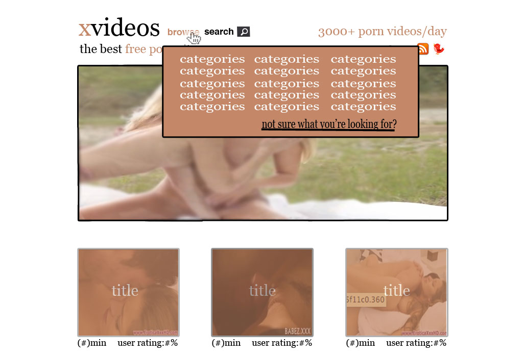
hovering over browse button will provide a list of categories and a link to taste evaluation quiz
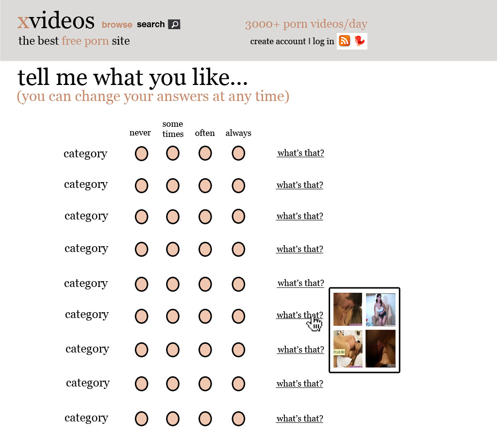
this survey generates an idea of what kind of content users may be interested in. hovering over "what's this?" will provide gifs that describe the characteristics of that category
mobile version:

mobile home page
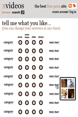
mobile quiz page