Chapter 4 Descriptive Plots
This chapter presents several descriptive plots of the raw data. No statistical analyses, no standard errors, no parameters to estimate, no hypotheses to test. Just raw data presented in different forms to gain insight into the patterns that are in the data. I’ll create a few plots at the world level, and then switch to the state and county levels for US data. You are free to take my code and edit it to produce additional plots for other countries and their states or provinces. Throughout these notes I’ll focus on the counts and rates of positive tests. I’ll defer death counts until the chapter on process models.
As stated in a few places in these notes, we need to be careful about how we interpret raw counts. Some countries and US states test more frequently and thus may see higher counts because they do more testing. Countries and states vary in population size so even if two units have the same testing rate but differ in population size they may have different counts that could give rise to differences in observed counts all other things being equal. Counts can vary across countries or states because decisions about who is tested may vary, the quality of the tests may vary across units, and countless other differences that make it difficult to generate clear explanations for patterns we may see in the raw counts. Moving to other variables such as the number of deaths doesn’t completely solve the problem either because, among other things, countries and states may vary in how they count deaths (e.g., death in a hospital, death among people who tested positive vs. deaths that are “presumed to be covid-19 related”).
4.1 World Map
Here is world map representing covid counts across countries. I used code copied from here and make use of the datacov.World file I created in the previous chapter from the Johns Hopkins git repository.
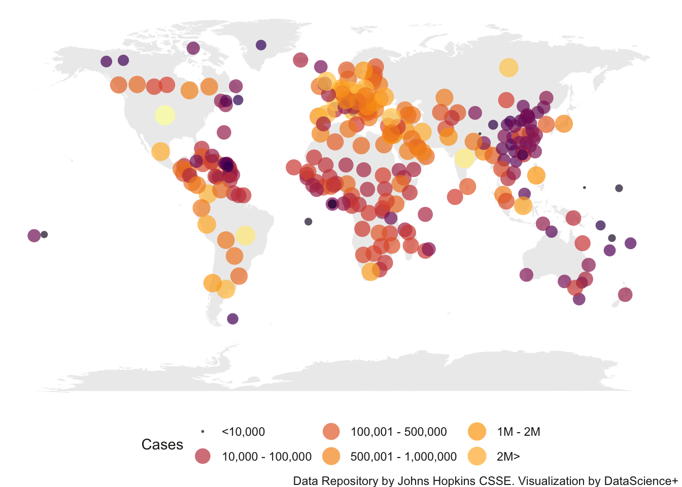
You’ll notice that some countries like Canada, UK, Australia have multiple points but most countries are represented by only 1 point. This is because the data set we are using has some inconsistencies in reporting either country totals or state/province totals. This would require further cleaning (e.g., computing country totals for those countries) but I left this in here as a teaching moment of how one needs to be careful working with data sets and consistently double check your assumptions about the structure of the data you are using. The data structure may be updated so one needs to monitor it carefully.
Even more sophisticated is the interactive map developed at Johns Hopkins (same group that provides the key data we downloaded in Chapter 3), where you can zoom the map in and out, click on different countries (left panel) and see data for that country on the right panel. A small interactive display of that website is displayed below.
4.1.1 World Map with Time Animation
I’ll expand this example with some of my code to create an animation so we can see the total cases in the world map change by day.
##
Frame 1 (1%)
Frame 2 (2%)
Frame 3 (3%)
Frame 4 (4%)
Frame 5 (5%)
Frame 6 (6%)
Frame 7 (7%)
Frame 8 (8%)
Frame 9 (9%)
Frame 10 (10%)
Frame 11 (11%)
Frame 12 (12%)
Frame 13 (13%)
Frame 14 (14%)
Frame 15 (15%)
Frame 16 (16%)
Frame 17 (17%)
Frame 18 (18%)
Frame 19 (19%)
Frame 20 (20%)
Frame 21 (21%)
Frame 22 (22%)
Frame 23 (23%)
Frame 24 (24%)
Frame 25 (25%)
Frame 26 (26%)
Frame 27 (27%)
Frame 28 (28%)
Frame 29 (29%)
Frame 30 (30%)
Frame 31 (31%)
Frame 32 (32%)
Frame 33 (33%)
Frame 34 (34%)
Frame 35 (35%)
Frame 36 (36%)
Frame 37 (37%)
Frame 38 (38%)
Frame 39 (39%)
Frame 40 (40%)
Frame 41 (41%)
Frame 42 (42%)
Frame 43 (43%)
Frame 44 (44%)
Frame 45 (45%)
Frame 46 (46%)
Frame 47 (47%)
Frame 48 (48%)
Frame 49 (49%)
Frame 50 (50%)
Frame 51 (51%)
Frame 52 (52%)
Frame 53 (53%)
Frame 54 (54%)
Frame 55 (55%)
Frame 56 (56%)
Frame 57 (57%)
Frame 58 (58%)
Frame 59 (59%)
Frame 60 (60%)
Frame 61 (61%)
Frame 62 (62%)
Frame 63 (63%)
Frame 64 (64%)
Frame 65 (65%)
Frame 66 (66%)
Frame 67 (67%)
Frame 68 (68%)
Frame 69 (69%)
Frame 70 (70%)
Frame 71 (71%)
Frame 72 (72%)
Frame 73 (73%)
Frame 74 (74%)
Frame 75 (75%)
Frame 76 (76%)
Frame 77 (77%)
Frame 78 (78%)
Frame 79 (79%)
Frame 80 (80%)
Frame 81 (81%)
Frame 82 (82%)
Frame 83 (83%)
Frame 84 (84%)
Frame 85 (85%)
Frame 86 (86%)
Frame 87 (87%)
Frame 88 (88%)
Frame 89 (89%)
Frame 90 (90%)
Frame 91 (91%)
Frame 92 (92%)
Frame 93 (93%)
Frame 94 (94%)
Frame 95 (95%)
Frame 96 (96%)
Frame 97 (97%)
Frame 98 (98%)
Frame 99 (99%)
Frame 100 (100%)
## Finalizing encoding... done!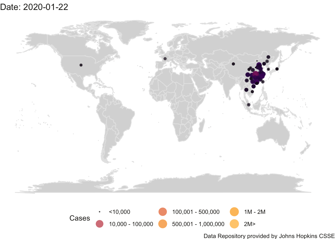
(#fig:world.animhtml)World Count of Positive Cases
While counts are useful (see the Introduction for a discussion of London’s cholera epidemic) they have their limitations. The help address issues with different countries having different populations, it is common to normalize counts by the population and report numbers per capita (e.g., 62 cases out of 100,000). One would have to track down the populations of each country, download the relevant population data using methods described in Chapter 3 and merge that population information into this animation. Later in this chapter, I develop the analogous animation for the US and I because already downloaded the state populations so will illustrate the difference in this animation in counts versus per capita However, raw counts still have a role in helping to inform the impact of covid-19. If a city has 1500 available hospital beds (and presumably the staff and supplies to provide care for those beds), but there are 2000 people in need of hospitalization, then there is a public health issue and the ’per capita" concern becomes moot.
Personally, I do not like this type of representation where points are overlayed on a map and the color of the point is used to represent a variable such as case counts. I’ll show some alternatives later in this chapter when we switch to the US data sets. For more information on working with maps see Gimond.
4.2 Compare World Counts to US
It would be helpful to see the cumulative pattern of the world confirmed covid-19 cases since the beginning of the pandemic relative to the cumulative US counts. I’ll create a subset of the datacov data.frame that includes just the 50 states. I dropped Washington DC and the US territories for this analysis.
It is helpful to place a horizontal line in the cumulative US plot that corresponds to the US fraction of the world population. If covid-19 cases were randomly distributed throughout the world, we would expect a country to have a fraction of cases consistent with the fraction of that country’s population relative to the world population. The US is not doing well as our total number of cases are far above the red line that corresponds to the proportion of cases we would expect given our fraction of the global population. Of course, we don’t know how well other countries are reporting their positive cases, how many tests they have administered, and other relevant information, but this descriptive plot suggests the rate of positive cases may be greater than expected so more investigation is needed.
To put this another way, as of mid November 2020 there are about 60M world-wide cases in a world population of 7.8 billion, the world-wide percentage of positive cases is less than 1%. But in the US with about 12M cases in a population of 330 million, the US percentage of positive cases is over 3.5%.

4.3 US State-Level Plots
I decided to plot the percentage of cases (i.e., counts/population * 100). I’ve seen people report this as cases per 100,000, but I decided to stick with cases per 100 to maintain the percentage interpretation. This is just a scale issue and doesn’t affect the plots or the analyses. It is a scaling issue analogous to measuring in feet vs meters. The labels in the plots, like “7.5 WA,” mean Washington state with a population of 7.5 million.
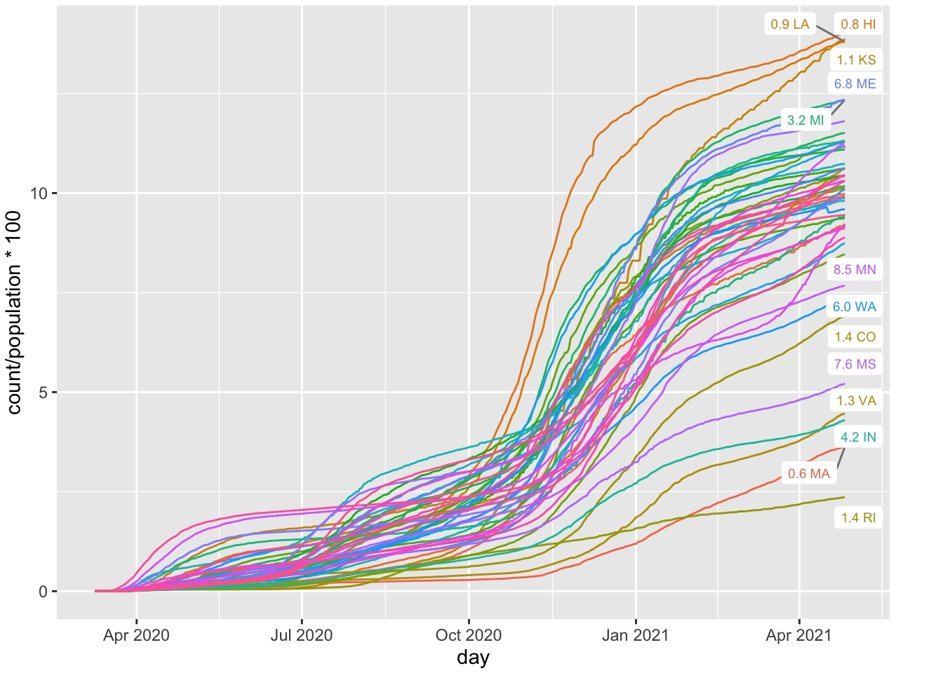
FIGURE 4.1: Per Cap Positive Cases by State
The graph shows a few features documenting what has happened in the US. There are three sets of curves representing three different regions in the US. Initially, the cases where high in the northeast and the west coast (e.g., New York, New Jersey, Washington, California). This shows up as a set of curves that shot up in April. Then, in the summer we started to see cases in the south (e.g., Florida and Texas) and this shows up as a second set of curves that shot up in July. Then, there is a third set of states, primarily in the midwest, that had increases in the fall (e.g., Wisconsin, Iowa, North Dakota, South Dakota), and this shows up as a set of curves that spike in Oct and November.
Let’s take the same plot but rescale the vertical axis on the log (base 10) scale. An exponential process becomes linear when taking logs so we would expect to see a pattern that closely resembles straight lines if the count of confirmed cases follows an exponential form. Each state can have a different growth rate, which will show up as different slopes, and different starting points, which will show up as different intercepts.
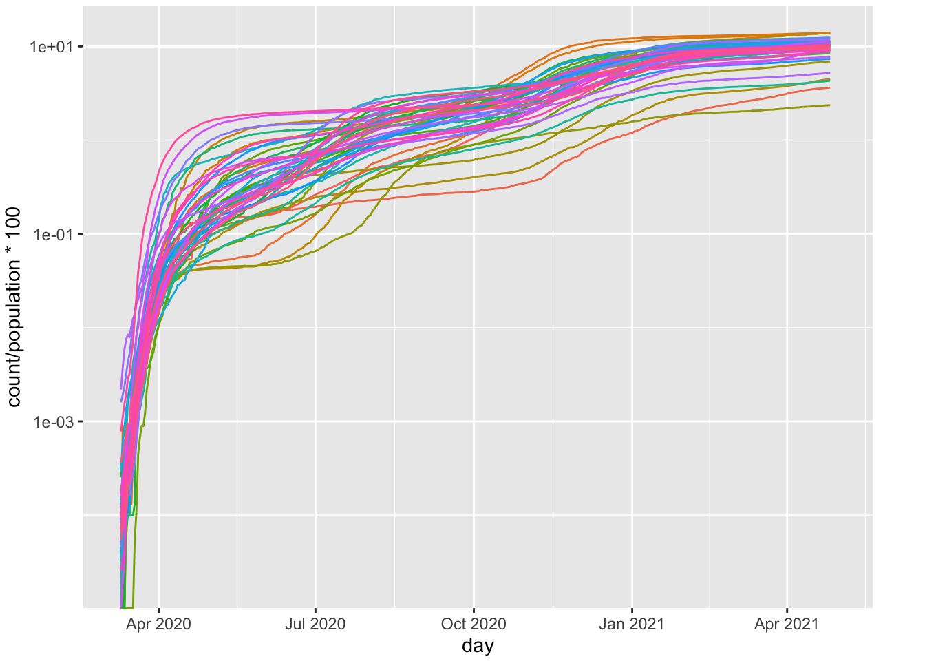
FIGURE 4.2: Per Cap Positive Cases by State (log10 scale)
West Virginia (WV) did not show its first case until 3/17/20 so that is why there is a green curve that has 0 until mid March before shooting up.
A straight line does not appear to approximate the pattern, which implies that these data do not follow an exponential form It may be that exponential growth characterizes the early days of a pandemic and not many months of data, which may include multiple waves. One can even see violations of a straight line just a couple of weeks into the pandemic so it doesn’t seem that Covid-19 follows an exponential form. I will return to this issue in the next chapter where I fit the exponential function directly to the data, examine some diagnostics, and consider some alternative functional forms.
But let’s continue with this descriptive plot to illustrate some additional features. one may wonder whether the curves vary by states with different populations. I partitioned the 50 states by population (sample sizes in each panel, yielding 12 or 13 states per panel). The states with larger populations (two lower panels) show roughly the same pattern as states with smaller population sizes (the two upper panels), except for the three clusters that we identified in the earlier version of this plot.
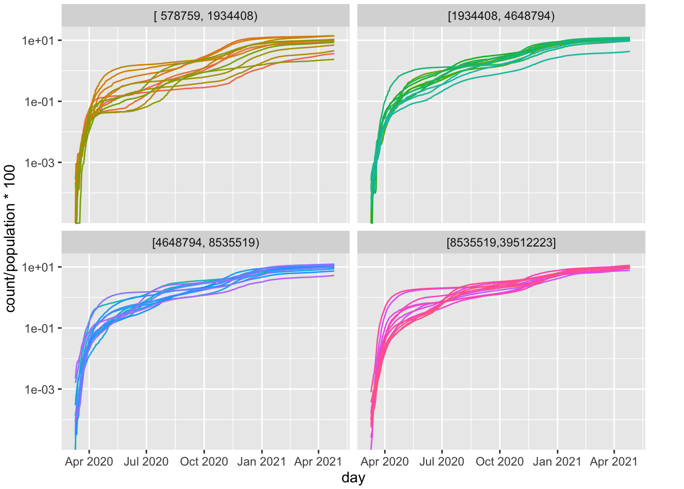
FIGURE 4.3: Per Cap Positive Cases by State (log10 scale); Panels are based on Population
I want to make a further improvement in this plot where I set 0 to missing value (NA) so that the curves begin where there are nonzero points. This modification to the plot makes it easier to detect linearity as we don’t have the artificial jump in the curve from 0. But, while it makes the plots a little easier to understand, it drops the important information about liftoff, the point at which the count moves from zero to nonzero. This is something that could be modeled with a parameter in the structural model that I will develop in later chapters and so, in principle, one could examine which variables affect the liftoff (in other words, which states started showing cases earlier and which started showing cases later). Another issue is that log(0) is undefined so to avoid 0s you’ll see some websites and research papers showing such graphs requiring a minimum number of cases (e.g., the day at which the state reached 10 cases) before they start plotting the curve for that state. In the spirit of transparency one should report all these graphing decisions and ideally provide the code that produced the figures provided in a paper. Actually, complete reporting would include not only the code that produced the figure but also all relevant code—the code that downloaded the data, the code that put the data in the format needed to produce the figure or table, the code to produce the figure.
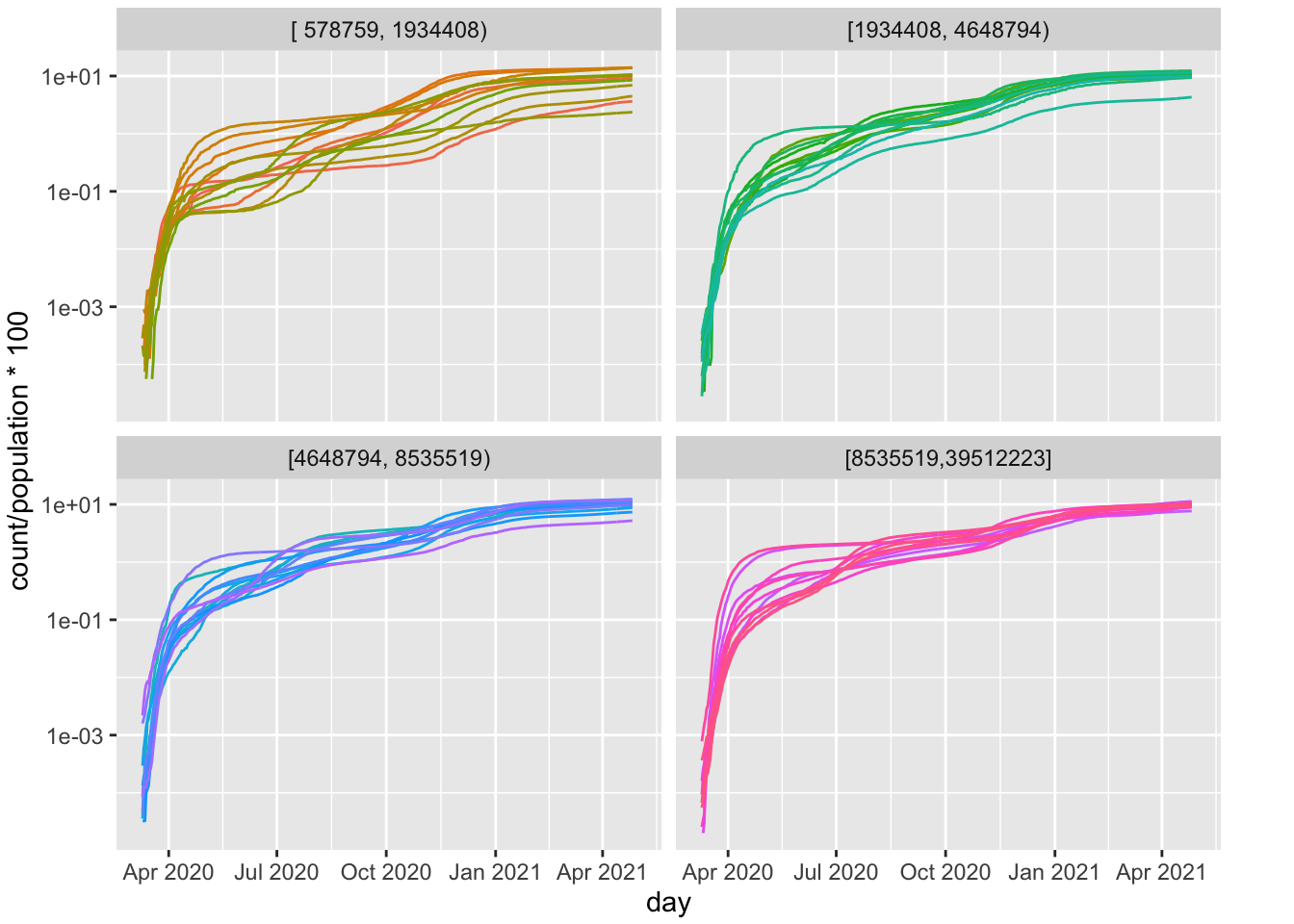
FIGURE 4.4: Per Cap Positive Cases by State (log10 scale); Panels are based on Population; Os dropped
This pattern is remarkable. The states appear to have similar slopes on this log plot. They vary in intercept, but that reflects when the state started reporting positive cases. It seems states are on a similar growth trajectory, but some states are further along (higher intercepts) than other states.
4.3.1 Animated Map of US
Here is the animation of the US. This map needs work as Alaska and Hawaii outlines are not printed (their data points appear on the left side roughly where the states would be on the map). I’ll need to do some coding to create an inset for Alaska and Hawaii.
##
Frame 1 (1%)
Frame 2 (2%)
Frame 3 (3%)
Frame 4 (4%)
Frame 5 (5%)
Frame 6 (6%)
Frame 7 (7%)
Frame 8 (8%)
Frame 9 (9%)
Frame 10 (10%)
Frame 11 (11%)
Frame 12 (12%)
Frame 13 (13%)
Frame 14 (14%)
Frame 15 (15%)
Frame 16 (16%)
Frame 17 (17%)
Frame 18 (18%)
Frame 19 (19%)
Frame 20 (20%)
Frame 21 (21%)
Frame 22 (22%)
Frame 23 (23%)
Frame 24 (24%)
Frame 25 (25%)
Frame 26 (26%)
Frame 27 (27%)
Frame 28 (28%)
Frame 29 (29%)
Frame 30 (30%)
Frame 31 (31%)
Frame 32 (32%)
Frame 33 (33%)
Frame 34 (34%)
Frame 35 (35%)
Frame 36 (36%)
Frame 37 (37%)
Frame 38 (38%)
Frame 39 (39%)
Frame 40 (40%)
Frame 41 (41%)
Frame 42 (42%)
Frame 43 (43%)
Frame 44 (44%)
Frame 45 (45%)
Frame 46 (46%)
Frame 47 (47%)
Frame 48 (48%)
Frame 49 (49%)
Frame 50 (50%)
Frame 51 (51%)
Frame 52 (52%)
Frame 53 (53%)
Frame 54 (54%)
Frame 55 (55%)
Frame 56 (56%)
Frame 57 (57%)
Frame 58 (58%)
Frame 59 (59%)
Frame 60 (60%)
Frame 61 (61%)
Frame 62 (62%)
Frame 63 (63%)
Frame 64 (64%)
Frame 65 (65%)
Frame 66 (66%)
Frame 67 (67%)
Frame 68 (68%)
Frame 69 (69%)
Frame 70 (70%)
Frame 71 (71%)
Frame 72 (72%)
Frame 73 (73%)
Frame 74 (74%)
Frame 75 (75%)
Frame 76 (76%)
Frame 77 (77%)
Frame 78 (78%)
Frame 79 (79%)
Frame 80 (80%)
Frame 81 (81%)
Frame 82 (82%)
Frame 83 (83%)
Frame 84 (84%)
Frame 85 (85%)
Frame 86 (86%)
Frame 87 (87%)
Frame 88 (88%)
Frame 89 (89%)
Frame 90 (90%)
Frame 91 (91%)
Frame 92 (92%)
Frame 93 (93%)
Frame 94 (94%)
Frame 95 (95%)
Frame 96 (96%)
Frame 97 (97%)
Frame 98 (98%)
Frame 99 (99%)
Frame 100 (100%)
## Finalizing encoding... done!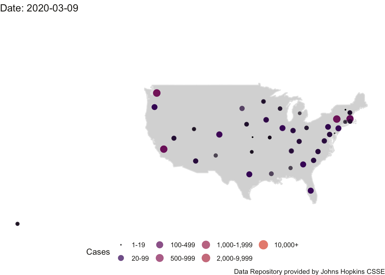
FIGURE 4.5: US Count of Positive Cases
Because I have the state-level population sizes I can redo the animation using a per capita normalization out of 100.
##
Frame 1 (1%)
Frame 2 (2%)
Frame 3 (3%)
Frame 4 (4%)
Frame 5 (5%)
Frame 6 (6%)
Frame 7 (7%)
Frame 8 (8%)
Frame 9 (9%)
Frame 10 (10%)
Frame 11 (11%)
Frame 12 (12%)
Frame 13 (13%)
Frame 14 (14%)
Frame 15 (15%)
Frame 16 (16%)
Frame 17 (17%)
Frame 18 (18%)
Frame 19 (19%)
Frame 20 (20%)
Frame 21 (21%)
Frame 22 (22%)
Frame 23 (23%)
Frame 24 (24%)
Frame 25 (25%)
Frame 26 (26%)
Frame 27 (27%)
Frame 28 (28%)
Frame 29 (29%)
Frame 30 (30%)
Frame 31 (31%)
Frame 32 (32%)
Frame 33 (33%)
Frame 34 (34%)
Frame 35 (35%)
Frame 36 (36%)
Frame 37 (37%)
Frame 38 (38%)
Frame 39 (39%)
Frame 40 (40%)
Frame 41 (41%)
Frame 42 (42%)
Frame 43 (43%)
Frame 44 (44%)
Frame 45 (45%)
Frame 46 (46%)
Frame 47 (47%)
Frame 48 (48%)
Frame 49 (49%)
Frame 50 (50%)
Frame 51 (51%)
Frame 52 (52%)
Frame 53 (53%)
Frame 54 (54%)
Frame 55 (55%)
Frame 56 (56%)
Frame 57 (57%)
Frame 58 (58%)
Frame 59 (59%)
Frame 60 (60%)
Frame 61 (61%)
Frame 62 (62%)
Frame 63 (63%)
Frame 64 (64%)
Frame 65 (65%)
Frame 66 (66%)
Frame 67 (67%)
Frame 68 (68%)
Frame 69 (69%)
Frame 70 (70%)
Frame 71 (71%)
Frame 72 (72%)
Frame 73 (73%)
Frame 74 (74%)
Frame 75 (75%)
Frame 76 (76%)
Frame 77 (77%)
Frame 78 (78%)
Frame 79 (79%)
Frame 80 (80%)
Frame 81 (81%)
Frame 82 (82%)
Frame 83 (83%)
Frame 84 (84%)
Frame 85 (85%)
Frame 86 (86%)
Frame 87 (87%)
Frame 88 (88%)
Frame 89 (89%)
Frame 90 (90%)
Frame 91 (91%)
Frame 92 (92%)
Frame 93 (93%)
Frame 94 (94%)
Frame 95 (95%)
Frame 96 (96%)
Frame 97 (97%)
Frame 98 (98%)
Frame 99 (99%)
Frame 100 (100%)
## Finalizing encoding... done!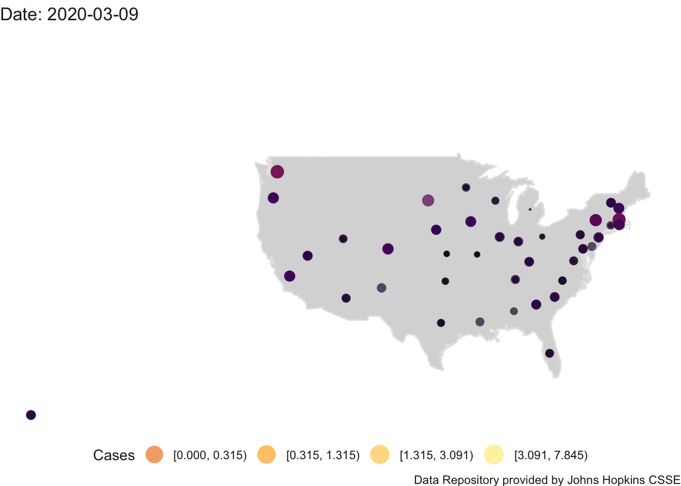
FIGURE 4.6: US Per Cap (100)
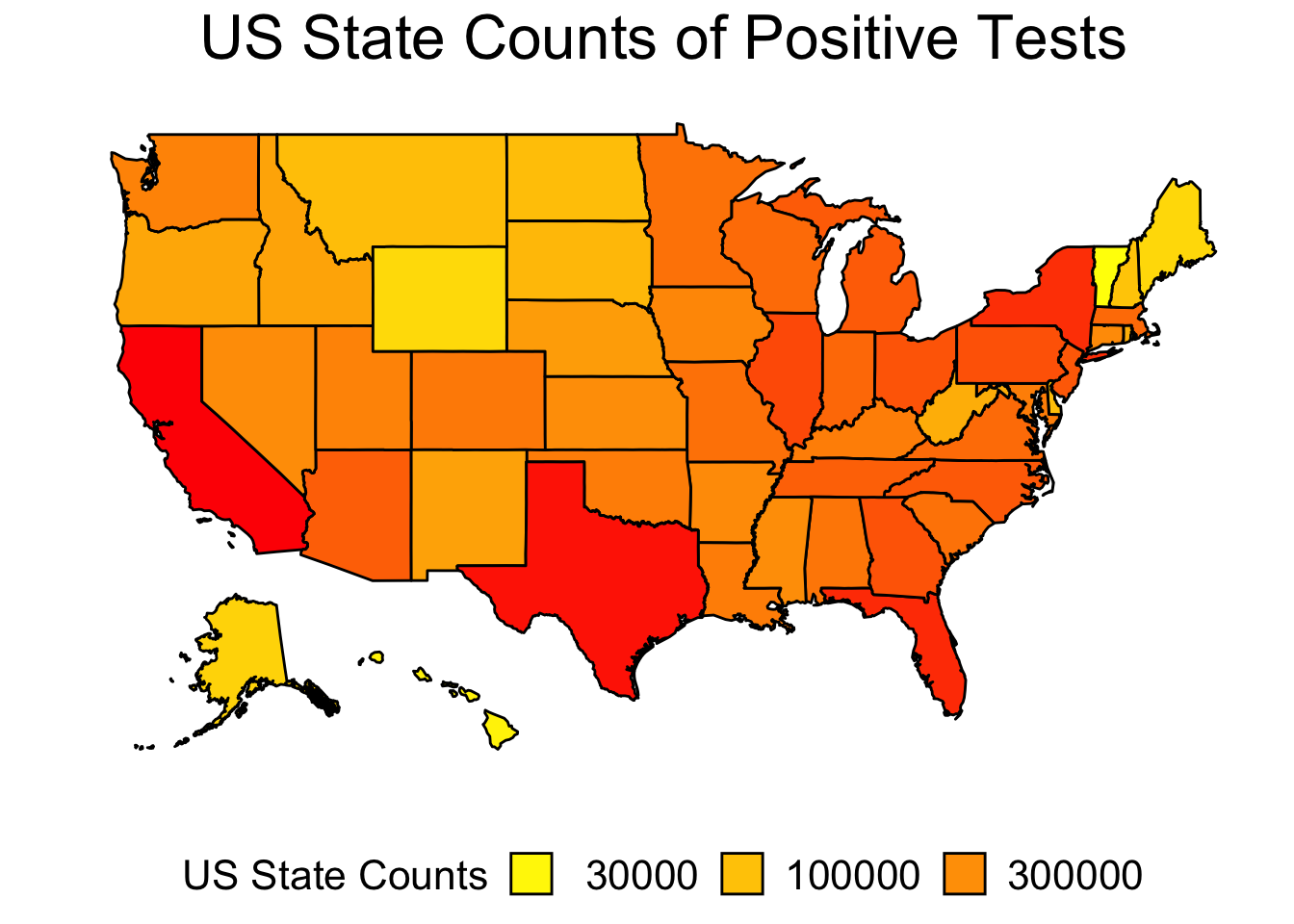
I don’t like these plots because they use latitude and longitude to place a point on the graph to represent the entire state. It may be better to do this plot so that the entire area of the state is colored in according to the positive count rather than representing count as a single point. Here is one example using the count of positive tests per state.
4.3.2 US county-level plots
We can move to a different level of resolution with county-level data. I used the log10 scale on the number of positive tests for each US county to achieve a smoother transition across the color range. White represents both counts of 0 and counts of 1. This plot uses count and not the per capita count.
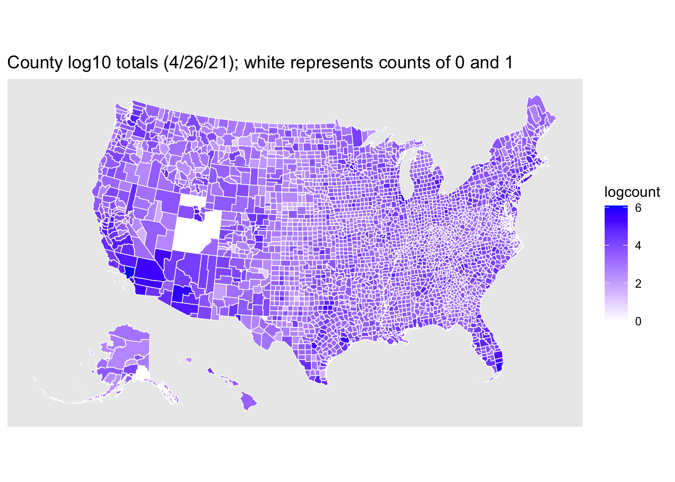
The plot suggests that `state’ may not be a good unit of aggregation for capturing tendencies of counties because of the amount of county-level variability.
The county-level plot suggests some hypotheses to test. For example, in May there was an increase in the number of protests over state social distancing restrictions and business closures. One could examine associations between the number of protests and properties of the states such as the political party affiliation of the governor. But with respect to county-level data, it appears in skimming the map of the US that some states have quite a bit of variability across counties in the positive test counts, whereas other states have relatively little variability with most counties having relatively high or relatively low positive test counts. One hypothesis to check is whether protests are more common in states with greater variability across counties (that is, some counties not experiencing as many cases as other counties in the state).
4.4 Incidence Plots
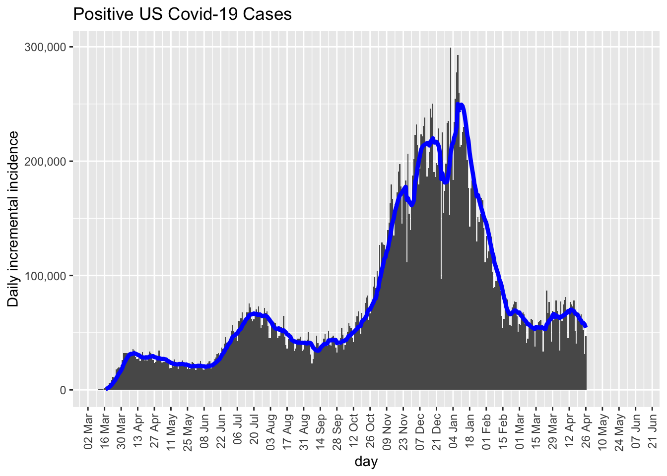
With time series data it is common to work with what are called first order differences. Rather than examine cumulative counts you look at day to day differences in the cumulative counts, or equivalently, the number of new cases each day. This is what give rise to the “curves” when people talk about “flattening the curve”. Think of this as daily counts and we merely compute histograms. This section was adapted from Tim Chruches Blog.
Here is the daily incidence rate using the same US data. This plot does not include DC and the territories. I also include a 7 day moving average (blue curve). This is the curve traced by computing the mean of the 7 previous days and using that value for the day’s count, then tracing those points with a curve. In the month of May news outlets began including such moving average summaries rather than the raw data. They make the data look less variable than they actually are, which is not a good thing when modeling data but fine for communicating general trend. We want our models to take into account the variability in the data rather than mask the variability.
We can add interactive capabilities to the ggplot by using the ggigraph package.
The html version of this book allows popups when the mouse hovers over the bars. You will notice that the number of positive deaths has a weekly pattern emerging on Monday April 13, 2020. There is a trough that occurs weekly on Sundays or Monday throughout. This is an important part of the variability these data exhibit, which is lost if we “smooth” the data by computing moving averages as shown in the blue curve of the previous graph.
The weekly pattern is interesting and could be explained, for example, by fewer tests conducted on weekends with a delay in the reporting of tests results. We can check this by examining another data set that reports the total number of tests conducted on a day, which is the sum of the number of positive tests, the number of negative tests and the number of pending tests. Of course, the number of positive tests will be correlated with this total measure, and this definition of total introduces some additional daily correlations due to some double counting (i.e., a pending today may show up as a negative tomorrow once the results are known). Further, this highlights the difficult of interpreting such data, for many reasons, including the issue that tests vary in the length of time needed to achieve a result, so if states vary in which tests they use or there are changes over time in which tests are used, we would see such patterns reflected in these counts. Such changes may say more about the decisions made on which tests to use than on the changing properties of the distribution of positive and negative test results.
The bar plot of the total test results is presented in the next figure. While the number of tests administered is increasing over the weeks, there is a slight pattern that fewer tests are reported on Mondays relative to surrounding days (e.g., April 27, May 4, May 10). The dips at the end of May, early July and early Septembrer can be attributable to holidays (Memorial Day, Independence Day, Labor Day) and delay in reporting.
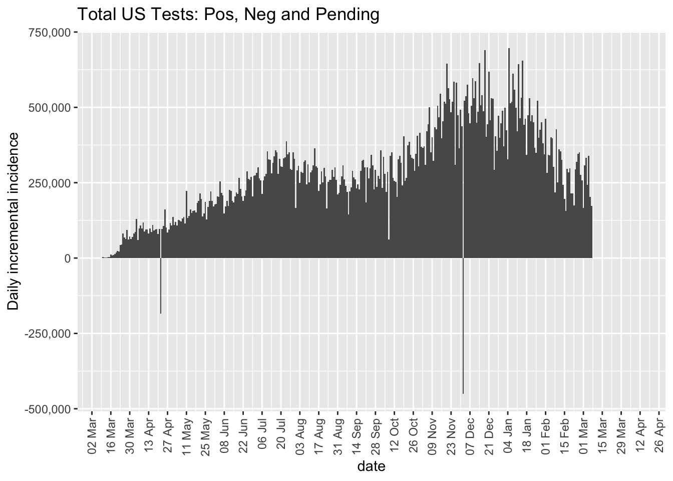
Overall, we see that the number of daily tests has been increasing over recent weeks. This adds an important caveat moving forward as we interpret positive test results in the remainder of this book. We may see an increase in positive tests not because virus contamination is increasing but because there are more tests being conducted. Of course, if the number of positive cases decreases in spite of the number of tests increasing, this suggests the virus rate is decreasing. Such a conclusion assumes the characteristics of the tests remain the same. If over time, the quality of the tests changes in terms of false positives and false negatives, that would add an additional layer of complexity in interpreting such testing data.
4.5 Using PCA to check for outliers
Principal components analysis (PCA) has many uses. An interesting use of PCA in time series data is that it can be used to detect outliers. Let’s take the 50 states and the time series from 3/09/20 to present, to create a 50 by day data matrix of positive counts. Then compute a PCA of the correlation matrix between states. This correlation matrix is 50 x 50 and represents how similar each state’s cumulative trajectory is to another state’s cumulative trajectory for all possible pairs of states. Plot the factor scores of the 50 states on the first two PCs. The majority of the states will cluster together. The outlier states, those with different trajectories from the majority of states, appear far away from the primary cluster suggesting they have a different trajectory. Four candidate outliers are NY, TX, FL and CA. Recall that the numbers in front of the state abbreviation correspond to the state population in millions. This type of PCA is commonly used in biological modeling to check for outliers, sometimes not on the raw data like I did here, but on the set of parameters that are estimated for each unit. For example, if you run regressions for each state, gather the betas from those regressions as data (such as 8 betas per state if you had 8 state-level predictors), compute a correlation matrix across states, then run a PCA on that correlation matrix to detect states with an outlier pattern across their betas relative to other states.
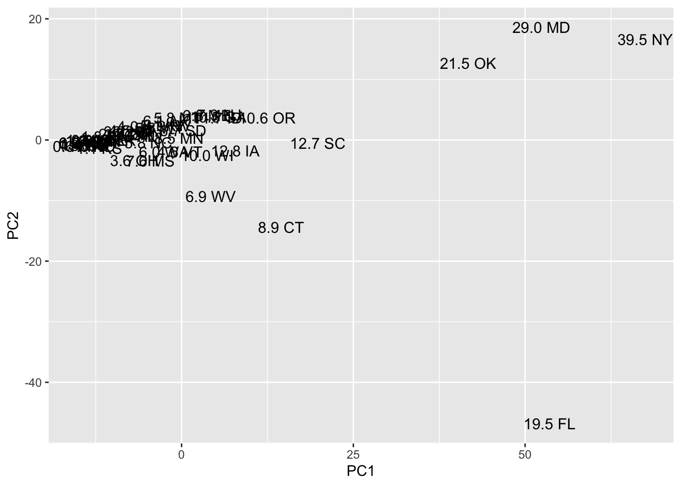
FIGURE 4.7: PCA to identify states with candidate outliers
4.6 Summary
In this chapter I focused on country, state and county-level analyses. Of course, finer resolution could be at by zip code, or any other sensible way of partitioning the map. A different type of partition could be in how hospitals are structured in an organized system across the US. There are about 340 “hospital referral regions.” These are regions where there is a primary hospital that can handle specialized cardiovascular procedures and several other hospitals, perhaps part of different systems, that refer patients needing these specialized services to the primary hospital. Or even more fine-grained, there are “hospital service areas”, which make up zip codes that are serviced by a particular hospital. Here are such maps for covid. When one starts adding predictors or outcomes of these trajectories, then the level of resolution becomes critical. If one wanted to examine the contributors to health disparities around covid-19 and how they impact the properties of the trajectories, then one should consider matching the level of analysis of the trajectory (state, county, zip code, hospital service area, population density, etc.) with corresponding predictors at similar levels such as predictors relevant to government expenditures, measures of income inequality, indices of urbanization, unemployment rates, etc. (that is, each of those predictors would be evaluated at the similar level as the trajectory data).