Chapter 5 Descriptive Modeling: Basic Regressions
The previous chapter presented several descriptive plots of raw data. In the next two chapters I would like to show some simple modeling methods of the same data. By no means is any of the modeling presented here considered breakthrough modeling. I call this descriptive modeling because all I do is describe the patterns using statistical methods. In a later chapter (Chapter 6) I’ll give examples of explanatory models that attempt to capture mechanism and underlying process.
The difference between descriptive models and explanatory models is that the former are summaries of the data and, whie they can be used to forecast, but they do not provide understanding of the underling mechanisms. Descriptive models do not give insight into what will happen if a change is imposed on the system. Descriptive models don’t tell us the effect social distancing may have, for example, on the future rate of covid-19. Descriptive models are fine for describing what has happened in the past but can be limited in helping us understand how the future will play out under various scenarios including interventions. I sometimes refer to descriptive modeling as “models of data.” Explanatory, or process, models focus on modeling underlying mechanism. Explanatory models also use data to estimate parameters and make predictions, but the focus of process models is the underlying mechanism.
For more general treatments on working with time series data see Hyndman & Athanasopoulos; Holmes, Scheuerell & Ward and the classic Box & Jenkins, with additional authors in newer editions of the book.
5.1 Regression on US State Percentages: Linear Mixed Models on Logs
In the previous chapter Descriptive Plots I showed that on the log scale the curves do not follow a straight line by state for the count/population variable, at least through the entire time series and likely not even in the early days of the pandemic. There is a belief that pandemics tend to follow an exponential process early on but not necessarily deeper into the pandemic. It isn’t clear that belief is consistent with the Covid-19 data.
I’ll illustrate one type of exponential growth with this simple example. Image each infected person infects 2 people and transmission occurs in the first day. The first person who contracts covid in the US infects 2 people for a total of 3 infected people. The next day those two newly infected individuals each transmit to 2 people, so on that day there are 4 newly infected people plus the 3 infected people from the previous day. This process continues each day, so that each newly infected person transmits to 2 new individuals. What is surprising is that if this process continues unchecked, it will take merely 28 days for the entire US population, approximately 330 million, to be infected with covid. Clearly, this simple exponential process did not play out because 10 months into the pandemic, the US is at 14 million known positive cases. I think 28 days would qualify as falling into the “early days of the pandemic,” so other processes, constraints and factors must be contributing to the spread of the disease. As we will see later in this chapter, exponential growth characterizes a family of growth rates, not just the specific one used in this example.
Still, for the time being let’s continue applying the belief that pandemics follow exponential growth. An exponential growth curve can be transformed into a straight line (i.e., linear growth) by taking logs of the data (this will be described later in this chapter). It is much easier to fit linear functions than nonlinear functions such as exponential curves, so many researchers follow the heuristic of applying a log transformation when dealing with these types of nonlinear curves.
Our ongoing example will focus on state-level effects so they are a natural candidate for a random effects linear regression. That is, each state will have its own intercept and slope on the log scale. The value of the state’s intercept can be interpreted as the percentage of the population infected with covid-19 on day 0; it can be tricky to interpret the intercept as I have formulated it so far, but I’ll present a different interpretation as we develop more machinery. The slope can be interpreted as the growth rate of the state.
We could use standard regression model (ordinary least squares) to create a complicated interaction between day and state, so that we have a state factor with 50 levels (i.e., 49 effect or contrast codes), giving us 49 intercepts (main effect of the state factor) and 49 slopes (interaction of the state factor with time) along with a main effect of time, but that is overkill. The random effects approach is a more efficient implementation. Intuitively, each state is modeled as a random draw from a multivariate normal distribution such that we draw 50 pairs of slopes and intercepts from that multivariate distribution. Once we have those 50 slope and intercept pairs, then we compute the predicted scores for each state. The algorithm finds the mean and covariance matrix of that multivariate distribution to minimize the discrepancy (i.e., squared residuals) between the observed and the predicted data. The multivariate normal distribution also allows a covariance between the intercept and slope to account for possible associations such as ``states that start early have more rapid growth rates.’’ As shown in the previous chapter, the log of the percentage of the state population follows an approximate line, though there was some evidence of curvature in the descriptive plots suggesting a deviation from a straight line, implying a deviation from a simple exponential growth curve.
In the following analyses, the variable day is entered into the model as a linear time variable (1, 2, 3, etc). In subsequent analyses we will consider more complicated treatments of the day variable to allow for additional nonlinearity over time.
5.1.1 Examine distributional assumptions
It is good practice to check the distribution of the log percent variable to make sure there aren’t major issues with symmetry. The log of the percent of the state population that tests positive will be the dependent variable in the regressions we will conduct.
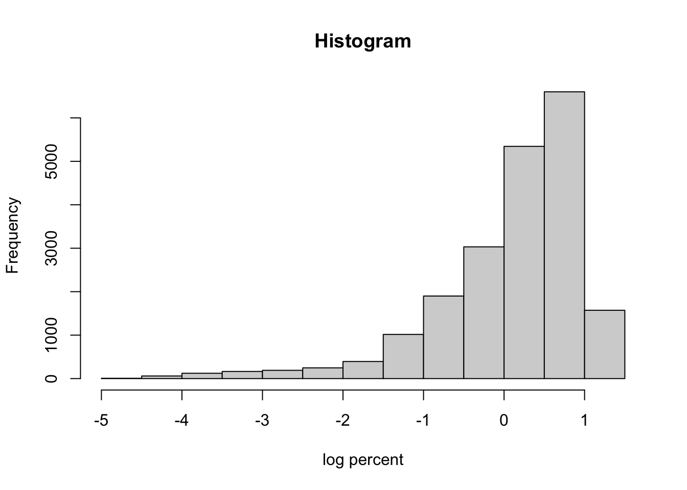
There is evidence of skewness in this variable, which raises concern about the distributional assumptions when conducting subsequent regressions. We will address this issue in later analyses but for now let’s plug along with the simpleminded idea that these data are a exponential function of day so a log transformation will be used.
5.1.2 Linear mixed model
Here are the results of this simple linear mixed model on the log scale.
| percent log 10 | |||||
|---|---|---|---|---|---|
| Predictors | Estimates | std. Error | CI | Statistic | p |
| (Intercept) | -1.26 | 0.05 | -1.35 – -1.17 | -27.92 | <0.001 |
| day.numeric | 0.01 | 0.00 | 0.01 – 0.01 | 45.16 | <0.001 |
| Random Effects | |||||
| σ2 | 0.20 | ||||
| τ00 state.abb | 0.10 | ||||
| τ11 state.abb.day.numeric | 0.00 | ||||
| ρ01 state.abb | -0.82 | ||||
| ICC | 0.20 | ||||
| N state.abb | 50 | ||||
| Observations | 20648 | ||||
| Marginal R2 / Conditional R2 | 0.709 / 0.767 | ||||
The estimates, se(est), CI, t and pvalue for the fixed effects are printed first, then the parameters of the random effect part are printed in the second part of the table. The random effect parameters, in order, are the variance of the residuals, the variance of the random effect intercept, the variance of the random effect slope, the correlation between the random intercept and the random slope, the adjusted ICC, number of states, number of observations (recall 0s have been removed from this data file so the N refers to the number of days by state for which there was a nonzero number of positive covid-19 cases), and the R\(^2\) values.
5.1.3 Diagnostics
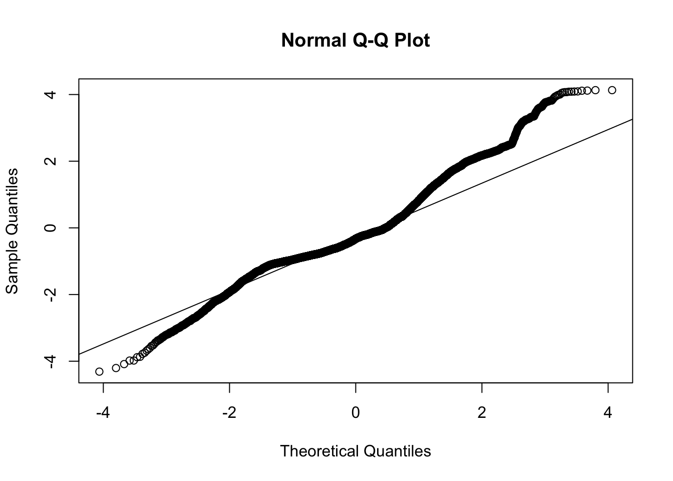
Now let’s examine plots of residuals to diagnose potential issues with this model. The plot of the residuals against the fitted values should look like a random point cloud in the ideal case and the QQ plot should show a relatively straight line. For a discussion of using residuals to diagnose model assumptions, see my lecture notes.
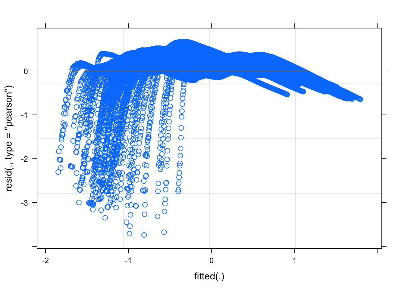
The residuals against the fitted values suggest a nonlinear pattern remains in the data. This suggests that we may not have completely linearized the data with the log transformation. Recall the logic rule modus tollens that states “if p, then q is accepted and not-q holds, then we can infer not-p.” Applied to this situation, if a functional relation is exponential (p), then a log transformation will linearize the relation (q). We observe from the residuals that a log transform did not linearlize the relation (not-q), so we conclude that the original functional relation was not exponential (not-p). While it may be disappointing that the residuals suggest the assumptions of regression are violated, we can make a relatively strong conclusion that the original relation, whatever it is, cannot be purely an exponential.
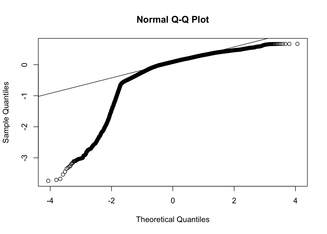
The qqplot also suggests a deviation from a typical normal distribution; that is, the residuals appear to have longer tails than expected by a normal distribution. Both of these plots suggest there are issues that need to be addressed. We probably don’t want to jump right into doing another transformation to deal with the skewness as that may create new issues with interpretation. We selected the log transformation because we are checking for exponential growth and on the log scale the exponential growth should become linear. So maybe the exponential growth model may not be appropriate here, or there may be other issues with the data that are contaminating the exponential growth pattern. Without additional modeling we cannot adjudicate between these possibilities just from this present regression alone.
Even though the residual plots raise concern about this model, let’s continue with this example and examine the state-level slopes and intercepts more directly with a table listing the slope and intercept for each state and with some plots. The the following plot, the light gray points have confidence intervals that overlap 0 so those parameter estimates are not significantly different from zero. We did not perform a multiple test correction such as Bonferroni or Scheffe to address the 100 tests we just did (50 states on each of slope and intercept). This would just require a small modification to the code to adjust the level of the CI to correspond, say, to the Bonferroni corrected levels. There has been some extensive debate in the literature as to whether multilevel models require additional corrections for multiple tests.
##                (Intercept) day.numeric
## Alabama             -1.193     0.00675
## Alaska              -1.732     0.00791
## Arizona             -1.341     0.00734
## Arkansas            -1.314     0.00712
## California          -1.312     0.00679
## Colorado            -1.154     0.00602
## Connecticut         -0.818     0.00505
## Delaware            -0.927     0.00561
## Florida             -1.221     0.00675
## Georgia             -1.102     0.00635
## Hawaii              -1.847     0.00667
## Idaho               -1.378     0.00721
## Illinois            -0.978     0.00596
## Indiana             -1.248     0.00675
## Iowa                -1.207     0.00693
## Kansas              -1.444     0.00746
## Kentucky            -1.560     0.00754
## Louisiana           -0.661     0.00496
## Maine               -1.557     0.00591
## Maryland            -1.013     0.00560
## Massachusetts       -0.616     0.00447
## Michigan            -1.000     0.00547
## Minnesota           -1.445     0.00734
## Mississippi         -1.044     0.00627
## Missouri            -1.479     0.00746
## Montana             -1.851     0.00845
## Nebraska            -1.234     0.00694
## Nevada              -1.229     0.00675
## New Hampshire       -1.406     0.00616
## New Jersey          -0.572     0.00453
## New Mexico          -1.322     0.00680
## New York            -0.404     0.00384
## North Carolina      -1.404     0.00705
## North Dakota        -1.382     0.00769
## Ohio                -1.438     0.00703
## Oklahoma            -1.598     0.00797
## Oregon              -1.633     0.00663
## Pennsylvania        -1.150     0.00596
## Rhode Island        -0.828     0.00567
## South Carolina      -1.333     0.00711
## South Dakota        -1.189     0.00700
## Tennessee           -1.257     0.00706
## Texas               -1.439     0.00740
## Utah                -1.331     0.00726
## Vermont             -1.504     0.00530
## Virginia            -1.282     0.00639
## Washington          -1.076     0.00513
## West Virginia       -1.701     0.00749
## Wisconsin           -1.371     0.00731
## Wyoming             -1.577     0.00756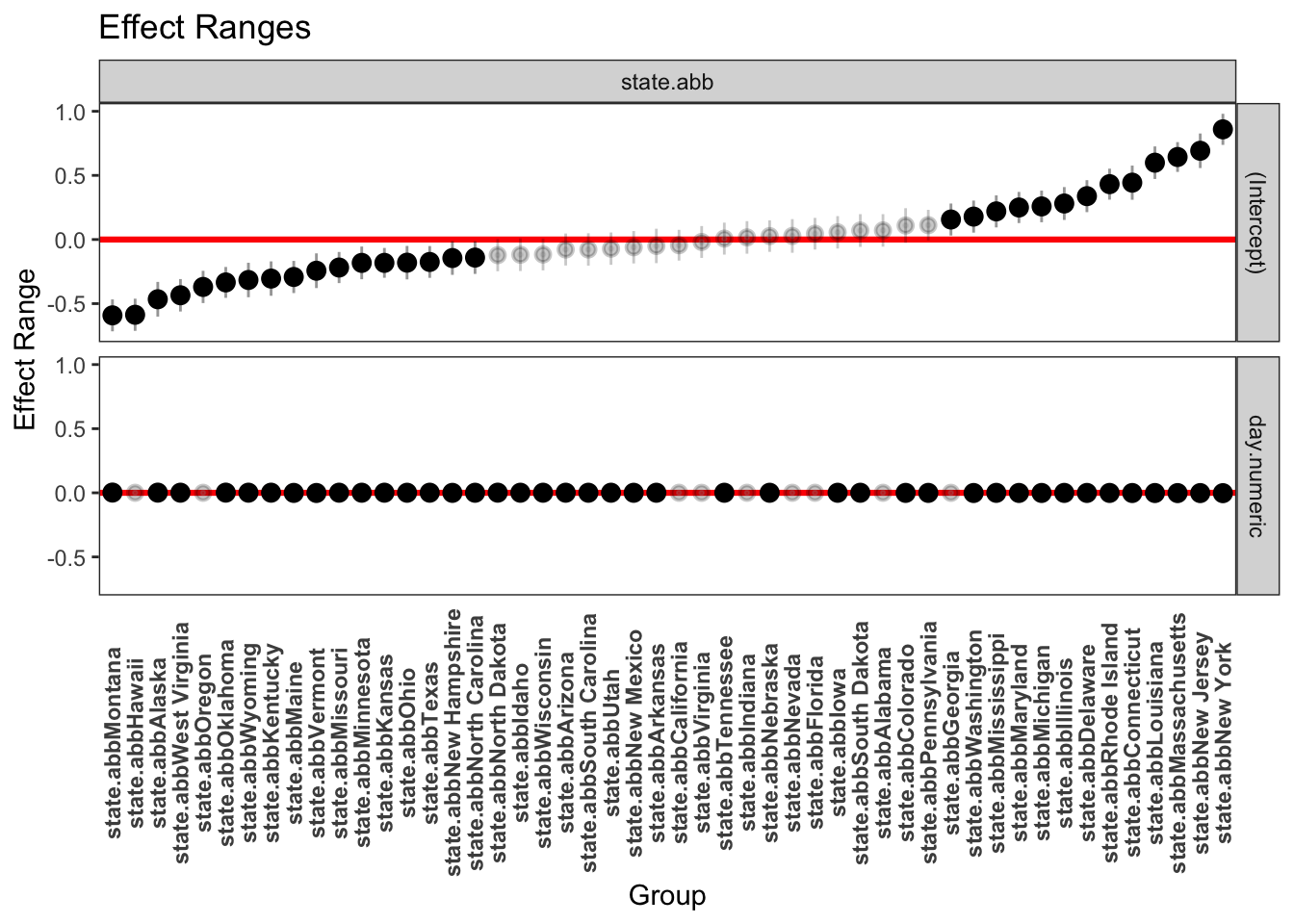
It turns out that computing standard errors for the prediction is not straightforward for linear mixed models and quite complicated for nonlinear mixed models that we will perform later. You can read about the complexity here.
Here is one method for computing the predicted value and a prediction interval that relies on sampling. To maintain clarity I’ll focus just on two states, but one could do these plots for all 50 states. I’ll print the data for the first 30 days in the state of New York. The table includes the day, the fit from the regression equation, the confidence interval around the fit, the fit placed back on the original scale (i.e., \(10^{\mbox{fit}}\)) and the original data on the percentage scale.
##    day.numeric    fit   upr   lwr fit.per percap100
## 1            0 -0.410 0.454 -1.30   0.376     0.001
## 2            1 -0.391 0.493 -1.30   0.408     0.001
## 3            2 -0.441 0.518 -1.31   0.376     0.001
## 4            3 -0.397 0.500 -1.33   0.395     0.002
## 5            4 -0.335 0.482 -1.23   0.409     0.002
## 6            5 -0.394 0.518 -1.25   0.435     0.003
## 7            6 -0.398 0.551 -1.31   0.430     0.003
## 8            7 -0.335 0.489 -1.29   0.430     0.005
## 9            8 -0.404 0.523 -1.31   0.418     0.007
## 10           9 -0.368 0.497 -1.28   0.422     0.013
## 11          10 -0.374 0.554 -1.25   0.445     0.022
## 12          11 -0.375 0.507 -1.31   0.417     0.039
## 13          12 -0.361 0.543 -1.25   0.435     0.054
## 14          13 -0.352 0.559 -1.27   0.456     0.078
## 15          14 -0.333 0.580 -1.15   0.457     0.107
## 16          15 -0.342 0.517 -1.23   0.451     0.132
## 17          16 -0.333 0.505 -1.22   0.443     0.159
## 18          17 -0.328 0.600 -1.19   0.429     0.192
## 19          18 -0.312 0.565 -1.21   0.476     0.230
## 20          19 -0.326 0.522 -1.16   0.429     0.269
## 21          20 -0.291 0.600 -1.22   0.479     0.307
## 22          21 -0.346 0.508 -1.19   0.516     0.343
## 23          22 -0.319 0.563 -1.17   0.494     0.390
## 24          23 -0.317 0.570 -1.12   0.479     0.465
## 25          24 -0.274 0.617 -1.18   0.521     0.518
## 26          25 -0.302 0.604 -1.17   0.498     0.573
## 27          26 -0.316 0.645 -1.18   0.490     0.626
## 28          27 -0.313 0.578 -1.22   0.472     0.682
## 29          28 -0.314 0.583 -1.17   0.515     0.733
## 30          29 -0.285 0.633 -1.14   0.541     0.771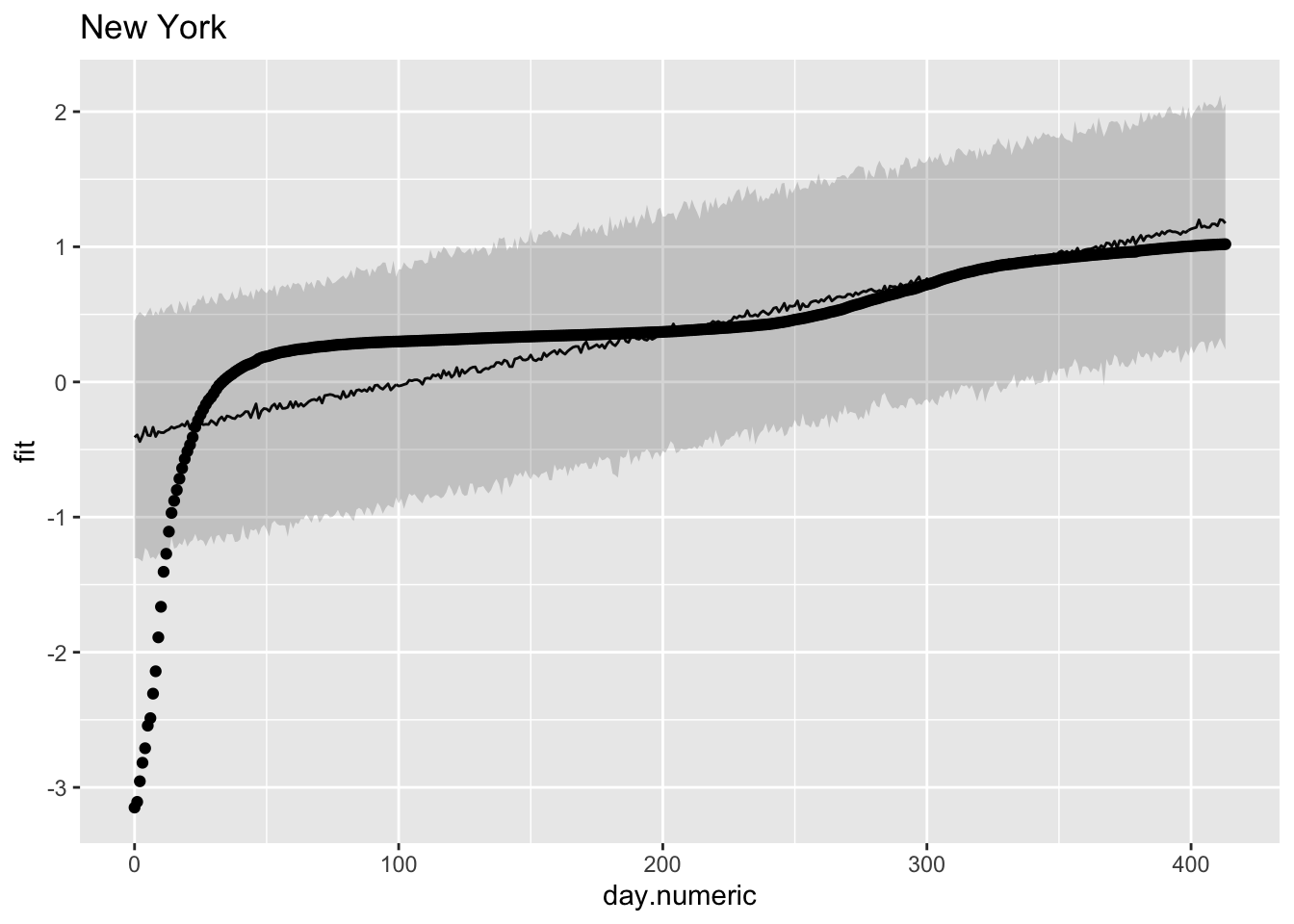
Note that the linear pattern (line and prediction band) doesn’t do a good job of capturing the actual data points. Some points are over predicted in the early days, then under predicted, then over predicted again. This would produce a pattern where the residuals are negative, then positive, then negative again as we saw in one of the earlier residual plots. The data looked approximately linear but upon close inspection a model that is actually linear in the log scale seems to systematically miss the underlying pattern.
To check that this pattern is not just a fluke for New York, let’s look at another state. For Michigan a similar story, where we see over, under and over prediction. These plots suggest that the linear model may show some systematic deviations from linearity.
##    day.numeric    fit    upr   lwr fit.per percap100
## 1            0 -1.003 -0.488 -1.53   0.098     0.000
## 2            1 -1.009 -0.417 -1.56   0.099     0.000
## 3            2 -1.012 -0.428 -1.54   0.101     0.000
## 4            3 -0.957 -0.387 -1.53   0.097     0.000
## 5            4 -0.995 -0.379 -1.57   0.103     0.000
## 6            5 -0.960 -0.370 -1.56   0.110     0.000
## 7            6 -0.987 -0.370 -1.54   0.113     0.000
## 8            7 -0.934 -0.370 -1.55   0.106     0.001
## 9            8 -0.973 -0.392 -1.53   0.116     0.001
## 10           9 -0.953 -0.389 -1.54   0.116     0.002
## 11          10 -0.951 -0.379 -1.54   0.111     0.003
## 12          11 -0.951 -0.411 -1.53   0.111     0.005
## 13          12 -0.948 -0.346 -1.52   0.117     0.006
## 14          13 -0.921 -0.372 -1.50   0.114     0.011
## 15          14 -0.933 -0.366 -1.52   0.124     0.015
## 16          15 -0.950 -0.367 -1.56   0.117     0.019
## 17          16 -0.899 -0.322 -1.47   0.129     0.025
## 18          17 -0.905 -0.330 -1.50   0.121     0.030
## 19          18 -0.889 -0.269 -1.50   0.123     0.039
## 20          19 -0.884 -0.318 -1.45   0.124     0.049
## 21          20 -0.919 -0.312 -1.48   0.126     0.058
## 22          21 -0.880 -0.292 -1.49   0.131     0.068
## 23          22 -0.893 -0.305 -1.46   0.127     0.080
## 24          23 -0.886 -0.315 -1.42   0.134     0.097
## 25          24 -0.905 -0.333 -1.47   0.127     0.112
## 26          25 -0.887 -0.316 -1.42   0.134     0.132
## 27          26 -0.864 -0.285 -1.43   0.142     0.148
## 28          27 -0.861 -0.286 -1.46   0.141     0.163
## 29          28 -0.884 -0.308 -1.40   0.147     0.178
## 30          29 -0.861 -0.267 -1.41   0.143     0.197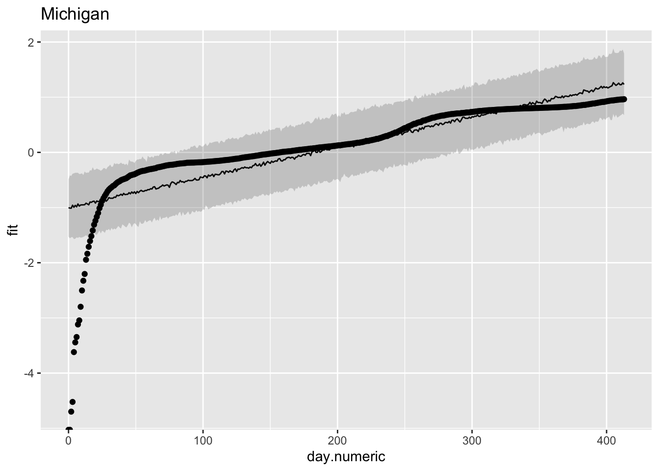
These plots suggest a major issue with this linear mixed model regression. The observation that the trajectories do not follow a straight line in the log scale suggests these data do not follow an exponential growth model. It is more complicated than that. We see similar violations of straight lines in the death data (e.g., see the New York Times graphs on the number of deaths for a similar curvature away from a straight line). The violation of the exponential could be due to many factors, such as interventions of social distancing, diseases tend to follow an exponential curve early but then switch to a different process (see below for logistic growth curves), additional sources of noise contaminating the data such as reporting bias, etc.
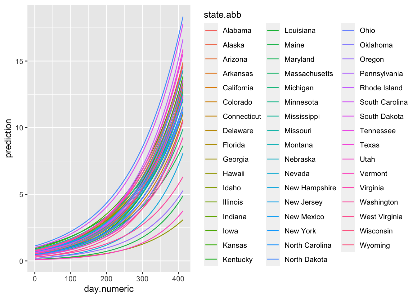
Now that we understand the slopes and intercepts, let’s make some predictions. I’ll go 5 days out. The first plot will be on the log scale, but be mindful that these predictions are based on an exponential growth model that the residual analysis suggests may not hold for these data.
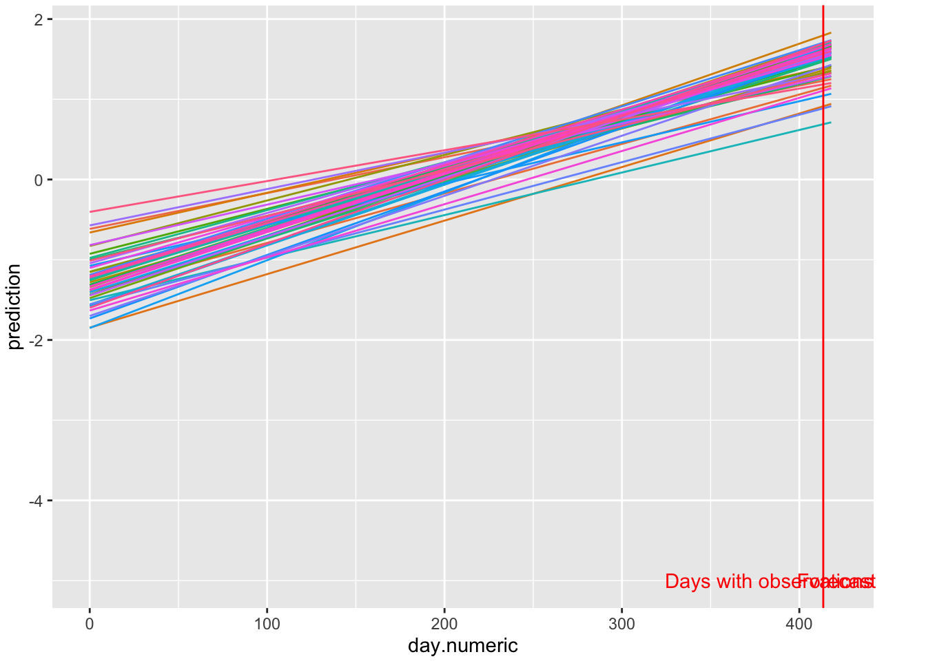
FIGURE 5.1: Log scale predictions 5 days out
Using the same data I take the exponential of those predictions to see the percentages with their predicted curves. The Y axis is on the percentage scale (count/population * 100).
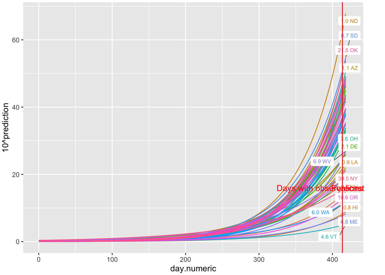
FIGURE 5.2: Predictions of percentages 5 days out
Other approaches I could have taken include using the state’s population as a weight and computed weighted linear mixed models on the log of the count data, or, because I’m working in log scale, I could use the state population as an offset in the linear mixed model (as in offset(log(population))) and use log counts as the dependent variable. These are alternative ways of taking population size into account. Further checks include taking into the account possible correlated residuals. For example, it isn’t reasonable to assume that the residual at day t is independent from the residual at day t+1 for a given state, which is what my model assumed in what I presented above. I’ll show how to include a correlation pattern on the residuals later in this chapter. There is clearly a lot more one would need to do in order to justify the use of the analytic strategy in this section.
Of course, once the basic structure of this linear mixed model on the log scale is set (e.g., error structure on residuals is determined, how best to use the state’s population in the model, etc), then one could bring in additional predictors. We could, for example, take some of the data sets we downloaded that have the dates of when states took different measures and see if any of those state mandates changed, say, the slopes for the states. At this point, once the complex error structure, linearity, and random effect structure are determined, then the rest is just routine regression that follows the analogous criteria in regression. For example, one could include interactions between predictors or controls using other predictors.
5.1.4 Comparison with polynomial regression
In the previous model I showed that the linear mixed model regression (allowing for each state to have their own slope and intercept) on the log of the state-level percentages can be used to model these data. Here I want to go on a little tangent and illustrate how well a polynomial can mimic the exponential pattern we see in the data.
Let’s take the case that in a particular locale the rate of covid-19 follows this general curve. In this subsection I made up the data so I know the curve follows exponential growth with an additive error term (the plus \(\epsilon\)) because I added random normally distributed noise with mean 0 and standard deviation .25.
I’ll run several regressions in order and produce one plot at the end. The points on the graph are the observed data points, the colored curves emerge from different regression models. The first regression is a linear regression with just x (days 1-25) as a linear predictor. I added a violet straight line to indicate the best fitting straight line—not a good fit. The second regression adds a quadratic term and will appear as a red curve. This is an improvement, but it is nonmonotonic and shows a decrease in the first few days (which is not a pattern displayed in the raw data). The third regression adds a cubic term and fits the points relatively well.
Next, I estimate the exponential directly using nonlinear regression. Instead of the parameter being a multiplier of the predictor (like in linear regression), the parameter serves as the growth factor. The green curve follows the data closely. Here only one parameter was estimated and it was .1502, very close to the actual .15 I used to estimate the data. The polynomial did quite well but needed 4 parameters (intercept and three slopes); those parameters are not easy to interpret. The single parameter of the exponential yields a very good fit with only one interpretable parameter. This makes sense because these hypothetical data were generated from an exponential model. Note that here I am using the nls() command, which estimates a nonlinear regression.
Finally, for comparison, I run a linear regression through these data after transforming the Y variable into the log, then re-expressing the predicted scores back to the original scale like I did in the predictions using the linear mixed model with the lmer() command above. I’ll draw that curve in black—very similar result to the nonlinear regression with the exponential and the third order polynomial.
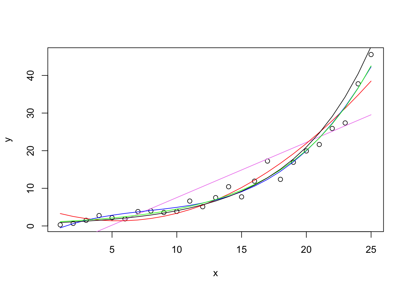
Polynomials can do a reasonable job at capturing functions but they are not always easy to interpret without some additional work (e.g., Cudek & du Toit, 2002). The third order polynomial got close but good luck in interpreting the four parameters (intercept and three \(\beta\)s). The quadratic though while it was close predicts that the counts in the early days will drop (the red curves is decreasing from day 1 to day 4) so that’s not good because the data points don’t see to be showing that pattern.
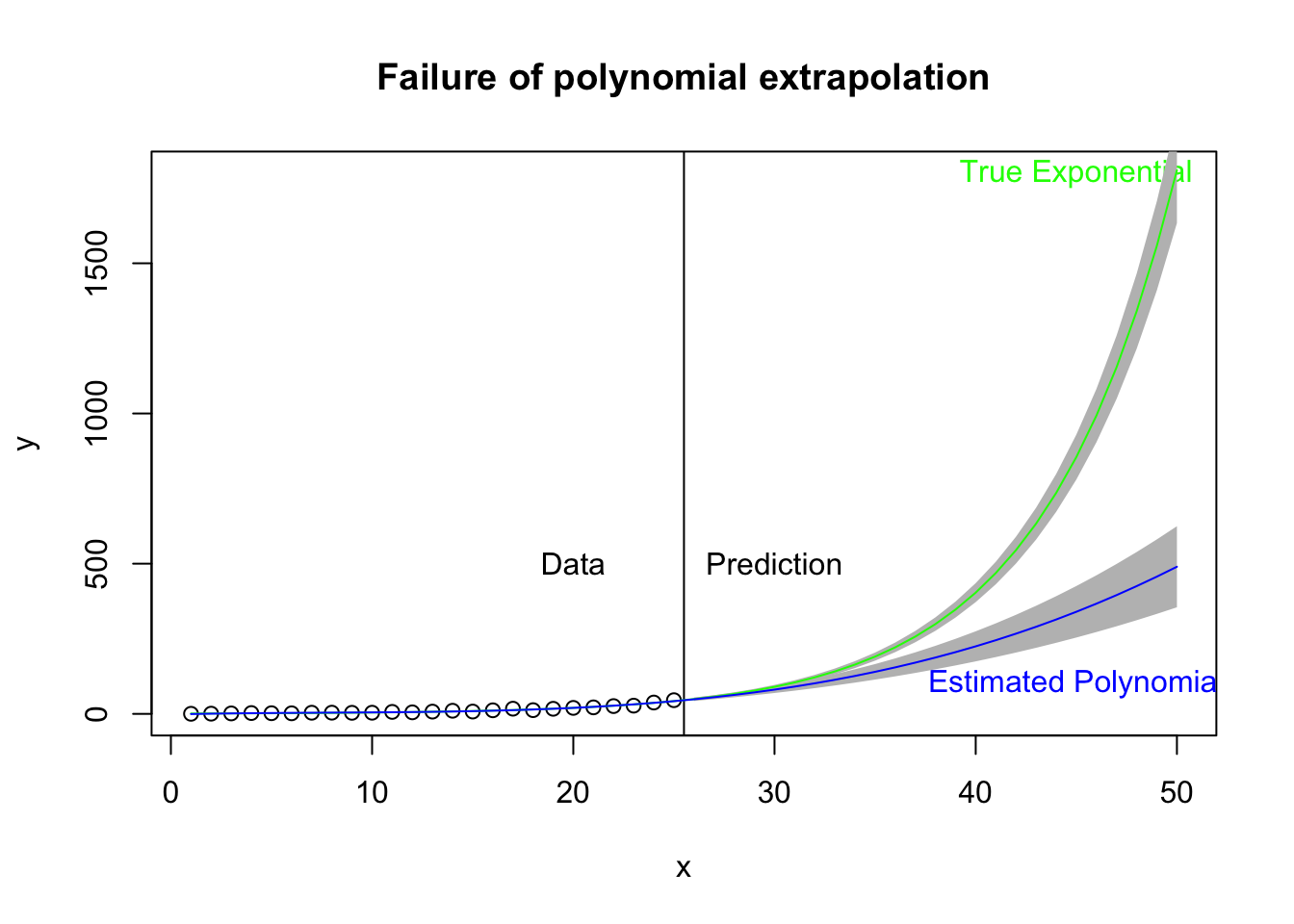
While polynomials may do a good job of fitting data in hand, they may not be the useful for prediction and forecast—basically, extrapolating out of the range of the data. Here I take the same plot just examined but extend the prediction out 25 days beyond the data. The vertical black line marks the region of data (left) and prediction (right). The green curve is the estimated exponential growth fit to the data and extended 25 days out. The blue curve is the cubic form that fits the data relatively well (left side) but in extrapolation out 25 days from the data may not do a good job of predicting the actual curvature of the exponential function. The gray bands refer to the 95% prediction bands. Note that the bands for the exponential curve appear to be too narrow, and this is an outgrowth that the theory for such intervals in the nonlinear case is not clear cut. A simulation-based approach to estimate the prediction interval may be better.
Polynomials are frequently used. I found this website that uses a 4th order polynomial to model covid-19 data from Spain, Italy and US. This page also focuses on the daily incidence rate, a topic I mentioned earlier. Personally, I’m suspicious of using such high order terms to model such curves especially if they are used to forecast out from the data (i.e., extrapolation). [As of June 17, the website no longer shows polynomials.]
The polynomial idea to approximate functions can be extended in more complex ways. Here is a tutorial using the MARS package in R; this is probably the direction I’d go if I was interested in taking this type of approximation approach. But I’d rather stick to more interpretable functional forms for most of the remaining sections.
5.1.5 Thoughts on the log transformation
This type of model where we transform the dependent variable by converting to logs, creates an additive error term in the log scale; that is, log(counts) = f(days) + \(\epsilon\). But maybe that isn’t the right error structure. Maybe the error is added to the counts rather than the log of the counts; that is, the data may exhibit a counts = f(days) + \(\epsilon\) structure, which is a different error structure than the one on the log scale. The point here is that while one may think about using a transformation to linearize a model, that transformation also has an implicit set of assumptions and has potential side-effects on the modeling such as introducing particular error structure.
We now turn to modeling the curvature directly using nonlinear regression methods that not only permits complicated functioanl forms such as exponentials but also permits modeling the error as an additive effect on the counts as in the form: counts = f(days) + \(\epsilon\) model.
5.2 Exponential Nonlinear Mixed Model Regression
5.2.1 Exponential Background
For a good explanation of exponential growth and logistic growth (which will be described in the next subsection) see this video.
You can think of this exponential form as being similar to a balance in a savings account that builds with compound interest. At each time step, a percentage is added to the current principal thus increasing the balance in the savings account. At the subsequent time step, the principal is now higher so the interest earned on that day will also be higher than the previous time step. In the case of the covid-19 positive test counts, if each day the total count grows by some percentage, analogous to the principal in the savings account, then the growth is exponential.
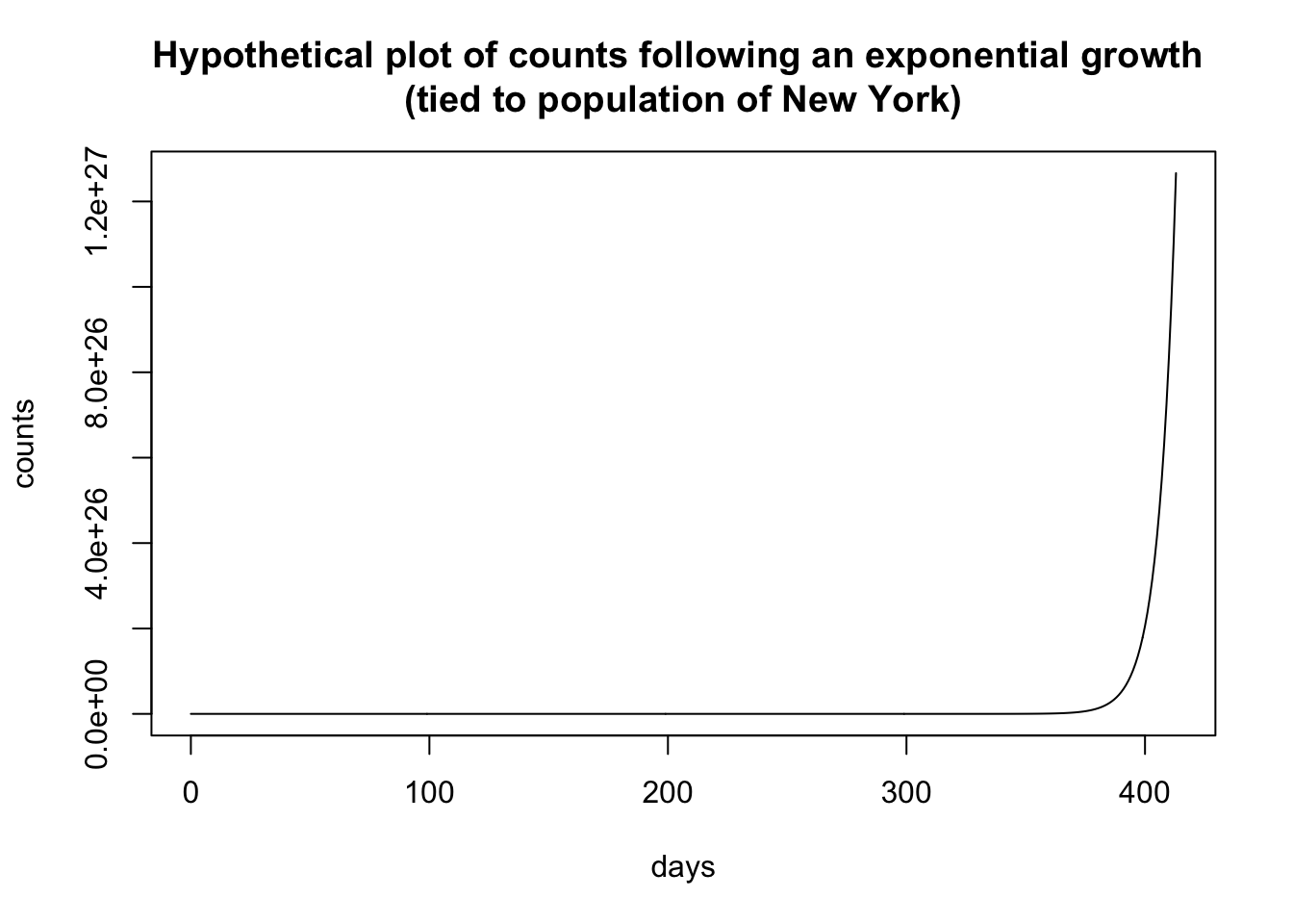
I’m using one form of the exponential where the “rate” parameter is the base and it is raised to the power t. I did this to maintain a connection to the savings account analogy where the principal grows at rate x (where, say, a 5% interest rate has x = 1.05). The form is
\[ \begin{aligned} \mbox{count} &= y r^t \end{aligned} \] where t is the day, r is the rate (i.e., an “interest rate” of 5% has rate = 1.05), and y is a scaling parameter. The hypothetical plot above used a rate of 1.15 and a multiplier of .000555, which is in part based on the population of NY of 19.5M. I estimated these numbers from data collected in mid March, early into the covid-19 pandemic, and extrapolated out 60 days. Back in mid-March the idea of having 350,000 cases in New York within a couple of months seemed crazy. On May 7 New York reported 327,000 cases.
There are other forms of the exponential that are equivalent, just on a different scale. For example, in the natural log scale, the form I’m using \(yr^t\) is equivalently expressed as \(y*\exp{(log(r)t)}\) and in base 10 it is equivalently expressed as \(y*10^{log10(r)t}\). These are equivalent formulations, one just needs to keep track of the scale of the rate across these different choices of the base.
5.2.2 Exponential: The Liftoff Parameter
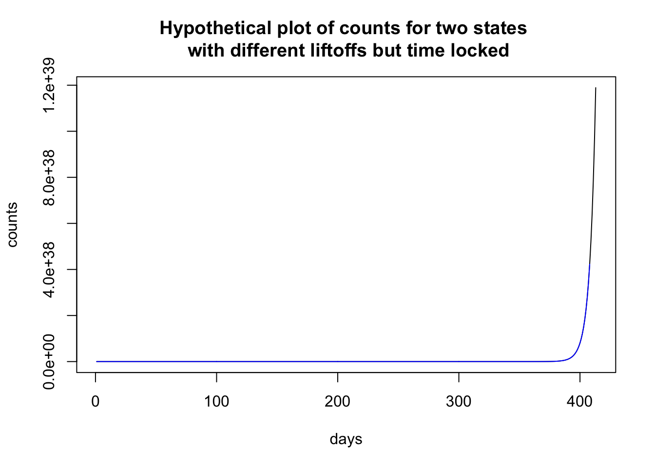
The exponential function can vary in terms of liftoff, where the curve breaks away from 0.
Here I plot two hypothetical states that have the identical set of parameters except that one state (black) has a liftoff of 0 and the other state (blue) has a liftoff of 4. It looks like the counts in the state depicted by the black curve is shooting up and by the end of the sequence almost double the count than the state represented by the blue curve.
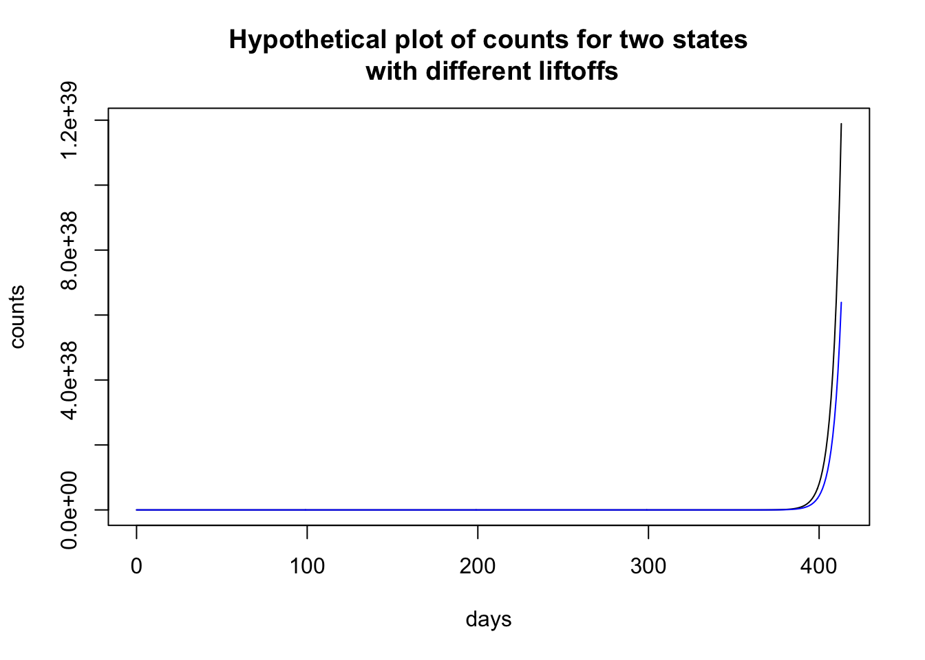
To illustrate how time locking can show structure, let me use the previous plot, where the two states look to have different patterns. Time locking the two states to the first day when they each have nonzero cases shows that both states have identical trajectories. It is just that one state started earlier than the other state and so the patterns in the previous plot look (dramatically) different, and just by a delay of 4 days! Much like singing “Row, row, row your boat” in rounds—voices sing the same melody but start at different times creating a harmonious whole.
A good example of controlling for different liftoff patterns is by John Burn-Murdoch of the Financial Times. These visualization are unique from the ones I have seen on the web in that their curves are not plotted on calendar time but in terms of when the country hit X cases (sometimes X is 3 or 10 depending on the graph). This normalizes the onset and allows us to compare across units that had different starting points. A common phrase for this is “time locking” to a particular event, in this case time locking to when a country hit, say, 10 cases.
There is a sense in which we didn’t have to worry about liftoff in the linear mixed model on the log scale we ran in the previous subsection because the intercept parameter essentially took care of that. We could complicate the exponential model by including a random effect intercept, but I’ll keep things simple in these notes.
5.2.3 Estimating the exponential with the nonlinear mixed model
Let’s estimate an exponential growth model using a nonlinear mixed model regression. This mimics the LMER model we ran earlier in these notes but rather than transforming with a log to convert the data into straight lines, this time we model the curvature directly with an exponential function. To simplify things I constrain the liftoff parameter to 0 and the multiplier b1 to 1. To estimate all four parameters simultaneously we need to move to a different R package saemix that uses a stochastic EM algorithm to estimate this nonlinear mixed model because nlme can’t handle very complex models like this one without doing more ground work in setting up a self-starting function that has information about the gradient of the function. But, some additional work needs to be done to check that all four parameters can be estimated. There may be a redundancy with the rate and the b1 parameters (related to the base of the exponent that I described earlier in the Exponential Growth Background subsection when moving to different bases like base 10 or \(\exp\)). Sometimes parameters cannot be identified.
For this estimation of the exponential function I’m using percent of positive cases in the state (i.e., count/population) rather than the raw count.
## [1] "File name associated with this run is v.95-123-g5a7aba6-dataworkspace.RData"| Value | Std.Error | DF | t-value | p-value | |
|---|---|---|---|---|---|
| rate | 1.007 | 9.558e-05 | 20597 | 10540 | 0 |
| y | 0.5937 | 0.03331 | 20597 | 17.82 | 1.559e-70 |
| Min | Q1 | Med | Q3 | Max |
|---|---|---|---|---|
| -4.284 | -0.803 | -0.3264 | 0.2745 | 4.104 |
| Observations | Groups | Log-restricted-likelihood | |
|---|---|---|---|
| state.abb | 20648 | 50 | -29663 |
| lower | est. | upper | |
|---|---|---|---|
| rate | 1.007 | 1.007 | 1.008 |
| y | 0.528 | 0.594 | 0.659 |
The fixed effects parameters refer to state-level parameters. You can think of these as the typical values for the states. The random effects part refers to the variability across states in those parameters. For example, while the fixed effects y parameter is estimated at 0.59, the states have a standard deviation of 0.233.
Let’s plot the fitted values of each state. These are the predicted exponential curves according to the model. Note that this plot represents the model estimates rather than the actual data.
(#fig:expo.fitted)Exponential Function Estimated through Nonlinear Mixed Model Regression
We can examine specific states. The best fitting exponential curve for New York is shown in the next figure (observed data points are in blue).
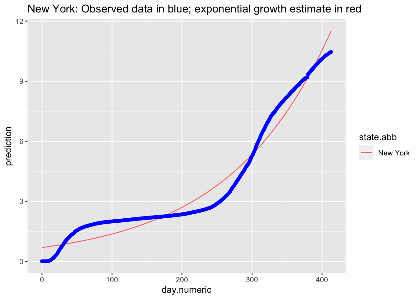
Consistent to what we observed in the log transformed data and the linear mixed model, the points do not appear to follow an exponential curve, with the case of New York being one example.
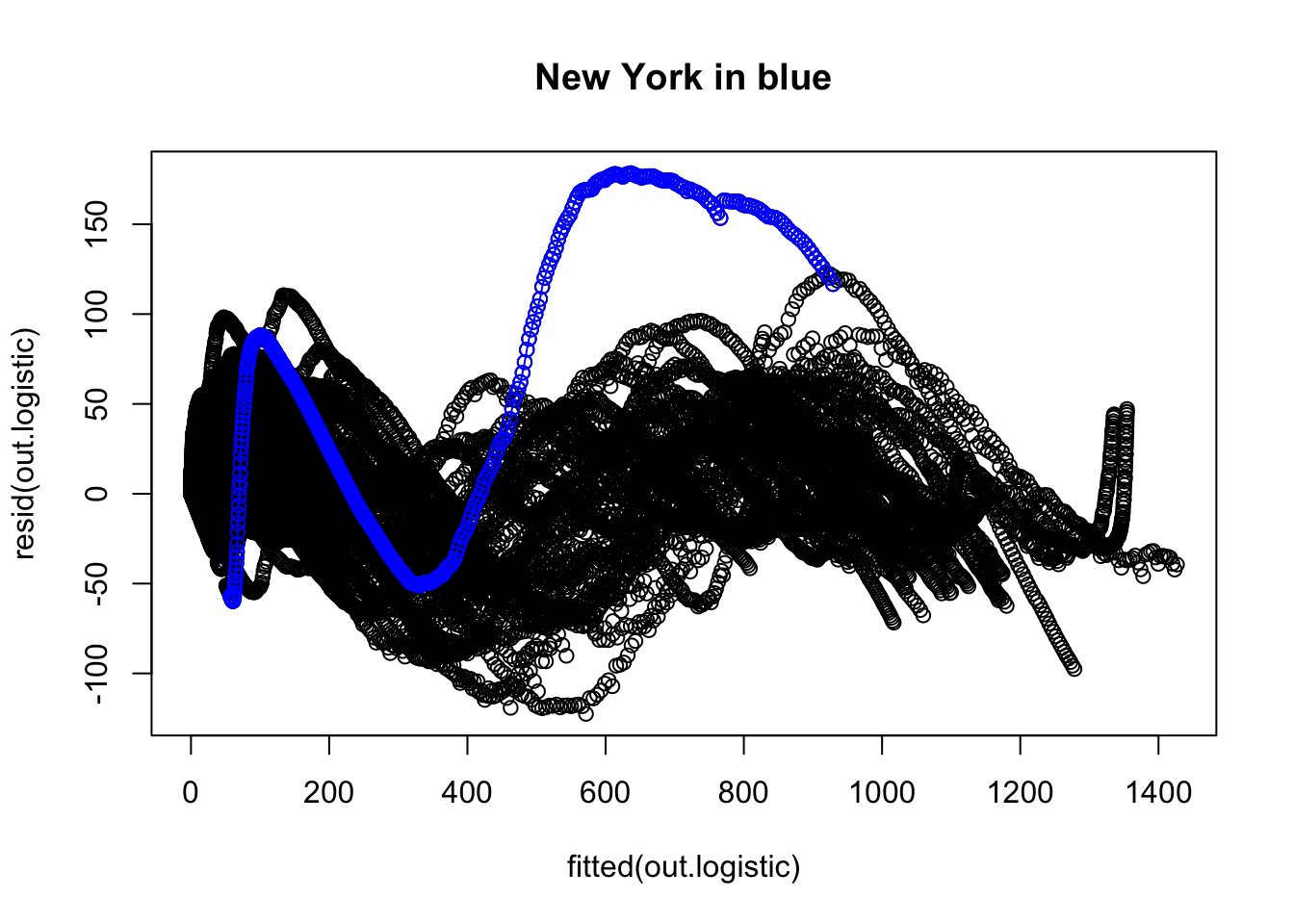
We now examine the residuals to evaluate whether there is any structure the model is failing to pick up. The overall plot of the residuals suggests some major issues. For example, I colored in blue the residuals corresponding to New York and connected them with line segments to help them stand out. There is other structure in those residuals.
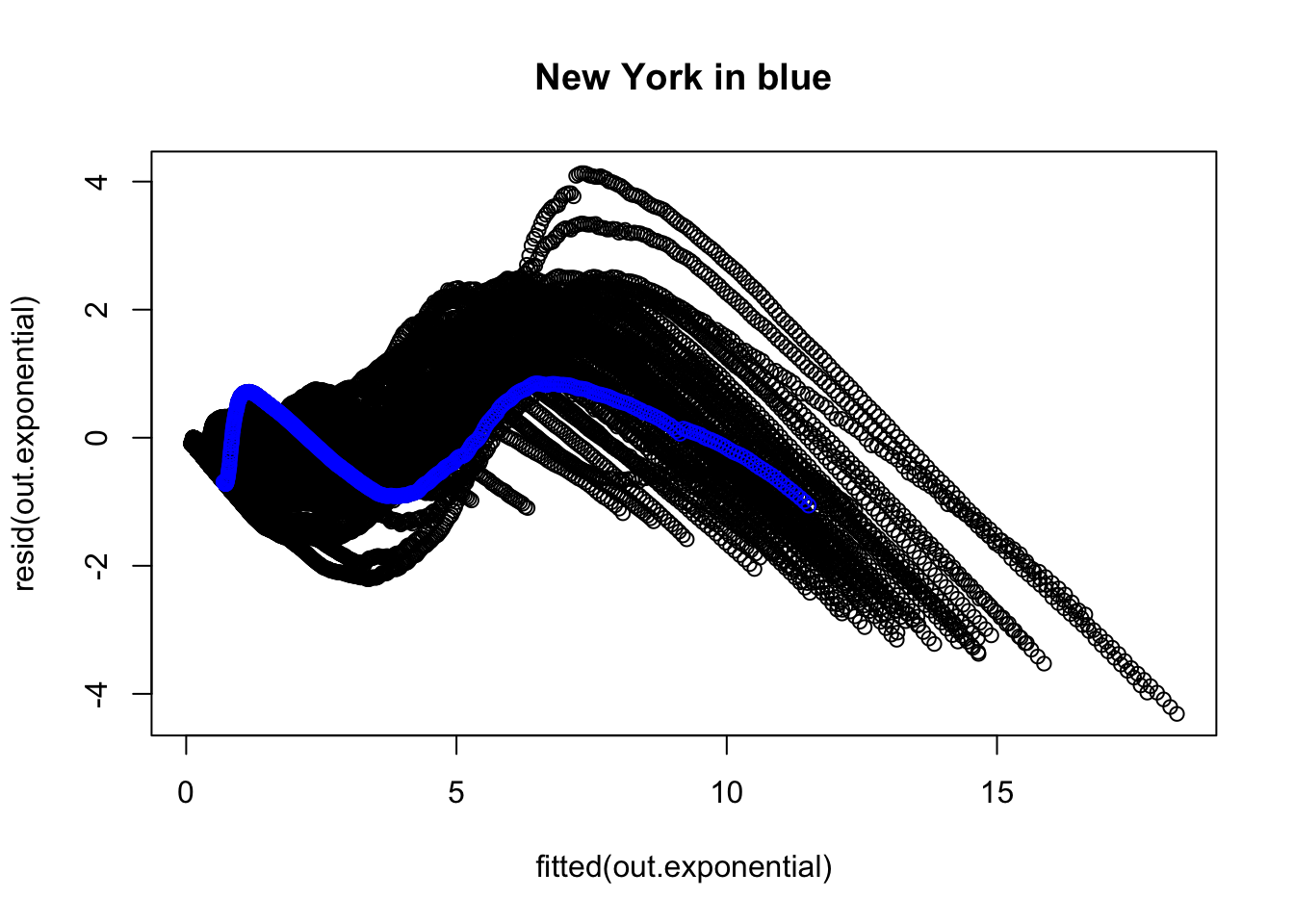
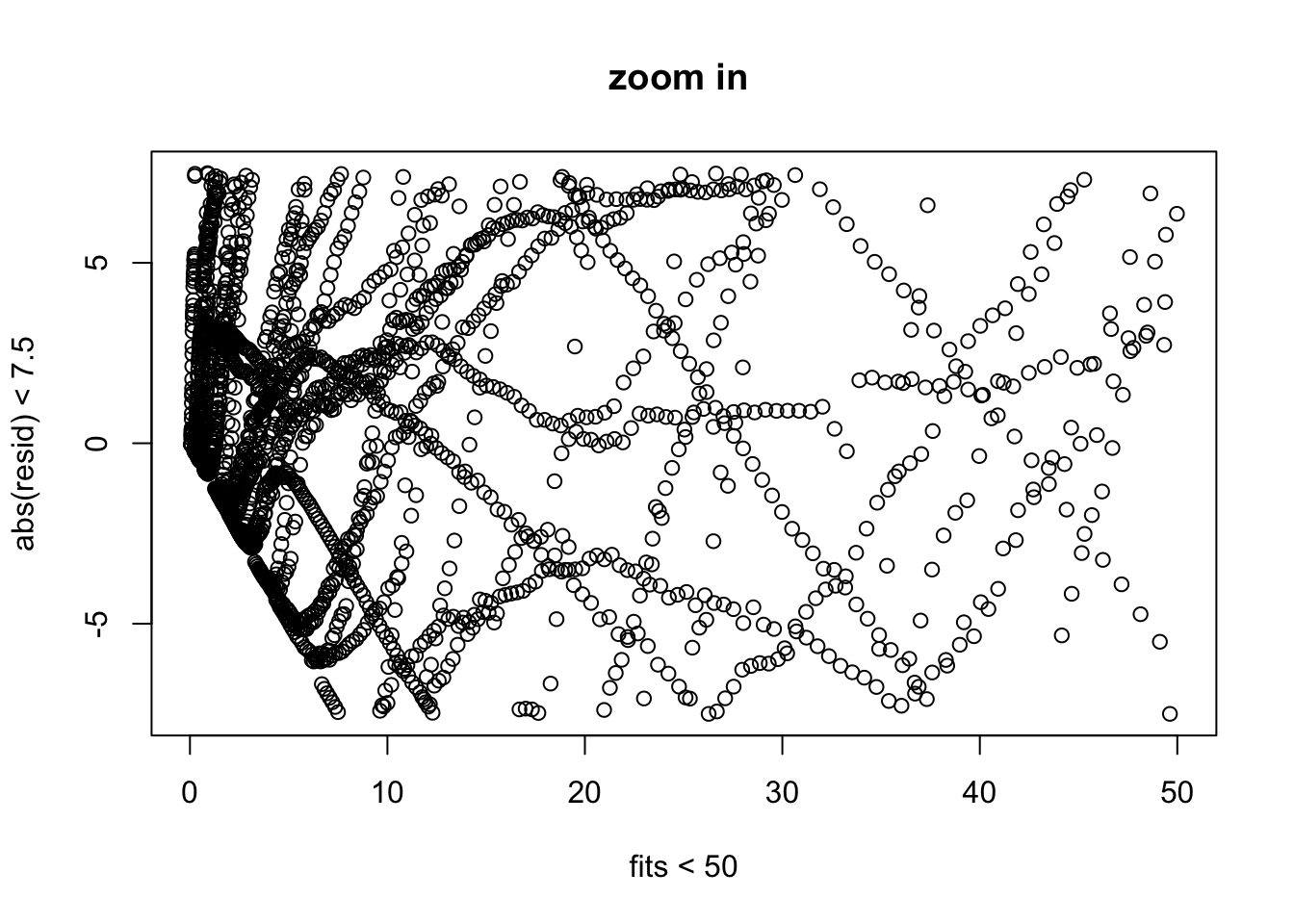
Here is a zoomed in version of the residual plot focusing in on the major “clump” of points.
[eval off]
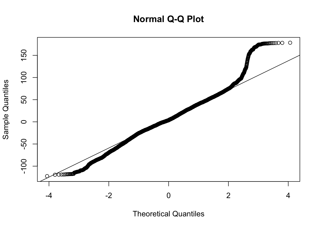
The QQ plot raises further suspicion on this model due to the long tails.
Overall, the exponential curve does not appear to offer a solid representation of these data. This is consistent with the conclusion we reached from the linear mixed model on the log data. We will move to a different form that may be more appropriate for these data.
5.3 Logistic Nonlinear Mixed Regression
Let’s switch to a logistic growth model (which is not the same as logistic regression for binary data). The nlme package has some additional functions to simplify the fitting of logistic growth models (e.g., SSlogis), which make it easier to set up starting values. In other work I’ve seen more efficient estimation (and less fussiness around starting values) with the stochastic EM approach to fitting nonlinear regression models such as in the package saemix.
The nlme() command has a difficult time with the three parameters of the logistic growth model. I did a little bit of tinkering with starting values and the three parameters. I was able to get a reasonable fit with fitting three parameters of the logistic growth model and having two of them be random effects (i.e., they are allowed to vary by state). A more careful analysis would need to be done to make this publishable, including exploring other parameterizations of logistic growth that may behave better with nlme.
The logistic growth model starts off being close to an exponential at first but eventually tapers off. Many biological systems follow a logistic growth function. Here is a link to a relatively simple explanation of logistic growth.
This is the form of logistic growth I’m using
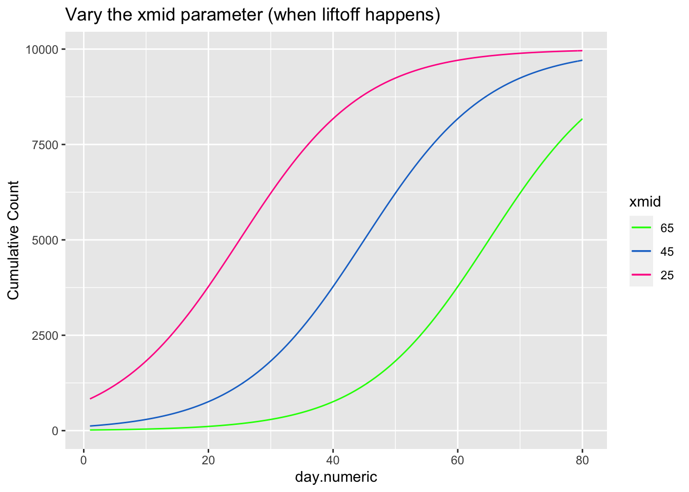
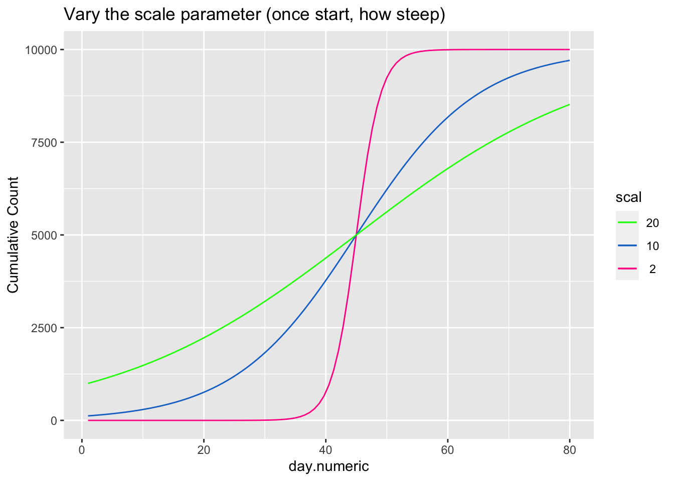
\[ \begin{aligned} count &= \frac{asymptote}{1 + ye^{\beta_1(day.mid - day)}} \end{aligned} \] The asymptote parameter controls the maximum value the function reaches, the day.mid parameter is both the day at which the function is half way to the asymptote and is also the inflection point and \(\beta_1\) is a scaling parameter defined to be the distance between the inflection point day.mid and point at which the count is 73% of the asymptote (basically, the difference between day.mid and the day corresponding to the count asymptote*\(\frac{1}{1+exp(-1)}\), see Pinhero & Bates). It is possible to have an extra parameter y, which is a multiplier, but be careful that the model is identified because \(y e^{x_1}\) can be reexpressed as \(e^{u + x1}\) where \(u=\log{(y)}\) creating issues in separately estimating y from additive parameters that are in the exponential. For most of the following I’ll constrain y to 1, thus setting the scale, and not estimate the y parameter.
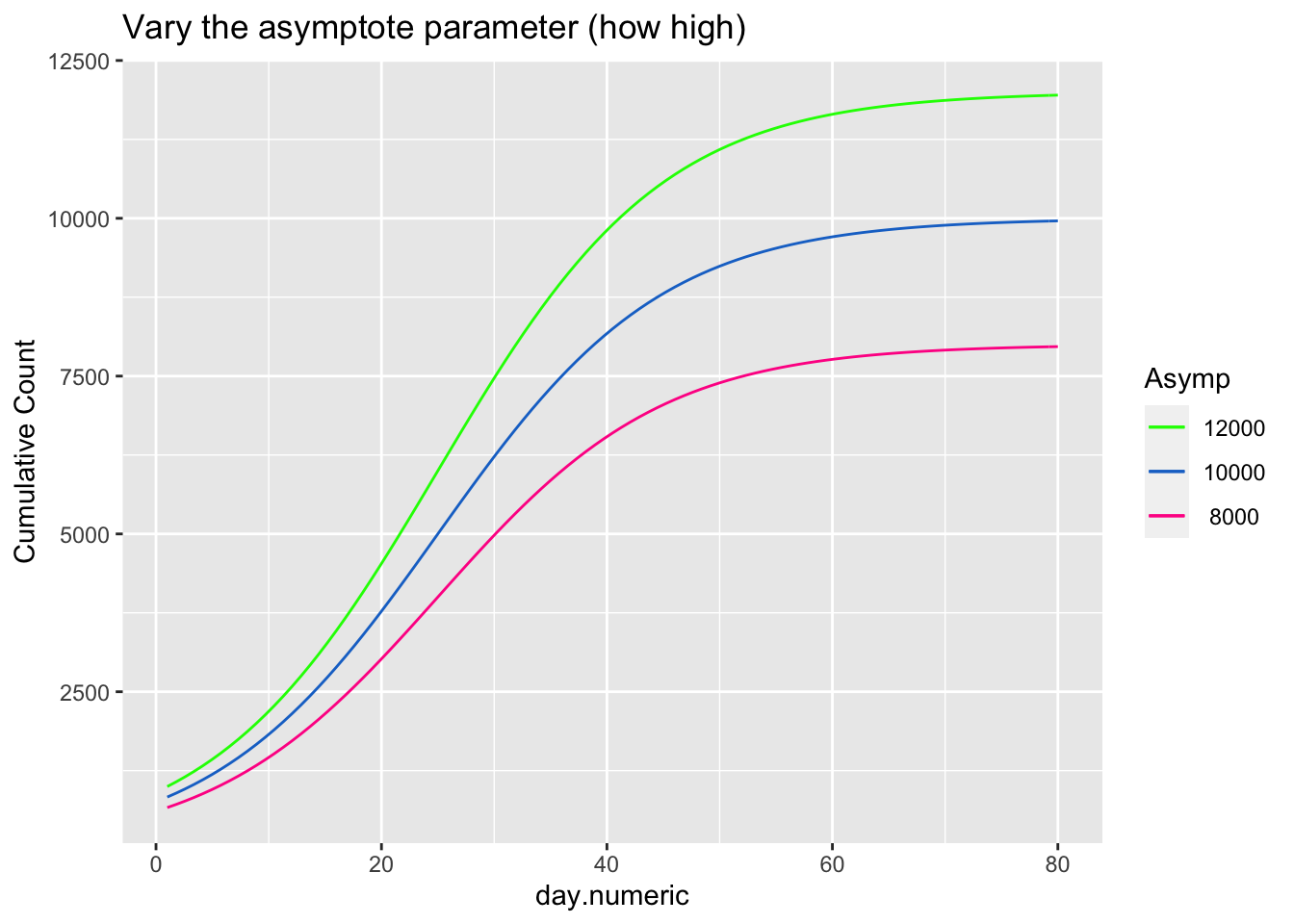
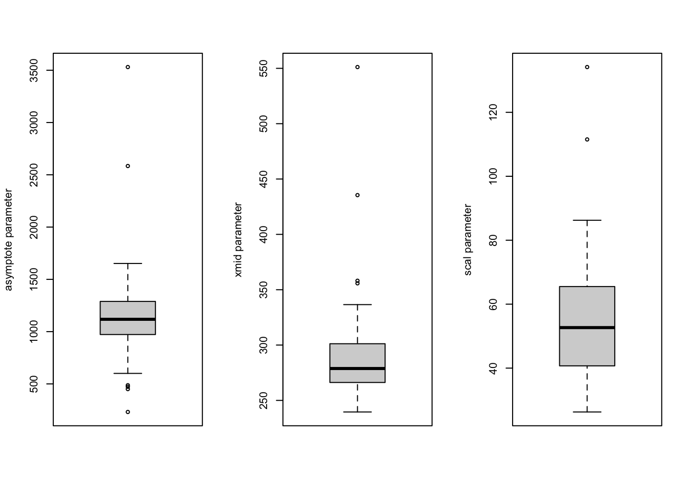
The next three plots examine how each of the three parameters control the shape of the logistic growth curve. I’m making use of the SSlogis function to define these logistic growth curves. The SSlogis() function labels these parameters asym, xmid and scal, respectively.
Let’s fit this logistic growth function to these data. I now use the per capita count of positive tests out of 10,000 to normalize by state population.
## [1] "File name associated with this run is v.95-123-g5a7aba6-dataworkspace.RData"| Value | Std.Error | DF | t-value | p-value | |
|---|---|---|---|---|---|
| Asym | 1161 | 107.8 | 20596 | 10.77 | 5.77e-27 |
| xmid | 292.2 | 9.276 | 20596 | 31.5 | 1.014e-212 |
| scal | 55.25 | 3.066 | 20596 | 18.02 | 5.129e-72 |
| Min | Q1 | Med | Q3 | Max |
|---|---|---|---|---|
| -3.499 | -0.4451 | 0.1083 | 0.819 | 5.096 |
| Observations | Groups | Log-restricted-likelihood | |
|---|---|---|---|
| state.abb | 20648 | 50 | -103273 |
| lower | est. | upper | |
|---|---|---|---|
| Asym | 949.9 | 1161.2 | 1372.6 |
| xmid | 274.0 | 292.2 | 310.4 |
| scal | 49.2 | 55.2 | 61.3 |
##   lag   ACF
## 1   0 1.000
## 2   1 0.999
## 3   2 0.997
## 4   3 0.994
## 5   4 0.989
## 6   5 0.984
## 7   6 0.978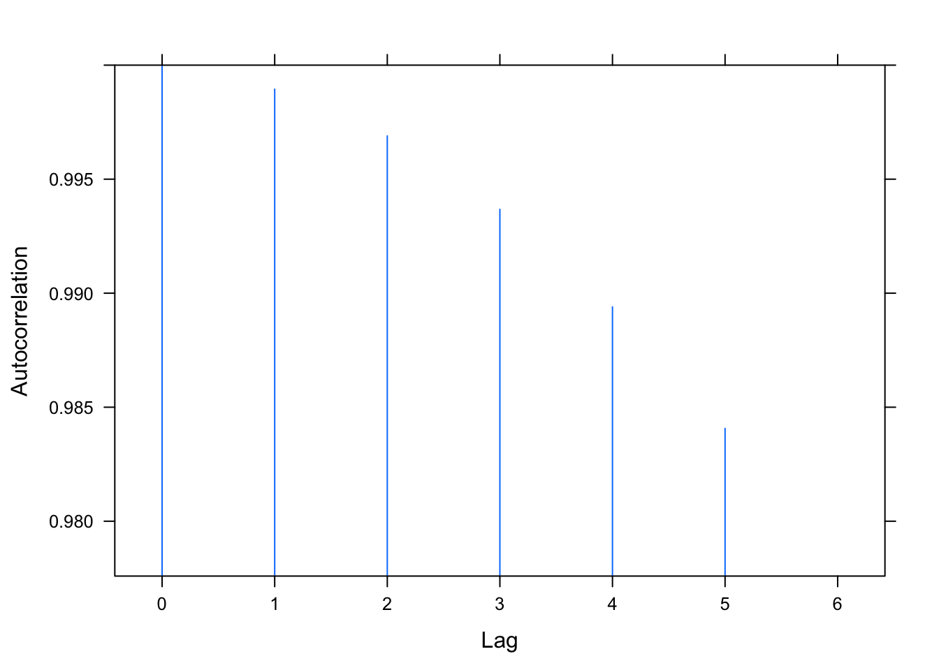
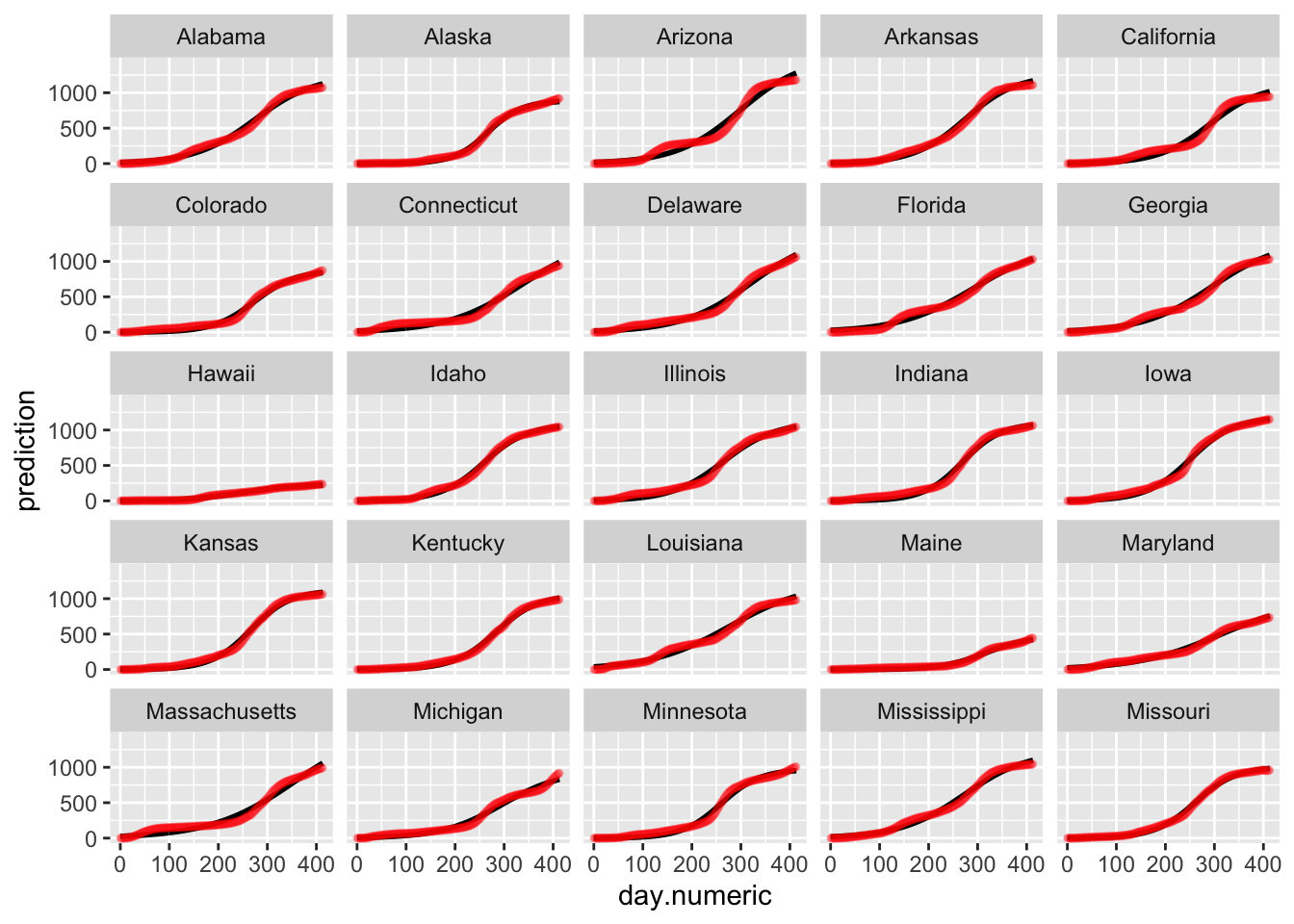
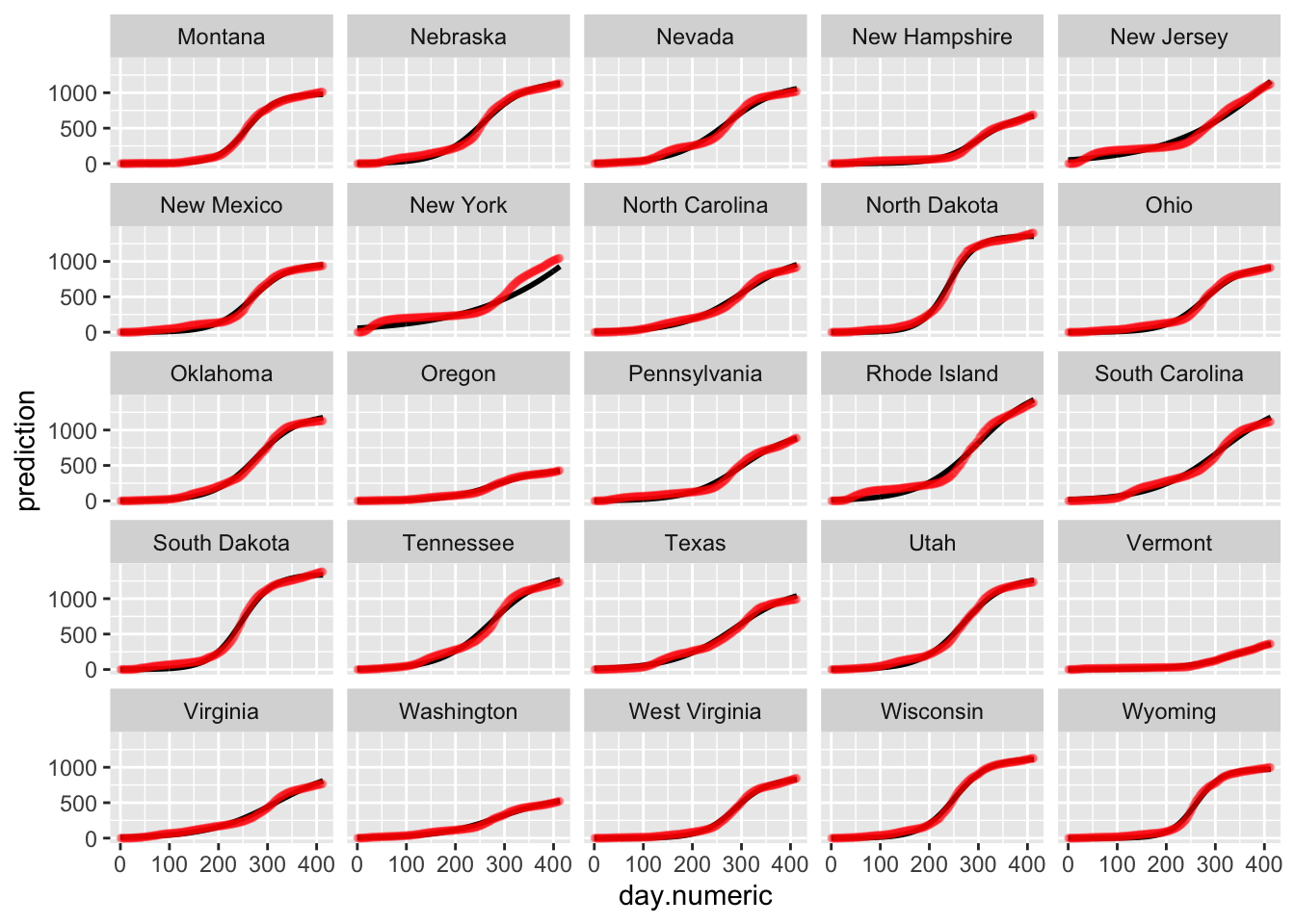
We examine the same three residual plots that we used with the exponential growth model and see a slight improvement in the zoomed in version and slightly less extreme tails. While better, these residual plots suggest there is still some structure that is not adequately modeled. I also include the autocorrelation function plot, suggesting significant autocorrelation in the residuals that is not being modeled.
Below is the plot of the predicted curves for this logistic growth model. Notice that the fits for some states begin to taper off according to the logistic growth model. One could examine these differences to see which model performs better in predictive accuracy (i.e., see if the actual data for the state tapers off or continues to grow exponentially). Such patterns are testable and the ideal way to compare models and decide which one provides a better representation of the data.
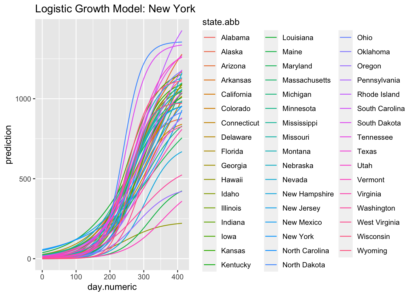
(#fig:logistic.fit)Logistic Growth Model: New York
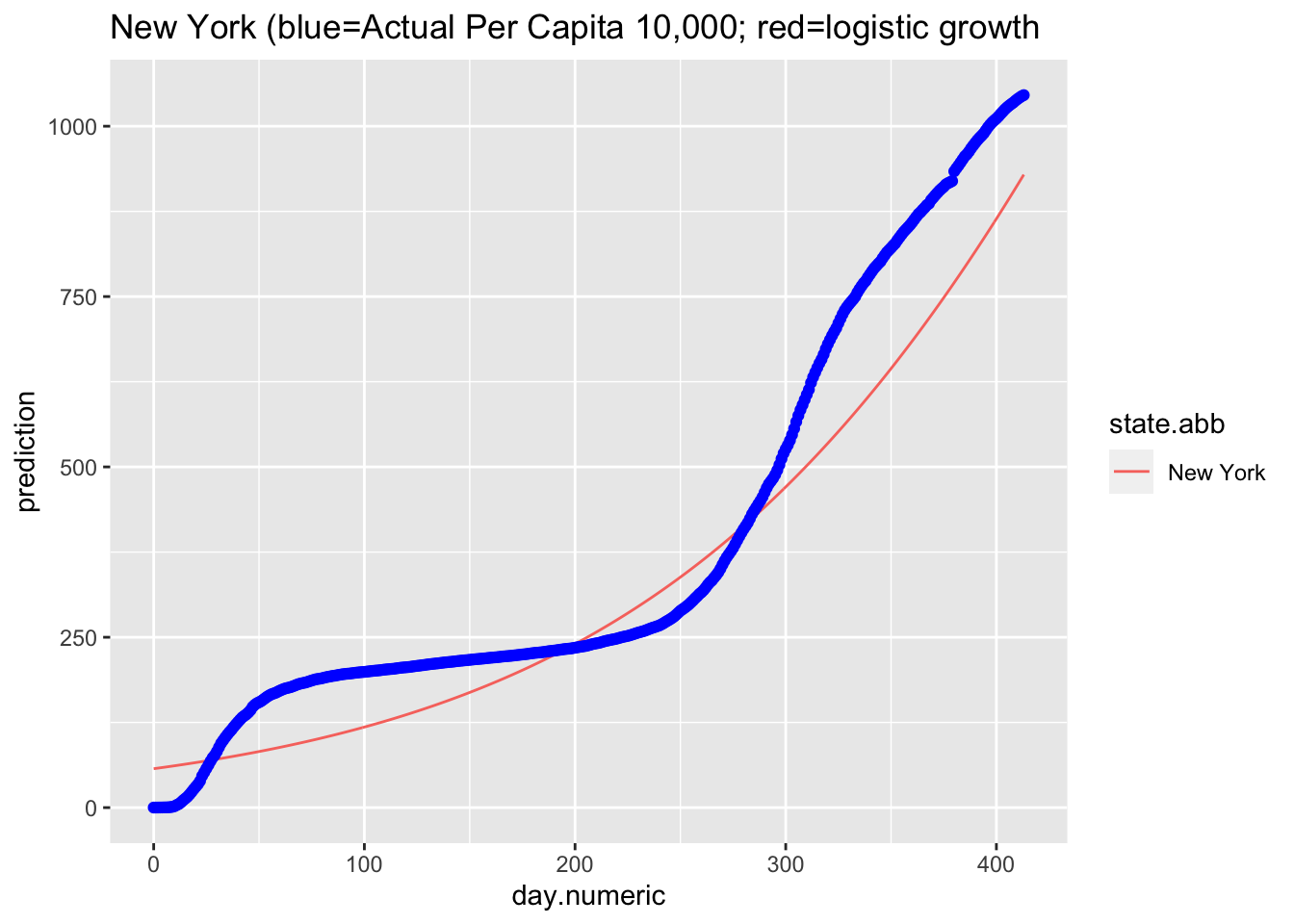
Here is the predicted curve for New York with the actual data points in blue. We know from the analyses of the residuals that the model fit is still not ideal, but this plots suggests a logistic growth pattern is a reasonable fit to the data and better than the pure exponential growth model. Where the model is not capturing the data well is the liftoff and the sharp increase once the curve started to increase. There is also a pattern in the data around day 75 that is worth examining (e.g., checking what happened around that time in New York, such as a change in counting policy or a change in diagnostic test) and the actual data pattern is continuing to increase more rapidly than the predicted logistic growth model after day 55.
Another way to compare across models is to use an index such as the AIC, which is a measure based on information theory and akin to R^2 adjusted that can be used to compare regression models that vary in the number of parameters. One needs to be careful when using AIC across models where the dependent variable is on different scales as in these notes. For example, my log transform of percentage cases (count/population) in the linear mixed model is on a different scale than the exponential nonlinear regression model I computed above. R provides such information-based criteria measures such as AIC() and an alternative called BIC(). Here I give AIC and BIC for the logistic growth model. When comparing models on comparable dependent variables the model with the lower AIC (or BIC) value is selected.
## [1] 206567## [1] 206646The AIC is a function of the likelihood function and the number of parameters; BIC is a function of those two values as well as the number of data points. The two indices are functionally related by BIC = AIC + k*(log(n)-2). The logistic growth model I estimated has 7 parameters (three fixed effects, two random effects variances, one correlation between the two random effects and the residual variance) with n=20648.
Another consideration is that the residuals may not be independent given that these are time series data. Yesterday’s residual may be correlated with today’s residual. Here I add a correlation structure to the nlme command using an autocorrelation lag of 1 (AR p =1) and a moving average lag of 1 (MA q = 1). The ARMA implementation in nlme, though, operates completely on the residuals. So, the AR refers to the previous residual correlation and the MA refers to a set of independent and identically distributed noise terms apart from the residuals (see Pinhero & Bates, 2000, as this is not standard). You can think of the MA noise parameters are “factors” that are added to produce an additional source of correlation across residuals, much like a common factor would in a factor analysis model, but separate from the serial correlation of residuals. One could also try a heterogeneous residual variance model (the weight argument described above) along with the correlated error. More diagnostics would be needed to settle on the appropriate correlational structure for the error term plus the usual checks on the residuals to ensure we are properly meeting the statistical assumptions.
NEED TO FIX
Here is a test of the two logistic growth models (with and without correlated error structure). The model with correlated error structure fits significantly better with only two additional parameters: one for the autogressive portion and one for the moving average portion.
For illustration purposes, here is another way of fitting this model using a different package lme4. While lme4 is in some ways easier to use, it is not as flexible as nlme, which allows, for example, correlated error structure on the residuals and the ability to impose structure on the covariance matrix between random effects. This model includes random effects from the asym and xmid parameters but there are convergence issues when all three parameters are allowed to be random effects. [now got it working with 3 RE parameters]
| Estimate | Std. Error | t value | |
|---|---|---|---|
| asym | 1140 | 1.369 | 833.2 |
| xmid | 298.4 | 0.2039 | 1463 |
| scal | 57.5 | 0.1404 | 409.6 |
5.3.1 Additional Predictors: Example with State-Level Poverty Rate
Now that we have a reasonable model, let’s see how we can include predictors to the model. One way to include predictors is to examine if the parameters of the logistic growth regression are influenced by the predictor, e.g. do the state asymptote parameters vary according to the predictor. We can accomplish this by, say, having the asymp parameter for each state be a linear function of the predictor, as in asym = \(\beta_0\) + \(\beta_2\) predictor + \(\epsilon\). Our current model is the special case where \(\beta_2\) is set to zero, thus asym = \(\beta_0\) + \(\epsilon\) where the intercept is the fixed effect (same value for each state) and the “\(\epsilon\)” is the random effect (a term associated with each state). By expanding the model to include a predictor associated with the asymp parameter we can examine if the predictor is linearly related to the asymp parameter.
For illustration, I examine whether the poverty rate in each state is associated with the “scal” random effect coefficient in the logistic growth model.
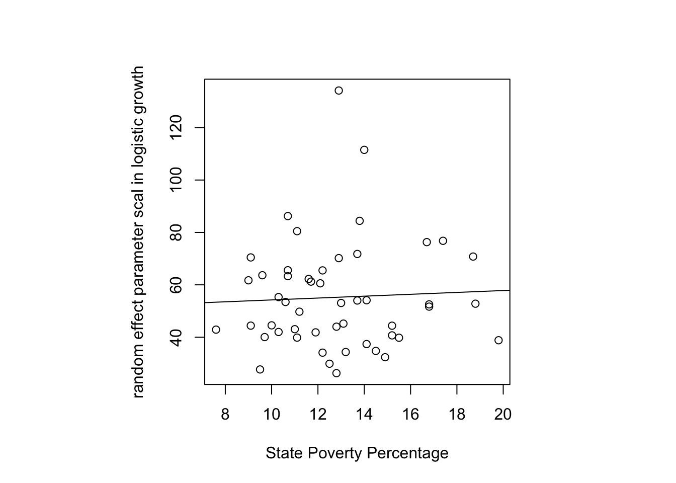
It looks like a slight positive association is present though the data are noisy. In principle, I could test this regression slope through a regular regression but it is better to do it in the context of the nonlinear logistic growth regression model directly. The reason is that a linear regression using the coefficients from the logistic growth as though they were an observed variable doesn’t take into account the error structure of these parameters—the parameters aren’t observed data but they are estimates from another model. By including the poverty predictor simultaneously in the logistic growth model, we can model the uncertainty much better. It would be even better to run this as a Bayesian model, which I’ll add in a later version using the brm package.
| Value | Std.Error | DF | t-value | p-value | |
|---|---|---|---|---|---|
| Asym | 1034 | 42.45 | 20595 | 24.36 | 3.323e-129 |
| xmid | 274 | 0.2494 | 20595 | 1099 | 0 |
| scal | 47.82 | 7.383 | 20595 | 6.477 | 9.587e-11 |
| b2 | 0.2385 | 0.5625 | 20595 | 0.424 | 0.6716 |
| Min | Q1 | Med | Q3 | Max |
|---|---|---|---|---|
| -3.489 | -0.3714 | 0.08368 | 0.6568 | 5.946 |
| Observations | Groups | Log-restricted-likelihood | |
|---|---|---|---|
| state.abb | 20648 | 50 | -109411 |
| lower | est. | upper | |
|---|---|---|---|
| Asym | 950.740 | 1033.937 | 1117.13 |
| xmid | 273.544 | 274.033 | 274.52 |
| scal | 33.346 | 47.815 | 62.28 |
| b2 | -0.864 | 0.238 | 1.34 |
DOUBLECHECK: significance status has changed.
The \(\beta\) associated with poverty is statistically significant in this example so there is evidence that the state variability in the scal parameter of this logistic growth model is associated with the state’s poverty level. In other words, state-level poverty is associated with how quickly a state increases in positive tests (the scal parameter). We need to be careful in interpreting this association given that the dependent variable we are using could reflect covid incidence but could also reflect the number of tests a state has conducted.
This example illustrates how one goes about adding predictors to such a nonlinear model. One could use more complicated predictors, even test differences across groups on parameter values (e.g., the question do states with democratic governors have different parameter values than states with republican governors, can be tested by creating an appropriate grouping code for the political party of the governor and including that code as a predictor in the same way I included the predictor poverty).
While the presentation has focused on associations, the overall framework can be extended to strengthen inference using various methods including instrumental variables (e.g., Carrol et al, 2004) and newer approaches (e.g., Runge et al, 2019), though much theoretical work remains to be done to move these nonlinear mixed models from mere description to stronger inferences by allowing more direct tests of possible alternative explanations. For an introduction to some basic modern methods in causal inference see Bauer and Cohen.
5.3.2 Additional assumption checking: random effect parameters
I’ll revert back to the simple logistic growth model at the start of this subsection. The residual plots already raised concern about the model fit. We can also examine additional assumptions of the model such as the distribution of the random effects. The random effect parameters in the nonlinear mixed logistic growth model are assumed to follow a multivariate normal distribution, which seems to be reasonable so many days into the pandemic. Here is a 2D density plot (I know, a lot to ask for when there are relatively few pairs of points, one for each state), separate qqplots and boxplots for the asymptote and scale parameters. The qqplot for the asymptote parameter has a long tail, mostly due to New York and New Jersey; the ones for the xmid and scal parameters look ok.

5.4 Evaluating Exponential and Logistic Growth Models
The overall point is that testing whether the data fit an exponential growth model, a logistic growth model, or various other plausible growth trajectories is not merely a modeling fitting exercise. There is much diagnostic testing one needs to do in order to figure out in what ways is a model working well and where it is messing up. The particular way a model is going awry may suggest directions for improvement and may offer clues about the underlying processes that generated the data, which is usually the important part of such an exercise.
The model selection game is more complex than merely selecting the model that has the best fit value on a standard metric such as AIC or BIC or predictive accuracy. To me, there is deeper insight that emerges from understanding the type of growth that is underlying the processes under investigation. We are in a better position to understand how to intervene if we understand the growth process that underlies a data set. Just because a model achieves relatively good performance on measures of fit does not imply that the model is following the same mechanisms of the processes that generated the actual data. This is where the diagnostic tests come in to help us diagnose such situations.
Let me illustrate what I mean by deeper implications. We know that if a growth pattern follows an exponential function, then the plot should be linear in the log scale. Think, the logical implication: “if p, then q”. Now, our data suggest that in the log scale we do not see linearity. What can we conclude? Well, through the logical contrapositive, the observation of not q, implies not p. In other words, the data rule out the simple exponential. Concluding that we can rule out an entire functional form from consideration is a more powerful result than merely claiming one model fits better than another.
The Center for Quality, Safety & Value Analytics at Rush University released a calculator that lets the user interactively change the model on cumulative cases. For example, one can click on exponential, or logistic, or (gasp) quadratic and run a model fit along with a forecast. The user can also select the state.
To get deeper in such process models of growth, we need to develop some additional machinery including differential equations, which are equations that govern changes over time. I’ll briefly touch on these models in the next chapter.
check on glmer and gamma

out.gamma <- glmer(percap100 ~ day.numeric + (day.numeric|state.abb), data=na.omit(allstates.long.new),
            family=quasi(link="identity"))
5.5 Splines, Smoothers and Time Series
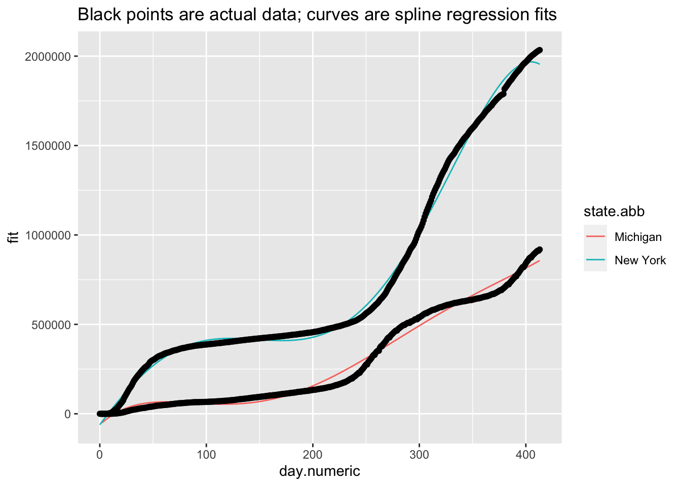
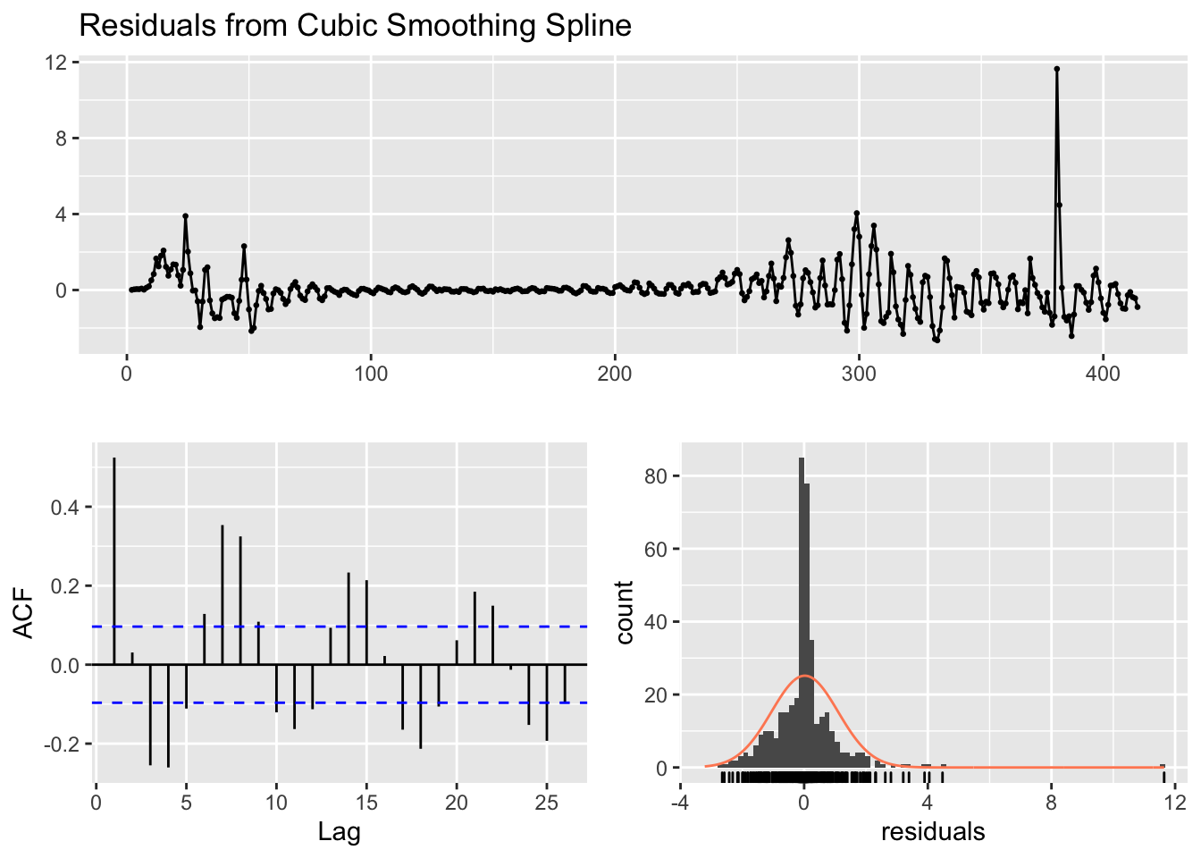
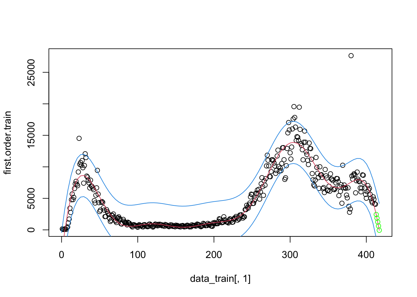
I’ll briefly give an example of splines because it will be helpful in subsequent sections. I don’t recommend going the route of splines and smoothers in this context. While splines can provide great fit to the data and can be used for interpolation (e.g., if we missed a day of data collection, we could interpolate), splines and smoothers are not helpful at informing one of the underlying process nor in forecasting (extrapolating) from one’s data, which is what we want to be able to do in this case. For illustration, and to show that I too can get curves that approximate the data points closely, I ran a mixed model spline regression where the knots are treated as a random effect by state and show the plots just for New York and Michigan for brevity. One would need to do all the usual diagnostics for this mixed model as well.
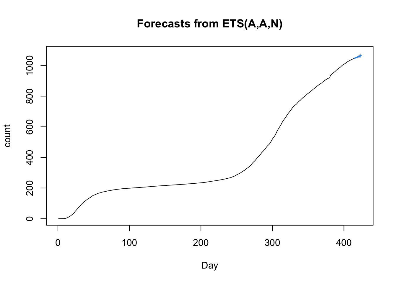
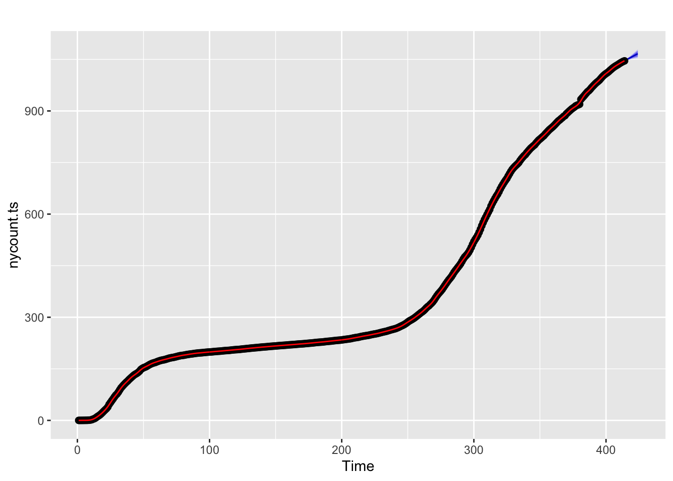
The splines approach can be extended in the context of time series to permit forecasts. Here I’ll show the use of the forecast package and the excellent online book by Hyndman and Athanasopoulos. I’ll forecast 10 days out from the current date using New York data and compute an error band, show how to check residuals with the checkresiduals() command, and how to use hierarchical time series to model state trajectories within the US.
I tend to lump a different class of models into the bucket of models considered in this subsection. There are models that directly model the coefficients as varying by time. Polynomials can be thought of as having time varying coefficients. For example, the quadratic \(Y = \beta_0 + \beta_1 t + \beta_2 t^2\) can be rewritten as a linear regression with one predictor \(t\) that has intercept \(\beta_0\) and a time-varying slope term (\(\beta_1 + \beta_2 t)\). Splines extend this logic by allowing the slope at a given \(t\) to vary continuously. There are models that take this idea and run with it. One such approach is a nonhomogenous Poisson process, which uses the Poisson distribution to model counts and allows the rate parameter to vary by time (hence the term nonhomogenous). There are several R packages that implement such models, including NHPoisson and some extensions to spatial cases such as spatstat. .In the modeling presented in this book, we mostly work with counts so a Poisson would be a natural standard distribution to consider rather than blindly relying on normal distributions assumptions as I have done in several sections. I have highlighted how the normal distribution assumptions have been suspect. A different approach for implementing time-varying coefficients is in the R package tvReg.
5.6 Bayesian Estimation of Nonlinear Regression: Adding value to prediction and uncertainty
I will illustrate the use of Bayesian nonlinear regression modeling to estimate prediction uncertainty. The Bayesian approach also allows for more general models than the standard regression approaches described earlier in this chapter, these include expanding the assumptions limitations of the classic approach. For example, within a Bayesian approach one can include predictors of the variance terms, which is not easy to do in the classic setting. This could be useful, for example, if a predictor influences not only the value of a random effect parameter but also its variance. Or, we may be able to do a better job of developing models that are more appropriate for the count data we are using throughout these notes. Another example of something that is difficult to do in the classical framework is dealing with the distribution of random effects that do not follow a normal distribution. Earlier we saw that there may be two clusters of states and that the joint distribution of random effect parameters appears to be skewed. This makes suspect inferences based on random effects that assume a joint normal distribution. These nonstandard cases can be easily handled in the Bayesian framework.
I co-wrote an introductory chapter on Bayesian statistics with Fred Feinberg that highlights some of the advantages and disadvantages of the Bayesian framework. For a complete book on Bayesian statistics I very much like the comprehensive book by Gelman et al. Bayesian Data Analysis. A more readable textbook is Kruschke’s Doing Bayesian Data Analysis.
My Bayesian example here will take a problem that was extremely difficult in what we did earlier but is relatively easy to do in the Bayesian context: put intervals (or, as a Bayesian would say, credible intervals because the interpretation is slightly different than a standard confidence interval) around predictions form a nonlinear random effects regression model. This is an important detail that the classical approach has a difficult time addressing, as I mentioned in earlier subsections of this chapter when I wasn’t able to establish the uncertainty around the predictions. While uncertainty intervals around the parameter estimates are possible in the classical approach, computing error bars around the prediction interval in a random effects nonlinear model is not straightforward.
I’ll follow the same modeling implementation as used earlier. The brm() function in the brms package provides a convenient wrapper to the Stan Bayesian modeling using typical R commands. I’ll follow a similar set of assumptions as I did before (e.g., normally distributed random effects using relatively “flat” priors). The computation takes over four hours on my desktop computer so for now I’ll set the iteration to 2000 with 4 chains, which are the default settings. When these notes are complete and I’m no longer running the code each evening, I will increase the number of iterations, say, to 10000 and vary some of the other computational details to produce more stable estimates. Experts in Bayesian analysis will see some issues with the diagnostic plots I show but I’m sure many will agree with my decision to keep things relatively quick for now in this draft form.
NEED TO FIX BAYESIAN MODEL TO USE percap10000 dv
Here are the signature Bayesian plots of each parameter (density and trace plots) as well as the intercorrelations across the parameters.
These are the prediction bands around the “fixed effect” part of the model and a plot for the state of Michigan.
5.6.1 Bayesian extensions
Pending: show a Bayesian approach to the generalized nonlinear mixed model
5.7 State-space modeling
The simple idea of a time series introduced earlier in Section 5.5 can be extend to a context involving a latent variable, or as it is called in this context, a state. The basic idea is that there are two equations governing different levels of analysis. One equation governs our observations and another equation govern a latent state.
One form of this approach has these equations. For the state-space portion, \[ S(t+1) = S(t) + \epsilon_s \] where S(t) is the state at time and the \(\epsilon_s\) is the noise in the state model. This equation governs the transition from one state to another at each time step possibly with error. The error is assumed to be normally distributed with mean = 0 and some variance. If the variance is constrained to be 0, then there is no noise in process modeling the transition across states. This model can be extend to include parameters, transition probabilities, covariates, structure on the error terms and other bells-and-whistles usually associated with regression models.
The second equation governs what we observe \[ Y(t) = S(t) + \epsilon_m \] where Y(t) is our observation at time t, S(t) is the state at time t and the \(\epsilon_m\) is the noise associated with our observation. Typically, the two \(\epsilon\)s in these two equations are assumed to be independent. If they are both normally distributed, then this is typically known as a dynamic linear model.
The way to think about these two equations is that there is a process governing the way way the system moves from time step to time step and there is an additional process that can lead to noisy observations of those states. There are analogous models in other areas of statistics (e.g., factor analysis can be represented in a similar way of a measurement model separate from a structural model).
I adapted some of the code from this webpage.
R example pending.
I will return to state-space models in Chapter 6 when discussing process models.
5.8 Basic Machine Learning Examples
In my opinion, while impressive progress has been made in text analysis and image analysis, the machine learning literature has lagged behind where it needs to be on development of methods that address multiple time series (e.g., times series by state, country or county). Here I review one approach, an implementation of a recurrent neural network (RNN) that I used for the data from New York state. We need to use an RNN, a specialized version of a neural network, because we have time series data. Here is one description, another description and a third description by UM’s Ivo Dinov of RNNs. The R package I will illustrate is rnn and it is a basic implementation of a recurrent neural network. There are much better implementations, such as the keras package and I’ll explore that later once I make more progress on other parts of these notes. For now, we’ll use the very simplified rnn package in R.
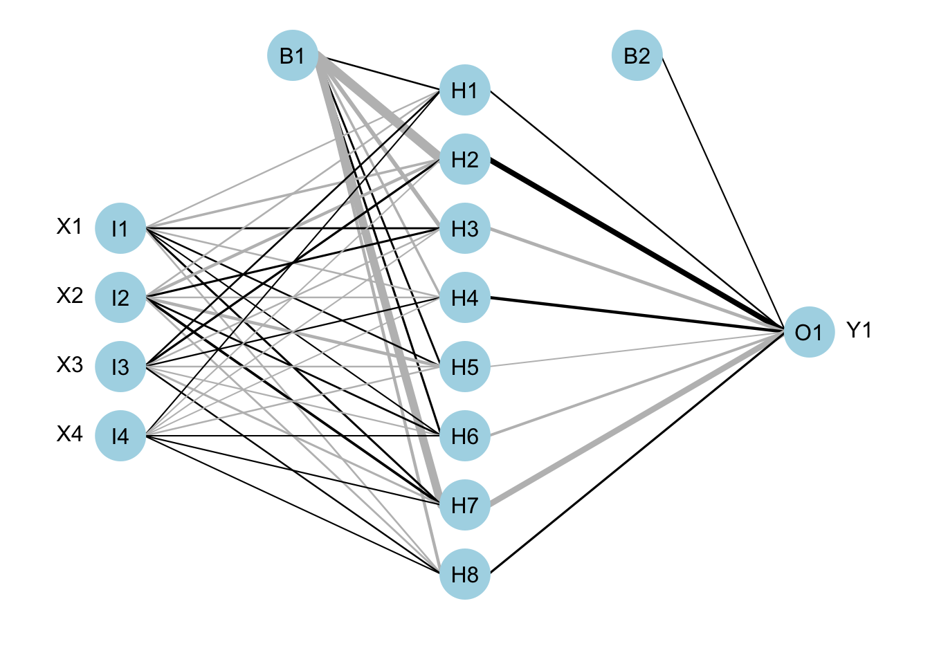
The underlying common element of a neural network is that they take inputs, weight them, sum and add a “bias” term. This is similar to regression in weighting predictors by betas, sum the products and add and intercept. The weighted sum is then converted into a number between 0 and 1, using the logistic form similar to logistic regression that converts the model on the real number line into the scale of the dependent variable that is a probability between 0 and 1. This can be done repeatedly to create multiple units, or different sets of weighted sums, in a manner similar to principal components analysis (PCA) where the observed variables are weighted and summed to produce components. It is possible to create additional layers with new outputs based on these weighted sums (so, weighted sums of nonlinear transformations of weighted sums). The the final layer of units is then mapped onto the outcome variable.
Here is a graphical representation of what I mean. This example has four inputs (i.e., four variables or features), one hidden layer with 8 units, and one output layer that is a single number prediction (like our counts of positive tests). The hidden layer is a set of 8 units. The two B terms are the “bias” terms that feed into the weighted sums. The thick black lines refer to higher positive weights and the thicker gray refer to smaller negative. Example adapted from the tutorial in the NeuralNetTools R package.
The RNN approach we will use is a simplified version. More appropriate approaches would be long short-term memory models.
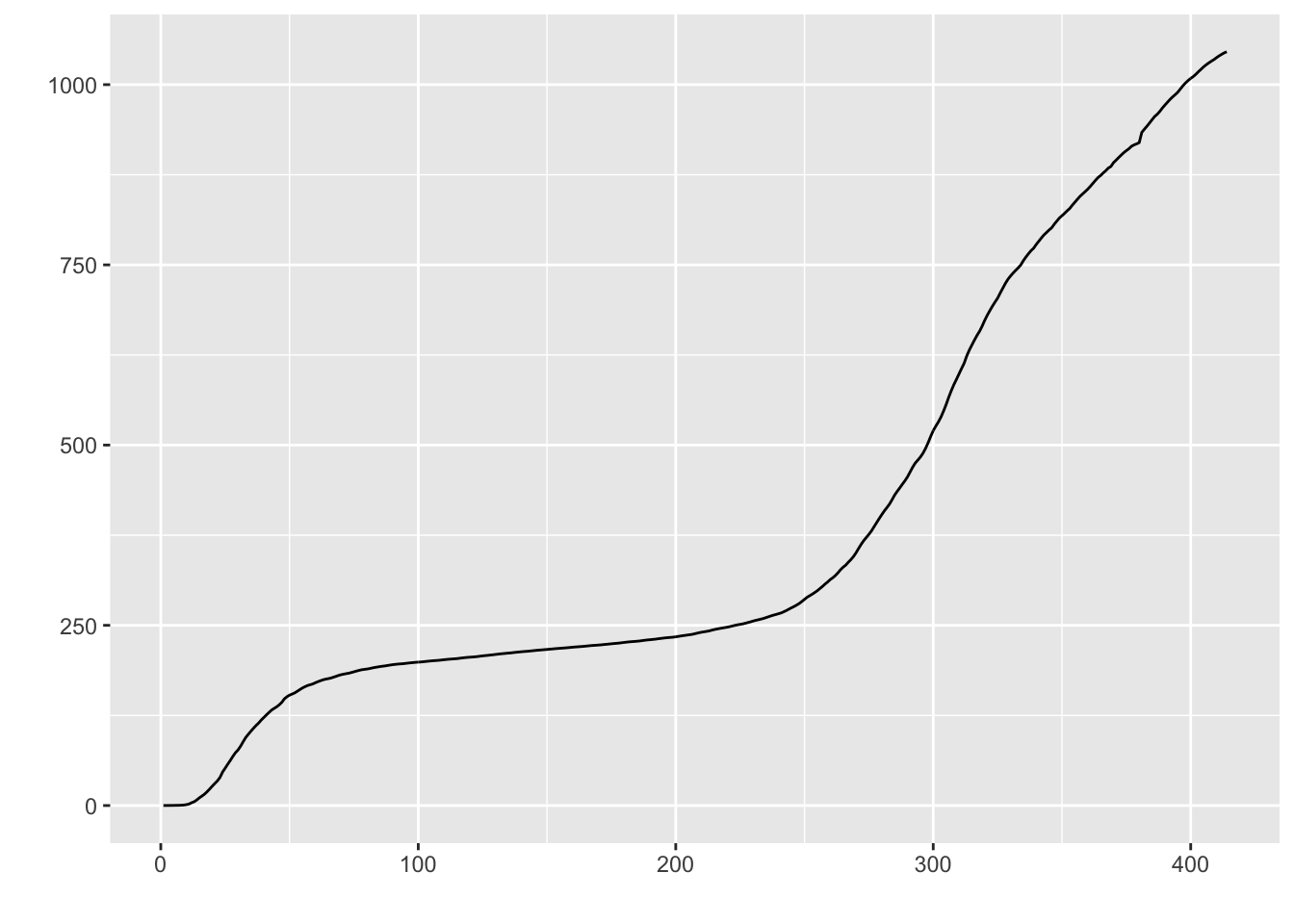
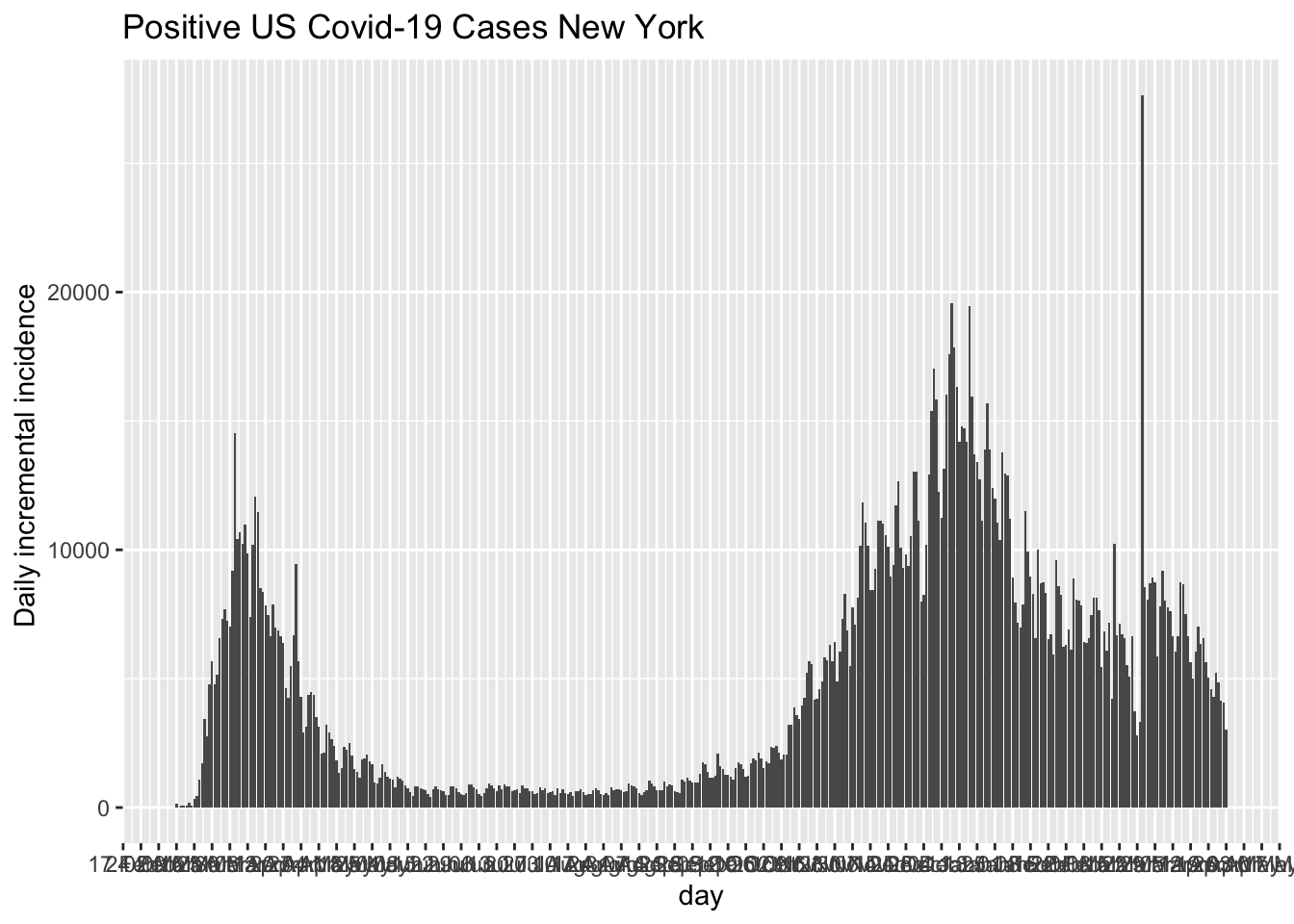
It is common to model time series using the counts for each day (such as with the incidence plot we saw in the Section 4.4) rather than the cumulative counts we have been using throughout most of these notes. I’ll follow that convention here.
The incident plot for New York State.
5.8.1 Simple RNN example
The following involves a relatively large chunk of code. Other implementations of deep learning networks require even more code. The basic idea is that we put all our data into one data frame, then partition it into testing data and training data. We want to be sure we partition early so as not to contaminate the testing data with any information that is in the testing data. For example, if we compute a mean we may inadvertently compute a mean for all the data (testing and training), and then if we use that mean in training we have contaminated the training data with information from the testing data.
The only information I have to work with so far is the number days and the previously observed daily counts; that is, as of this point in these notes we don’t have access to other possible predictors of a state’s daily count. Here, “previously observed” means if I’m at time t, then any data prior to t is “previous” data that I have but any data after t has not occurred. In the case of data I’m downloading, t may be, say, 4/10/20 so from that perspective any data after 4/10/20 cannot be used because as of that time point t I don’t know of data after t. Part of the machine learning algorithm works by varying t to different days, repeatedly feeding those sequences of data to the model and trying to learn the patterns by figuring out what it is getting wrong, making adjustments in the model’s parameters (the weights and bias terms) and making new predictions, and iterating that process.
The rest of the code is creating daily counts and several features to use as predictors. We don’t have a rich set of predictors set up yet so I created some from the day variable. I will use day, day\(^2\) and day\(^3\) (of course, mean centering day before computing the higher order terms). I created a predictor of how much daily change there was (e.g., the count at t minus the count at t - 1). This serves as a slope estimate of change, which is a first order difference because I’m working in discrete time (days); technically, it is a secant rather than the slope (which would correspond to the tangent). I also created a “difference of difference” (or second order difference analogous to acceleration, or how the change is changing) to measure how much the slope is changing from day to day. In other words how different is the change today from the change we saw yesterday. This process of creating new variables from existing variables is called “feature engineering.”
This model has 7 inputs: day, day\(^2\), day\(^3\), count, count difference, count second order difference and running mean of the counts from the previous 3 days. I currently have just have a few units in a single hidden layer, and one unit in the output layer. Of course, to make this more interesting I could add many more predictors including state-level and daily information (e.g., measures of compliance to social distancing measures; weather, which could affect people’s behavior going outside; changes in a state’s social distancing policy).
In the figure below the red points are the actual daily cases in New York. The green curve is what the machine learning model learned. I intentionally over trained the model. The last day shows the prediction by the machine learning model in solid blue and the actual in solid red.
FIX: computer memory problem staring 8/27 with R upgrade
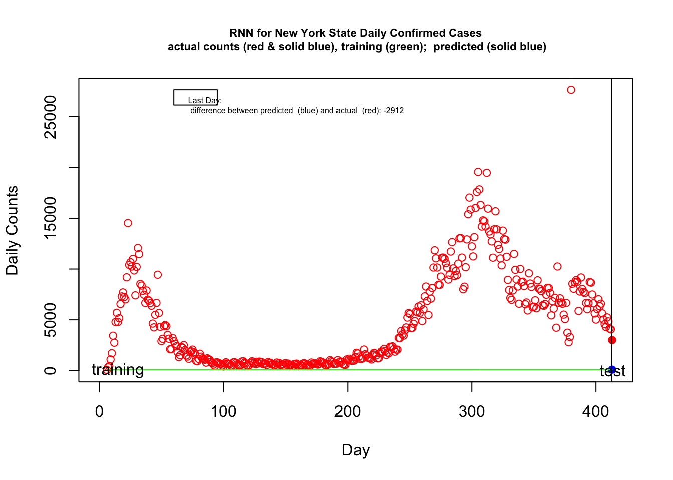
I’ll be the first to acknowledge that this example is just for demonstration purposes. Our data set is way, way too small to have any chance of estimating meaningful machine learning models, I created a kludgy set of predictors (aka features) without much thought, I haven’t included more predictors to the model and I’ve only focused on number of positive tests (e.g., a better demonstration of machine learning methods would be to use positive testing rates as predictors of outcomes such as subsequent death rates). the particular forms of the predictors I’m using (polynomial, first and second order differences) are known not to behave well when extrapolating beyond one’s data, as we are doing here when predicting the subsequent day. I also have not optimized for the various tuning parameters including the learning rate, so there is much one can do to improve the fit of this particular example.
There are more diagnostics to consider such as error in prediction and we can iterate over the tuning parameters to find optimal values that give good predictive validity without overfitting. Note that between day 25 and 40 the overall “trend” of the open red circles is relatively flat (as an average) but the daily variability is increasing. The current set of predictors I’m using in this RNN doesn’t have the ability to easily capture changes in the variability. This is one clue for additional predictors (features, see next subsection) that could be added to the model. This could be an interesting part of the story and something that can be addressed not only with machine learning models but also for the other models we considered in this chapter. Models that are not capturing this change in variance are possibly missing something important about the underlying process (which could just be something as simple as not all jurisdictions in New York state are reporting daily but nonetheless an important property to understand if we want to use these approaches to make forecasts). We could check whether this increasing variance occurs in other states and at different levels of analysis such as the county level. We could check whether this increase in variance is consistent with a multiplicative error model where error (the “plus \(\epsilon\)” term we discussed earlier) could provide a clue to the underlying process. The point is that there is a potential signal here that our current models are not capturing, and we need to figure out whether we need to move to a different class of models or whether this heterogeneity is due to a simple factor that can be easily addressed.
The increasing variance was not easy to detect in the cumulative plots and models on cumulative data such as the log linear, exponential and logistic models we covered earlier in this chapter. If you go back and look at those plots, even the ones using the curve fitting spline methods, they show systematic “under and over the curve” errors consistent with what we are seeing in the incidence plot. The increasing variance is there but just difficult to spot in the way we examined these data previously. Sometimes converting data to different forms, such as cumulative and incidence forms, helps highlight different aspects of the same data. It is not easy to see in the barplot of the New York incidence presented at the beginning of the RNN section. It is often useful to cross-check one’s interpretation with different model forms and plots.
There are many other approaches that fall under the large machine learning umbrella, these include extensions of RNNs such as long short-term memory deep learning models that can learn patterns further back in time than simple RNNs, general additive models with penalized smoothers, genetic algorithms, and symbolic regression as well as several packages in R to compute these methods. Overall, I was underwhelmed by the effort so far. Some of the R packages gave error messages even running the very examples supplied in the package or they made strange predictions. Part of the issue is that we don’t have enough data to allow these machine learning methods to shine. For a more detailed and systematic discussion machine learning approaches for time series data see Makridakis et al.
5.8.2 Gaussian Process Regression
There are many approaches that fall under the Machine Learning umbrella, with neural networks presented in the previous subsection being just one type of approach. In this subsection I will consider a different approach that mingles Bayesian methods with machine learning approaches and standard statistical models. The approach is to treat the function as a draw from a parent distribution of functions (see Erickson for a short introduction and Rasmussen & Williams (2006) for a book length treatment). I demonstrate one implementation using the GauPro package in R. The default is a Gaussian kernel but other can be used as well. In this demonstration I stick with the default settings but these can be tuned as with most machine learning algorithms.
FIX: temporarily commented out
## Error in deviance_fngr_joint(X, Z, K) :
##   BLAS/LAPACK routine 'DLASCLMOIEDDLASRTDSP' gave error code -4
## Error in deviance_fngr_joint(X, Z, K) :
##   BLAS/LAPACK routine 'DLASCLMOIEDDLASRTDSP' gave error code -4
## Error in deviance_fngr_joint(X, Z, K) :
##   BLAS/LAPACK routine 'DLASCLMOIEDDLASRTDSP' gave error code -4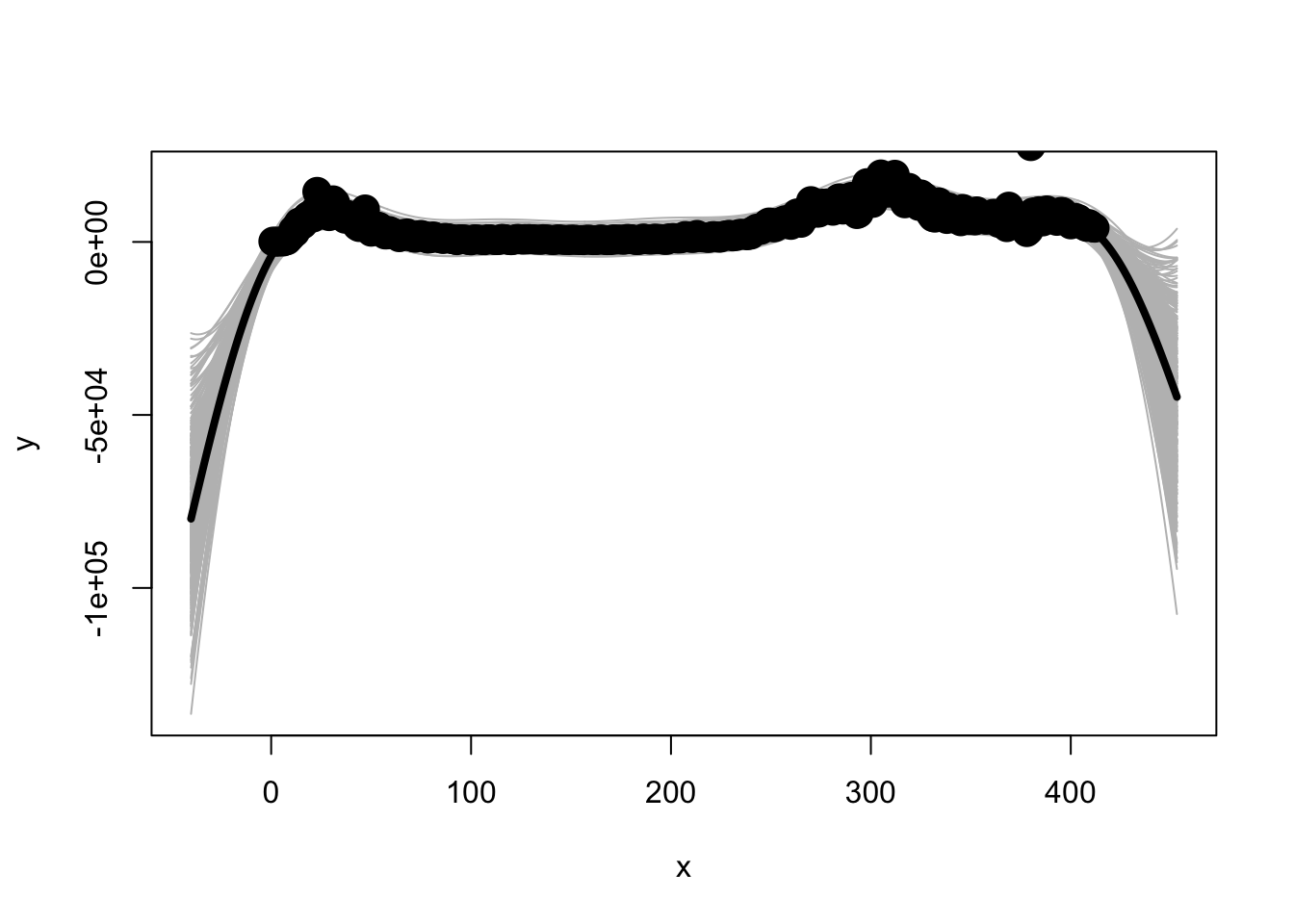
There are related approaches in the area of functional data analysis that also treat the function as a sample but they use different estimation approaches than those in used in Gaussian process models.
5.8.3 Feature engineering
To implement machine learning methods for these data I need to spend more time thinking about the feature engineering side of things. In machine learning parlance feature engineering refers to how the input variables are processed. When one works with time, for instance, it is common to think about multiple ways that time could enter into the model and include all of them. Machine learning algorithms are designed to drop out the irrelevant formulations. There is a commonly used time series package used in machine learning (TSFRESH in python and an effort to port this to R tsfeaturex) that computes several hundred possible measures on each time series (mean, max, min, variance, entropy, auto-correlation, etc) and stores these computations into a large matrix so that they can be used down stream in subsequent analyses. I didn’t put in the effort to go through the sensible features to compute and include those as input into the models so I shouldn’t be surprised at the relatively low performance of these models given that I didn’t play by the rules of machine learning.
The concept of feature engineering is much like entering linear, quadratic, cubic terms of a predictor into a regression equation. The idea is that variants of the predictor in the form of a polynomial are treated as predictors. Take that idea, inject it with steroids, and you have feature engineering in machine learning.
As a simple illustration of feature extraction, here is the output of the daily count variable for each of the 50 states.
FIX: temporarily commented out
As you can see tsfeaturex computes 82 different measures on the count data for each state. Those 82 measures could then be included as state-level predictors in a machine learning algorithm using a type of regularizer that introduces sparseness (drops predictors that are not useful in the prediction).
A more appropriate machine learning strategy would be to take the time trajectory data for every country reported in the Johns Hopkins site (about 140 countries) and see if we can learn patterns about the nature of the trajectories, given various aspects of the country’s demographics, dates they instituted various policies (shelter at home), information about their health care system, etc. One could use the principles developed here about web scraping and gathering these other sources of data, merging them into a single file, and running appropriate machine learning algorithms to find patterns.
An interesting use of machine learning methods (specifically computer vision) is the development of a physical distancing index by a group at UM. Physical movement of humans and social distancing is detected in major cities. This website has some live cameras and charts to illustrate their index.
I’ll continue adding to this section and improving the quality of the machine learning example as time frees up from completing other sections.
5.9 Summary
We covered a lot of material in this chapter. We started with a simple linear mixed model on log transformed data that seemingly did a reasonable job of accounting for the patterns across states. The finding that the linear relation in the log scale holds fairly well suggests that there is exponential growth. The ability to make a statement about the underlying process, in this case exponential growth, is far more valuable than finding a good fit to a data set. But there was a suggestion that the exponential may not be the ideal fit as there was some systematic deviation from a growth curve. The rest of these notes covered a more direct way of fitting exponential growth models through nonlinear regression, a different type of growth model based on the logistic curve and a toy example using a standard machine learning example.
A key idea I followed in this chapter is not to have a single pattern that represents all states but to use models that simultaneously tell us something about the overall pattern across states (the fixed effect portion of the output) and the variability, or heterogeneity, across the states (the random effect portion of the model). We could get fancier with this idea where, for example, we could weight the results based on population size of each state, so counts from more populous states receive more weight. There are several generalizations of these notions from different perspectives such as statistics and machine learning that you can follow in papers (e.g., varying coefficient models such as one by Hastie and Tibshirani and extensions of tree-based methods like CART in the R package vcrpart) as well as books (Hastie et al; Ramsey & Silverman). Once we properly characterize the shape of the trajectories and the variability across units, we can then study the associations between predictors and the parameters of the model, such as I attempted to do with the state-level poverty data and a parameter from the logistic growth model.