OLDER MAPS
The maps on this page are based on data that is older
than the March 2005 data. They are included here because they
suggest ideas of what one might wish for, using updated information.
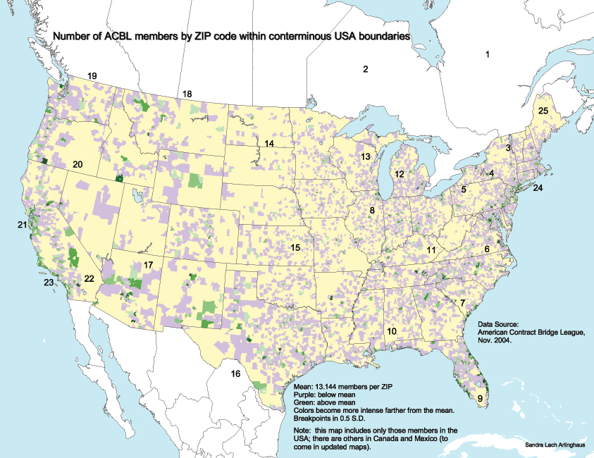
The map
below merges the databases for the 23 maps into a single file and
calculates the mean at the national level (13.144 ACBL members per
ZIP
code area for the conterminous 48 states) and the classes on either
side
of the mean (at intervals of 0.5 standard deviations).
This
National
Map is derived from total "count" by ZIP code region. Total
count
is useful for certain types of analysis; however, it gives a partially
skewed picture of pattern--is Southern Idaho really more of a bridge
hotspot
than coastal Florida? If not, then the reason for such distortion
is that the total number in a large polygon in Idaho is about the same
as the total number in a small polygon in Florida: the large
polygon
of the same color is simply more visible. Absolute measures, such
as total count, have use in a variety of contexts but not in all
contexts.
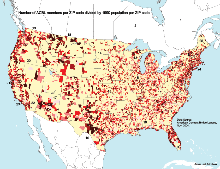
Maps that show total numbers in relation to
another variable, such as to total land area or total population, may
reduce
effects of the sort described above and have additional utility.
The set of maps below shows maps based on introducing population and
land
area (darker shades of red show higher values; yellow means no
members).
The datasets underlying these maps are partitioned into 5 "quantile"
categories
with roughly the same number of observations in each category (other
methods
of partitioning the datasets would produce spatial patterns different
from
these). All maps have merits and drawbacks; the challenge is to
select
the map that best suits the need at hand--there can be no single "best"
map.
In the "density" maps above, again large land
areas with low population but high percentages of ACBL members tend to
dominate the picture. That domination may not be realistic in
reflecting
where national focus on bridge is highest; it may, however, suggest
areas
where recruitment of members in rural areas has been successful or a
variety
of other issues best analyzed by regional experts. The first map
in the sequence above shows US 48 state boundaries, for reference
purposes.
The second map shows the same pattern with 48 state boundaries removed
(as they can distract from visualizing national pattern).
In the "land area" maps above, the national
picture
that one might expect is reinforced. Again, the first map in the
sequence above shows US 48 state boundaries, for reference
purposes.
The second map shows the same pattern with 48 state boundaries removed
(as they can distract from visualizing national pattern). The
Boston-Washington
corridor, with its high concentrations of urban population dominates
the
picture, as does (once west of the Appalachians) the central EW axis of
scattered cities from Pittsburgh to Chicago together with the
associated
Great Lakes perimeter. The large cities of the West Coast,
of Texas, and of the coast east of the Appalachians are also evident,
again,
as one would expect from simply looking at US urban patterns.
In addition, the cities of the Southwest,
and
of Florida, emerged as strongholds of ACBL members--not necessarily
expected
from the general urban pattern, but certainly expected when one
considers
the location of the retired population. This well-known
observation
suggests that maps that separate the population according to age (these
require work to get US Census data, by County, into a form that is
reasonable
to use with ZIP code boundaries) might be of interest in studying the
spatial
aspects of the ACBL dataset. The difficulty here is that many of
the population datasets that are readily available are partitioned by
county,
whereas the ACBL dataset is partitioned by ZIP code area. County
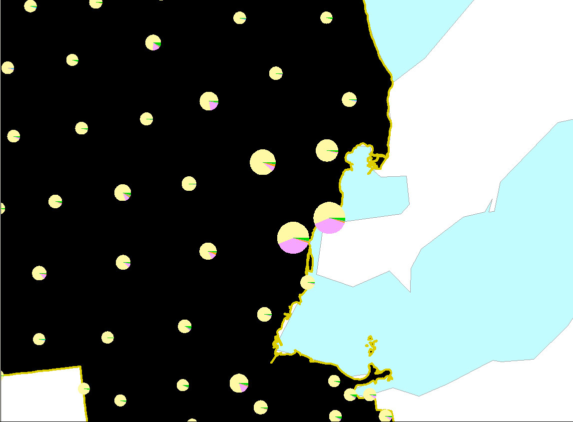
boundaries and ZIP code boundaries do not mesh. The map below
shows
one approach to this issue. In it, counties in Florida are
represented
as pie charts: the purple piece of the pie represents the
population
of Florida aged 50 or over. The light yellow piece represents the
population under age 50. These pies are superimposed on the ZIP
code
polygon boundaries to suggest a general idea of age distribution in
given
regions.
Another strategy for viewing population
patterns
is the "dot density" map. Dots are scattered, based on
information
from the underlying database, at the local level: 1 dot
represents
X people (or some such). The scatter at the local level is
random,
so that one cannot infer that the position of any dot at this local
level
is "correct" positionally. To make sense of the dot scatter, one
must step back and view it at a more global level, where the local
clustering
begins to make sense. Thus, the map below uses 1 dot to represent
1 ACBL member. The dots are randomly scattered within ZIP code
areas.
Then, the ZIP code area boundaries are removed and state boundaries are
inserted. The cluster of dots in southeastern Michigan (for
example)
represents a concentration of ACBL members in the Detroit metropolitan
area; it does not show, however, where each individual is located
within
that metro area. Dot density maps may also suggest means for
looking
at data sets that do not mesh.
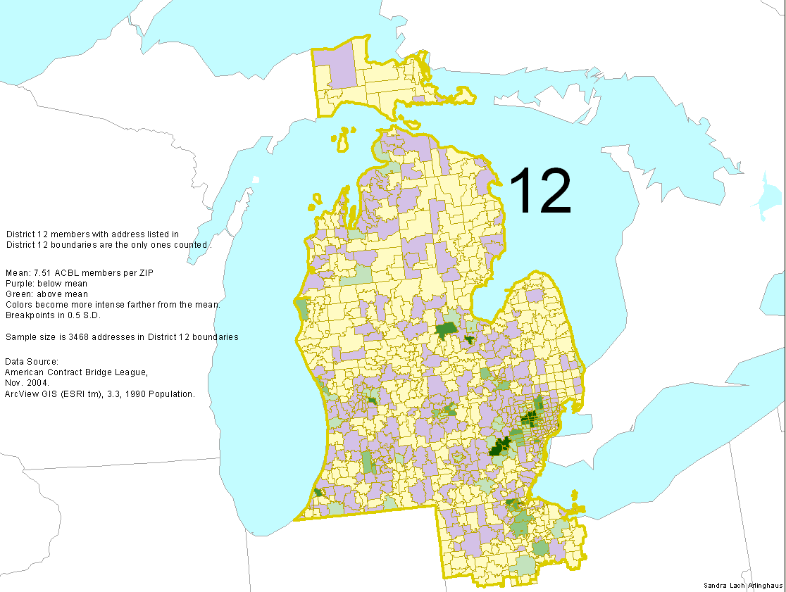
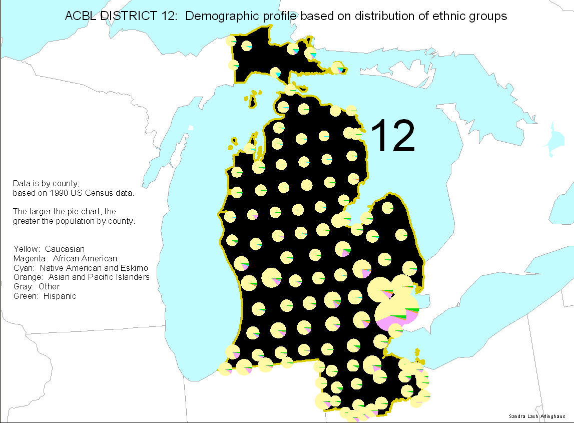
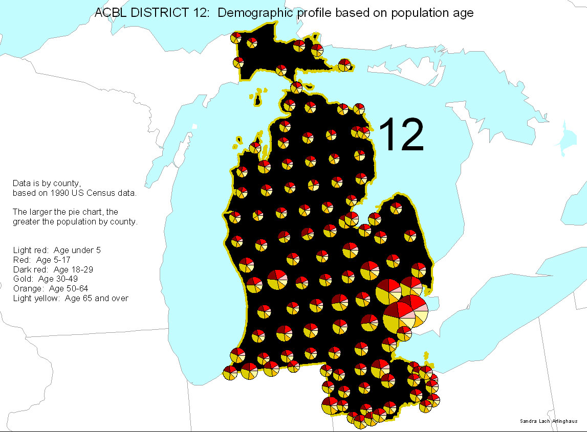
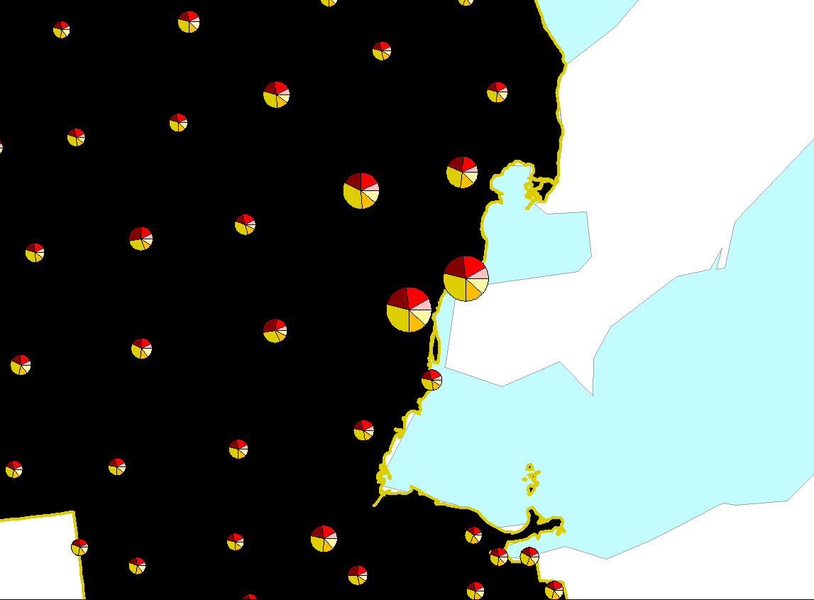
Maps of
District 12 with demographic
analysis
by County, based on U.S. Census Bureau data and categories:
What
patterns do these maps suggest:
- Concentrations of young population
(30
and
under) are present
- in college or university towns
- in urban areas that also have
relatively high
concentrations of African-American population
- Asian population is predominant in
university
towns.
Reasons to
consider such patterns involve
marketing of bridge for clubs, for tournament staff, and for the
ACBL:
educational outreach might thus be considered of particular importance
in university towns and in urban areas with high concentrations of
African-Americans.
This
Atlas of international, national, and regional bridge maps is designed
for visualizing
information
about the broader bridge-playing population. Selected problems
are
considered using the evidence of maps. These maps are tied in the
computer to various ACBL databases and U.S. Census databases.
Thanks
to Jay Baum, ACBL CEO, Rick
Beye, Carol Robertson, Richard Oshlag, and Ed Evers, ACBL, for
providing
the materials directly to Sandra Arlinghaus, who then created the map
sets
using GIS software (ESRI, ArcView 3.2) that forges a dynamic link
between underlying
database
and outline base map. Graphic adjusments of various kinds were
made in Adobe PhotoShop or Adobe Illustrator.
The linked materials
display
data from the ACBL national data base. If you are looking for
local
materials related to finding a bridge club, please go to maps created
originally
by Jim Lahey, former District 12 Webmaster, and maintained by Alan W.
Bau,
current District 12 Webmaster (http://www.d12bridge.org/).
If instead, you are looking for materials about the broader
bridge-playing
population, at the regional and national levels, you are in the right
place! |
Click
here to send an email to Bill Arlinghaus
Click
here to send an email to webmaster of this page


