Part II: Greater London, 1901-2001
Sandra Arlinghaus
and Michael
Batty
Dr. Sandra Arlinghaus is Adjunct Professor at The University of
Michigan, Director of IMaGe, and Executive Member, Community Systems
Foundation.
Dr. Michael Batty is Bartlett Professor of Planning at University
College London where he directs the Centre of Advanced Spatial Analysis.
Please set screen to highest
resolution and use a high speed internet connection.
Please download the most recent free version of Google Earth®. Make sure the "Terrain"
box in Google Earth® is checked.
|
Download
the following file to use in Google Earth®:
|
Greater London: A Century of Change
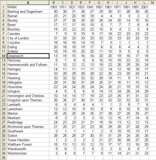
Greater London is
composed of the City of London (of quite small population) and 32
boroughs that surround the central city.* As in Part I, we begin looking at changes in the data
sets of interest, by decade, over the course of the
20th century. Rank-size plots are shown in Figure 1; the general
pattern is as one might expect. There appears to
be a change in pattern around the time of World War II.
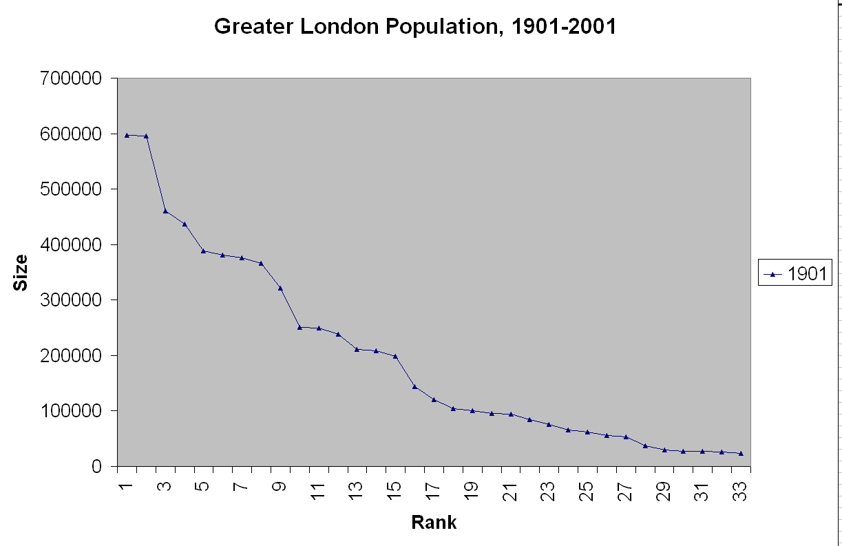 Figure 1. Rank-size plots of the City of London and 32 surrounding boroughs composing Greater London. Click here to view a .mov file in which the reader can control the animation rate. |
To take a closer look
we separate the rank-plots into two sets, in Figure 2. Figure 2a
shows the plots from 1901 to 1941 and Figure 2b shows them from 1951 to
2001.
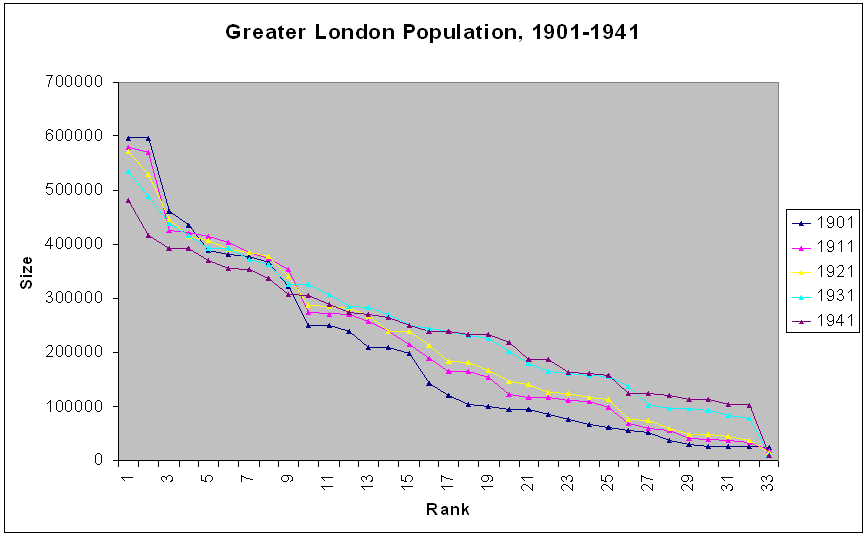 Figure 2a. |
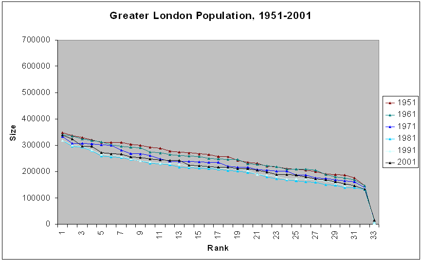 Figure 2b. |
Parallel to the Part I case, we note that any given locale is likely to change rank over time. Thus, we look at the data set in relation to 1901 ranks, for the entire century (Figure 3a) and for the pre-and post-World War II data (Figures 3b and 3c). The general pattern appears quite wild while the shorter time span ones centered on either side of World War II offer a more organized picture. Is that picture more organized for Greater London than it is for the entire UK? These observations are perhaps not surprising. They do benchmark strategy and might offer interesting visualizations to those doing policy, planning, or historical studies of the study region.
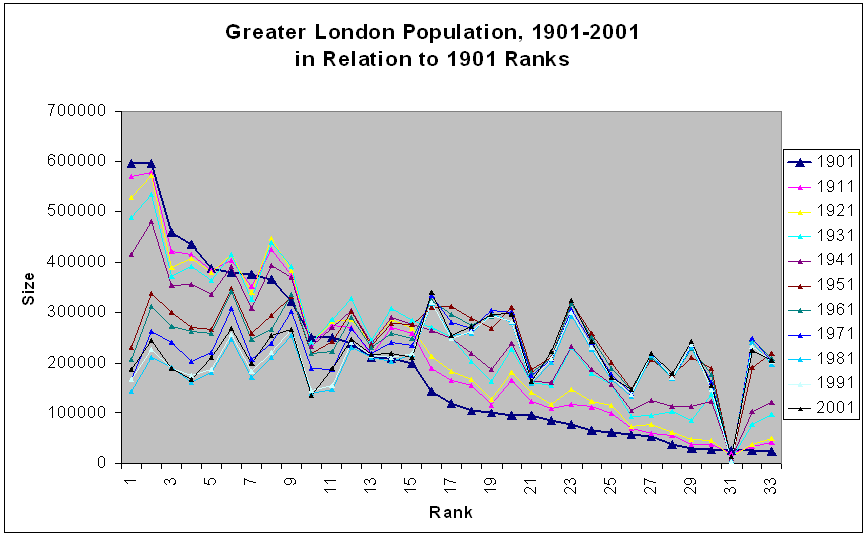 Figure 3a. |
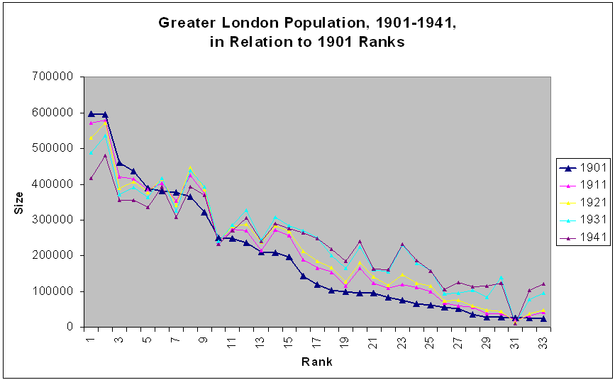 Figure 3b. |
 Figure 3c. |
Next, we map the data.
The
Google Earth® screenshots of Figure
4 show not only
all the population bars for each borough and for the City of London for
1901 but also for each of the other decades up through 2001.
Again, we have animated them so the reader can quickly see such
change. Click on any single image in Figure 4 (a-k) to see a
larger image. Or, keep track of up to nine changing scenes on the
screen at a single time. To drive around, download the associated file
used to make the images
(Figure 4l).
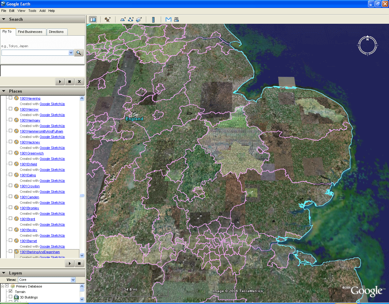 Figure 4a. |
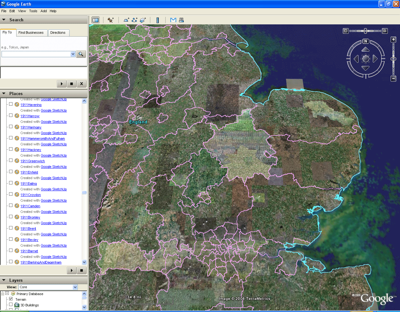 Figure 4b. |
 Figure 4c. |
 Figure 4d. |
 Figure 4e. |
 Figure 4f. |
 Figure 4g. |
 Figure 4h. |
 Figure 4i. |
 Figure 4j. |
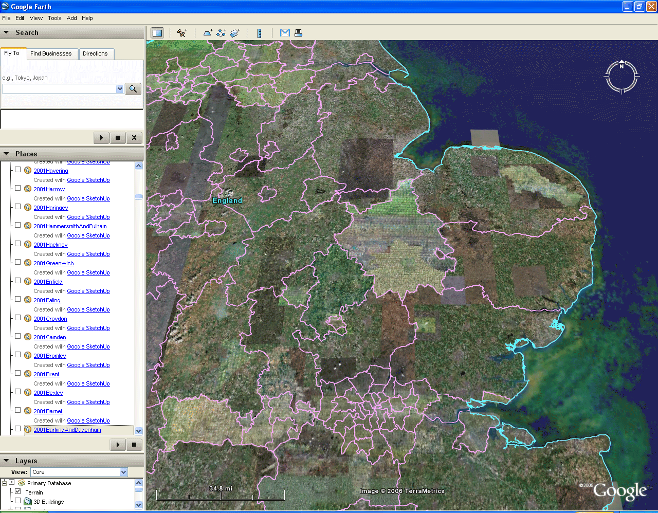 Figure 4k. |
<>
Open
these files in Google Earth: File|Open and then navigate to where
you have stored the files below.
Downloads: .mov files, user controls animation rate: 1901 1911 1921 1931 1941 1951 1961 1971 1981 1991 2001 Greater London: all kmz files for each decade. If you have not already done so from the box at the top, download GreaterLondon.kmz and open it in Google Earth®, File|Open and then navigate to where you saved GreaterLondon.kmz on your hard drive. Figure 4l. |
There are a number of
interesting patterns one can observe; we invite the reader to add to
these or to challenge them.
Tower Hamlets: A Local View.
The borough of Tower Hamlets is adjacent to the City of London: it is a "close-in" borough. Simple animation of the rank-size graph easily shows its changing population/size and rank pattern over time (Figure 5). In addition, animation from Google Earth® makes it easy to compare and contrast the relative rise and fall in population of Tower Hamlets in relation to Barnet, a "far out" borough (Figures 6a and 6b; again, to take a closer look at either model, click on the image to link to a bigger file). Thus, scholars investigating patterns associated with sprawl might find this tool to be helpful in a variety of ways.
- Boroughs close to the central city are larger earlier and larger
as a group in pre-World War II Greater London. The general
pattern is pyramidal with the apex close to the City of London.
- Post -World War II sees a flattening of the heights of
parallelepipeds across the entire region.
- The last two decades begin to see some growth back toward the center.
- Early on, the southeast boroughs seemed under-sized in relation
to other bars; later, that changes.
Tower Hamlets: A Local View.
The borough of Tower Hamlets is adjacent to the City of London: it is a "close-in" borough. Simple animation of the rank-size graph easily shows its changing population/size and rank pattern over time (Figure 5). In addition, animation from Google Earth® makes it easy to compare and contrast the relative rise and fall in population of Tower Hamlets in relation to Barnet, a "far out" borough (Figures 6a and 6b; again, to take a closer look at either model, click on the image to link to a bigger file). Thus, scholars investigating patterns associated with sprawl might find this tool to be helpful in a variety of ways.
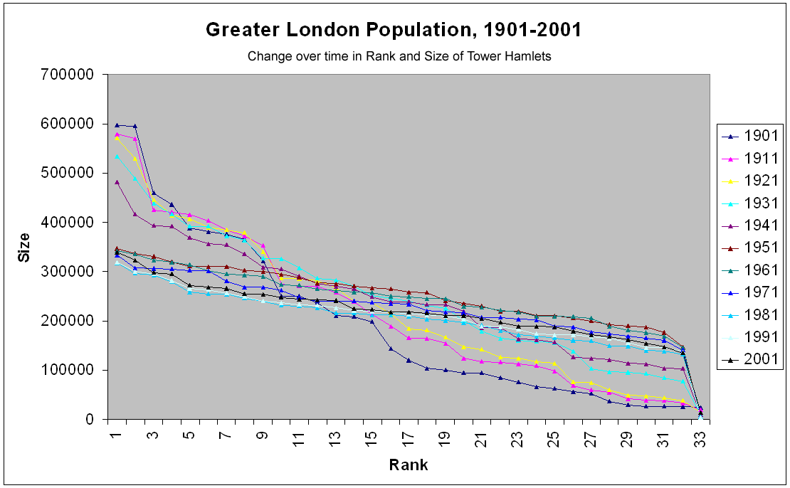 Figure 5. |
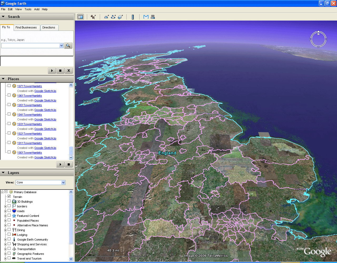 Figure 6a. |
 |
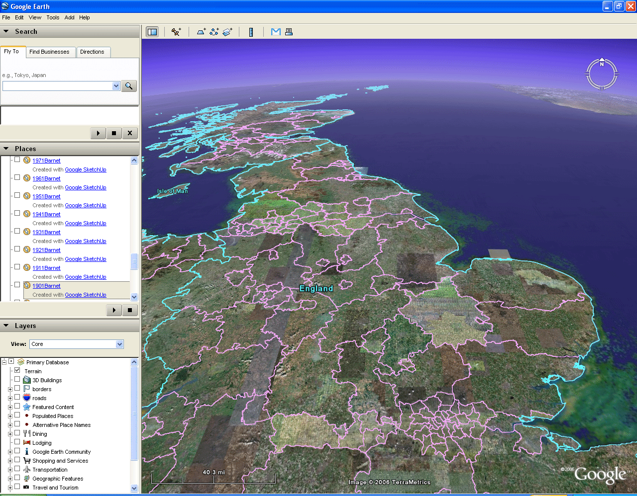 Figure 6b. |
A visual
limitation in perspective is involved with this procedure. One
cannot
see changes over time while driving around within the virtual
distribution of a single time slice. The animation scheme is
useful
because it is hard to retain 3D models in the mind and mentally
superimpose one time frame on top of another. The strategy
developed above, while apparently useful in many ways, does not allow
one to see simultaneously the full picture and also see change
over time. There may be other strategies that fulfill that
need.
Future Directions
Both authors have recently offered a number of different strategies for visualizing data sets over time and also from different periods of time. In addition, one might imagine that a host of other possibilities will arise given the relative ease of current remarkable visualization techniques.
In order to merge the spatial and temporal concerns, we consider first introducing audio files to supplement the visual. Click on any of the boroughs in the map below. A sequence of notes from a musical scale will play. They represent the rise or fall in rank of that borough during the twentieth century. Different boroughs will play different notes from the musical vectors serving as a basis for a musical vector space in which both rank and size change through time. As the reader listens to change over time he/she is free to study simultaneously spatial aspects of the map Generally, the pattern of the notes works as follows:
Future Directions
Both authors have recently offered a number of different strategies for visualizing data sets over time and also from different periods of time. In addition, one might imagine that a host of other possibilities will arise given the relative ease of current remarkable visualization techniques.
Add Sound
In order to merge the spatial and temporal concerns, we consider first introducing audio files to supplement the visual. Click on any of the boroughs in the map below. A sequence of notes from a musical scale will play. They represent the rise or fall in rank of that borough during the twentieth century. Different boroughs will play different notes from the musical vectors serving as a basis for a musical vector space in which both rank and size change through time. As the reader listens to change over time he/she is free to study simultaneously spatial aspects of the map Generally, the pattern of the notes works as follows:
- a musical vector that is relatively high in pitch throughout is one whose associated region has had relatively high rank throughout the time period (and vice versa).
- within a musical vector, be it generally high, low, or middle, the higher notes represent higher numerals (hence lower ranks) and vice versa.
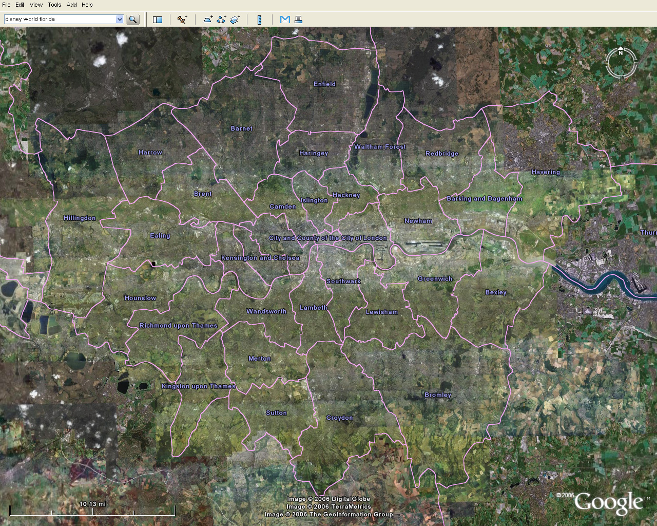 Figure 7. Musical map of Greater London. Click on a borough or the City of London and listen to the general rank pattern and to rise and fall of rank within that general pattern. |
Change
the Geometry
The methods for looking at spatial change over time outlined above in the context of UK data sets offer exciting prospects for imaginative geometric use of the internet. What they all have in common is that they are couched in Euclidean geometry. The most radical, and perhaps the most interesting, approach might well be to change the geometry--to employ the non-Euclidean. In the last issue of Solstice, we announced our interest in this topic and outlined a research agenda for using non-Euclidean geometry to look simultaneously at spatially disparate rank-size plots from different locales, time frames, or both. To that agenda it now seems important to add that we should investigate the role of internet mapping and geometry, especially as they draw from Google Earth®. Might one imagine the Google Earth® "sphere" as a rotating Poincaré Disk on which to embed non-Euclidean views of rank-size plots? Stay tuned...the answers will be coming soon!
APPENDIX
PROCEDURE USED WITH "A MUSICAL GENERATOR®"--DOWNLOAD A FREE DEMONSTRATION COPY AND OPEN IT TO FOLLOW ALONG WITH THE DISCUSSION BELOW.
RELATED REFERENCES
See links on author names in title material for links to publication lists.
*The City of London population data from 1901 to 1991 is
Before 1901 the population was likely much higher; indeed, in 1801 the City of London probably had the largest population in the United Kingdom. London lost more than half its population in the interwar years. By 1951 the population was very low, never to recover, as it was all employment by then.
PROCEDURE USED WITH "A MUSICAL GENERATOR®"--DOWNLOAD A FREE DEMONSTRATION COPY AND OPEN IT TO FOLLOW ALONG WITH THE DISCUSSION BELOW.
- Create a matrix showing change in rank, over time, of a city or a set of cities. We choose "Greenwich" for the sake of example of procedure. The row associated with Greenwich will be referred to as its "vector."
 |
- Enter data from the row associated with Greenwich into the generator.
- Direct approach:
- Choose the tab named "Data"
- Click on the letter "N" in order to directly enter numerals associated with Greenwich.
- Type the numerals, leaving a space between successive entries, creating a space-delimited file.
- Click "OK" when done. You will then see a small chart appear in the previously blank left area of the window. The chart will have the label "data." Change the title to "Greenwich" by right-clicking and choosing "rename."
- Indirect approach: bring in data directly from Microsoft Excel® (or other software) using directions from the help files of A Musical Generator®.
- Next, generate music from the data.
- Click to highlight channel 8; it has longer-sounding notes
associated with it than does channel 1.
- Drag the chart entitled "Greenwich" and drop it on top of the graphic on the "Notes" button.
- Then, hit the "play" button to hear the raw sound of audio associated with the data for Greenwich.
- Adjust the music. We give the setttings used in the files for the clickable map of Greater London.
- Set the Tempo to 182: slide the bar.
- Set the number of measures to 10; there are 11 entries in the
vector.
- Click on the "Duration" button and set the "Maximum" to 33 (the number of possible ranks) and the "Default" also to 33.
- Click on the "Notes" button. Set the "Minimum" and "Maximum" to correspond with the minimum and maximum values of the numerals in the rank vector for Greenwich. A Musical Generator® allows values from "c" as the Minimum to "g10" as the Maximum. We use the following assignment pattern to associate musical note value with rank value, from 1 to 33, assuming after considerable experimentation that a musical octave, based on Western style with a "Major" tone scale, is presumed to begin with "c".
- c3=33; d3=32; e3=31; f3=30; g3=29; a3=28; b3=27; c4=26;
d4=25; e4=24; f4=23; g4=22; a4=21; b4=20; c5=19; d5=18; e5=17; f5=16;
g5=15; a5=14; b5=13; c6=12; d6=11; e6=10; f6=9; g6=8; a6=7; b6=6; c7=5;
d7=4; e7=3; f7=2; g7=1. Thus, to cover the entire range of ranks,
one would set the Minimum in the "Edit notes aspect" window to c3 and
the Maximum to g7--as an absolute maximum and absolute minimum for the
rank situation.
- To focus on the general nature of the Greenwich vector, however, we restrict the focus to the local maximum and local minimum of the vector itself. The minimum is 13 and the maximum is 20. Thus, set the Minimum in the "Edit notes aspect" window to b5 (assigned to 13) and the Maximum to b4 (assigned to 20). Now, try playing the associated music once again.
- Save your work both as "Greenwich.tmg" and as
"Greenwich.mid"--the latter is a midi file which plays on the internet
and elsewhere.
RELATED REFERENCES
See links on author names in title material for links to publication lists.
- A Musical Generator 3.0, from MuSoft Builders, http://www.musoft-builders.com/ Last accessed Nov. 27, 2006.
- Arlinghaus, Sandra and Batty,
Michael. 2006. .Zipf's
Hyperboloid? Research
Announcement, Solstice: An
Electronic Journal of Geography and Mathematics, Volume
XVII, No. 1.
- Arlinghaus, Sandra and Arlinghaus, William. 2005 Spatial Synthesis (Chapter 2, scroll to end for music characterizing central place hierarchies). Ann Arbor, MI: Institute of Mathematical Geography.
- Batty, Michael. 2006: Rank clocks, Nature, Vol. 444, 30 November, 2006, doi:10.1038. Link to reprint.
*The City of London population data from 1901 to 1991 is
City of
London 26882
19619 14158
11054
5324 4767
4245
5864
5900
4000
Before 1901 the population was likely much higher; indeed, in 1801 the City of London probably had the largest population in the United Kingdom. London lost more than half its population in the interwar years. By 1951 the population was very low, never to recover, as it was all employment by then.
Solstice:
An Electronic Journal of Geography and Mathematics, Volume XVII,
Number 2
Institute of Mathematical Geography (IMaGe).
All rights reserved worldwide, by IMaGe and by the authors.
Please contact an appropriate party concerning citation of this article: sarhaus@umich.edu
http://www.imagenet.org
Institute of Mathematical Geography (IMaGe).
All rights reserved worldwide, by IMaGe and by the authors.
Please contact an appropriate party concerning citation of this article: sarhaus@umich.edu
http://www.imagenet.org