 |
An earlier article in Solstice
constructed an Animated Map, "Animap," from current data to suggest pattern
that might exist if actual data were available. To quote from that
article:
Sometimes it is difficult to acquire data over a period of time. With a bit of imagination, one may instead be able to use a surrogate variable to capture easily what might otherwise have been difficult to capture. To illustrate this sort of technique, in a time-dependent framework, consider the following animap. When African-Americans first came to North America, they entered often along the south and southeastern shores of modern-day U.S.A. Over time, population migrated and moved throughout the country. If one considers as a surrogate to having year by year data for that movement, the fact that not many people move over time all that far from their point of entry to the country, then one might capture the temporal movement pattern over centuries by the spatial density pattern at a single time slice. To test this idea from the standpoint of simple mapping, the U.S. was mapped by county according to density of African-American population (1990 Census data) (S. Arlinghaus and A. Laug). The mapping of this initial test-run was kept simple: the default lat/long framework, rather than a conventional projection, were used in the GIS (Atlas GIS, version 3.03) for eventual ease in switching to other projections. As had Nystuen, Laug wished to color percentages from previous frames all in one color, with percentages in the current frame colored in a different set of colors. She also wanted to track the advancing edge, as had Nystuen, but in addition wanted to see gradations in that edge. There is a tradeoff in clarity; how many categories should one use on the edge?In this article, the map from the previous article is recast using an Albers projection, and the edge gradations are removed in favor of a single edge color. Thus, counties shaded burgundy are ones for which the density has been measured. The edge counties colored yellow are those introduced at that particular time frame. Those left as white have not yet entered the picture.
|
|
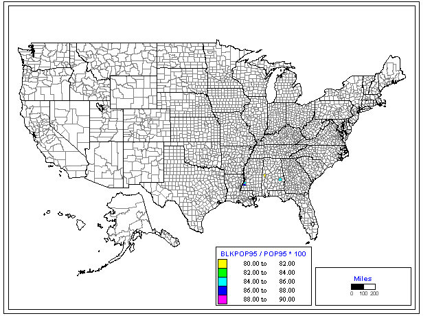
As in the previous
case the counties with highest percentage African American populations
(as measured in 1990 Census data) enter the map first. The manner
in which they do so is reminiscent of actual migration patterns.
The premise is that people, even over a substantial time interval, do not,
as large groups, move quickly from their original ports of entry.
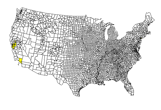
Does this idea extend to other ethnic groups? The maps below show
the same analysis applied to 1990 Census data for percentage Hispanic and
percentage Asian populations by county.
 |
The Hispanic Animap also suggests a pattern of diffusion that reflects
(but does not exactly replicate) reality. The heavy early populations
are along the U.S. Mexico border, followed by Florida and large cities
in the northeast and midwest. One issue with creating animaps is
to decide when to stop the process; otherwise, the whole nation will eventually
become burgundy. There is a tradeoff in process and meaning.
 |
The case of the Asian Animap is a bit different. In the early frames, one sees the "expected" pattern with high densities on the west coast. In the next stage, one sees high densities enter in large cities across the nation, and, at the same time, high densities in what appear to be counties far removed from the largest cities. When those "unexpected" counties are checked, all contained large (mostly public) universities. In the case of the Asian population, the American university system appeared as a measurable agent fostering diffusion of population, even in this simulation.
How nice it is to have an easy-to-use strategy to capture movement general movement patterns. It would have been a monumental task to gather data on a county by county basis, from the first entry, for each of these populations. Instead, use of a well-chosen surrogate variable permitted creation of animated maps in a matter of a few hours.