Spatial
Synthesis
The Evidence of Cartographic
Example: Hierarchy and Centrality*
Sandra Lach Arlinghaus
The cartographic
example presented below displays principles of spatial synthesis as they
focus on centrality and hierarchy.
-
Classical example: The dot density
map employs a nested hierarchy of regions to convert information about
dots to information about regions; in so-doing, the clusters of dots emerge
as centers of activity associated with the nature of the underlying data
from which the dots were extracted.
-
Contemporary example: The interactive
online map may employ a nested hierarchy that, in a single map, offers
not only information of the sort available in a dot density map but also
a host of other previously impossible features, as well. It may be
linked to the underlying database in a manner that also permits
-
scale transformation
-
views of the database corresponding to
small regions on the map
-
searches of the underlying database.
Interactive
capability can be far more than an interesting visualization tool; it can
be one offering synthesis of spatial information at a level far greater
than that available with any classical map.
|
| These traditional
(but perhaps under-utilized) cartographic techniques, are based on synthetic
geometric and or number theoretic considerations. The focus of Spatial
Synthesis: Book 1, Volume I, will be to present further theory
and example of such intellectual interaction and to do so in a manner that
allows the reader to participate in that interaction. |
A scatter of dots might represent any real
world phenomenon: from the location of emergency telephone kiosks,
to small villages, to national capitals. Dots pinpoint geographic
position. At a global scale, national capitals may appear as dots;
at a local scale, they may appear as areas containing dot scatter of their
own. What matters is geographic scale: dots at one scale may
not be dots at another scale. In that regard, it does not matter
what the dots represent.
Dot density maps
Dot density maps might show 1 dot representing
200 people in some spatial unit or 1 dot representing 1 percent of the
population of yet another spatial unit. One might see a map in a newspaper
showing concentrations of voters of different political persuasion, by
ward, prior to an election. Often, though, these maps might appear
to be (or actually be) in error: a glance at one's own home ward
generally elicits reactions such as "no one lives over there where that
dot is!" Dot density maps should not be confused with pushing pins
in a wall map to indicate position; dot density maps show pattern, not
specific position tied to address or latitude/longitude. When the dot density
map is properly constructed it can serve as a tool offering valuable insight
into clustering. A variety of examples are shown below: they range
in scale from a local neighborhood example, centered on Hyde Park (in Chicago,
Illinois, USA) the University of Chicago neighborhood, to the city
level, to the state level, to the watershed level. The lessons they
suggest should lure the thoughtful reader away from error in interpretation
and use.
Nested Hierarchies
of Polygons
To be effective, the dot scatter should
be randomized at a relatively local scale and then viewed for pattern at
a scale more global than the scale of randomization. In Figure 1, dot scatter
has been randomized at the U.S. Census Block Group level; it is then viewed
successively at the U.S. Census Tract level (tracts are larger than block
groups) and then at the state level (in the animation): a hierarchy
of regions. Any pattern in the scatter of dots within individual block
groups is meaningless: the scatter is random. Within tracts, broad clusters,
or centers of activity, are evident; and, even more obviously within the
state, clusters of dots delineate urban (central) areas.
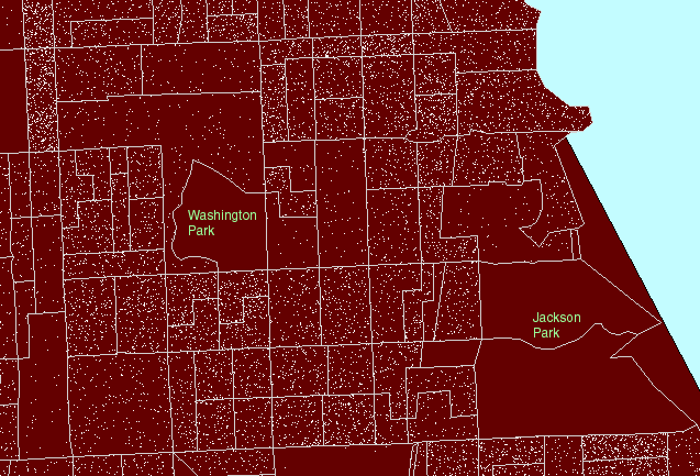
Figure
1. A local view:
Hyde Park lies roughly between Jackson Park on the east and Washington
Park on the west. US Census block groups are shown in gray outline.
US Census tracts are shown in heavier pink outline. (First frame in the
animated map shows dot scatter in block groups.) |
The dots in the animated map in Figure
1 are simply counts of population: 1 dot represents 10 people according
to the 1990 U.S. Census of the Population. Dots are scattered randomly,
by the computer, throughout each block group. Thus, because the scatter
is random at the block group level, clusters of dots within block groups
boundaries (gray in Figure 1) are meaningless and the location of dots
within block groups does not correspond to locations of individuals either
in relation to the underlying base map or to other individuals. The
most common error in using dot maps is to show the dot scatter within the
polygons used for randomizing the scatter; hence, the common complaint
that these are "not accurate."
For the clustering of dot scatter to have
meaning, look at it, for example, through the lens of the more regional
US Census tract boundaries (heavy pink lines in Figure 1). Figure
1 moves the reader's eye from block group boundaries, to block group boundaries
nested inside tract boundaries, to tract boundaries alone, to no boundaries.
As boundaries increase in generality, and dot scatter remains the same,
clustering of dots becomes sensible. Thus, in Figure 1, one sees
no dots in the block groups containing Jackson Park and Washington Park
so that when the block group boundaries are replaced by tract boundaries,
which contain the park and dwelling units, the dots are not scattered across
the park but remain in the region of the tract where people live.
The clustering to the west of Jackson Park means something at the tract
level.
The pattern of boundary removal, to make
sense of dot scatter, is not symmetric. In Figure 1, dots were randomized
at the block group level and then viewed at the tract level. Because
-
tracts are larger than block groups, and
-
block groups are nested within tracts
the opportunity to observe clusters at the
tract level is optimized. If the situation exhibited in Figure 1
were reversed, and dot scatter randomized at the tract level, and then
viewed through the block group boundary lens, clear clustering errors would
result. Figure 2 shows this sort of reversal. In it, note that
now dot scatter is present in the parks suggesting that there are numerous
dwelling units in the parks: a clear erroneous situation.
Figure
2. Dot scatter is randomized at the tract level and then
viewed within block group boundaries causing error in assigning dwelling
units (people) to parkland. (First frame in the animation shows dot
scatter in tracts outlined in pink.) |
Principle 1: Randomizing
Principle
In a dot density map, dot scatter
is randomized at one scale and then, to have the map make sense, must be
viewed at a scale more global than that of the randomizing layer.
A dot density map that is constructed to
follow Principle 1 will be said to be a "properly constructed"
dot density map. Any that does not follow Principle 1
will be viewed, therefore, to be improper and likely to convey error.
In a properly constructed dot density map,
if a more global layer is composed of polygons that contain the randomizing
layer in a nested fashion, then there is no problem of overlapping regions
and possible confusion about assignment of dot to polygon. Thus,
Principle 2: Optimization
Principle
A nested hierarchy of layers provides
optimized assignment of dots to more global layers.
A dot density map that is constructed to
follow Principle 1 and Principle 2 will be
said to be an "optimized properly constructed" dot density map. In
the next section, example will be given of a properly constructed dot density
map that is not optimized.
Hierarchies with
Overlapping Layers
Often, unfortunately, one is not able
to obtain data arranged in a nested spatial hierarchy, such as the tract
and block group units shown above. It may be desired, for example
to use Census data to obtain information about zip code polygons, school
districts, minor civil divisions, and so forth. Census boundaries,
however, are not generally commensurate with zip code boundaries and various
other spatial units.
There are a number of ways of extracting
information from Census units about, for example, zip code areas.
One way involves using computer software to calculate the centroids of
Census units and count the Census unit as lying "within" the zip code area
if the centroid of the Census unit lies within the zip code area.
Zip code areas are often larger than tracts and block groups, especially
in urban areas (as Census units are scaled in area according to population).
Thus, in an urban setting, one might properly construct a dot density map
randomizing the dot scatter at the block group level and then viewing that
scatter through tract boundaries and ZIP code boundaries, creating a properly
constructed dot density map that is not optimized because the hierarchy
of spatial units on which it is based is not a nested hierarchy.
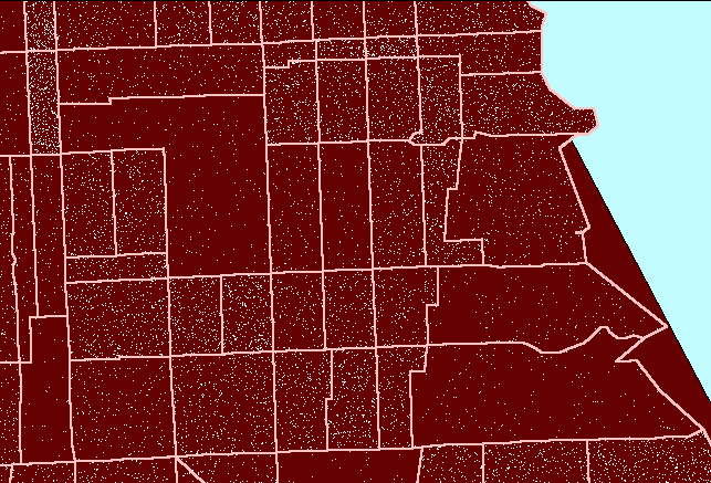
Figure 3 illustrates the process for a region on the south side of Chicago
centered on Hyde Park.
Figure
3. Zip code boundaries
(yellow) do not match either Census tract (pink) or Census block group
(gray) boundaries. (First frame in the animation shows dot scatter
in block groups.) An example of a properly constructed dot
density map that is not optimized. |
Scale Change
Beyond the two principles above, there
are a number of other issues to consider when using a properly constructed
dot density map. Often, randomizing at the most local level is best.
When one looks at a more regional view, however, local randomization may
introduce clutter into the map. In Figure 4 the scale has been made
more global to include much of the Chicago metropolitan area. In
that view, the white dots nearly fill space and clustering is not evident.
Conceptually, in order to reduce dot clutter, one might randomize at a
more global level or one might alter what the dots represent. Sacrifice
in accuracy of dot position always undermines the fidelity of the dot density
map; alter what the dot represents, instead of its position.
Principle 3: Scale Principle
When a change in scale produces
dot clutter from dot density, randomize at the most local scale available
and alter dot representation to retain a properly constructed dot density
map.
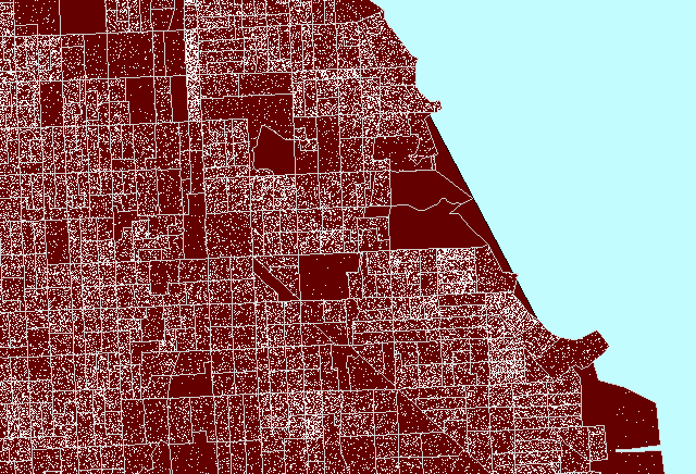
Figure
4. Dot clutter followed
by a properly constructed dot density map of Chicago, Illinois. (First
frame in the animation shows heavy white dot scatter in block groups.) |
The animated map in Figure 4 shows dot
clutter resulting from using 1 dot to represent 10 people. A better
choice, at this scale, of 1 dot to represent 100 people reduces the number
of dots by a factor of 10 so that clusters become evident, particularly
when no Census boundaries are overlain. In both cases, the dot scatter
is randomized at the block group level: the most local level for which
data was readily available in this example. Thus, there is no sacrifice
in accuracy of dot position in removing dot clutter by thinning the number,
rather than by altering the position, of dots.
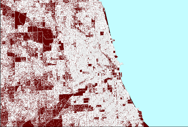
When the '1 dot to represent 100 people'
representation is transformed to the state level, portrayal of urban areas
is evident. Dot clutter, from this particular representation, once
again enters the picture at the watershed level (Figure 5). The first
watershed frame in Figure 5 shows Illinois at 1 dot to 100 people: dot
clutter obscures dot clusters. The second watershed frame shows Illinois
at 1 dot representing 1000 people: dot thinning may appear to have removed
clusters. The final frame shows a compromise at 1 dot representing
800 people: a view that reduces dot clutter yet retains dot clusters.
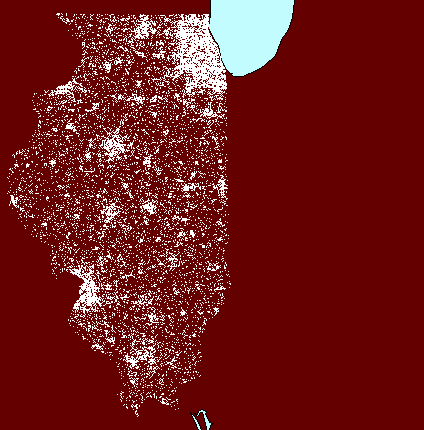
Figure
5. Change in scale and
dot scatter thinning. (First frame in the animation shows only the
state of Illinois.) |
The Importance
of the Equal Area Projection
Map projections on which a geometric unit
square represents the same amount of geographic area, independent of position,
are called "equal area projections." On an equal area projection,
relative land mass sizes appear as they do on the globe: Brazil is
larger than Greenland, for example. Dot density maps can be used
to make comparisons; the animated map below (Figure 6) suggests comparing
population (either as total numbers or as a percentage) in Chicago (green
square) to that of Milwaukee (yellow square) and Traverse City (red square).
The underlying projection employed is an Albers equal area projection.
Thus, the squares represent the same amount of area on the earth and comparisons
at different latitudes are valid. Had a Mercator projection (for example)
been employed, the red square would have represented less geographic area
than would have the green square and comparisons based on area would have
been invalid.
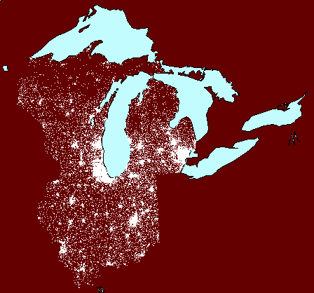
Figure
6. Valid comparisons
of dot scatter using an equal area projection: Chicago (green), Milwaukee
(yellow), and Traverse City (red). (First frame in the animation
shows dot scatter surrounding Lake Michigan with no extra polygons.) |
Principle 4: Projection principle
A properly projected dot density
map must be based on an equal area projection.
If any projection other than an equal area
projection is employed in making a dot density map, then comparisons involving
area will be in error.
In order of importance the Principles for
making these maps are:
-
If dot density maps are to be properly constructed,
then they must follow Principle 1: Randomizing Principle
-
If dot density maps are to be used to make
comparisons involving area, then they must follow Principle 4:
Projection Principle
-
If dot density maps are to optimize assignment
of dot pattern, then they must follow Principle 2: Optimization
Principle
-
If dot density maps are to succeed in transcending
scale change, then they must follow Principle 3: Scale Principle
Dot density maps offer one way to synthesize
information derived from point sources to suggest information about areas.
Interactive
Maps
Interactive maps are tools that may offer
both vertical and lateral movement within a hierarchy. Figure 7 shows
a screen shot of an interactive map that includes state boundaries (heavy
white lines), county boundaries (yellow lines), Census tract boundaries
(pink lines), and dot scatter at the 1:800 level as in Figure 5 above.
Click on
this
link to go to the map in its interactive form. Once there,
use the zoom feature to shift hierarchical levels in a scale transformation.
Within a given hierarchical level, click on single polygons to view associated
database information. Or, search the underlying database using the
"search" feature to find polygons with attributes of special interest.
In this instance, the technological realm offers a form of spatial synthesis
not available in the classical realm.
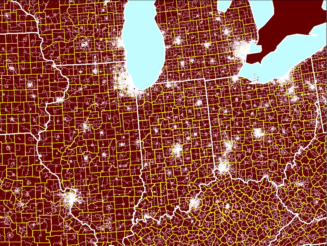
Figure
7. An example of a dot
density map that follows all four basic principles. State boundaries
in white contain county boundaries in yellow which in turn contain tract
boundaries in pink. Click on the map to go to the associated interactive
map. |
*Synthesis
in which one discipline sheds light on another
Sarastro: Die Strahlen der
Sonne vertreiben die Nacht
Background music that launches when the title is clicked
is a sample from advertising on Amazon.com from the following link:
http://www.amazon.co.uk/exec/obidos/ASIN/B000001GXI/qid=1115239267/sr=8-2/ref=sr_8_xs_ap_i2_xgl/026-8133798-8086815
(Die) Zauberflöte, '(The) Magic Flute'
798-8086815
Die Zauberflöte
(The Magic Flute), opera, K. 620
Composer: Wolfgang
Amadeus Mozart
Conductor: Karl
Böhm
Performers: Evelyn
Lear, Roberta Peters, Lisa
Otto, Fritz
Wunderlich, Dietrich
Fischer-Dieskau, Franz
Crass, Hans
Hotter, Friedrich
Lenz, Hildegard
Hillebrecht, Cvetka
Ahlin, Sieglinde
Wagner, Rosl
Schwaiger, Antonia
Fahberg, Raili
Kostia, James
King, Martti
Talvela, Hubert
Hilten, Martin
Vantin, Manfred
Röhrl
Orchestra: Berlin
Radio Chamber Choir, Berlin Philharmonic Orchestra
Label: The Originals
Catalogue Number:
4497492
Released: February
10, 1997
Audio CD A-D
Number of Discs:2
ASIN: B000001GXI
Solstice: An Electronic Journal of Geography and Mathematics,
Institute of Mathematical Geography, Ann Arbor, Michigan.
Volume XVI, Number 1.
http://www.InstituteOfMathematicalGeography.org/