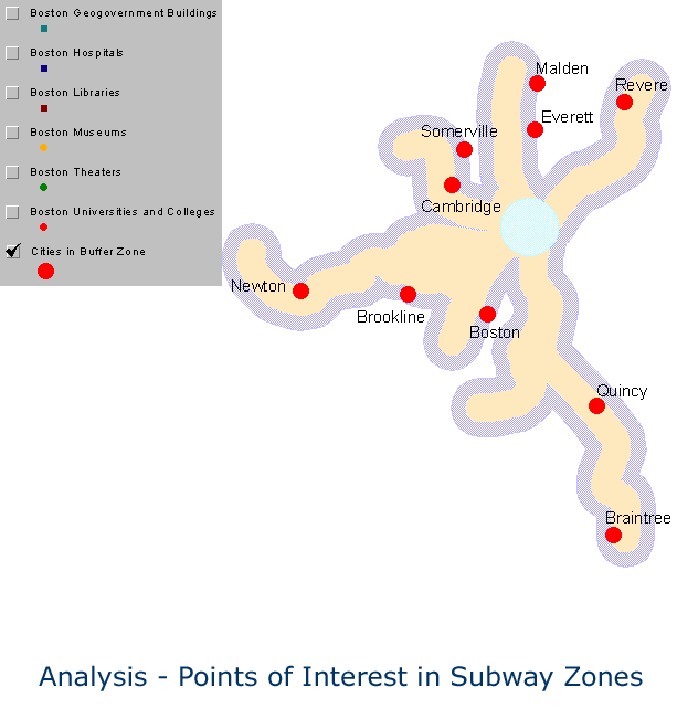
This analysis involves determining
the points of interest in subway buffer zones. These points of interest
were partitioned into six categories, as follows (MBTA website from 2000
was the source of the dataset):
- Government Buildings
- Hospitals
- Libraries
- Museums
- Theaters and Convention Centers
- Universities/Colleges
After matching the dataset entries
for each point of interest with the street layer, the "Centroid within"
method was used to investigate the location of each point of interest in
relation to the subway buffer. On the average, 68% of the entire
collection of all points of interest were located in the subway buffer
zone. Points of interest might thus be regarded as well distributed
and within walking distance from subway platforms. The following animated
map shows the distribution of all points of interest in the Boston area
and their relation to the subway buffer zone (Map 17).
(Click the map to see details.)
Map 17. Points of interest in Boston Area
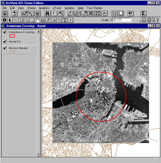
The next two maps form an information
system for taking a closer look at the Downtown Crossing area. As shown
on Map 18, the geographic environment of the downtown crossing, where the
Charles River and the sea meet, seems to induce the development of the
area. It is easy to see why it is difficult to squeeze subway lines
into this small area. I have combined the following two maps and made a
clickable information map for the area, in which each point on the map
has detailed information about the place retrieved from the dataset using
ColdFusion. To gain access to that map, and to other efforts of the
author involving ColdFusion, contact the author directly (hshoon@umich.edu).
(Click the map to see details.)
Map 18. Aerial Scene of Downtown
Crossing

(Click the map to see details.)
Map 19. Points of interest in 1-Mile Downtown-Crossing Buffered Zone
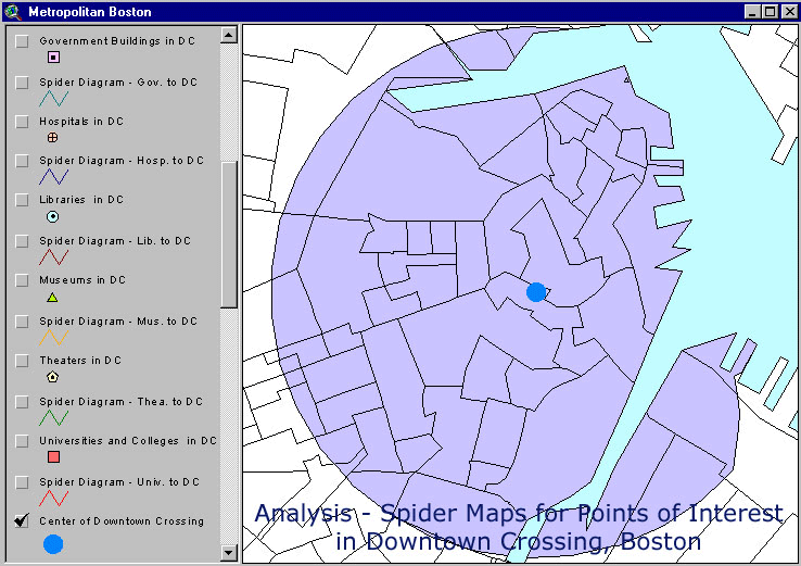
Map 20 shows an animated map using
spider diagrams. Spider diagrams simply focus on connectivity and suggest
regional outline based on point position rather than on, for example, arbitrary
administrative or geometric criteria. These particular spider diagrams
suggest the extent of dispersal of points of interest of various types
around the subway crossing point, Downtown Crossing. A more linear
and less dispersed spider diagram suggests a type of point of interest
that might be more easily serviced by linear transport routes, such as
subway lines. Note the concentration of various types of points of
interest in various sectors of the Downtown Crossing.
(Click the map to see details.)
Map 20. Distribution of Points of Interest from the Center of the Downtown Crossing
Libraries and museums, however, seem to be evenly distributed. These points of interest are relatively well placed within the Downtown Crossing area. The average walking distance from the center of the area to each point of interest is 0.54 miles, which is smaller than MBTAs average working distance, 0.75 miles, for both handicapped and non-handicapped citizens. The observed spatial pattern is interesting; it is a matter of future research to understand if the pattern noted above was one that was planned at the outset as a part of some sort of master plan, or if the pattern evolved over time, perhaps in response to zoning ordinances or public interest.
SUBWAY ZONES IN BOSTON, MASSACHUSETTS / POINTS OF INTEREST