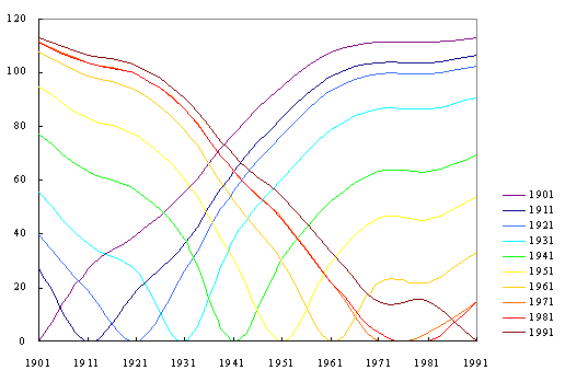
Figure 1. Static Havlin plot for rank differences in British population, 1901-1991 [2]. |
Animation is important because
it permits the portrayal of spatial information as a rapid sequence of
snapshots. Thus, it integrates time with space. Many of us
think of cartoons of cute animals bouncing around on a movie screen when
we think of "animation." As is the case with most enduring ideas,
this concept, too, has its amusing side as well as its scholarly side.
Several aspects of the scholarly side have been explored in previous articles
in this journal (see list of links, below), which
by its internet transmission alone, lends itself as a fine medium in which
to embed animations. In this paper we suggest the power of animation not
only to simplify complexity, but also to coordinate sequences of information
portrayed graphically.
Havlin [4] used data plots to measure differences
between ranks [8] over time. He captured the differences in ranks,
as a "Havlin score" on the vertical axis and the difference in time on
the horizontal axis [2]. Vilensky [7] used Havlin plots to compare
texts on the basis of word frequencies; books by the same author showed
more in common on this factor than did books by different authors.
The idea of measuring such differences is one that applies to a whole range
of topics: from phase-shift diagrams, to word frequencies and authorship
[7], to oil recovery [5], to agricultural applications [6], and beyond.
Recently, Batty and Shiode [2] plotted populations for 459 British municipalities
in Wales, Scotland, and England in 1901 by their rank differences every
10 years (Figure 1). Casual knowledge [2] suggests a British urban
spatial system that is stable in form; most large cities entered the urban
system by 1901. The single Havlin plot (Figure 1, Shiode created
this original Havlin plot) displays a remarkably complex data set at a
single glance. It also suggests the underlying stability of the dynamics
of this urban system through similarity of successive pattern as one moves
from left to right: color, only, serves as a guide to tracking the
pattern.
|
Figure 1. Static Havlin plot for rank differences in British population, 1901-1991 [2]. |
To gain a more focused look at this pattern,
we animate the Havlin plot: a dynamic visual serves as a model for the
underlying dynamic system (Figure 2). When the plot is animated,
the time lines come into the picture in sequence; the corresponding
sequence of dates for each time line is coordinated, using color, to enter
the picture along with the curve. Coordination of sequences within
a single image can underscore elements of that image's content. Figure
2 emphasizes the time at which a particular curve enters the system so
that one can easily track the dynamics of the British urban spatial system
through a complex data set. Note in particular that it is far easier
to distinguish the 1971 curve from the 1981 curve in the animated figure
than it is in the static figure.
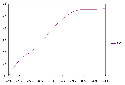
Figure 2. Animated Havlin plot coordinated with time legend. |
The Havlin plot is an effective means of portraying complex urban dynamics
in the British system because new cities do not enter the picture in any
significant manner. If one wishes, instead, to look at a corresponding
plot for United States cities, the problem of cities entering and leaving
the system obscures meaning to the pattern. Thus, Batty [1] focuses
instead on this entry/exit of cities from the broad urban system and expresses
it in terms of half-life: the extent to which new cities enter the
list of top 100 cities, at each time slice, and the extent to which cities
already in this list leave the list. A plot of these values [1], tallied
in a matrix, results in a somewhat inverted Havlin plot (Figure 3).
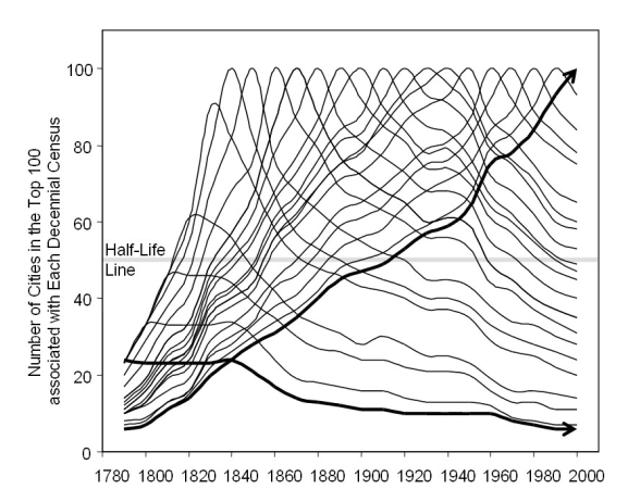
Figure 3. The Lives of US Cities from 1790 to 2000 [1]. |
Again, animation offers a dynamic view of a dynamic system. Time
lines in Figure 4a portray an animated sequence of Figure 3: the
moving blue line simplifies the otherwise complex visual pattern.
The interested reader, of course, will ask about the derivation of these
time lines. In conventional format, that reader might be referred
to a matrix and left to run an eye up and down columns to understand the
derivation of the plotted curves. Figure 4b imitates that eye movement
with an animated matrix. The blue color of the curves in Figure 4a
coordinates with the blue color of the matrix column outlines in Figure
4b to show clearly which column corresponds to which plotted curve:
coordination of animations clarifies mathematical process. Coordination
of images, each of which is itself an animated image, presents a sort of
"meta" animation: an animation of animations. Thus, the transformation
from the numerical to the geometric is emphasized.
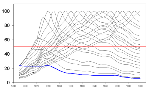 |
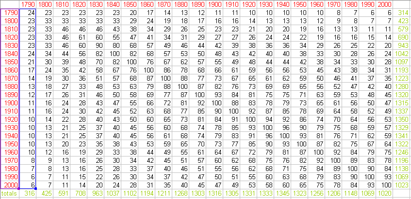
Figure 4b. Animated sequence of matrix columns. |
Figure 4. Animated sequence of time lines (4a) coordinated with animated sequence of matrix columns (4b) to show derivation of plotted curves.
In the current Internet climate, this technique
of image coordination can be effective only if the targeted audience is
known to have high speed connections to the Internet or has the capability
to download and view the image on a modern computer. Otherwise, the timing
between successive images quickly goes out of kilter; fortunately, however,
modern computing capability is rapidly becoming more affordable and more
widespread. Figure 4, viewed as a single whole, displays this sort
of synthesis of animations. Dynamic images of all sorts, including
coordinated sets of images that are themselves dynamic, serve as models
for dynamic systems.
Links to previous articles
in Solstice. Back to top.