
analysis & critique
Wolverine Access is the designated site for students to access a majority of school-related materials; these include admission applications, financial aid documents and notices, course scheduling and registration, and personal information such as addresses, emails, and emergency contacts, just to name a few. A glance at at the Student Business grid is overwhelming, cluttered with seemingly endless subjects and links. From my personal experience with this site as a student, I have found the internal pages to be just as cluttered with links, unorganized in subject material, and hard to navigate (most not allowing an easy route back to the "base navigation page"). You can refer to the original site, by clicking the link above (*note: you must have a umich uniqname to access the page).
The first thing I noticed when studying this site is that the subject material can be divided up into two main categories - prospective students and admitted/enrolled students. Because of the completely separate needs of these two audiences, I suggest that a separate site for prospective students (and the respective materials) be made; that being said, my proposed design focuses around already admitted, current students. Next, I categorized the remaining links/subjects of interest to currently enrolled students into just 8 subjects (rather than the 17 different sections listed on the current Student Business home page): courses, academic records, finances, student employment, benefits, study abroad, graduation, and career connector.
Below, under proposed designs you can find an example design of an internal page titled "Example Internal Page". This example shows how all course-related materials, including one's current course schedule, course sites, course catalogue, and backpacking & registration are accessible in one place under the "course" page. Likewise, all materials related to academics (including transcripts and a progress toward degree timeline) will fall under the "academic records" page, and all finance-related documents (including anything related to financial aid, tuition, student invoice/accounts, etc.) can be found under the "finances" tab, and so on.
site maps
existing site map
click picture to open PDF
This is a map of the home page (first column) and of just one internal page (second column, main links, Student Center). You can see just by looking at the number of boxes (which represent a link) and the titles in those boxes that this set up is extensive and disorganized.
proposed site map
click picture to open PDF
I was able to group all various functions of the Student Business into just 8 main categories (second column, main links). This example shows the internal page of the Courses category, encompassing all things course-related, including current schedule to backpacking & registration.
designs
web
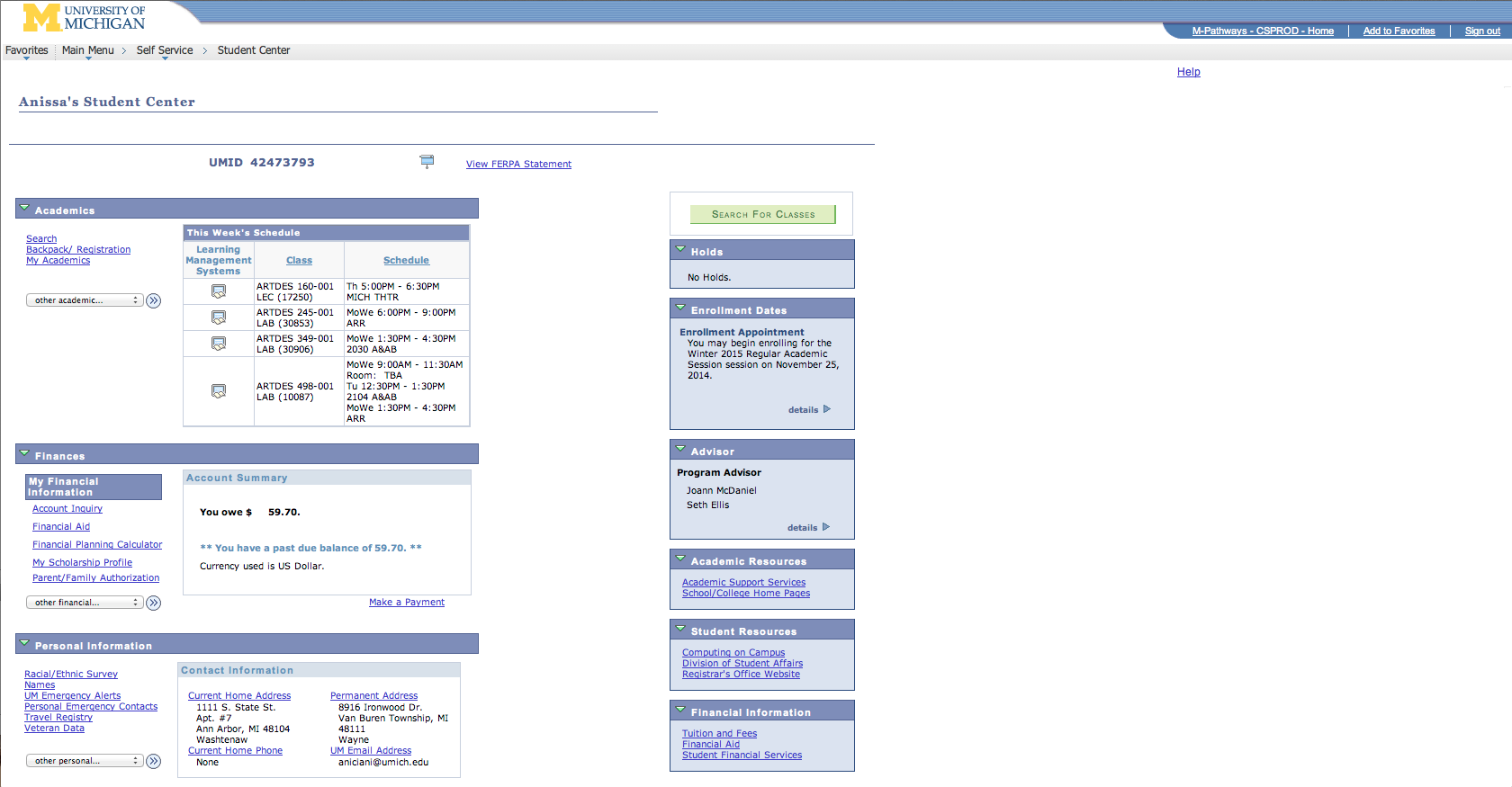
existing home page
click picture to enlarge
This is page is cluttered and disorganized, making it hard for the user to find what they are looking for.
existing profile&settings page
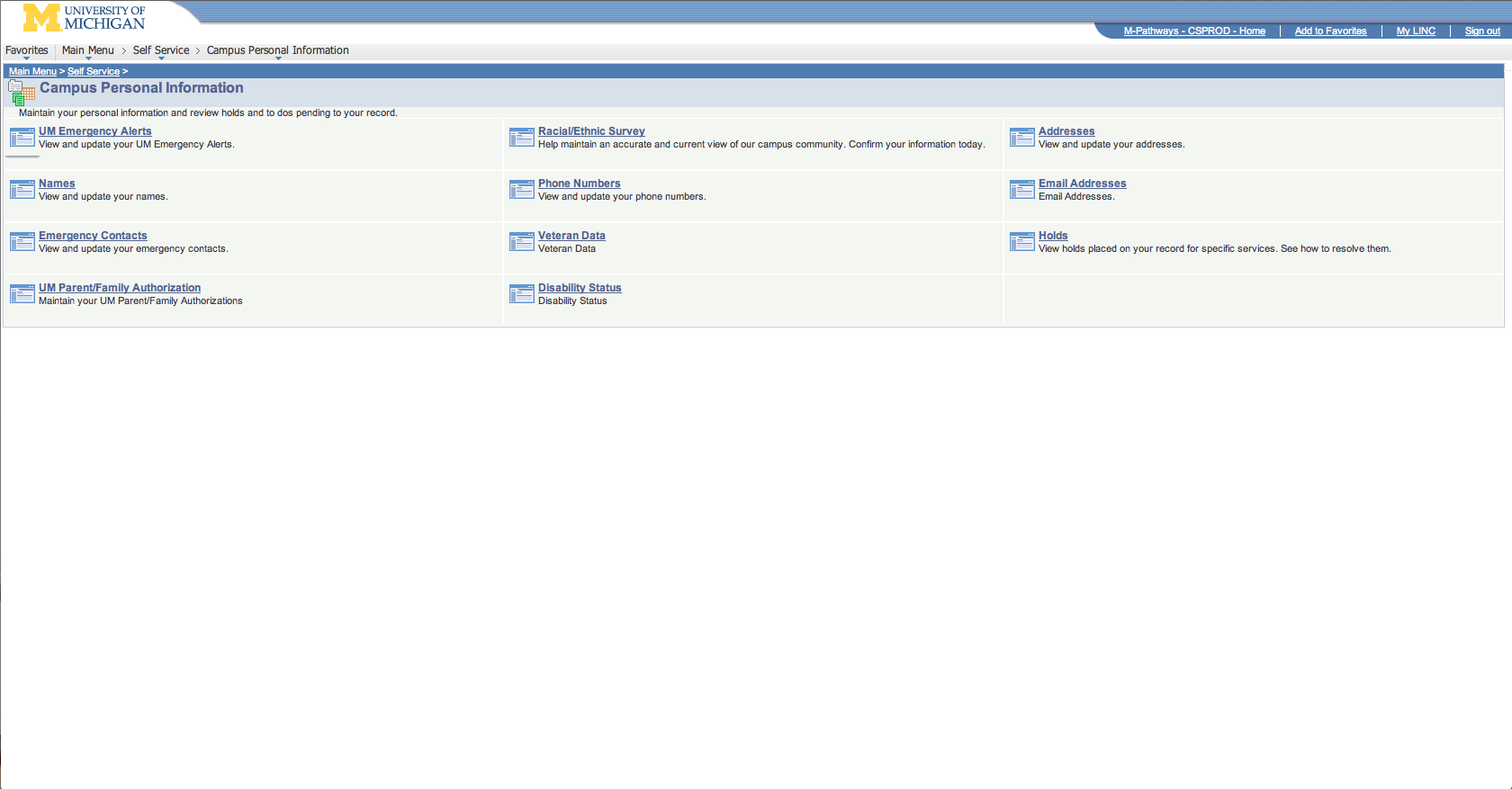
click picture to enlarge
This is page is disorganized and boring.
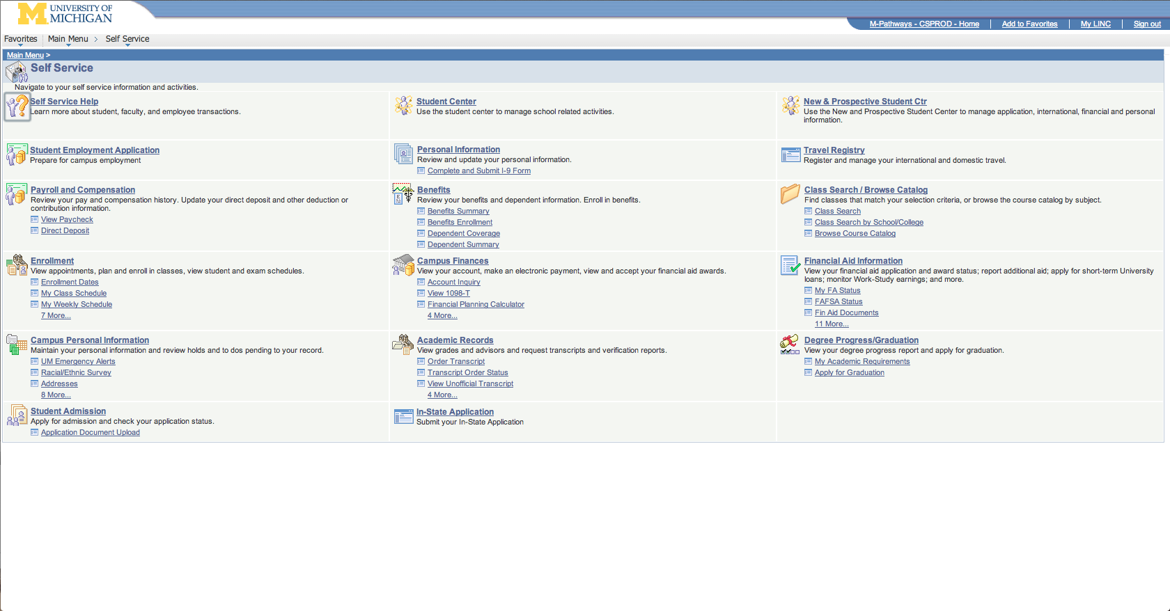
existing internal page
click picture to enlarge
This is page is disorganized, boring, and has excessive links.
proposed home page
click picture to enlarge
The categorization of functions into just 8 groups allows for a cleaner, more easily navigable home page.
proposed profile&settings page
click picture to enlarge
This setting & profile page can be easily updated and allows for the student to make personal preference choices.
proposed internal page
click picture to enlarge
The internal page design is a singular page encompassing all things related to the category. In this example, all things related to courses are listed on the left below courses and can be easily navigated by clicking on the separate links (i.e. current schedule, backpacking®istration, etc.), which will then bring you to that exact section of the page, or scrolling through the different sections.
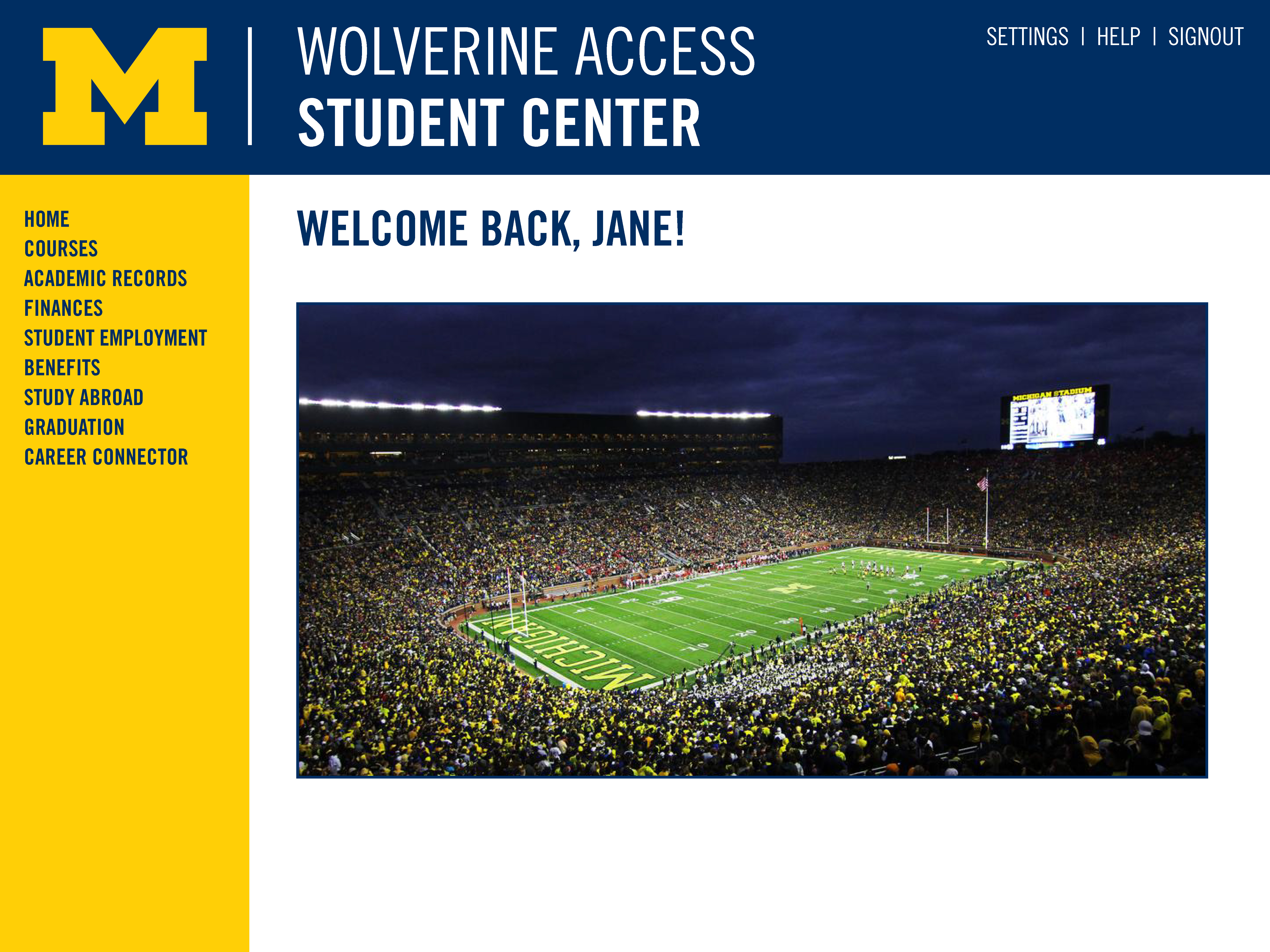
mobile
proposed home page
click picture to enlarge
This home base page provides all the essential links to navigate the site.
proposed internal page
click picture to enlarge
Like the laptop version of the site, the internal page design is a singular page encompassing all things related the category - in this example, Courses.
proposed internal page
(with drop-down menu)
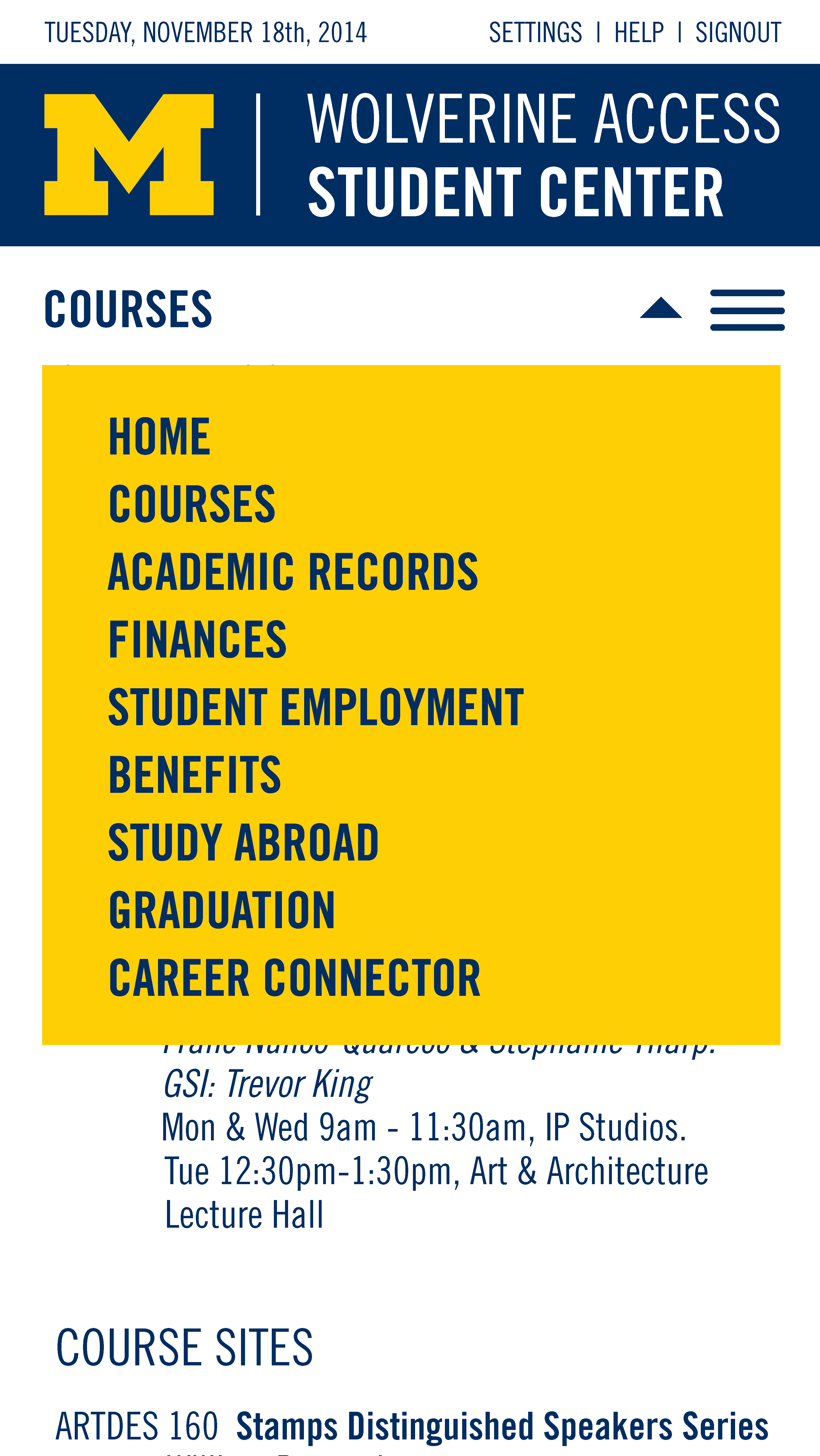
click picture to enlarge
This image shows that the drop-down menu is available on each category page to allow for simple navigation to the other category pages or back to the home page.