|
A price change appears in the diagram as a shift of a unit-value isoquant. An increase in the price of good X, for example, means that a smaller quantity of good X is needed to be worth one dollar. With linearly homogeneous technologies, the new unit-value isoquant is just a shrunken version of the old, contracted inward toward the origin by the fraction of the price increase.
As shown, an increase in the price of X, then, shifts the X-isoquant inward, causing the common tangent to rotate clockwise. From the intercepts, the wage rises and the rental falls. A fall in price of X has the opposite effects, while a change in the price of Y is analogous.
|
|
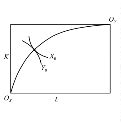
The Lerner Diagram provides a convenient starting point for further analysis of the Heckscher-Ohlin Model. The figure can be used to determine, essentially in the following order,
- industry factor ratios (techniques) corresponding to diversification,
- the diversification cone,
- patterns of specialization,
and with addition of a point representing factor endowments
- factor employment in each industry, and
- industry outputs.
The effects on all of these variables can therefore be derived, for any initial pattern of specialization, due to changes in anything exogenous to the diagram: prices, technology, and factor endowments.
The Diversification Cone
If factor prices are those given by the common tangent, as they must be for both goods to be produced, then the cost-minimizing techniques of production in the two industries are at the two points of tangency. Therefore, the factor ratios at these points of tangency, and the rays with these slopes labeled kX and kY above, represent these techniques. The diversification cone is the set of all factor endowments lying on or between these rays.
Patterns of Specialization
The reason for calling it the diversification cone, aside from its shape, is that only for factor endowments lying inside the cone -- between the rays kX and kY -- will a country produce both goods. Otherwise it would not be able to employ both factors fully, since it would be using either a higher or lower ratio of factors in both industries than it has in its endowment. Outside the cone, therefore, the country completely specializes, producing only the most labor-intensive good, X, below the cone and the most capital intensive good, Y, above it.
Factor Allocations and Factor Prices
Outside the cone, the factor allocations are simple. The entire endowment is employed in one industry. In order for firms to do that willingly, they must face factor prices that induce them to hire factors in the same proportions as the endowment. Therefore, factor prices outside the cone are not given by the common tangent, but rather by the slope of the operating industry's isoquant at the factor ratio of the country's endowment.
Inside the cone, factor prices are given by the common tangent, and the industries employ factors in the ratios kX and kY. With two factors and two goods, there is only one way that factors can be fully employed given this constraint. It can be found by constructing lines parallel to the kX and kY rays from the point representing the country's factor endowment to where each intersects the other industry's ray. The point of intersection is the amount of factors allocated to that industry.
Effects of a Price Change
All of this can be combined to determine the effects of changes in variables that are exogenous to the diagram, such as prices. The case shown is an increase in the price of good X. The price increase pulls the unit-value isoquant for X in toward the origin. This causes the common tangent to rotate clockwise, becoming steeper and representing a higher relative price of labor compared to capital. In nominal terms, the wage rises and rental falls. These changes cause both industries to substitute toward less labor and more capital, moving up and to the left along their isoquants to higher ratios of capital to labor. This increase in the capital-labor ratios of diversification means that the diversification cone rotates counterclockwise. Some factor endowments that previously would have involved specialization in the more capital-intensive industry now will accommodate both industries, while other factor endowments that were inside the cone but closer to its bottom edge are now below it, switching from producing both goods to producing only X. For endowments that remain within the cone, factors must be reallocated in order to keep them fully employed at the new higher capital labor ratios. The more labor-intensive industry, even though it now employs a higher ratio of capital to labor, also must contract, employing a smaller amount of both factors. The capital-intensive industry Y, on the other hand, employs more of both factors and expands. Thus, for a country within the cone, the output of Y rises and the output of X falls.
|