Adjacency patterns: one viewpoint.
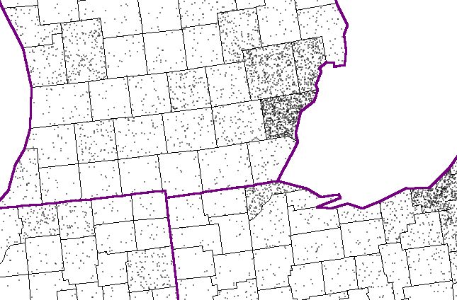
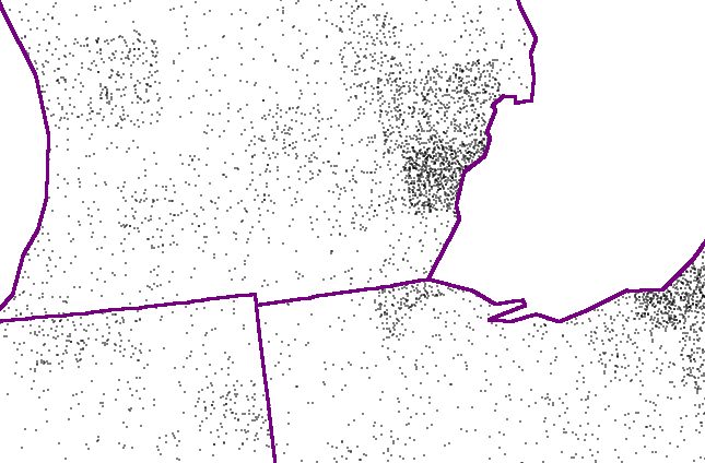
The dot density map.
It is interesting to consider how to use a GIS
to do some analysis of mapped information--using a bit of creative effort.
-
Dot density maps: layer of randomization, layer
of observation--scale change; absolute representation (1 dot represents
1000 people) and relative representation (1 dot represents 0.1% of the
population of the state). Use ArcView.
-
The concept of clustering is tied to scale.
-
Equal Area Projections and dot density maps--one way to look for clustering
in geographic space.
-
Select a distribution that can usefully be represented as dot scatter--such
as population.
-
Then, choose polygonal nets of at least two different scales--such as state
and county
boundaries.
-
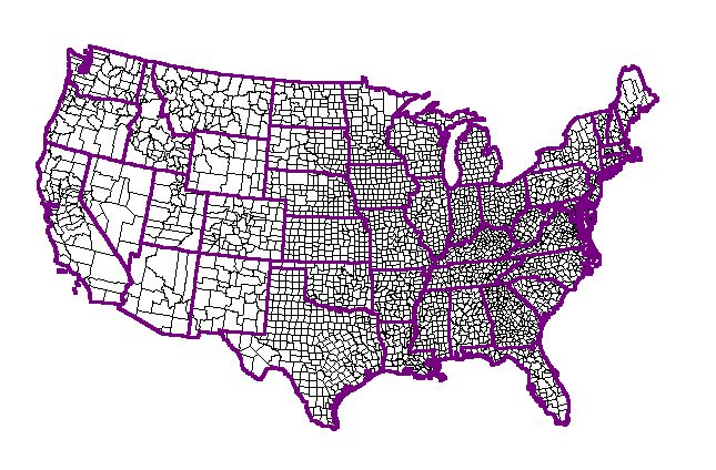
Let the map with the smallest spatial units (counties) be used as the randomizing
layer--the dot
scatter is spread around randomly within each unit.
-
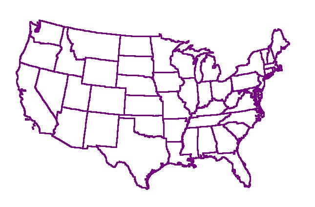
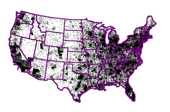
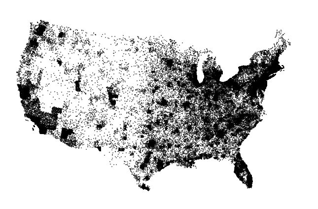
View the scatter through polygons (states) that are larger than are those
of the randomizing layer (counties). Map
1
shows the results of removing the county boundaries; Map
2 shows the national picture with state boundaries; and, Map
3 views the dot scatter through the national border lens. The
clustering of dots at the state level means something; at the county level
it is merely random.
-
Select an equal
area projection (such as an Albers Equal Area Conic for the U.S.).
-
Because the underlying projection is an equal area projection, a unit square
(or other polygon) may be placed anywhere on the map and comparisons made
between one location and another. Indeed, urban or rural measures
might be held up to a value associated with similar polygon tossed out
randomly.
Interesting reading on related topics: Mark Monmonier and Harm deBlij,
How to Lie with Maps, University of Chicago Press.
|