Lecture Material
UP507
Winter, 2003
Instructor will keep you posted on City Planning Commission meetings.
Week 1:
-
Syllabus--go over webpage
-
Latitude and Longitude
-
chalkboard explanation
-
link
to brief explanatory material
-
Dot
density
maps
-
One page biosketch
-
Academic background
-
General and particular interests
-
Software use background
-
Do you already have a webpage and if so, what software do you like to
use.
-
GIS experience
-
Anything else you would like to share
-
Discussion; project ideas
-
Your own project
-
City of Ann Arbor
-
Planning Department
-
Creating a more interactive CIP presence on our webpage, including
having
maps & projects interrelated.
-
Help Planning create a more integrated approach to putting development
petition info on our webpage (creating links, adding staff reports,
maybe
creating a map to show where active petition-related property is
located,
etc.).
-
Conduct a land use & zoning analysis in the Montgomery Wellfield
area
to supplement other work underway.
-
Helping catalog data in the GIS and indicate directions for use.
-
Building Department--Historic Preservation--continue with an inventory
already begun.
-
Environmental Coordinator--continue with work
already begun on phosphorus.
-
Other possibilities
-
I-maps improve communication giving residents direct access to
municipal
information
-
Cell towers--location map (use GPS)--look at study
from Simon Fraser--locational criteria for new towers/antennae and
colocational
issues.
-
City of Detroit--contacts through TCAUP
-
Other municipal contacts--on your own.
-
Projects from the past--some links given on home page. An archive
that will hold all is under construction.
-
Websites--set one up.
Week 2:
-
Media Union field trip: starts at 5:45p.m. from our
classroom.
See the various facilities available to you. Later we will see
the
CAVE. Today we see what all is available to use.
-
Thiessen polygons
-
Link
to article about them: these polygons serve as a limiting
position
for constructing nested circular buffers.
-
Demonstration of ArcView to calculate these polygons on an arbitrary
distribution
of dots: Spatial Analyst extension must be loaded.
-
Create a new layer
-
Edit the table and add a field with some numerical information
-
Use Analysis|Assign Proximity to create Thiessen polygons--convert
layers
to shape files.
-
Modify them by using a rectangle
-
Modify using convex hull of distribution--draw it if Animal Movement
extension/Home
Range is not loaded. Clip, if desired.
-
Set distance--use the polygons to estimate maximum buffer radius for
the
distribution.
-
Maps brought in on CD: some in response to student request--Ann
Arbor,
Japan and Korea. Others, as well.
-
More suggestions from Planning Department (AA)
-
Map impact of Chapter 63 changes in each watershed--that is, how much
previously
undetained impervious has been corrected
-
Map the location of ash trees
-
Map the footing drain disconnect program
-
Site plan project interactive map
-
Transportation plan project map--detours, progress, etc.
-
Transit boardings and adjacent land use
-
Comparison between zoning and existing land use to find areas where
rezoning
is warranted.
Week 3:
Martin Luther King Day: no formal class. I will be in the
classroom during class/lab time if you wish to work on your project;
there
will be no lecture. Also, I will be in my office earlier in the
day
for scheduled office hours.
Week 4:
-
Map projection: the goal is to
send
each point on the globe-sphere to a unique point in the plane: a
one-to-one transformation.
-
Stereographic projection--trapped in
Euclidean geometry.
-
The One-point Compactification Theorem
(blackboard
demonstration): shows that the skin of a spherical globe cannot be
perfectly
flattened into the plane; it fails to do so by at least one point. Thus,
there can be no perfect map in the plane: the stated goal cannot
be attained.
-
Open questions: geographic maps in
the non-Euclidean
world.
-
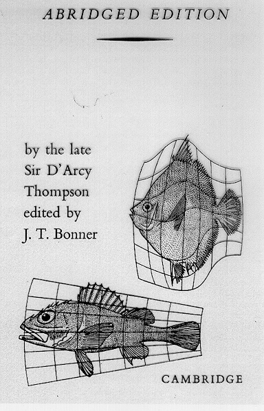
Map projection as a transformation: Thompson's
fish--classification schemes are not unique, either. There is
an infinite number of them (Tobler, Map Transformations of Geographic
Space).
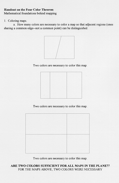
-
Four Colors are sufficient for any map,
assuming
adjacent regions have a line segment in common. Open
questions:
corresponding material involving other adjacency assumptions.
-
in the plane
(links 01,
02,
03)
-
on a sphere, as well (link 04).
An application of the one-point compactification theorem.
-
on developable surfaces that result may not
be the
case (links 05,
06,
07,
08).
-
Given that no more than four colors are ever needed to color a map in
the
plane, subject to the initial adjacency assumption, why should a GIS
have
so many choices for color?
-
Thematic maps (aka, ranged fill or choropleth maps) with many ranges
need
a variety of colors
-
Ranges need to make sense so that changes in data intensity are
reflected
in changes in color intensity
Four colors are sufficient to color any map in the plane; one never
needs
more than four. Thus, when choosing coloring schemes, bear this
fact
in mind and have a rationale for color selection based on the
underlying
known theorem about coloring.
- Color, extrusion, and use of GIS to move from 2D to 3D.
-
Load up the map sample of the downtown Ann Arbor parcel map, loaded
with
hypothetical height values in the underlying database (map file sent to
you to put into your ifs space).
-
In ArcView,
-
color the parcels as "unique value" using "height" as the variable
-
check to see that both the Spatial Analyst and 3D Analyst extensions
are
enabled
-
Go to View|3DScene|Themes
-
Go to Theme|3DProperties
-
In the extrude section, hit the calculator button and choose "height"
-
Go back to the extrude section and multiply "height"*5, to exaggerate
the
vertical component--or click on "vertical exaggeration" in the
"properties"
menu.
-
Use the various buttons to move the Scene around--rotate it, zoom in
and
out: left-click and drag--rotate; right-click and drag--zoom in
and
out; both-click and drag--pan.
-
Export to vrml and put on a website: load Netscape plug-in to
view--free
from, http://www.cai.com/cosmo/html/win95nt.htm
-
Here is Sandy's first attempt at this (link)--you
try it with the same files--do better!! Second
attempt: background changed to light green; position of sun
in
sky raised from very low to low and direction of sun changed from
northeast
to southwest (north is at the top as it comes up). Look in the
"properties"
menu.
-
and also look at a website
from
UM College of Engineering Virtual Reality Lab to see other projects and
student projects from Eng 477 (Prof. Peter Beier).
-
Real-world application--project making alternative scenarios for City
of
Ann Arbor regarding maximum height in the downtown.
Week 5:
-
Classification and Adjacency in thematic maps: rationale for
choosing
different schemes for classification (after ArcView documentation).
-
Natural Breaks (Jenk's Optimization, statistical formula that minimizes
variation within each created class): identifies breakpoints by
looking
for "natural" groupings and patterns in the data under
consideration--ArcView
Default
-
Merits
-
Big jumps in the data appear at class boundaries.
-
Extreme values are visually obvious.
-
The two merits taken together may produce a "realistic" view of the
data--hence,
the suitability for choosing this method of data partition as the
default.
-
Drawbacks
-
Class intervals difficult to read
-
Clear replication of results may be difficult
-
Merging or mosaicking maps will produce different classifications
-
Coloring may need to be adjusted so as not to give undue visual
importance
to extreme values
-
Quantile--each class is assigned the same number of features (insofar
as
divisibility permits).
-
Merits
-
Well-suited to data that are linearly distributed--data that does not
have
disproportionate numbers of features with similar values ("clusters").
-
Easy to explain to others how it works.
-
Useful for making comparisons in relation to the partition: to
show
that a commercial establishment is in the top quarter of sales of all
stores
in the region.
-
Distinctions among intermediate values, grouped in natural breaks, may
be easier in quantile.
-
Drawbacks
-
Features close in value to each other may lie in different classes
-
Features ranging widely in value may be included within the same class
-
Increasing the number of classes may help to overcome these drawbacks
but
that act then adds clutter to the map
-
Clear replication of results is easier than with natural breaks but
still
problematic when merging files.
-
Equal area (polygons only)--classifies polygons by finding breakpoints
in the attribute values so that the total area the polygons in each
class
is similar. This approach is similar in nature to the quantile
approach
except here each feature is given a weight in the classification equal
to its area (instead of 1).
-
Merits--Polygons that are largest in area are in classes by themselves
-
Drawbacks--Polygons that are smallest in area are grouped in classes
and
distinctions among them may be difficult to make
-
Equal interval--partitions the range of attribute values into equal
subintervalues.
-
Merits
-
Familiarity: a natural legend in terms of ease in reading (at
least
when the nature of the entire range of possibilities is clear, as in
percentages,
temperature, and so forth).
-
Emphasis on ranking in relation to the partition: to show that a
store is part of a group of stores in the top quarter in sales.
-
Drawbacks
-
Hides variation between features with fairly similar values
-
When the data range does not already make natural sense, a different
classification
scheme may be better.
-
Standard deviation--shows extent to which attribute values differ from
the mean.
-
Merits--Easy to visually assess which regions have values above or
below
the mean for all data.
-
Drawbacks--The data may skew class count and position in relation to
the
mean: many high values may cause low values to be grouped in a
single
class below the mean and produce multiple classes above the mean, so
that
the mean class does not, itself, occupy a visual central position on
the
map.
-
Normalizing data--divides each of the attribute values by some
other
value.
-
Merits
-
Divide by the sum total of the attribute's values, so that the
resulting
ratios represent percentages of the total. Enables comparison
from
one region to the next, using percentages of the total (region 1
contains
50% of the sales while region 2 contains a mere 17% of the sales)
rather
than absolute totals.
-
Divide by values in another attribute: may take into account
spatial
variation influencing the original attribute. Population density,
dividing total population per unit by area of the unit is a common
example.
-
Drawbacks
-
If total count is important, then normalization of data is not
appropriate.
For example it may be more important to know how many members of a
minority
group are present in a particular region, to trigger some funding
mandate,
that it is to know what the density of population is within that
particular
group. In a group of 100, 35 members of a minority group may
appear
fairly "dense"; however, if 50 members are required as a floor for
certain
programs to be realized, then the density is irrelevant.
-
Do not normalize data that has already been normalized: rates,
attribute
per unit area, and so forth.
-
Think about what you want, though, when using census tracts which are
already
scaled in area to include roughly equivalent numbers of population.
-
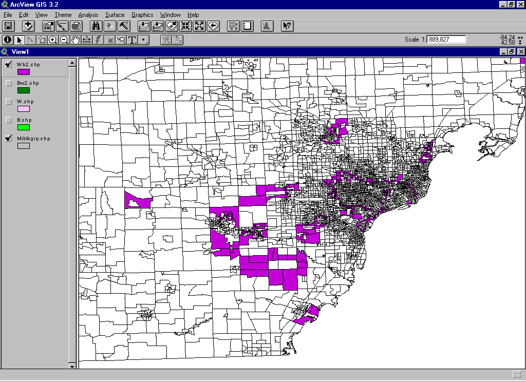
Adjacency patterns: points and regions. The
clustering of regions and regional definition.
-
How are regions clustered in space? Are similar ones next to each
other or are dissimilar ones next to each other. Consider for
example
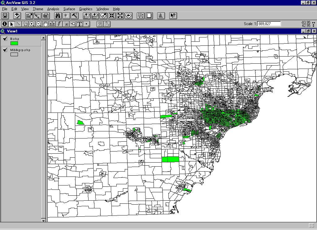
some of the on-board population that comes with ArcView. Open up
the Michigan Block Group shape file. Zoom in on southeastern
Michigan.
-
A more detailed look at the clustering process might consider
separating
out those block groups in which black exceeds white and has a
neighboring
block group in which white exceeds black--denote this situation as
BW.
There are then four logical alternatives: BW, WB, BB, and
WW:
the first letter represents which variable dominates; the second letter
indicates which variable dominates in neighboring blocks.. To
pick
out the appropriate block groups:
-
BW:
make the B layer active.
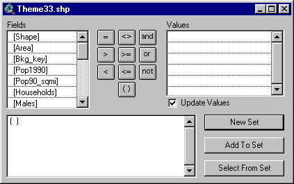
In ArcView 3.2: Go to Theme|Select by Theme. In the top
pull-down,
select "intersect";
in the next pull down, select the W layer. Choose "new
set".
When the selected polygons come up, convert them to a shape file and
color
it a deeper green. This process will pick out the edge of the B
layer
that is adjacent to the W layer.
-
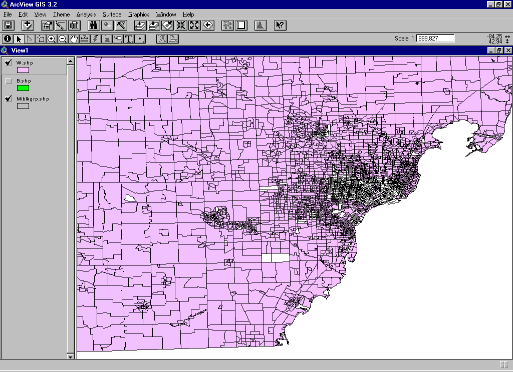
WB:
make the W layer active.
Go to Theme|Select by Theme. In the top pull-down, select "intersect";
in the next pull down, select the B layer. Choose "new
set".
When the selected polygons come up, convert them to a shape file and
color
it a deeper purple. This process will pick out the edge of the W
layer that is adjacent to the B layer.
-
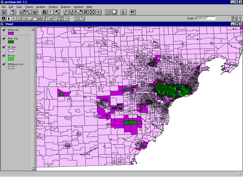
Look at the whole
map. Clustering of like groups is evident in the Detroit
metro
area--similar groups are clustered. In Washtenaw county some
dissimilar
groups are clustered, some are not. Clustering of either similar
or dissimilar groups is highest in Detroit--this would fit with field
evidence
(often referred to as "spatial autocorrelation). This process can
be iterated indefinitely (limited by the size of the base file) and
creates
a sort of "contouring".
-
In terms of simple conditions, each of the four conditions, BB,
BW,
WB, WW would be expected, with no constraints, to occur 25% of the time.
-
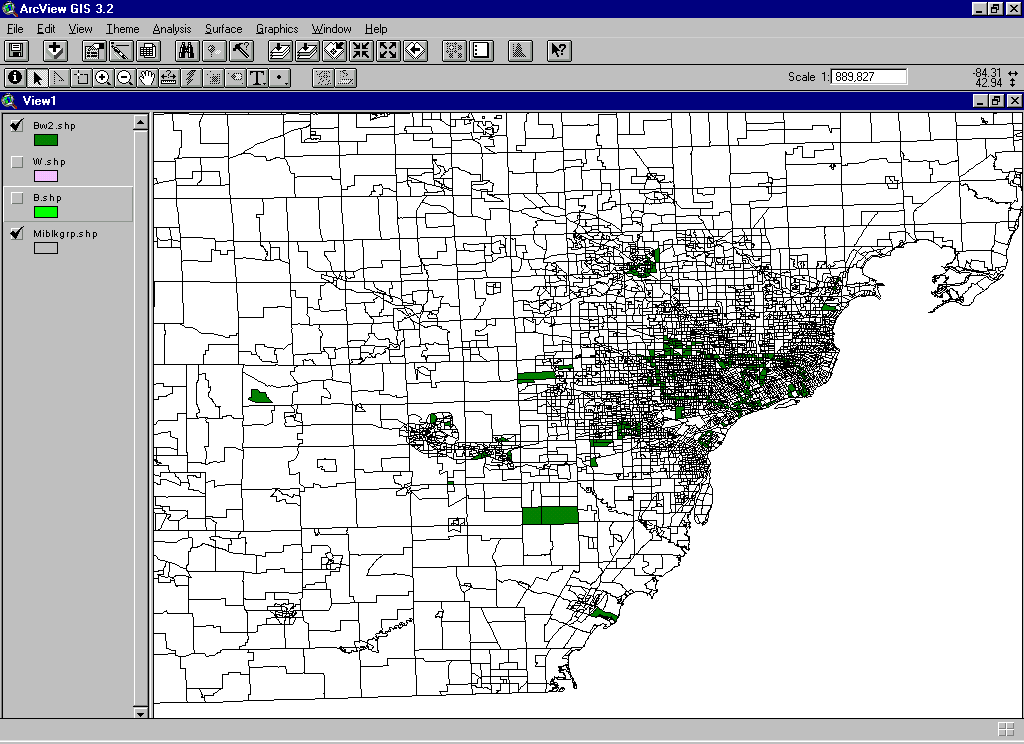
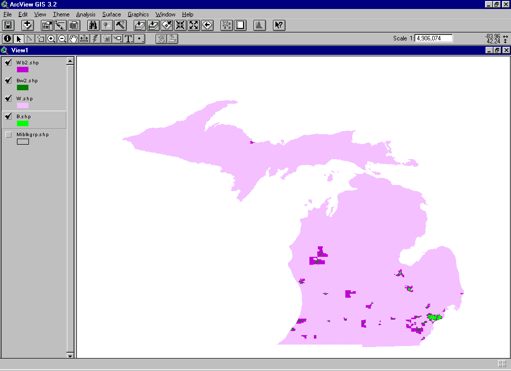
When all the block group outline boundaries are removed from the
different
colors, it is easy to look at a map
of the whole state.
-
Policy makers and municipal authorities may find maps such as these
useful.
-
Academic research may modify how to interpret what the adjacencies mean
and what sort of quantitative significance to assign to them; it may
also
consider definitional matters, such as how polygons are adjacent--at
corners
only, at edges only, or at corners and edges; or, it might also
consider
how such variables might be made more meaningful through
normalization.
Chess analogies are often-used jargon to describe relative adjacency
pattern.
The subject of "spatial statistics" delves more deeply into different
measures
for clustering and for levels of significance once clustering is found
(a different course from this one).
-
Animated maps based on GIS maps showing clustering of regions: Link
1; Link
2
-
"Mapplets"
offer an opportunity to find critical points
Week 6:
-
CAVE demo...starts promptly at 5:30--you will
need
to remove shoes. Visit to University of Michigan virtual reality
immersion CAVE. The files are similar to the ones you created in
3D Analyst in ArcView (using the Ann Arbor parcel map of downtown).
-
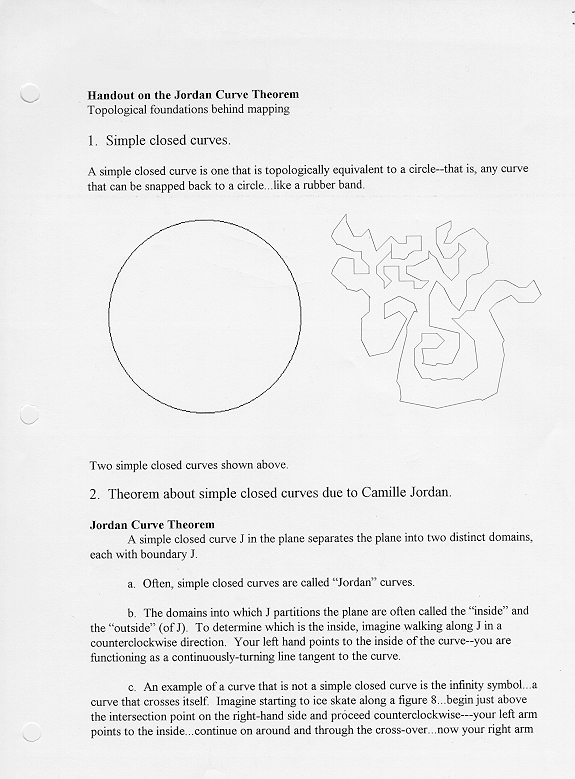
How can you tell the inside from the outside
-
Jordan Curve Theorem; implications for
mapping.
-
The Jordan Curve Theorem:
-
permits correct assignment of addresses
on either
side of streets--suppose that the path is composed of two squares
touching
at a point. When the path is separated into two squares, a
consistent
assignment procedure for addressing may be given. If the squares
were not split apart, then the set of addresses would be misallocated,
at least in part. One must have the Jordan Curve Theorem built
into
the software if geocoding is to work on matched addresses.
-
permits visually appropriate coloring of
polygons
-
illustrates the need to split complex
curves apart
at nodes where the curve crosses itself in order to ensure that the two
properties above will hold on maps. This fact is important in
digitizing
(and elsewhere).
-
Defining regions in the absence of regional information: making
something
from nothing? (All three cases below use ESRI software,
ArcView3.2
with Spatial Analyst Extension, 3D Analyst Extension; also Animal
Movement
extension from the Alaska Biological Center, and Xtools from Oregon
Forestry).
-
Spider
diagrams:
one way of defining regions in the absence of regional information.
-
Thiessen
polygons: another way of defining regions in the absence of
regional
information
-
Contours:
Partitioning the plane in various ways (level curves of a surface--but
hard to find--requires knowing an equation for the volume).
-
Other ways to make maps come alive: animation--brings temporal
and
spatial elements together. Use of Adobe ImageReady.
-
Work on projects.
Week 7:
-
Developing world application
-
Use of transparency in making multiple layers in maps show on the web
-
Create a map with two layers. In the top layer, make a pattern
and
a transparent background.
-
Put the map in Layout--adjust the units first so the scale is correct
-
To get rid of the grid points:
-
In the view window, change the background color to white
-
In the layout window, hide the remaining outer grid points.
-
Save it in .jpeg format: File|Export|jpeg
-
Then, load the .jpeg onto a web page; notice that only one layer shows.
-
Instead, use the alt+prntscreen approach and save the map in
PhotoShop--then
both layers show.
-
Use of DreamWeaver (by MacroMedia) on web pages
-
clickable maps
-
mouse-over text
-
Use of extensions (if loaded in the load set). Projector!; Animal
Movement; XTools; EdTools; or others.
Spring Break--SA will be available by e-mail throughout much of the
break. Presentations will be the Monday after spring break.
There are 12 students, and four hours of class time. Thus, each
student
has 20 minutes in which to present material to the class.
Week 8: Midterm Presentations--Party afterwards at
Sandy's home.
-
Dan Shoup
-
Howard Tsai
-
Angkana Chairatananon
-
Luci Kim
-
Hyoung Bae Park
-
Chris Eckman
-
Katie Kozarek
-
Wayne Buente
-
Zeb Acuff
-
Pat Sloan
-
Simon VanLeeuwen
-
Chuck Hahn
Week 9: MOVING THINGS AROUND...
-
Diffusion of an innovation: one approach to moving things around
at the theoretical level. Numbers can create spatial
pattern.
Consider the following locational
model of Hagerstrand. In an urban planning context, these
ideas
might parallel
-
spatial infill and extent of urbanization (limit to sprawl).
-
possibility of introducing new ordinance material--leapfrogging effect
(reference to creeksheds material).
-
Extensions to ArcView: several approaches to moving things around
at the practical level.
-
Projector! reprojects maps (not datums)
-
EdTools permits translation and rotation of shape files: slide
shape
files around in the plane.
-
Register.avx permits image registration to shape files.
-
Animal
Movement extension offers a variety of tools for tracking movement
in the plane.
-
E-mailed information:
Week 10: Spatial Hierarchy and Fractal
Transformations.
Week 11:
Week 12:
Continuation...
Week 13:
Finish up...
Review of where we have been.
Week 14: Final Presentations
Dan Shoup
Howard Tsai
Angkana Chairatananon
Luci Kim
Hyoung Bae Park
Chris Eckman
Katie Kozarek
Wayne Buente
Zeb Acuff
Pat Sloan
Simon VanLeeuwen
Chuck Hahn
Week 15: Final project websites due.
copyright, S. Arlinghaus.