B. Why do I want to map fundraising?
1. Initially, I had planned
to map where the University of Michigan athletic department was receiving
its financial contributions came from. Unfortunately, the department hired
a new director of athletic fundraising, and he had too much work on his
plate to help me.
2. While I was not able
to do something with sports fundraising, which appeals to me as a former
collegiate athlete and employee in sports business, I decided that it would
be interesting to try to map a class at a major university. Princeton a
place that is special to me, since I worked in the athletic department,
and my brother and father are both graduates. Additionally, my father and
some of our best family friends raise money for their classes at this school,
so this would provide me with a unique opportunity to examine this topic.
The class that I will be working with is the graduating class of 1974,
which will be celebrating its 40th reunion this May, and this map will
help the class agents and development/annual giving staff see where they
are receiving their donations.
Additionally, I found that when I joined the
Princeton and ESRI data that I was not getting a very appealing map using
a graduated color scheme, which has something to do with the sample size
of class members the university has. There are only a little over 1,000
people in the class I am studying, and when one maps their contributions
on a map of the whole United States, the sparse nature of the data does
not give me a particularly good map. Below I have imported some of the
maps that I have drawn on ArcView.
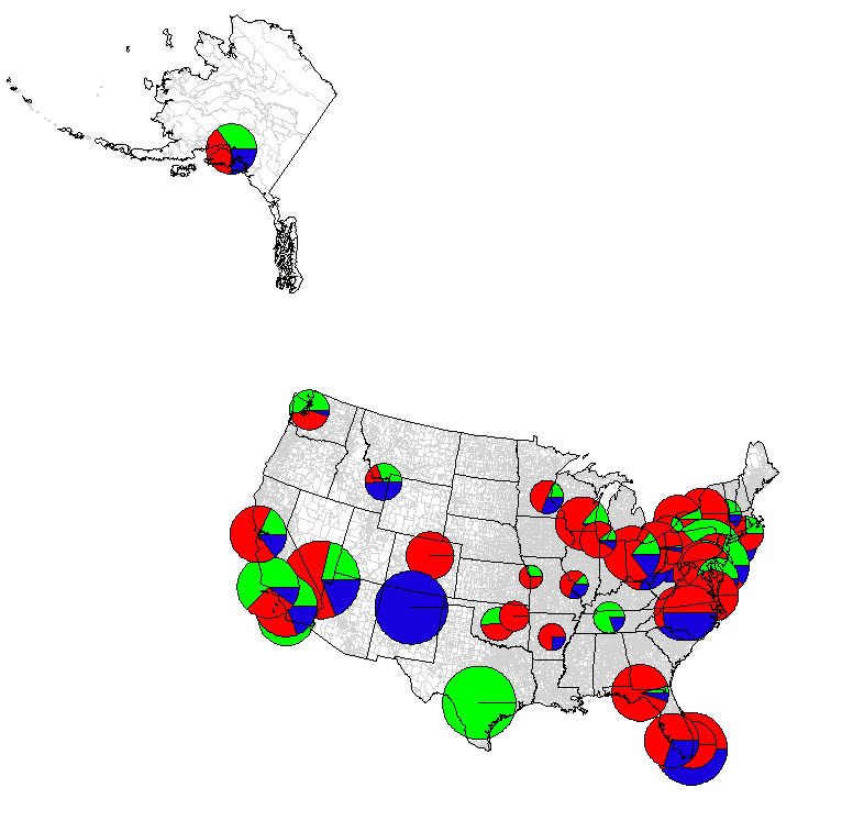
1. The United States in full:
I am not terribly surprised that the majority
of the fundraising dollars come from the northeast/mid-Atlantic region
considering that Princeton, New Jersey is located in central New Jersey.
The color green represents annual giving at a zip code during the 1990-95
campaign, and the color red highlights the amount of annual giving during
the 1995-2000 capital campaign. Finally, blue represents fundraising dollars
earned from a zip code in the 2000-03 time frame. This is a class from
the mid-1980's, and I am surprised to find so much annual giving money
coming from destinations like Florida, California and Arizona, which are
popular retirement destinations. Perhaps, several of the members in this
class made gobs of money during the internet boom of the 1990's and retired
early? It is also very like that folks in this class have moved around
in the last three-to-eight years, which could account for the differences
in giving for each zip code.
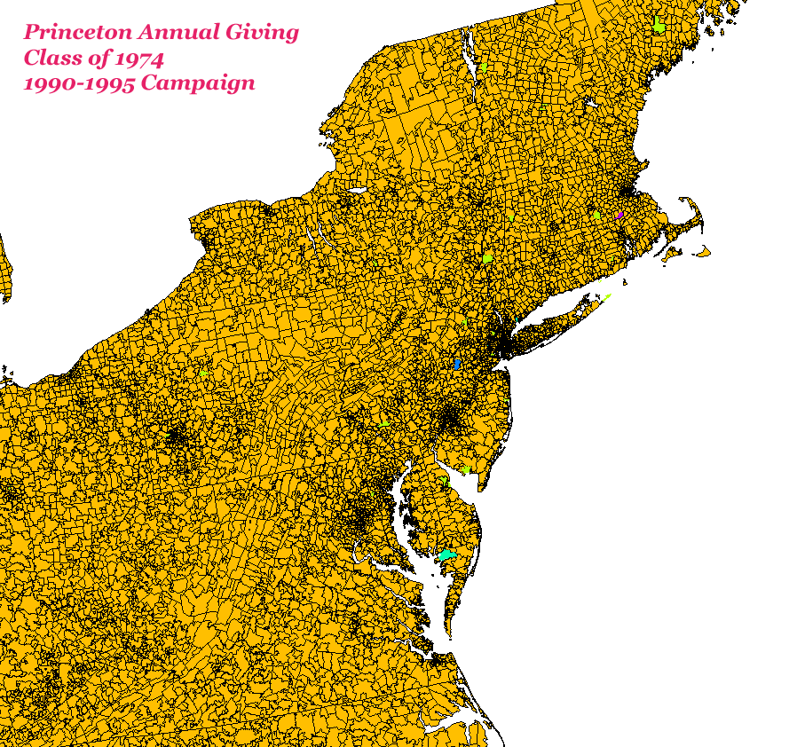
2. The Northeast:
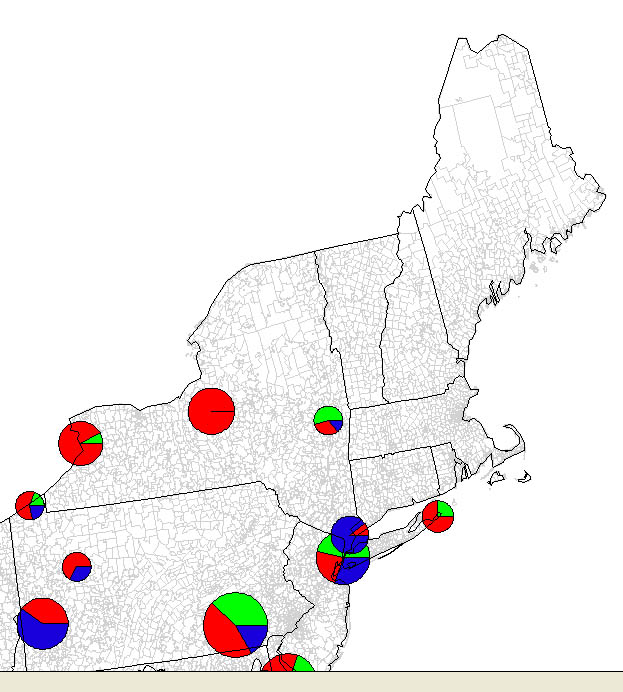
The first thing that jumps out at me is how big the Philadelphia,
Pennsylvania and New York City giving amounts are, and I am not surprised
since Princeton, New Jersey is located between these two major cities.
The fact that I do not see anything near Boston is surprising, since I
know that this is one of the cities with a large alumni group at Princeton.
Also, several students matriculate to Princeton from the Boston area every
year. Further, Connecticut is another place where lots of Princetonians
settle down, but I do not see any annual giving therein.
3. The Mid-Atlantic:
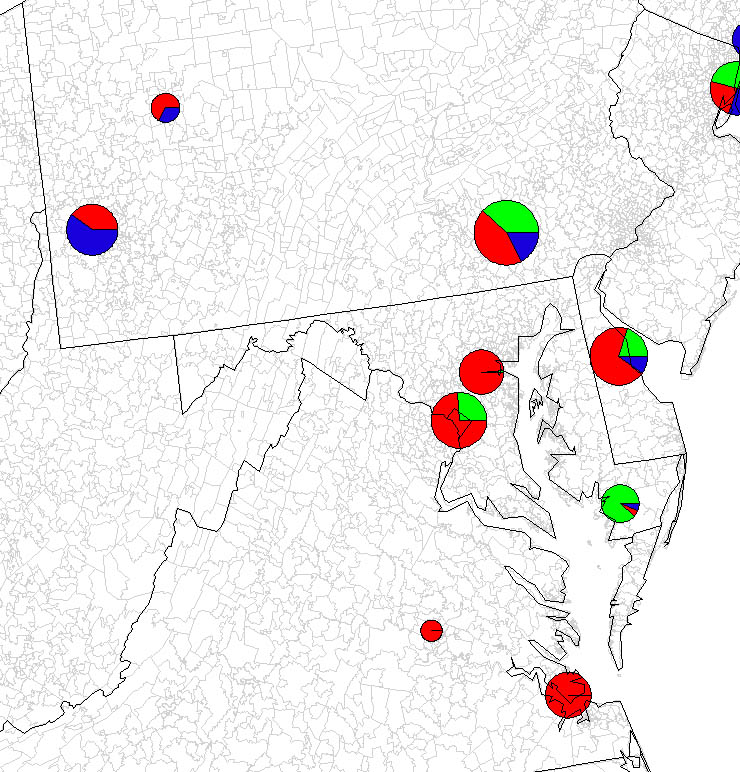
Several Princetonians live and work in the Washington, D.C./Baltimore,
Maryland area, as is evidenced by the large amount of annual giving therein;
however, I am surprised to find no recent annual giving dollars coming
from this area. Perhaps, the poor economy and attack on the Pentagon have
something to do with this, but I do not see similar results in the New
York City region.
3. The South:
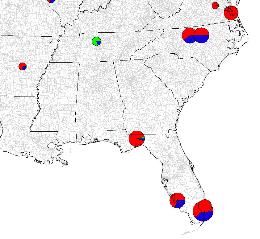
Princeton has often been called the "furthest north, Southern college," which is because so many Southern gentlemen and ladies end up studying there. In fact, one of the archways on the west side of campus honors Princetonians that died in the American Civil War, and it may surprise you to find out that there were as many Union dead as there were Southern dead from this institution. Virginia, North Carolina, Mississippi and Florida are places where there is fundraising activity, but I am surprised to find nothing in the Atlanta, Georgia area. If you refer to my first table, one of the zip codes that did not match between ESRI and Princeton data was 30301, which is in that area.
D. Where do I want to go from here?
1. I want to do separate maps for the three different capital campaigns, and I want viewers to be able to scroll between these maps and a map which has an aggregate amount of giving for all of the years.
2. I would like to focus my maps on the Northeast,
since I was so surprised to find that there were no donors in the Boston
area in my original maps.
When the scale is changed on my map of the northeast
I still found that Boston, Massachusetts did not have any donors, which
is why I decided to pick different zip codes in the four areas of the region
where I found evidence of giving.
3. I would like to plot where the volunteer fundraisers are on
the map, so that they can see where they need to pay more attention in
their areas.