
Figure 1. Static map showing a hierarchy of nodes in the Rohrpost network.
Sandra Lach Arlinghaus
Animated maps, "animaps," offer a unique opportunity to visualize changes in spatial pattern over time. Diffusion studies thus offer a natural platform from which to launch animaps (for samples, see "Animaps" in previous issue of Solstice). These maps are dwellers of cyberspace, dependent on it for their existence. To "publish" such a map in a conventional medium, such as a book, would require pages of maps (a costly venture) and still the animation, or time-tracking feature, would be lost (unless of course, as seems to becoming more and more the practice, a CD or similar medium with book files is included with the hard-copy book). Previous work has illustrated the utility of animated maps in a number of diffusion contexts. In this article, animated maps are used as tools to refresh, enliven, and analyze historical maps as well as conceptual models; hopefully, this approach will serve to underscore, as a side issue, the importance of converting historical files and other enduring ideas to an electronic format. These animated maps are presented in the common Euclidean dimensions of point, line, and area. Left to the future is to examine them more generally in Euclidean space as well as in classical non-Euclidean space and then to permit fractional dimension.
An Historical Context: the Berlin Rohrpost
Beginning in 1853, a number of experiments with
relatively expensive underground pneumatic communications systems were
underway in western Europe. After slowdowns caused by the Seven Weeks War
(1866) and the Franco-Prussian War (1870), full-fledged pneumatic communications
systems began to appear in major cities in western Europe as a speedy alternative
to mail delivery through congested surface streets. Among others,
the city of Berlin boasted a substantial pneumatic postal network, known
(appropriately) as the "Rohrpost."
By 1901, the "Rohrpost" carried messages under most
of Berlin (Figure 1). The heart of the message system was in a central
office on Unter den Linden, denoted as the largest circle in Figure 1.
Adjacent graphical nodes were linked as underground real-world nodes by
"edges" of metal tubing. The real-world nodes had surface housing that
could pump and compress air and thus receive and deliver messages.
Figure 1. Static map showing a hierarchy of nodes in the Rohrpost
network.
The map of the Rohrpost (Figure 1) shows the linkage pattern of edges joining nodes and reflects, only indirectly as a static map, a hierarchy in the procedure for message transmission. Certain pneumatic stations were designated as having functions of a higher level of service than were other locations. Typically, message containers were pushed, using compressed air, from one higher order office to a handover position intermediate between higher order offices. From this handover position, suction drew the carrier toward the next higher order office. The animated map (Figure 2) shows clearly one handover node, belonging to both black and blue subnetworks. This node is a transfer point, or gate, from compression to suction, as are all other similar offices. This kind of partition was useful in suggesting a graphic code that could be used to track the progress of a message through the system (and thus detect the location of collisions or blockages).
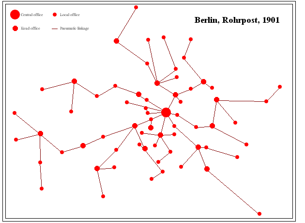
Figure 2. Animated map showing handover position between adjacent subnetworks: this position is a transfer point from compression to suction within the system.
One might wish to consider more than the actual
pattern of transmission. Would an analysis of this Rohrpost map,
based on existing technique, have yielded an answer that coincided with
actual field circumstances as to which node is the hub of the network?
Thus, consider the map as a scatter of nodes linked by edges.
The concept of center measures, to some extent,
how tight the pattern of connection is around a core of nodes. It measures
whether or not there is central symmetry within the structural model:
whether or not accessibility within the network is stretched
in one direction or another. This sort of broad, intuitive, notion
of center does not take into account the idea of volume of traffic; to
do so requires looking at more than direct adjacencies in calculating weights
for nodes. What happens in a remote part of town may influence traffic
patterns across town. The concept of centroid, which rests on the idea
of branch weight--the number of edges in the heaviest branch attached to
each node, does so. The animated map in Figure 3 shows the branch weight
for each node in the Rohrpost. The red node has a heaviest branch
with 19 edges in it (shown as the black subnetwork in the animation).
Other nodes are color coded according to heaviest branches. Those
nodes with higher values are more peripheral in their function to the network:
a node with a branch weight of 65 has one route coming from it with 65
edges in it--crossing the entire network from one side to the other. Nodes
in a peripheral position have longer heaviest branches and therefore greater
branch weights than do nodes in the interior. Thus, it is reasonable numerically
to view the most central, in this context, as the node(s) with the smallest
branch weight. In this case, the centroid is the red node and it does coincide
with the actual network hub.
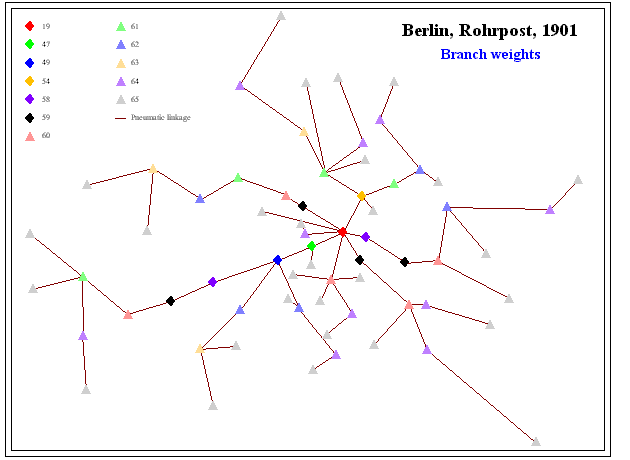
Figure 3. Example to illustrate branch weight. The heaviest branch
from the red node in the Rohrpost has 19 edges, labeled in this figure.
All nodes in the Rohrpost graph are labeled with branch weights. Those
of lowest value (in this case one node) serve as the centroid.
Beyond the mere calculation of the centroid of the network, one might wonder about using the measure to capture other elements of the network. Thus, the animated map in Figure 4 shows all nodes colored according to branch weight. The first frame of the animation shows the single node of weight 19 as a red node. The next frame shows the node of weight 47 as a red node and shows the node from the previous frame as a black node. Iteration of this coloring strategy, using red for nodes added in a frame and black for nodes accumulated through previous frames, produces the pattern shown in Figure 4. In addition, the time-spacing between successive frames is tied to the numerical distance between branch weights; thus, the time-distance between frames 1 and 2 of the animation (from branch weight 19 to branch weight 47) is substantially longer than is the time distance between any two other successive frames in the animation.
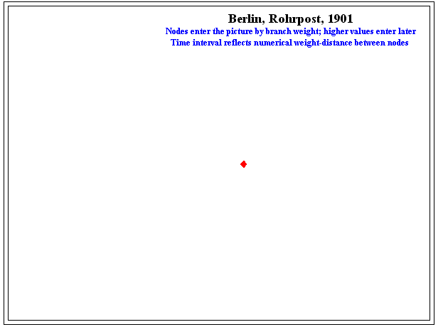
Figure 4. Note in this case the long wait in the animation from the central office to the next tier of offices suggesting the highly dominant central role (in terms of structure) played by the "central" office. Next most dominant is the role of the line of core of offices under Unter den Linden.
What the animation shows is the dominance of the central node and a line of tight control emanating from the center with many peripheral nodes, of roughly equivalent lack of centrality, scattered throughout. When the animation is checked back against the original, this "line" is in fact composed of pneumatic postal offices under Unter den Linden, a central thoroughfare in Berlin during this time period. The fit between model and field is precise at both the point (centroid) and line (street) levels. Thus, one might speculate that the areal pattern of extension/sprawl and infill evident in the Rohrpost animation of Figure 4 functions as a surrogate for actual neighborhood population density patterns in Berlin in 1900 and is thus of significance in studying planning efforts of the time. When this sort of idea is extrapolated to the future, it is not difficult to imagine, instead, satellite positions serving as a similar backdrop against which to test models that can then be extended to offer extra insight about terrain or human conditions.
A Conceptual Model Context: Hagerstrand's Diffusion of an Innovation
The context above suggests one way for considering
patterns of spatial extension/sprawl and infill using tools from the mathematics
of graph theory. Another, based on probabilistic considerations,
employs numerical simulation to speculate or plan. To follow the mechanics
of Torsten Hagerstrand's simulation of the diffusion of an innovation,
it is necessary only to understand the concepts of ordering the non-negative
integers and of partitioning these numbers into disjoint sets. Indeed,
the theoretical material from mathematics of "set" and "function" will
underlie the real-world issues of "form" and "process."
Some of Hagerstrand's Basic Assumptions of the Simulation Method (Monte Carlo)
Assumptions to create an unbiased gaming table:
MAP BASED ON EMPIRICAL EVIDENCE--REGION INTERIOR IS SHADED WHITE; CELLS
WITH NUMERALS IN THEM INDICATE NUMBER OF ACCEPTORS IN LOCAL REGION.
| aa | a | A | B | C | D | E | F | G | H | I | J | K | L | M | N |
|
|
a | a | a | a | a | a | a | a | a | a | a | a | a | a | a |
|
1
|
a | a | a | a | a | a | a | a | |||||||
|
2
|
a | a |
1
|
1
|
a | a | |||||||||
|
3
|
a |
1
|
a | ||||||||||||
|
4
|
a |
5
|
1
|
a | |||||||||||
|
5
|
a | a |
2
|
a | |||||||||||
|
6
|
a |
2
|
|||||||||||||
|
7
|
a |
1
|
3
|
a | |||||||||||
|
8
|
a |
1
|
1
|
1
|
a | ||||||||||
|
9
|
a | a |
1
|
a | |||||||||||
|
10
|
a | a |
1
|
a | a | a | a | a | a | a | a | ||||
|
11
|
a | a | a | a | a | a | a | a | a | a | |||||
|
12
|
a | a | a | a | a | a | a | a | a | a |
MAP BASED ON EMPIRICAL EVIDENCE--REGION INTERIOR IS SHADED WHITE; LIGHTEST
COLOR REPRESENTS FEWEST ACCEPTORS. DARKER COLORS REPRESENT MORE ACCEPTORS
| aa | a | A | B | C | D | E | F | G | H | I | J | K | L | M | N |
|
|
a | a | a | a | a | a | a | a | a | a | a | a | a | a | a |
|
1
|
a | a | a | a | a | a | a | a | |||||||
|
2
|
a | a |
a
|
a
|
a | a | |||||||||
|
3
|
a |
1
|
a | ||||||||||||
|
4
|
a |
5
|
1
|
a | |||||||||||
|
5
|
a | a |
2
|
a | |||||||||||
|
6
|
a |
2
|
|||||||||||||
|
7
|
a |
1
|
3
|
a | |||||||||||
|
8
|
a |
1
|
1
|
1
|
a | ||||||||||
|
9
|
a | a |
1
|
a | |||||||||||
|
10
|
a | a |
1
|
a | a | a | a | a | a | a | a | ||||
|
11
|
a | a | a | a | a | a | a | a | a | a | |||||
|
12
|
a | a | a | a | a | a | a | a | a | a |
In Figure 7, a map of the same region shows the pattern of acceptors
after two years--again, based on actual evidence. Notice that the pattern
at a later time shows both spatial expansion and infill. These two latter
concepts are enduring ones that appear over and over again in spatial analysis
as well as in planning at municipal and other levels. Figure 8 shows a
color-coded version of Figure 7.
| aa | a | A | B | C | D | E | F | G | H | I | J | K | L | M | N |
|
a
|
a | a | a | a | a | a | a | a | a | a | a | a | a | a | a |
|
1
|
a | a | a | a | a | a | a | a | |||||||
|
2
|
1
|
1
|
a | a | |||||||||||
|
3
|
a |
1
|
1
|
1
|
a | ||||||||||
|
4
|
a |
6
|
1
|
1
|
1
|
a | |||||||||
|
5
|
a | a |
2
|
1
|
a | ||||||||||
|
6
|
a |
5
|
|||||||||||||
|
7
|
a |
1
|
1
|
1
|
3
|
a | |||||||||
|
8
|
a |
1
|
1
|
2
|
2
|
a | |||||||||
|
9
|
a | a |
1
|
1
|
a | ||||||||||
|
10
|
a | a |
1
|
a | a | a | a | a | a | a | a | ||||
|
11
|
a | a | a | a | a | a | a | a | a | a | |||||
|
12
|
a | a | a | a | a | a | a | a | aa | a |
Figure 7. Actual distribution of acceptors after two years.
| aa | a | A | B | C | D | E | F | G | H | I | J | K | L | M | N |
|
a
|
a | a | a | a | a | a | a | a | a | a | a | a | a | a | a |
|
1
|
a | a | a | a | a | a | a | a | |||||||
|
2
|
1
|
1
|
a | a | |||||||||||
|
3
|
a |
1
|
1
|
1
|
a | ||||||||||
|
4
|
a |
6
|
1
|
1
|
1
|
a | |||||||||
|
5
|
a | a |
2
|
1
|
a | ||||||||||
|
6
|
a |
5
|
|||||||||||||
|
7
|
a |
1
|
1
|
1
|
3
|
a | |||||||||
|
8
|
a |
1
|
1
|
2
|
2
|
a | |||||||||
|
9
|
a | a |
1
|
1
|
a | ||||||||||
|
10
|
a | a |
1
|
a | a | a | a | a | a | a | a | ||||
|
11
|
a | a | a | a | a | a | a | a | a | a | |||||
|
12
|
a | a | a | a | a | a | a | a | aa | a |
Figure 8. A color-coded version of Figure 7.
Might it have been possible to make an educated guess, from Figure 5
alone, as to how the news of the innovation would spread? Could Figure
7 have been generated/predicted from Figure 5? The steps below will use
the grid in Figure 9 to assign random numbers to the grid in Figure 5,
producing Figure 10 as a simulated distribution of acceptors after two
years.
|
|
|
|
|
|
|
|
|
|
|
|
|
|
|
|
|
|
|
|
|
|
|
|
|
|
|
|
|
|
| RANDOM NUMBERS | a | |
| a | a | a |
| SET 1 | SET 2 | SET 3 |
| a | a | a |
| 6248 | 4528 | 8175 |
| 0925 | 3492 | 7953 |
| 4997 | 3616 | 2222 |
| 9024 | 3760 | 2419 |
| 7754 | 4673 | 5117 |
| a | a | a |
| 7617 | 3397 | 1318 |
| 2854 | 8165 | 1648 |
| 2077 | 7015 | 3423 |
| 9262 | 8874 | 2156 |
| 2841 | 8443 | 1975 |
| a | a | a |
| 9904 | 7033 | 3710 |
| 9647 | 0970 | 4932 |
| 3432 | 2967 | 1450 |
| 3627 | 0091 | 4140 |
| 3467 | 6545 | 5256 |
| a | a | a |
| 3197 | 7880 | 4768 |
| 6620 | 5133 | 9394 |
| 0149 | 1828 | 5483 |
| 4436 | 5544 | 8820 |
| 0389 | 6713 | 7908 |
| a | a | a |
| 0703 | 5920 | 2416 |
| 2105 | 5745 | 9414 |
| a | a | A | B | C | D | E | F | G | H | I | J | K | L | M | N |
|
|
a | a | a | a | a | a | a | a | a | a | a | a | a | a | a |
|
1
|
a | a | a | a | a | 1 | a | a | a | ||||||
|
2
|
a | a |
1+1
|
1
|
a | a | |||||||||
|
3
|
a |
1+1
|
a | ||||||||||||
|
4
|
a | 1 |
5+1
|
1+1 |
1
|
a | |||||||||
|
5
|
a | a |
2+1
|
1 | 1 | ||||||||||
|
6
|
a | 1 |
2+1
|
1 | |||||||||||
|
7
|
a |
1+1
|
3+1+3
|
a | |||||||||||
|
8
|
a |
1+1
|
1+1+1
|
1
|
a | ||||||||||
|
9
|
a | a |
1
|
a | |||||||||||
|
10
|
a | 1 |
1
|
a | a | a | a | a | a | a | a | ||||
|
11
|
a | a | a | a | a | a | a | a | a | a | |||||
|
12
|
a | a | a | a | a | a | a | a | a | a |
| aa | a | A | B | C | D | E | F | G | H | I | J | K | L | M | N |
|
|
a | a | a | a | a | a | a | a | a | a | a | a | a | a | a |
|
1
|
a | a | a | a | a | 1 | a | a | a | ||||||
|
2
|
a | a |
2
|
1
|
a | a | |||||||||
|
3
|
a |
2
|
a | ||||||||||||
|
4
|
a | 1 |
6
|
2 |
1
|
a | |||||||||
|
5
|
a | a |
3
|
1 | 1 | ||||||||||
|
6
|
a | 1 |
3
|
1 | |||||||||||
|
7
|
a |
2
|
7
|
a | |||||||||||
|
8
|
a |
2
|
3
|
1
|
a | ||||||||||
|
9
|
a | a |
1
|
a | |||||||||||
|
10
|
a | 1 |
1
|
a | a | a | a | a | a | a | a | ||||
|
11
|
a | a | a | a | a | a | a | a | a | a | |||||
|
12
|
a | a | a | a | a | a | a | a | a | a |
Figure 11. A color-coded version of Figure 10.
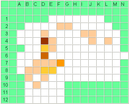
Figure 12. Two-frame animation. First frame contains actual distribution of adopters after two years. Second frame contains simulated distribution of adopters after two years.
How does the color-coded simulation (Figure 11) compare to the actual distribution of adopters after two years (Figure 8)? Consider the animated map that superimposes actual and simulated distributions as one way to compare pattern (Figure 12). The reader might enjoy using the second and third columns of random numbers to create more simulations and compare them to the first simulation and the actual distribution. From a visual standpoint, one might further imagine subtracting cells from one another and then animating the results. From the standpoint of municipal planning and policy considerations, one might imagine applying this sort of animated model to target key initiators (within a subdivision parcel map, for example) of innovative urban or environmental character that relies on word-of-mouth diffusion throughout a neighborhood. Using a simulation strategy based on location of known neighborhood trend-setters can maximize diffusion of a favored practice while minimizing expenditure of scarce tax-payer funds. Models that can be simply executed have fine potential for actually being used in real-world settings.
References
Arlinghaus, Sandra L. 1985. Down
the Mail Tubes: The Pressured Postal Era, 1853-1984. Ann Arbor: Institute
of
Mathematical Geography, Monograph #2, 80 pages.
Arlinghaus, Sandra L., Drake, William D., Nystuen, John D., with input from Laug, Audra, Oswalt, Kris; and, Sammataro, Diana, 1998. Animaps. Solstice: An Electronic Journal of Geography and Mathematics, Summer, 1998.
Hagerstrand, Torsten. Innovation Diffusion as a Spatial Process.
Translated by Allan Pred.
University of Chicago Press, 1967.
Beschreibung der Rohrpost. 1901. Berlin.
U.S. Postmaster General, 1891. Annual Report. Washington, D.C.: U.S.
Post Office Department.