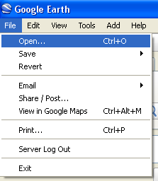
| SOLSTICE: An Electronic Journal of Geography and Mathematics. (Major articles are refereed; full electronic archives available). Persistent URL: http://deepblue.lib.umich.edu/handle/2027.42/58219 |
 |
| SOLSTICE: An Electronic Journal of Geography and Mathematics. (Major articles are refereed; full electronic archives available). Persistent URL: http://deepblue.lib.umich.edu/handle/2027.42/58219 |
|
Introduction
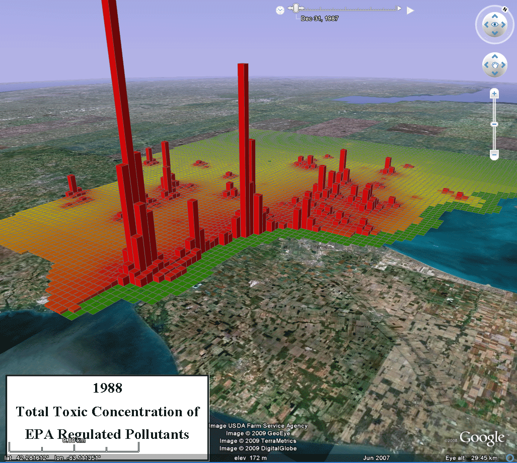
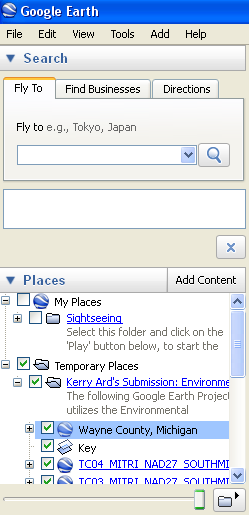
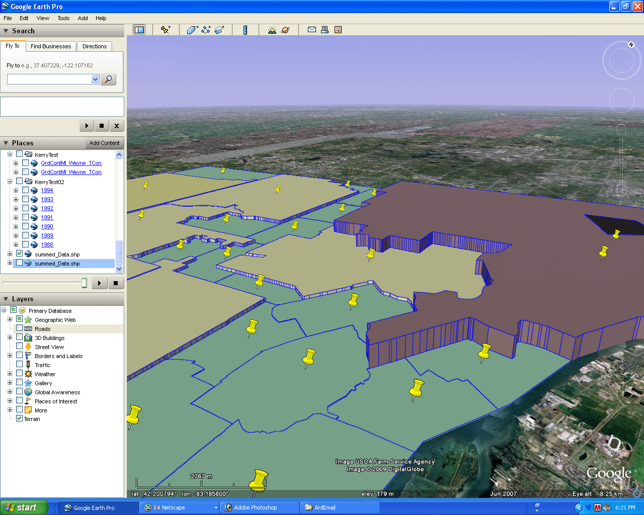
Google Earth can be a effective tool to educate the public about environmental risk, especially when it is coupled with the Environmental Protection Agency's (EPA) Risk Screening Environmental Indicators (RSEI) data. This data set employs information submitted by facilities that emit toxic pollutants into the air: chemicals distributors, manufacturers, mining industries, utility operations, hazardous waste treatment, and disposal plants (among others). The toxicity of over 600 individual chemicals, amounts released, the path the chemical is expected to take as it is disbursed into the environment (determined by weather patterns) is modeled and a unitless score is created so that one might make quantitative comparisons. This score allows one to see which geographic areas have higher amounts of airborne toxic chemicals. This project animates the changes in the amount of these chemicals for a grid of squares, each of area 1 square kilometer, in Wayne, Oakland, and Macomb Counties in Michigan for the years 1988- 2004. The publicly available version of these data is provided on a facility by facility basis. However, this project utilizes publicly unavailable data that were purchased from the EPA by a consortium of research universities, of which the School of Natural Resources and Environment at The University of Michigan is a member. Other participating universities include The University of Massachusetts and The University of Southern California. Model The base from which to generate the model in Figure 1 was developed by the author in association with advice and input from Paul Mohai and Sandra Arlinghaus. Mohai helped Ard generally (as her Ph.D. Advisor) to develop Environmental Justice connections. Arlinghaus created various basemap files (per personal communications noted in references) from which Ard then imaginatively integrated data over the years along with a variety of environmental justice considerations. The results of Ard's work were submitted to a Google contest and Ard won one of the top world-wide awards (as one of two contest winners), in the Student Category, for that work. Figure 1 shows an animation derived from that model. To drive around in the virtual world, and to study that model from various perspectives at leisure, download necessary software and files from the links in Figure 2 and study the associated images suggesting how to proceed.
Data & MethodsThe
Risk-Screening
Environmental
Indicators
(RSEI) is developed by the Environmental Protection Agency (EPA) to
analyze
risk factors of the
Toxics Release Inventory (TRI). A more thorough description of the data
and the model the EPA used can be found on their website:
EPA's Detailed information about RSEI data The first step to loading the geographic data into Google Earth was to load the RSEI data into ArcGIS. The data set for the Detroit metro area was pulled out of a larger, national database, that houses pollution risk scores for every 1x1 kilometer square in the US. The data is categorized by latitude and longitude of the central point of the square, as well as being linked to census block identification numbers. From this set, all squares within the three county area surrounding Detroit, Michigan were selected. Information about the type and amount of pollution estimated to affect any particular site is associated with the lat/long coordinates. The type and amount of pollution values are used to estimate a total toxic concentration for each square. These toxicity scores are comparable across different areas and time periods. Once a suitable data layer was open in ArcGIS the symbology options were opened and choices made concerning the toxic concentration of the EPA regulated pollutants (seen as TOXCON in the example below) as my value field (Figure 3).
To determine which
symbology colors to use, I considered two questions: (1) how is the
data
distributed? and (2) What
classifications would be useful? Unfortunately, the EPA warns that
these data should not be used to determine the chance of illness for
the exposed population. Thus comparison of the toxicity of
one area to another seems one of only a few natural choices.
Because of this limitation, the only value that can
be understood through coloration of the data is where that square is
located in the whole distribution of the data. Thus, "Natural
Breaks," which identifies groupings in the data that
naturally exist (Jenks), was selected as the data partitioning scheme.
The Hue, Saturation and Value (HSV) method was
used
which takes a slice across the color wheel. The slice between
red and green, typically associated with safe (green) and
unsafe (red), was chosen as the color pattern. This choice allows
viewers to visually determine which
areas are safer than others.
With the map colored, the next step was to export it to Google Earth. For this purpose, the program 'Export to KML' was downloaded (free) and installed. This program installs a tool on the ArcGIS (ESRI) toolbar that has an icon as shown in Figure 4. (Note: those who do not have administrator privileges for ArcGIS can get similar results using stand-alone software for converting shape files to kml files. One such stand alone program is 'Shp2kml 2'. ) The Export to KML tool allows users to uplod their shapefiles from ArcGIS to Google Earth. Figure 5 shows a screen capture of the option pad that comes up from clicking on the icon in Figure 4 (when installed in ArcGIS).
In
this option pad I selected the layer Toxic Concentration (TOXCON) as
the layer to export and selected the attribute to
represent the height as (TOXCON). The data set is highly skewed with
most
areas having
low levels of toxic concentration and only a few areas having high
levels
of concentration. Thus by choosing the height as the
actual value of the toxic concentration for cells, users can not
only visualize areas of general toxicity through color but can also
observe when and where there are extraordinarily high
values of toxicity. Thus
viewers can not only clearly visualize actual data patterns but can
also be guided toward suggested local regions for added research.
Such patterns that are clearly obvious when visualized but may not be
obvious
when comparing columns of numerical data from one spreadsheet to
another.
The symbology process repeats for every year from 1988 to 2005. These are uploaded each individually (Figure 6). <>Once these layers are in Google Earth they can be joined together under one project. In the image below note that each layer uploaded to Google Earth is labeled as TC## (TC is for toxic concentration and ## is for the year) MITRI (which stands for Michigan TRI data) NAD27 (the projection used) and South Michigan the spatial reference.
If
one of these layers is expanded in Google Earth,
by clicking
the plus sign button (+) next to the layer, a title key becomes
evident. Right Click this layer, choose copy, then paste it
in a
notepad document. Upon doing so, the following syntax will appear.
<?xml version="1.0" encoding="UTF-8"?> <kml xmlns="http://www.opengis.net/kml/2.2" xmlns:gx="http://www.google.com/kml/ext/2.2" xmlns:kml="http://www.opengis.net/kml/2.2" xmlns:atom="http://www.w3.org/2005/Atom"> <ScreenOverlay> <name>TitleKey</name> <TimeSpan> <begin>2004</begin> <end>2005</end> </TimeSpan> <Icon> <href>http://www-personal.umich.edu/~kerryjoy/2004.PNG</href> </Icon> <overlayXY x="0.02" y="0.1" xunits="fraction" yunits="fraction"/> <screenXY x="0.02" y="0.02" xunits="fraction" yunits="fraction"/> <rotationXY x="0.5" y="0.5" xunits="fraction" yunits="fraction"/> <size x="0" y="0" xunits="fraction" yunits="fraction"/> </ScreenOverlay> </kml> Several things are suggested by this syntax. It shows a Time Span command. This command tells Google Earth to show the icon image (listed as http://www-personal.umich.edu/~kerryjoy/2004.PNG) during the years 2004 to 2005. The icon image is a simple image created in the program Paint that has the year and the phrase "Total Toxic Concentration of EPA regulated Pollutants". The overlay information below the Icon command places this image in the appropriate spot in Google Earth. Each layer of pollution data has been given a title key like the one discussed as well as a 'time span' linked it to an Icon image that is suitable for that year. Similarly,
In the image above note that under
the Wayne County,
Michigan layer there is a file called Key. Right click on this,
paste it into Notepad, and the following syntax appears:
<?xml version="1.0" encoding="UTF-8"?> <kml xmlns="http://www.opengis.net/kml/2.2" xmlns:gx="http://www.google.com/kml/ext/2.2" xmlns:kml="http://www.opengis.net/kml/2.2" xmlns:atom="http://www.w3.org/2005/Atom"> <ScreenOverlay> <name>Key</name> <TimeSpan> <begin>1988</begin> <end>2005</end> </TimeSpan> <Icon> <href>http://www-personal.umich.edu/~kerryjoy/key.PNG</href> </Icon> <overlayXY x="0.02" y="0.1" xunits="fraction" yunits="fraction"/> <screenXY x="0.66" y="0.1" xunits="fraction" yunits="fraction"/> <rotationXY x="0.5" y="0.5" xunits="fraction" yunits="fraction"/> <size x="0" y="0" xunits="fraction" yunits="fraction"/> </ScreenOverlay> </kml> Unlike the syntax discussed previously, we can see that the Time Span command for this syntax is from 1988 to 2005. This means the icon image that it is linked to will be showing during this entire animation. This image is shown below (Figure 7) and is a useful guide to have shown for the entire animation.
Each
of the toxic concentration layers has a
'Time Span" command in them. Google Earth will automatically read these
and give the
option to animate the file by showing a toolbar (shown in Figure 2 and
also, for ease of reference, shown below in Figure 8).
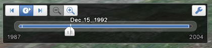
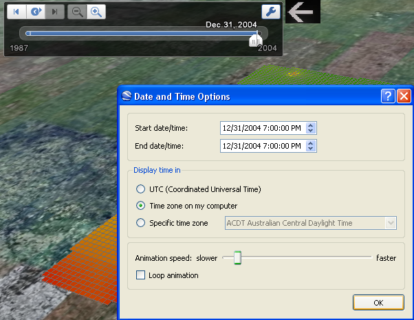
To
view the animation just click the play button. If
needed, change the speed setting by clicking on the wrench
image.
ConclusionThis project has helped to visualize a complex data set with multiple inputs for chemicals, concentrations, toxicities, and amounts, all changing over time. Two-dimensional representations of such data are limited. Google Earth provides the opportunity to visualize data in 3D and drive through it in order to look at complex spatial pattern from various perspectives (Arlinghaus, 2005-). The model presented here does not utilize all options provided by this program. In future projects it might be useful to change the opacity of the layers in order to see what landscape features underlay these areas, such as schools, lakes, parks, etc. (Arlinghaus 2008). As the capabilities of Google Earth continue to expand I am confident that it will prove to be a useful tool to educate the public about environmental risks and how their family and communities might be affected (Naud 2009). References
|
|
.

Solstice:
An Electronic Journal of Geography and Mathematics,
|
|
Congratulations to all Solstice contributors. |


