Deardorff's Glossary of International Economics
Integrated World Economy Diagram
|
|
|
|
|
Pass mouse over underlined tags to change figure:
|
| |
|
Effects of Factor Re-allocation
Across Countries
Labor into:
|
Country A
Country B
| |
| | |
|
|
|
Key:
| K, L
| | Factors capital and labor
| | X, Y
| | Goods X and Y
| | A, B, W
| | Countries A and B, and world W
| | OA, OB
| | Origins for graphing factors in countries A and B
|
|
|
Explanation:
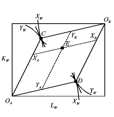
The diagram shows allocations of two factor endowments between two countries for given prices of the two goods that the countries are able to produce. The prices themselves do not appear in the diagram but enter instead through their corresponding (via FPE) factor prices and the cost-minimizing ratios of factors that each industry would employ at those factor prices. The dimensions of the box are the combined factor endowments of the two countries, with each point inside the box representing a division of these endowments between them as measured from their respective origins OA and OB, much as in the Edgeworth Production Box. The industry factor ratios are the slopes of the rays OAC (and its parallel DOB) for capital-intensive good X and OAD (and its parallel COB) for good Y. These rays form a parallelogram, within which lie all allocations of the two factors to the two countries consistent with both countries producing both goods and thus having factor price equalization. (Outside this parallelogram it is simply not possible to fully employ both factors while still using them in these proportions.)
In most uses of the diagram, the prices of the goods are those that would prevail in equilibrium if the world were to contain only these two countries and if they were fully "integrated," in the sense that both goods and factors were able to move freely between them. These goods prices would then imply corresponding factor prices and factor proportions such that factors would be fully employed in the world economy, some producing good X and others good Y in the quantities demanded at those prices, XW and YW. Thus the isoquants through points C and D in the figure represent these outputs, which may be represented with respect to either OA or OB, as shown.
The diagram can also be used to represent two countries that do not constitute the whole world, or two regions within a country, facing arbitrary exogenous prices. In that case, XW and YW become the outputs of only this part of the world if it alone is integrated and has FPE, and these outputs need not equal demand.
In either case, the diagram can be used to identify how factors are allocated to the two industries across the two countries, and thus how the two countries' outputs of X and Y depend on the country allocation of their combined factor endowments. For the particular allocation indicated at point E in the diagram, the dotted lines parallel to the sides of the parallelogram intersect the parallelogram at country A's allocation to industry X, XA, etc.
| Effects of Re-allocating Factors Across Countries
|
|
If factors are reallocated from one of these two countries to the other, this does not change their combined outputs so long as the allocation remains inside the FPE parallelogram. The cases shown are for re-allocation of labor from B to A, and from A to B. In both cases, the country receiving labor expands its employment of both factors in the labor-intensive industry, Y, and thus expands output there. And to keep both factors fully employed, it must reduce employment of both factors in the capital-intensive industry, X, and thus reduce its output of X. This is an example of the Rybczynski Theorem in action. Re-allocation of capital, not shown, would have analogous effects.
|